What the work is
DIN 1451 is a 1931 German standard specifying three sans-serif typefaces—Engschrift, Mittelschrift, and Breitschrift—for traffic signs, technical drawings, administrative documents, and wayfinding.
How it was made
It was made by the German Institute for Standardisation as a standard sheet—DIN 1451-Schriften—published preliminarily in 1931 and formalised in 1936. All letterforms were drawn on a coarse grid and designed to be reproducible with compass and ruler.
The condensed face, Engschrift, had an older lineage than the standard. In 1905 the Prussian state railways prescribed a standardised lettering style for all of its rolling stock, in a document known as Musterzeichnung IV 44. Ten years later the railway, by then the Prussian-Hessian Railways, required platform and station signage to follow the same template. When all German railway companies were consolidated into the Deutsche Reichsbahn in 1920, the Prussian typeface quickly became a de facto national standard, before the DIN committee had taken up its work on DIN 1451. That committee was headed by Ludwig Goller, a Siemens engineer. The design also follows DIN 16, an earlier standard for oblique lettering on technical drawings, released in 1919.
What works
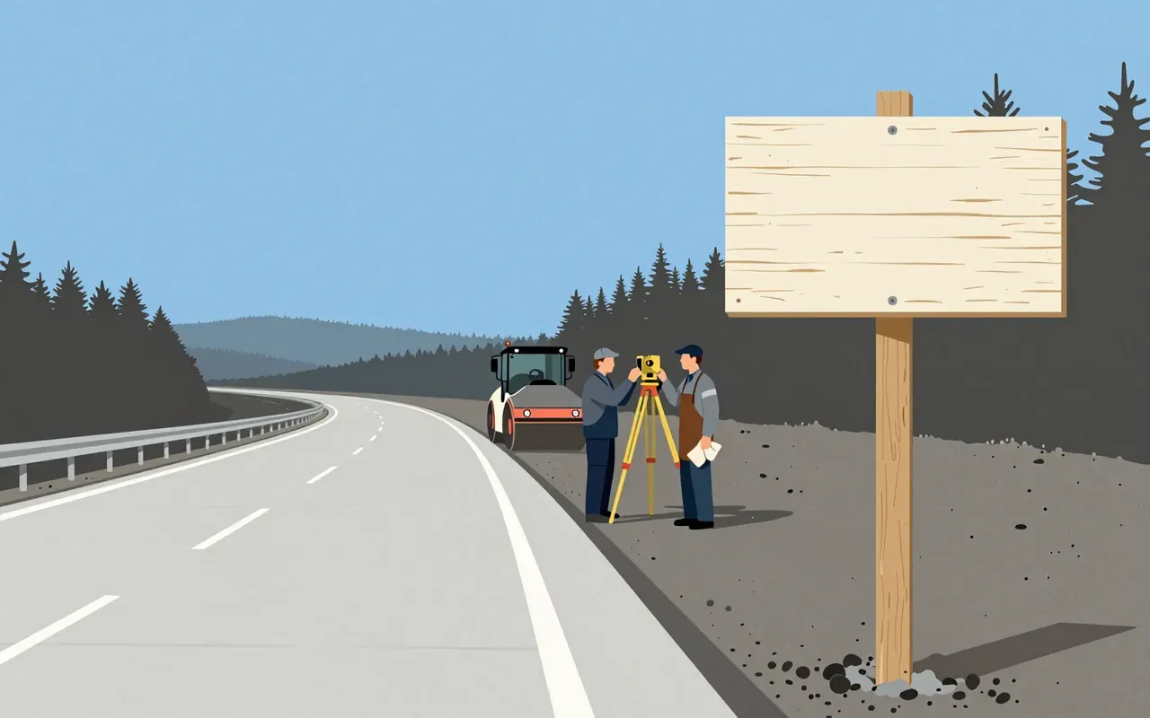
Its grid-based geometry ensures consistent reproduction across stencils, engraving, hand-lettering, and printing. Its narrow proportions and high x-height deliver legibility at distance and speed—proven by its 1938 mandate on the Autobahn.
The standard reached the street in several forms: celluloid lettering stencils for small applications, larger metal stencils for machinery, vehicles and aircraft, and cast metal lettering for street and building signage. Wikipedia says that after Temporary Order No. 20 of 1938 and similar regulations, DIN 1451 still dominates German public lettering. It was also the typeface on German car number plates from 1956 until January 1995, when FE-Schrift replaced it; FE-Schrift is described as impeding tampering and aiding automatic number-plate recognition.
What does not
DIN Breitschrift never achieved wide use. The standard does not address screen legibility, multilingual support, or variable weight or width axes.
Its coarse grid was also a limit. In 1980 the lettering artist Adolf Gropp redrew the typefaces on a finer grid, so that details such as the overshoot of round characters like C, G and O below the baseline and above the cap height could be defined exactly. Characters such as S, for which an accurate construction drawing had never been made, were now defined with lines and arcs for the cutting plotters that would be used for motorway signage. Several glyphs changed, notably “a”, “6” and “9”, and “t” in Engschrift.
The Bauhaus advocated coarse grids for designing typefaces, through Herbert Bayer and Joost Schmidt in the Dessau period. According to Wikipedia, the DIN typefaces, though similar in design, did not incorporate the elegance of that stylistic trend; sans-serif geometric lettering and Art Deco were both very popular in the 1920s and 1930s.
What it influenced
It established the precedent that public infrastructure requires typographic standards—not just for aesthetics, but for operational clarity across signage, railways, and technical documentation.
Others produced standards of their own. A consortium of Dutch organisations, inspired by the DIN standard, created NEN 3225, but it has no similarity to DIN: it is a humanist family with serif and sans-serif styles. The International Standards Organisation developed its own derivative, Isonorm, in 1980.
Its wider popularity followed when Linotype, with Adobe, released the redrawn faces as DIN Mittelschrift and DIN Engschrift in 1990, as part of the Adobe/Linotype PostScript library. Graphic designers and studios such as Uwe Loesch in Germany, Tel Design in the Netherlands, and David Carson and April Greiman in the USA began using them. FF DIN (1995), by Albert-Jan Pool for FontFont, is among the best-selling digitisations; Stephen Coles of Typographica has praised its hinting for onscreen display. In 2016 Microsoft released Bahnschrift, its first OpenType variable font, rebuilt from the ground up by Aaron Bell of Saja Typeworks. Fontwerk’s Neue DIN followed in 2023.
The body that issued the standard is a non-profit and the German member of ISO. It was founded in 1917 as the Normenausschuß der deutschen Industrie and took the name Deutsches Institut für Normung in 1975. DIN 1451 sits beside DIN 476, which introduced the A-series paper sizes in 1922 and was adopted as ISO 216.
Is it worth your time
Yes. It is the first national standard for a typeface, and its constraints—legibility at speed, mechanical reproducibility, administrative uniformity—still define functional typography today.