What the work is
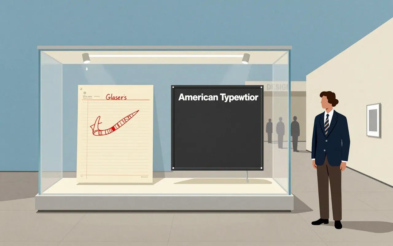
A stacked typographic logo: capital ‘I’, red heart (❤), and ‘NY’ in American Typewriter. Commissioned in 1977 by the State of New York for a tourism campaign. Held in MoMA’s permanent collection as both original sketch and presentation boards.
How it was made
Glaser drew the logo in a taxi in 1977 using red crayon on scrap paper. He conceived it spontaneously en route to a meeting. He placed I and a heart on one line, then revised it to stack I and the heart above NY. He used American Typewriter typeface. He worked pro bono. He intended the campaign to last only months. He donated the logo freely, hoping it would become public property.
What works
The vertical stack creates immediate rhythm and hierarchy. The heart replaces ‘love’ without spelling it—compressing language into symbol. American Typewriter’s rounded slab serif adds warmth without informality. Red crayon origin signals immediacy and accessibility. The three elements are legible at any scale and reproducible in any medium.
What does not
It does not resolve New York’s fiscal crisis. It does not depict the city’s geography, architecture, or demographics. It does not use photography, illustration, or custom lettering. It does not include slogans beyond ‘I ❤ NY’. It does not scale meaningfully beyond its three glyphs without external context.
What it influenced
It directly influenced the adoption of stacked-letter composition in civic branding. It modelled how a public-sector logo could function as both marketing tool and collective symbol. It established precedent for designers donating intellectual property to government campaigns. It seeded the use of the heart symbol as linguistic shorthand in mass communication.
Is it worth your time
Yes. It is a rare case where constraint—urgency, budget, medium, and civic intent—produced a durable visual syntax. Its simplicity masks deliberate compositional decisions: stacking over alignment, typographic restraint over illustration, and symbolic reduction over literalism. It rewards close reading of how few elements carry so much cultural weight.