
David Carson (graphic designer)
Carson didn’t break the rules—he replaced them with a new contract: attention first, meaning second.
The industry that pays for most of the culture and is rarely credited.
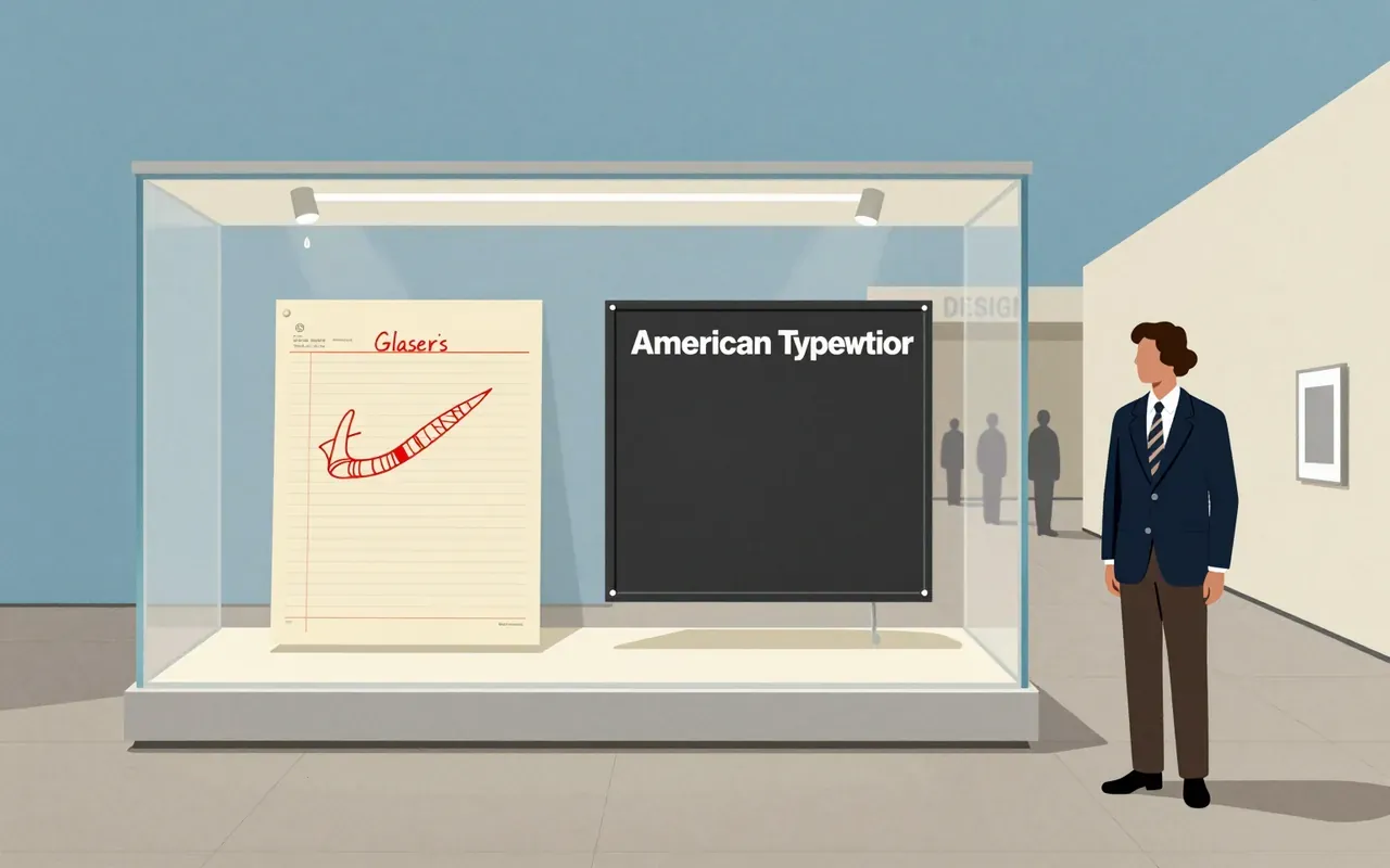
A graphic design brief must account for what is materially present—not reputation, not legacy, not what it ‘feels like’. This logo is three glyphs, one typeface, one colour, made in a taxi, given away, preserved in a museum, and later reactivated by trauma. Its power lies in what it omits: no skyline, no people, no narrative, no explanation.


Cooper Black is an ultrabold serif typeface designed for display use, drawn as an extra-bold weight of the Cooper Old Style family. It originated from Oswald Cooper’s lettering practice in 1920s Chicago and the Midwest. Its low stroke contrast and soft, 'muddy' appearance distinguish it from nineteenth-century fat faces. It quickly became popular in newspaper advertising and later in pop culture — notably on the 1966 Pet Sounds album cover. It was the second-best-selling typeface for American Type Founders and polarised typographic opinion: rejected by conservative typographers but embraced so enthusiastically by graphic designers that supply could not meet demand.





The Post-it note is a small sheet of paper with a low-tack, reusable, pressure-sensitive adhesive. It emerged from a failed adhesive experiment (1968), five years of internal neglect, a hymn-book insight (1974), bootleg development, and opportunistic colour selection. Its communicative function was proven through employee message exchange—not market testing. The 1977 'Press 'n Peel' test failed; the 1978 Boise Blitz succeeded only after renaming and free-sample distribution. It is worth attention because it reveals how industrial innovation depends less on intention than on permission, accident, and low-fidelity validation.