What the work is
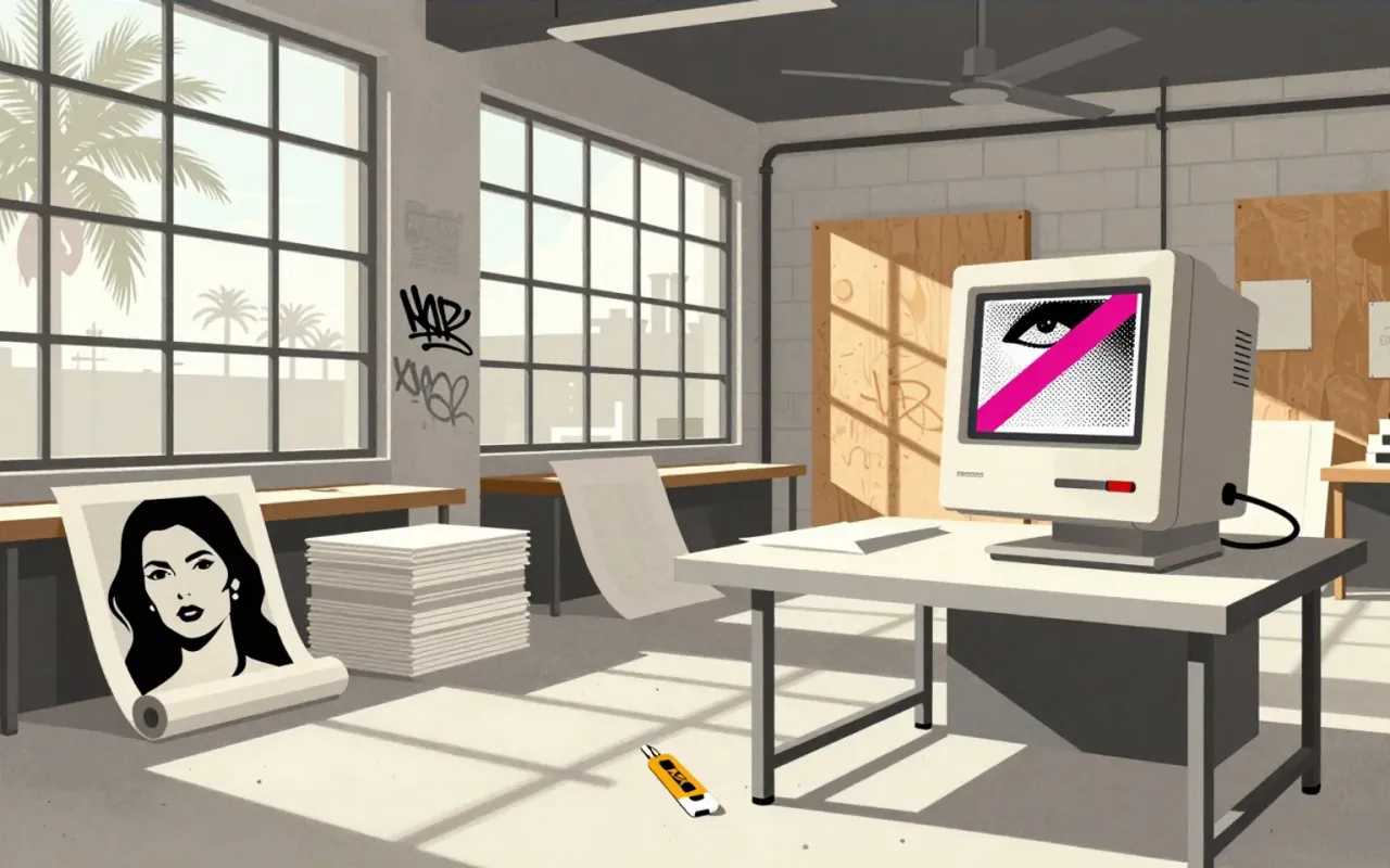
A body of magazine covers and layouts produced primarily for Transworld Skateboarding and Ray Gun, defined by visual noise, deliberate illegibility, and high-contrast communication aimed at youth and corporate audiences.
How it was made
Carson made work by editing magazine layouts, developing ‘dirty’ photographic techniques, and applying chaotic collage-like composition with layered photos and messy typography. He prioritised basic design decisions—images, cropping, font choice—over digital effects during the early 1990s.
What works
The covers work as visual triggers: they stop scrolling, signal cultural alignment, and communicate attitude before content. The emphasis on image, cropping, and font choice—over digital manipulation—gave the work material specificity and decisional clarity.
What does not
The work does not establish legibility as a primary goal. It does not rely on grid discipline, typographic hierarchy, or photographic fidelity. It does not serve archival, instructional, or regulatory communication needs.
What it influenced
Carson’s visual concepts influenced graphic design discourse in the 1990s by reframing chaos as intentional strategy—not error, not trend, but a mode of direct address. Ray Gun became the vehicle for that influence.
Is it worth your time
Yes—if you need to understand how editorial design can weaponise visual disorientation to target young readers and corporations simultaneously. No—if you expect coherent typographic systems or reproducible production methods.