Australia Post — Huveneers's Postal Mark
A postal horn and a letter share one compact sign.


















Gotham is a geometric sans-serif typeface family designed in 2000 by Tobias Frere-Jones with Jesse Ragan and released in 2002. It was commissioned by GQ magazine to display a sans-serif with a 'geometric structure' that would look 'masculine, new, and fresh'. Its letterforms were inspired by examples of architectural signs of the mid-twentieth century, especially the sign on the Eighth Avenue façade of the Port Authority Bus Terminal. Frere-Jones based the font on lettering seen in older Manhattan buildings, and characterised the simplification as 'not the kind of letter a type designer would make. It's the kind of letter an engineer would make.' The letterforms Gotham was based on were geometric yet did not look like Futura; their widths were more uniform and less classical, bowls were larger. Reviews of Gotham focus on its identity as something both American and specific to New York City.
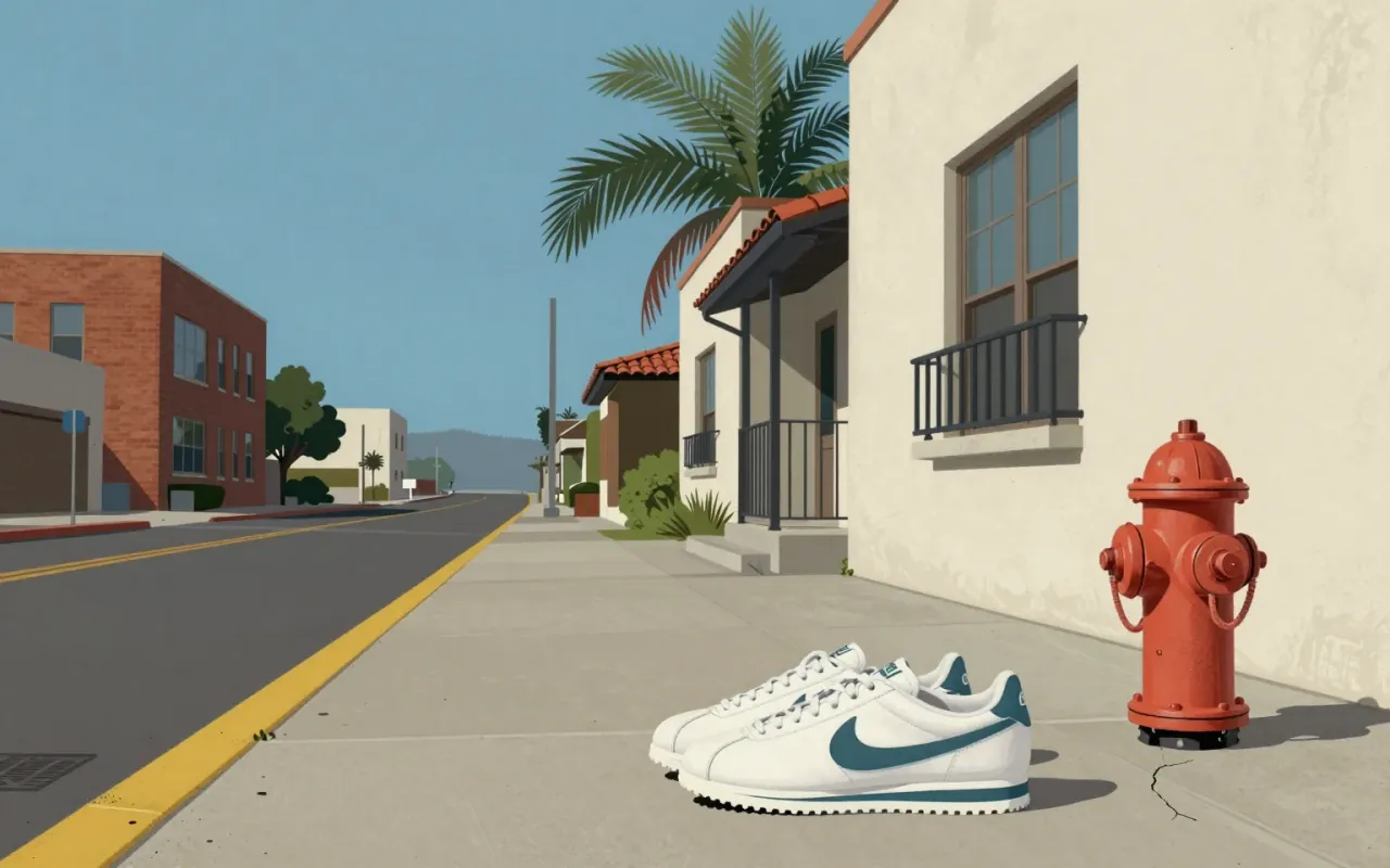
The Swoosh is a 1971 graphic design solution to a specific client request: motion, differentiation from Adidas, speed of execution. It succeeded not as an expression of personality or craft, but as a functional answer to a narrow constraint — and its longevity reveals more about brand consolidation than design innovation.


Gill Sans is a humanist sans-serif typeface designed by Eric Gill and released by Monotype in 1928, based on Edward Johnston's 1916 Underground Alphabet and Roman inscriptions, with lowercase forms derived from old-style serifs and uppercase proportions drawn from Trajan’s Column.

Helvetica is a deliberately constrained sans-serif, made to erase voice — not to express it.

IBM Plex is a corporate typeface designed to replace Helvetica across IBM’s global communications. Its rationale is financial and ideological: open-source licensing eliminates licence fees; typographic decisions reject expressive or historical categories in favour of functional clarity. It delivers a coherent, documented system — but only within the narrow frame of IBM’s internal brand requirements.

The work is Kenya Hara’s 2001 appointment as Muji’s art director — a strategic, graphic-led recalibration of a brand adrift from its 'No design' principle. He treated every object as designed, not neutral; replaced myth with method; and tightened coherence across 5,000 products and 250 stores. His posters — 'Horizon' (2003) and 'Natsure, Naturally, MUJI.' (2018) — are artefacts of that stance. Nothing in the sources supports claims about product design, architecture, or influence beyond Muji itself.