What the work is
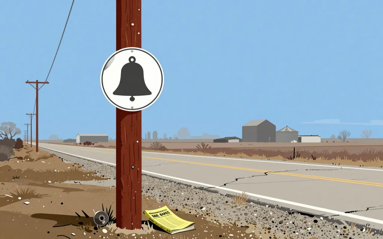
Saul Bass’s 1969 identity was for the Bell System, rather than a separate Bell Labs logo system. Alliance Graphique Internationale identifies it as the predecessor of his later AT&T identity.
The AGI page dates the AT&T logo to 1983 and describes it as the successor of his Bell System logo of 1969. It lists the 1983 project as a logo, in the discipline of identity. AGI lists “Bell Systems” and AT&T among the trademarks and corporate identity programmes Bass designed.
How it was made
The design reduced the bell to a simple outline within a circle. Logo Histories describes a wider programme of typography, colour and vehicle graphics intended to coordinate applications across the telephone organization.
The designer’s own practice gives some context. AGI says Bass was principal of Saul Bass & Associates in Los Angeles from 1946 to 1980, later renamed Bass Yager & Associates. He worked as a graphic designer, animator, photographer and film director, and the same list of identity clients includes United Airlines, Minolta, Alcoa, Warner Communications and Exxon.
What works
Retaining the bell preserved a recognisable connection while simplifying its execution. A consistent graphic rule could make separate applications read as parts of one service.
What does not
The scale of an organization makes consistency an implementation problem. A clear master drawing does not ensure that every vehicle, directory or sign will be replaced or applied correctly at once.
What it influenced
The later AT&T globe marks a documented change in the identity’s history. Comparing the two makes it possible to distinguish continuity of design authorship from continuity of the corporate symbol.
AGI credits Bass with titles for more than 40 films, including Exodus, The Man with the Golden Arm, Vertigo and Psycho.
Is it worth your time
Worth studying through several applications and their dates. The case is about a system being put into use, not merely a pleasing outline. Keep Bell System, Bell Laboratories and later AT&T identities distinct.