What the work is
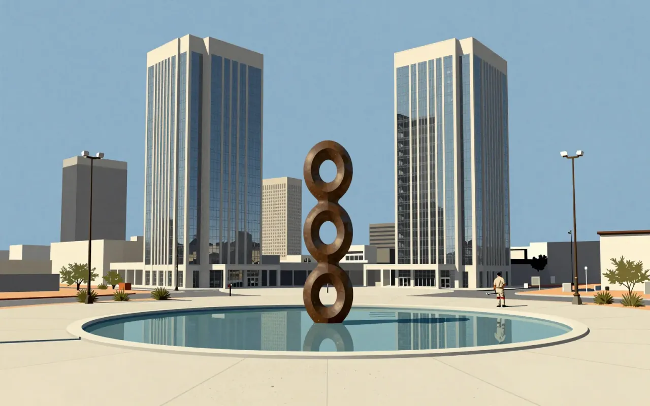
A body of typographic, branding, and environmental design work: two unrealised type systems (1925–1930, 1959), the ARCO logo and branding (1972), the Double Ascension sculpture-fountain, and direction of ARCO’s art collection (which grew to nearly 30,000 works).
How it was made
Bayer developed all-lowercase, sans-serif typographic systems using geometric forms as a base. He produced sketches for a universal typeface between 1925 and 1930 but never cast it. In 1959, he designed the fonetik alfabet — a phonetic, lowercase-only English alphabet with custom symbols for endings and digraphs. He also directed ARCO’s corporate branding and art collection from the early 1970s.
What works
The elimination of uppercase letters increased writing efficiency. The fonetik alfabet’s specialised symbols for -ed, -ing, -ion, and digraphs like ‘sh’ and ‘ng’ advanced phonetic legibility. The ARCO Plaza branding unified corporate identity across scale and medium.
What does not
The universal typeface was never realised in physical form. Bayer’s fonetik alfabet was never adopted. Neither system solved the tension between phonetic clarity and existing orthographic infrastructure.
What it influenced
His lowercase-only, geometric approach became foundational for mid-century Swiss typography and later digital interface fonts. His ARCO work modelled how corporations could embed art into architecture and identity simultaneously.
Is it worth your time
Yes — if you need to understand how typographic reduction serves efficiency, or how corporate patronage reshaped environmental art and branding in postwar America.