What the work is
British Rail introduced its new corporate identity in 1965. The Design Research Unit programme joined Gerry Barney’s Double Arrow symbol with Rail Alphabet, designed by Jock Kinneir and Margaret Calvert, and a coordinated colour scheme.
The programme grew out of a desire for modernisation in the 1960s: the management of what was then British Railways wanted to divest the organisation of older motifs and develop a corporate identity to rival that of London Transport. The identity was introduced to the public in December 1964 and rolled out at the start of January 1965, as the organisation’s brand name was shortened to “British Rail”.
How it was made
A corporate identity manual specified the relationship between the elements. Rail Blue and pearl grey served rolling stock, while the symbol and lettering extended across trains, stations, tickets and other applications.
BR’s design panel set up a working party led by Milner Gray of the Design Research Unit, and the manual it drew up set a design standard for the whole organisation, specifying Rail Alphabet as the standard corporate typeface. Gerry Barney, also of the Design Research Unit, designed the Double Arrow: two interlocked arrows across two parallel lines, symbolising a double track railway.
What works
The achievement is coordination across encounters. Travellers meet a railway through signs, documents and vehicles; a shared system connects those separate objects without requiring each to look identical.
What does not
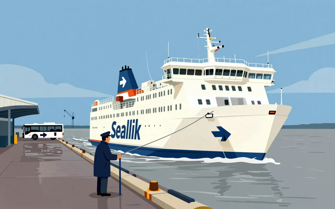
Different applications still need different treatment. Sealink ferries used a reversed symbol on one side so the upper arrow faced the bow, demonstrating that implementation cannot always be reduced to placing an unchanged mark anywhere.
On the ships’ funnels the standard image appeared on the port side and a mirror image on the starboard side, so that the top arrow always pointed to the bow. Flags followed a similar logic: the logo appeared in reverse on the back, with the top arrow pointing towards the flagpole. The logo has traditionally been used in a variety of colours, and in both positive and reversed forms.
What it influenced
The Double Arrow survived British Rail’s privatisation as a sign for the wider passenger railway network. Its continued role separated the recognition of rail travel from the identity of a single operating company.
With privatisation in the mid-1990s the trademark registration passed to the Secretary of State for Transport. Because trains are now run by a number of independent operating companies, the logo no longer appears on railway vehicles except preserved ones, but it still appears on tickets and marks stations within the National Rail network, including on street signs pointing to them. In September 2022 Network Rail released specifications for an updated version, Rail Symbol 2, made with graphic designer Nick Job and the Design Council. It looks almost identical to the original but replaces the dark and light variants with a single version, widens the symbol slightly to give a more practical aspect ratio, and adjusts the diagonal arms to perform better at small sizes. The logo was adopted by Great British Railways in 2025.
Is it worth your time
Worth studying for large public-service identities. Examine a ticket, station sign and vehicle together. The manual’s organising rules explain the programme more fully than an isolated view of its famous symbol.