What the work is
Palatino is an old-style serif typeface released in 1949 by Stempel, designed by Hermann Zapf. It is a commercial display face with open counters, balanced proportions, moderate stroke contrast, and flared serifs.
How it was made
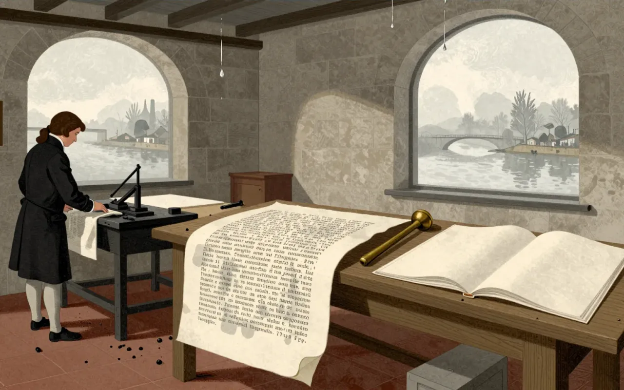
Hermann Zapf designed Palatino in 1949 for Stempel under constraints of post-war German printing: poor-quality paper, lithographic and gravure processes. He widened apertures, thickened strokes, and flared serifs to ensure clarity at small sizes, at distance, and on low-grade stock. It was conceived as a commercial face—not for books—but for trade use like headings and advertisements.
What works
Its open counters, wide apertures, and thickened weight deliver legibility on poor paper, at small sizes, and from a distance. The flared serifs and balanced proportions stabilise character recognition across variable reproduction conditions.
What does not
Palatino does not function well as a book type by Zapf’s own measure. Its wide structure and increased weight compromise rhythm and density in long-form setting—evident in how Aldus, designed for that purpose, was sidelined despite being narrower and lighter.
What it influenced
Palatino influenced digital typography’s foundational repertoire. Linotype licensed it to Adobe and Apple for PostScript, embedding it as a standard font in early desktop publishing—shaping expectations of readability across screens and printers.
Is it worth your time
Yes. Palatino reveals how legibility is engineered, not inherited; its adaptations to material limits remain legible in digital interfaces today. Its misapplication as book text—despite Zapf’s intent—exposes the gap between design intention and cultural adoption.