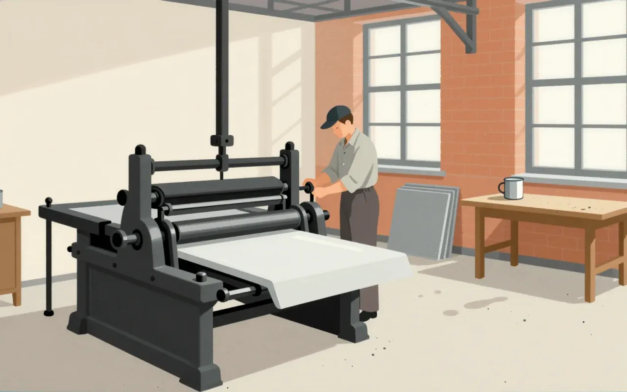
Palatino
Palatino was built for bad paper—not books—and became a book face anyway.
The medium everything else has to pass through.


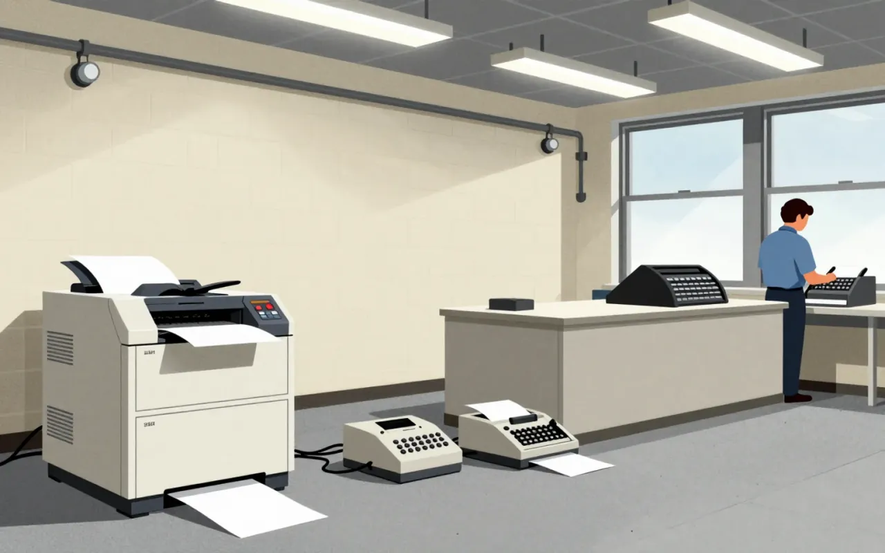
Arial is a neo-grotesque sans-serif typeface designed in 1982 by Robin Nicholas and Patricia Saunders at Monotype Typography as a metrically compatible alternative to Helvetica for the IBM 3800–3 laser printer.
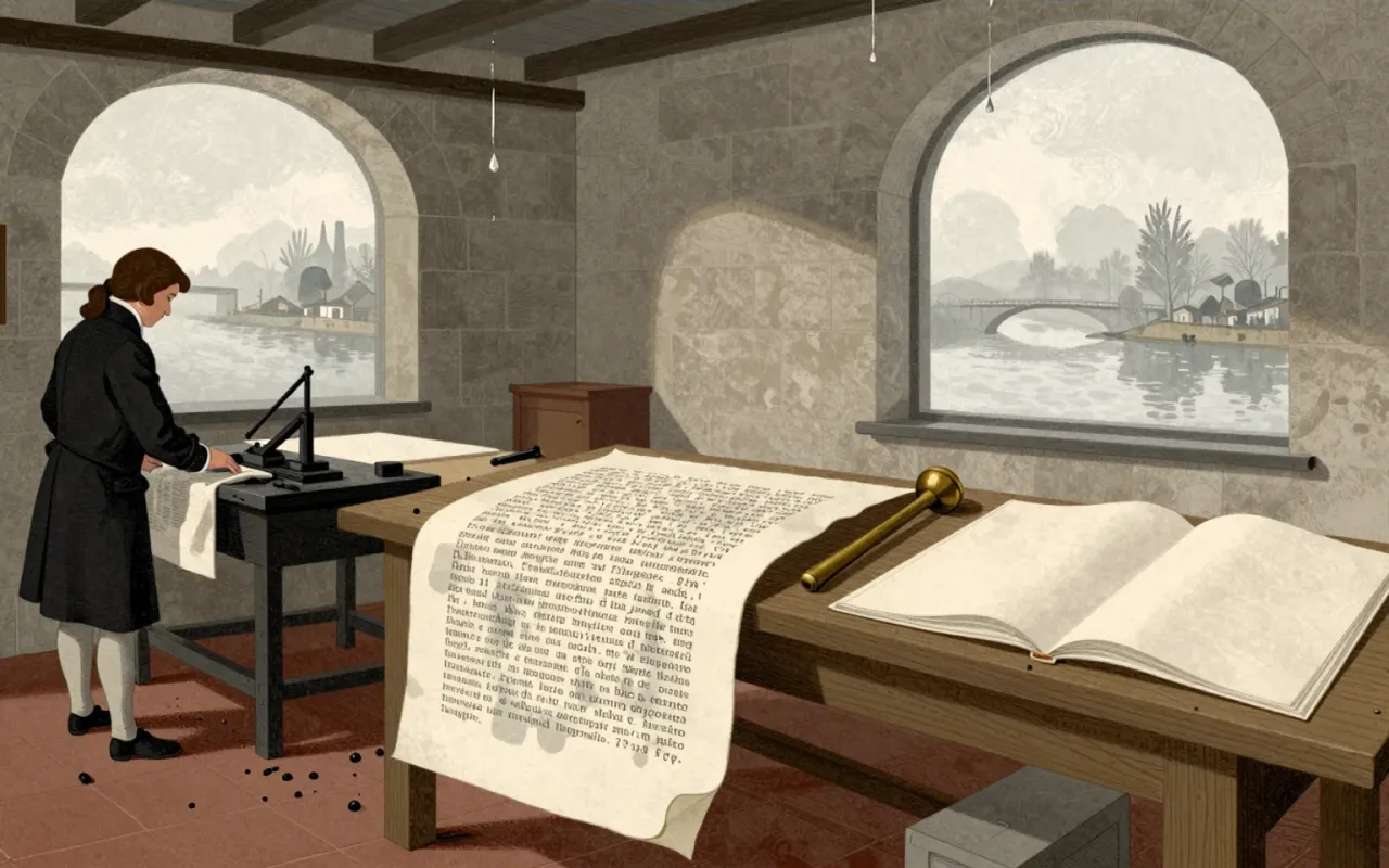
Bodoni is a late-eighteenth-century type system defined by extreme stroke contrast, flat unbracketed serifs, geometric construction, and rational structure. It was made possible by Bodoni’s technical mastery in cutting fine hairlines across many sizes—and by his aesthetic commitment to plainness and material purity. It works where size, paper, and ink support its optical demands: the 1808 Iliad and 1806 Oratio Dominica prove its fidelity and ambition. It fails where those conditions collapse: at small sizes, hairlines vanish and alternating strokes cause dazzle. It influenced all subsequent Didone typography—not as a timeless ideal, but as a precise, constrained, and unforgiving system. It is worth your time if you treat legibility as a condition, not a guarantee.
Optima is a deliberate hybrid: a sans-serif built from serif sources, calibrated by mathematical proportion, and tested in real textual labour. It does not invent new categories — it occupies the gap between them with precision.