What the work is
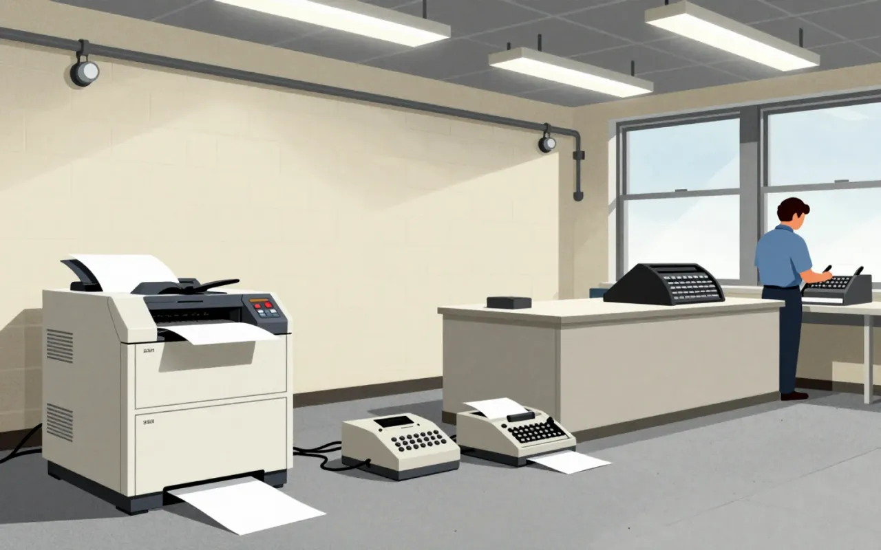
Arial is a neo-grotesque sans-serif typeface designed in 1982 as a metrically identical substitute for Helvetica, built for bitmap rendering on the IBM 3800–3 laser printer.
How it was made
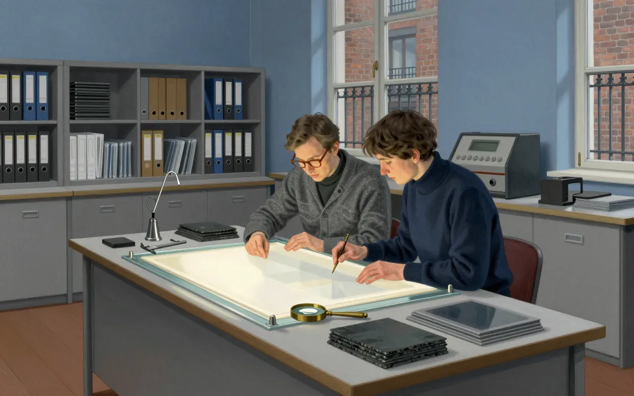
Arial was hand-drawn in 1982 by a 10-person team at Monotype Typography led by Robin Nicholas and Patricia Saunders. It was digitized at 240 DPI exclusively for the IBM 3800–3 laser printer under contract. Its widths were locked to Helvetica’s; its shapes drew from Monotype Grotesque, Venus, and the 1956 ‘New Grotesque’ project.
What works
Arial preserves document layout when swapped for Helvetica. Its rounded terminals, fuller curves, and open counters improve consistency in continuous text at medium sizes — a direct response to the limitations of 240 DPI rasterisation.
What does not
Arial does not offer visual differentiation where width equivalence is enforced. Its softer curves and open counters vanish in low-resolution output or small sizes, collapsing into Helvetica’s silhouette without delivering functional advantage in legibility or tone.
What it influenced
Arial influenced the default typography of early desktop publishing and operating systems, becoming a de facto standard for documents where layout fidelity mattered more than voice — but it did not shift typographic taste or spur new design thinking.
Is it worth your time
Yes — if you need to understand how technical constraints shape typographic identity, or how metric compatibility can override aesthetic distinction in mass digital deployment.