What the work is
Optima is a flared, humanist sans-serif typeface released by D. Stempel AG in 1958, intended to bridge serifs and sans serifs while serving both titling and continuous text.
How it was made
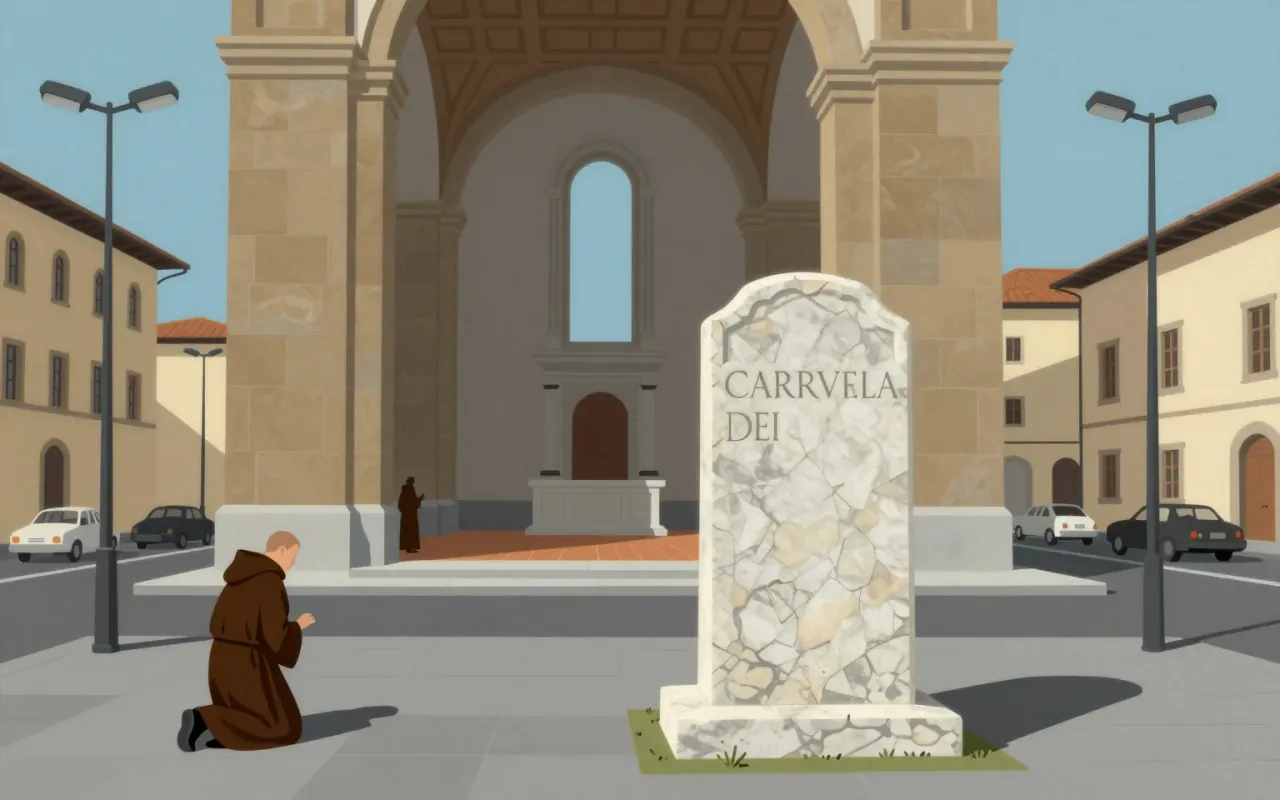
Zapf designed Optima between 1955 and 1958 as a humanist sans-serif, drawing directly from Roman capitals on the Trajan Column (A.D. 113) and Renaissance tombstone inscriptions in Florence. He applied Golden Section proportions to letterform dimensions and deliberately abandoned standard German baseline alignment.
What works
Its terminal swelling suggests glyphic serifs without adding actual serifs. Its Golden Section proportions unify x-height and ascender-descender relationships. Its departure from baseline alignment signals intentional formal divergence. Its use across an entire book proves functional versatility in one weight.
What does not
The sources do not establish any failure mode, limitation or criticism of Optima. No claim is made about poor legibility at small sizes, rendering issues, licensing constraints, or commercial reception.
What it influenced
The sources do not state what Optima influenced. No successor typefaces, movements, designers, or applications are named or implied.
Is it worth your time
Yes — if you need to understand how typographic intention can reconcile structural contradiction: serifless forms that evoke serifs, classical proportion deployed in a sans context, and a single weight engineered for both headings and body text.