What the work is
Bodoni is a family of serif typefaces designed by Giambattista Bodoni in the late eighteenth century. It is classified as Didone or modern—not a revival, but a new design system.
How it was made
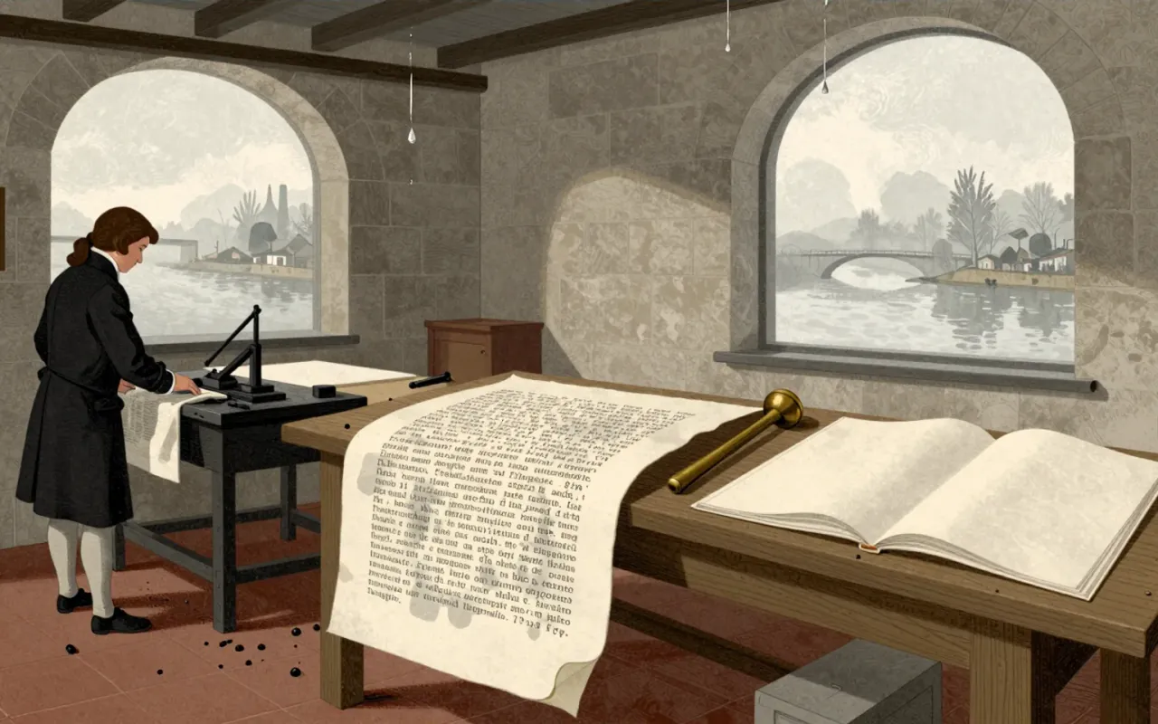
Bodoni extended Baskerville’s ideas to an extreme, co-evolving the Modern type style with Firmin Didot. He cut original typefaces across a large range of sizes. His method relied on technical refinement to render very thin hairlines against thick stems, and his printing used plain, unadorned style and material purity.
What works
Bodoni achieves unprecedented technical refinement in rendering extreme stroke contrast. Its multi-size families enabled subtlety in spacing and composition. Its rational structure earned it the label ‘classical’ on release. The 1808 Iliad demonstrated fidelity to Greek manuscript forms; the 1806 Oratio Dominica showed scale and linguistic ambition.
What does not
Bodoni fails at small point sizes: hairline strokes recede from visibility, and alternating thick-thin strokes cause ‘dazzle’. It is not a revival of Roman or Renaissance letterforms, so it offers no historical continuity—only rupture.
What it influenced
Bodoni established the Didone classification and set the terms for modern typography’s emphasis on geometric construction, rational structure, and material fidelity. Its influence persists in digital revivals—but those often inherit its legibility flaws without its compositorial discipline.
Is it worth your time
Yes—if you need to understand how rational structure, extreme contrast, and multi-size systems shape legibility and compositorial control. No—if you assume Bodoni is inherently readable or universally scalable.