What the work is
Matthew Carter is a typographer whose verified work consists of punchcutting metal type, adapting historical models (e.g., Granjon), designing for specific technical constraints (Bell Centennial), and creating enduring editorial marks (Private Eye masthead).
How it was made
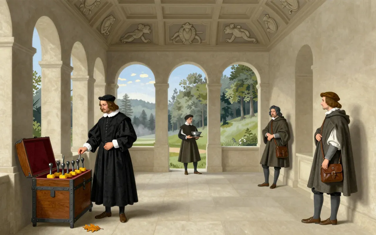
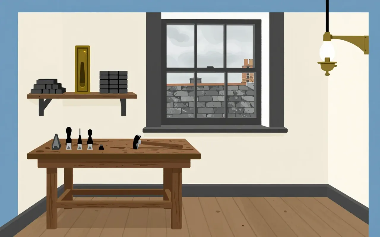
Carter studied manual punchcutting under P. H. Rädisch to make moulds for casting metal type. He cut his own version of Dante by 1961. He designed typefaces for Mergenthaler Linotype in Brooklyn from 1965. He adapted historical models like Granjon’s and solved technical constraints — Bell Centennial for phone directories, Verdana and Georgia for screen rendering.
What works
His mastery of punchcutting gave him direct control over letterform geometry before digital tools existed. His adaptation of Granjon into Galliard shows disciplined translation of historical contrast and rhythm. The Private Eye masthead remains in use — evidence of functional longevity. Bell Centennial solved legibility at small sizes in dense print — a concrete problem with a concrete solution.
What does not
The sources do not establish that Carter designed Verdana or Georgia. They do not attribute any digital typeface to him directly. They do not state he invented new technologies, led studios, or worked outside the verified contexts: punchcutting, Linotype, Private Eye, Bell System, Granjon adaptation.
What it influenced
Carter bridged transitions across type technologies — from physical metal type through phototypesetting to digital type design. His work established how historical forms could be re-engineered for new media without losing functional clarity.
Is it worth your time
Yes. Carter’s work maps the material logic of type across technological shifts — from punch to pixel — without mythologising craft or surrendering to novelty. His decisions are legible, consequential, and anchored in constraint.