designbriefs
Typography

Baskerville

Baskerville did not perfect typography — it weaponised contrast, and forced every printer after to choose between clarity and compromise.

Baskerville is a 1757 serif typeface designed by John Baskerville in Birmingham and cut by John Handy. It is transitional — a refinement of Caslon’s old-style forms — with higher stroke contrast, sharper serifs, vertical axis shift, more circular curves, and greater character regularity. Its success depended on wove paper (co-developed with James Whatman), custom ink, and precise presswork. The 1757 Virgil edition demonstrated its capabilities and secured Baskerville’s 1758 appointment as University Printer to Cambridge. It set formal precedents for Bodoni and Didot, but its legibility limits at small sizes and material dependencies remain unaddressed.

Subject
Typeface
Design credit
John Baskerville
Year
1757
Discipline
Typography
Organisation
Birmingham, England
Worth your time?

Yes. Study the whole thing.

4.5/ 5
What works
  • creates visual rhythm through contrast
  • improves terminal definition with sharpened serifs
  • enhances symmetry via vertical axis shift
  • yields consistency through calligraphic discipline
What does not
  • resolve legibility at small sizes
  • eliminate variation
  • function independently of wove paper and custom ink
Study it if
  • typographers
  • print historians
  • design educators
Skip it if
  • digital interface designers seeking ready-to-use fonts
  • brand strategists needing scalable systems
The design analysis1 min read

What the work is

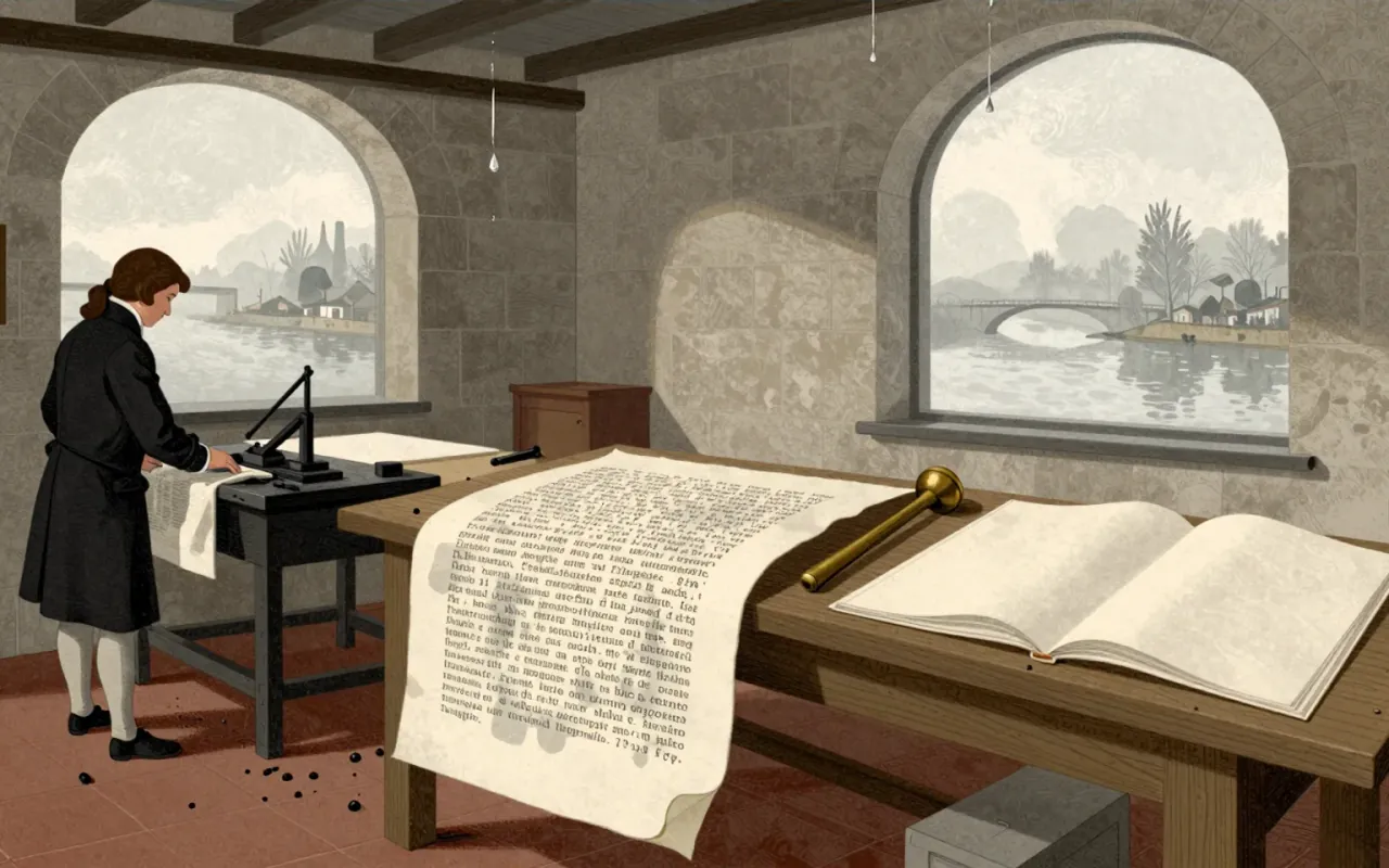
Baskerville is a serif typeface designed in 1757. It is classified as transitional. It was cut into metal by John Handy under Baskerville’s direction. It was first used in a 1757 quarto edition of Virgil printed on wove paper.

How it was made

Baskerville designed the typeface in 1757 in Birmingham, England. He directed punchcutter John Handy to cut it into metal. He developed the project over seven years, releasing a prospectus in 1754. He collaborated with paper maker James Whatman to produce wove paper. He innovated across printing, paper, and ink production.

What works

The increased contrast between thick and thin strokes creates visual rhythm. Sharpened, tapered serifs improve terminal definition. Vertical axis shift in rounded letters enhances symmetry. More circular curved strokes and greater character regularity yield consistency — a direct result of Baskerville’s calligraphic training.

What does not

It does not resolve the tension between high-contrast letterforms and legibility at small sizes. It does not eliminate variation — its regularity is relative to earlier British types, not absolute. It does not stand alone: its impact depended on wove paper, custom ink, and precise presswork — none of which were standard at the time.

What it influenced

It influenced later transitional and modern typefaces, including those of Giambattista Bodoni and Firmin Didot. Its emphasis on vertical stress, circular curves, and sharpened serifs became structural benchmarks for type design in the late eighteenth and nineteenth centuries.

Is it worth your time

Yes. It is the first fully realised transitional typeface — a deliberate, coherent recalibration of letterform logic that changed how type could be conceived, made, and read.
Same discipline · Typography4 of 55
Up next in Design

Bauhaus

Walter Gropius · 1919 · 11:34

The Bauhaus wasn’t a style — it was a school that made mass production a moral imperative for design.

11:34