What the work is
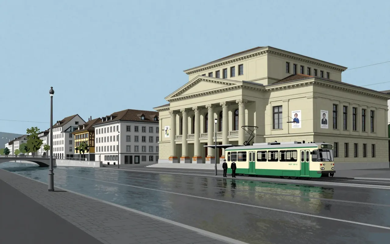
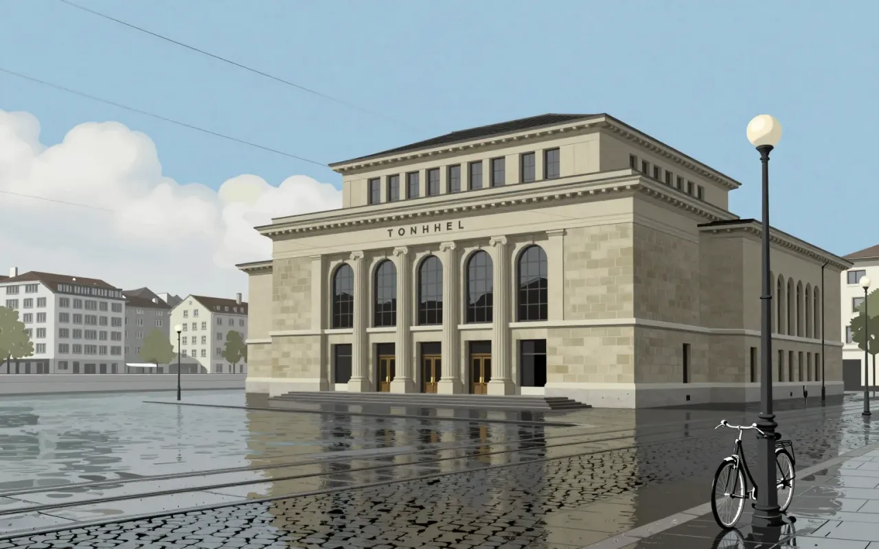
A body of graphic design work including concert posters for the Tonhalle in Zürich (starting 1950) and a 1952 accident barometer for the Automobile Club of Switzerland.
How it was made
He used geometric elements without illustration or embellishment. He translated music’s mathematical structure into visual form using scale, rhythm, and repetition. His method centred on nonrepresentational abstraction, visual metaphor, and constructive graphic design.
What works
His use of geometry to express musical feeling worked. The Tonhalle Series grew increasingly abstract while staying tied to composers’ structures. The accident barometer communicated reckless driving statistics at scale in Paradeplatz.
What does not
The material does not establish influence beyond his own practice. It does not describe typography as a primary tool, nor does it mention grids, Swiss Style as a label, or any engagement with photography, colour theory, or printing technology.
What it influenced
The material does not state what his work influenced. No successors, movements, institutions, or later works are named or implied.
Is it worth your time
Yes — his posters and data visualisations are early, rigorous applications of systematic abstraction to public communication. They show how formal discipline can serve both clarity and emotional resonance.