What the work is
Susan Kare developed icons for the original Macintosh in the early 1980s. Her notebooks record the first stages of making useful symbols within a small, single-colour pixel grid.
How it was made
Before she had a computer for the work, Kare used graph paper. In her account for MoMA, an icon occupied roughly a 32-pixel square, with each small decision contributing to a recognisable shape.
What works
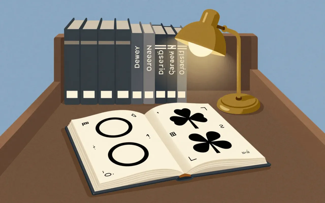
The Command symbol shows how reference and constraint worked together. Kare found a cloverleaf-like sign for an interesting feature in a symbol dictionary; it offered a friendly shape that could be expressed clearly in pixels.
What does not
Kare rejected harsher associations for command, including police imagery. The decision exposes a limitation of literal illustration: an image can suggest the wrong tone even when its connection to a word is defensible.
What it influenced
The Command symbol continued onto Apple keyboards and menus, as Kare notes in the museum recording. Its persistence is a concrete example of an early interface decision extending beyond its original screen context.
Is it worth your time
Worth studying for interface and icon design. Recreate the constraint with a small grid, then compare possible symbols for the same action. Judge the association and emotional tone alongside the clarity of the silhouette.