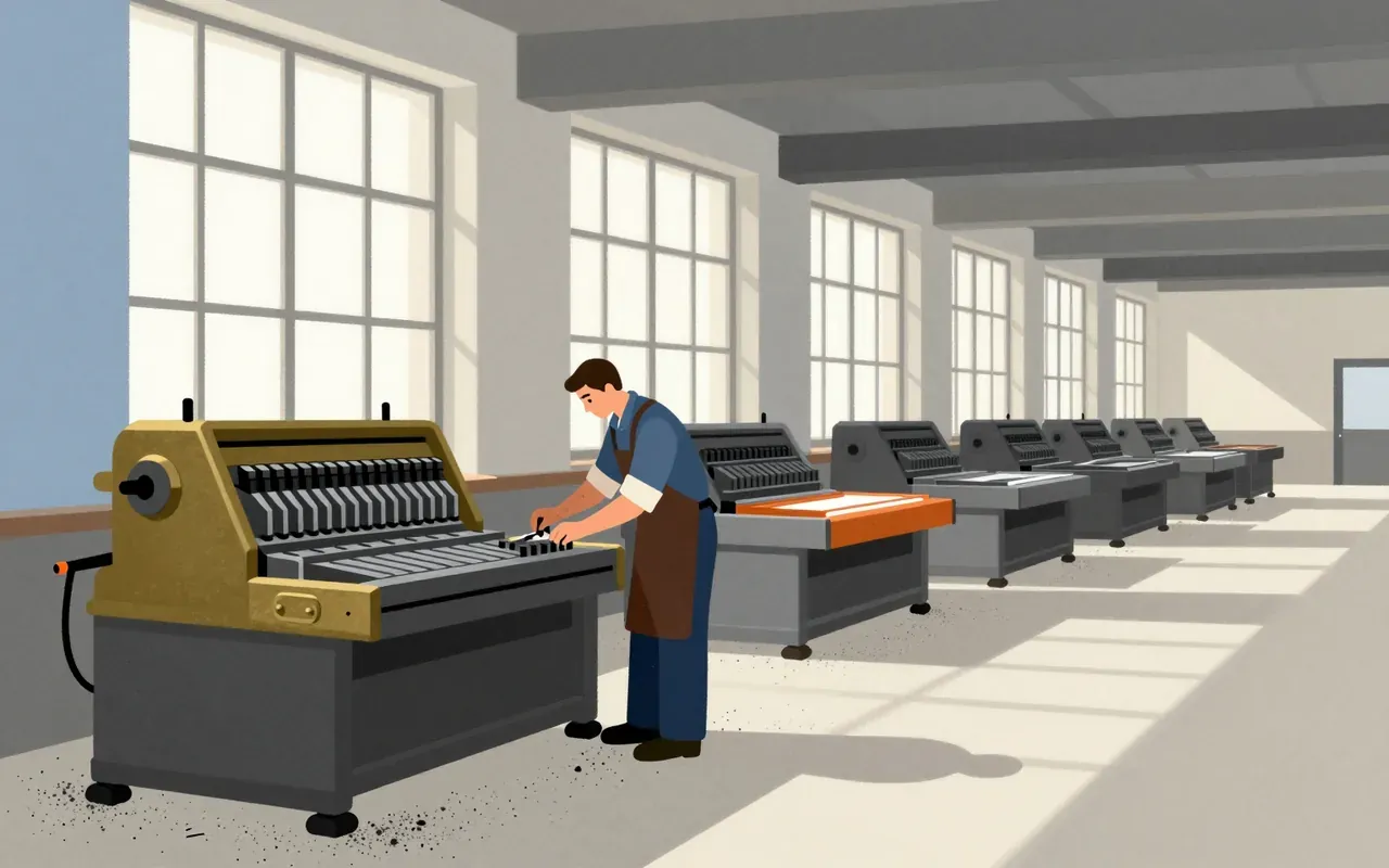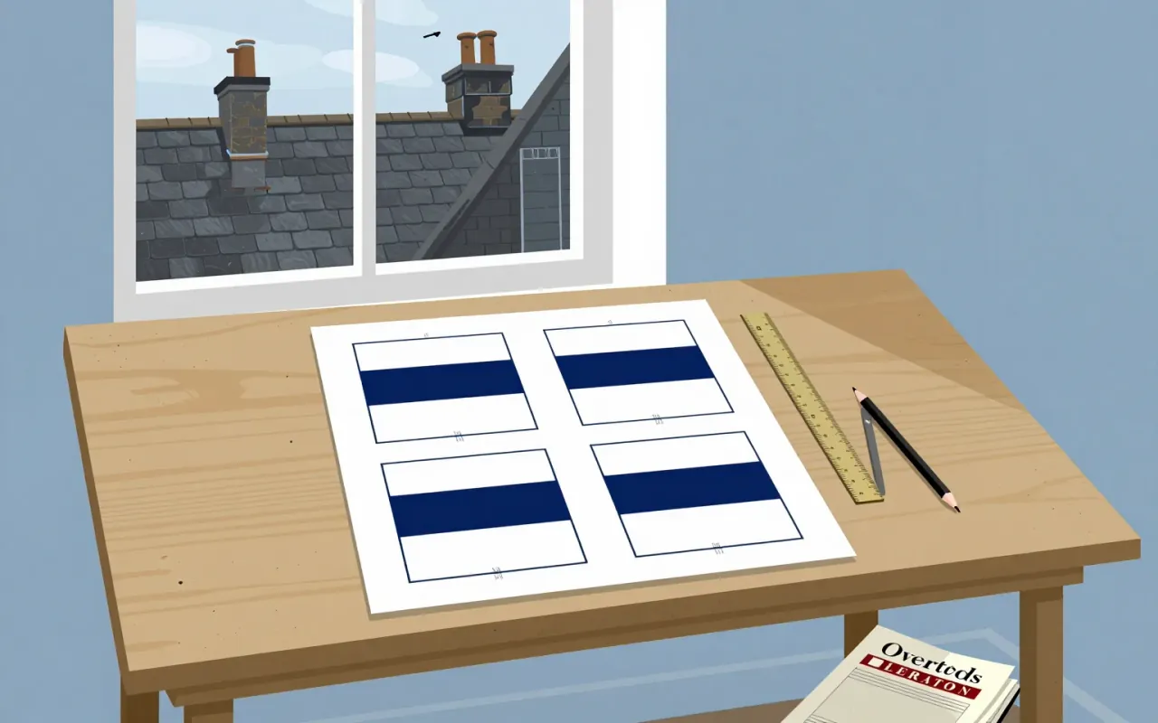
What the work is
Penguin’s official Classics history records early covers by John Overton, followed by Jan Tschichold’s revision in 1949. This brief concerns that series, rather than attributing every familiar Penguin cover to Tschichold.
How it was made
The early scheme used colour to distinguish the language of the original text and a roundel for an illustration. Tschichold revised an existing system: the design problem included maintaining a family resemblance while improving its presentation.
What works
A recurring arrangement lets a reader recognise the collection before reading an individual title. Variation can then carry information about the book without requiring a wholly new visual language for each release.
What does not
The same regularity can make differences between books less conspicuous. A cover system serves the publisher and the shelf as well as the particular text, and those priorities do not always coincide.
What it influenced
The publisher’s historical collection places this revision within successive generations of Classics covers. Its value is as one stage in a changing series identity, not a final formula that later designers merely repeated.
Is it worth your time
Worth comparing with an Overton cover and a later Classics edition. Look for what survives the redesign and what is redistributed. That sequence reveals design as stewardship of an existing system.