What the work is
Georgia is a 1993 serif typeface commissioned by Microsoft, built for legibility on low-resolution computer monitors using binary bitmap rendering.
How it was made
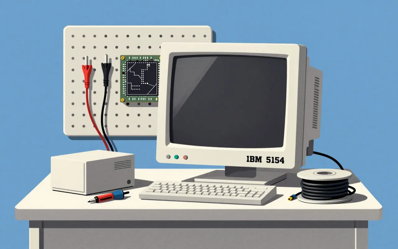
Matthew Carter designed Georgia in 1993 for Microsoft, with manual hinting by Thomas Rickner. It was engineered for binary bitmap rendering on mid-1990s low-resolution screens. Its large x-height, thicker thin strokes, reduced stroke contrast, and thickened serifs were direct responses to pixel-thickness constraints — where stems could only be one or two pixels wide.
What works
Its large x-height, thickened serifs, and unusually bold weight deliver clarity at small sizes on coarse screens. The reduced stroke contrast prevents thin elements from vanishing. Its derivation from Scotch Roman models gives it typographic authority without sacrificing screen function.
What does not
Georgia does not scale elegantly to high-resolution displays without adjustment. Its unusually bold weight and flattened contrast, essential for 1990s bitmaps, can appear heavy or blunt in print or modern UI contexts where fine gradations are possible.
What it influenced
Georgia established the template for screen-optimised serif typefaces — proving that serifs could be legible on low-res displays, directly influencing later web fonts and setting a precedent for purpose-built digital text families.
Is it worth your time
Yes. Georgia is a decisive, constraint-driven solution to a vanished technical problem: legibility on pre-subpixel-rendered screens. Its logic remains legible in its forms, and its success reshaped expectations for screen typography.