What the work is
Akzidenz-Grotesk is a metal typeface family released by Berthold Type Foundry in 1898 for commercial print jobs—publicity, tickets, forms—not fine printing.
How it was made
Berthold based Akzidenz-Grotesk on Bauer u. Cie’s Schattierte Grotesk, removing its drop shadow. It originated in Stuttgart before Berthold’s Berlin registration. Two design patents were filed in April 1898—one in Stuttgart on 14 April, one in Berlin on 28 April.
What works
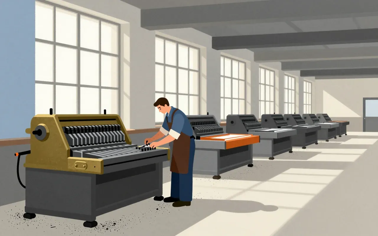
Its monoline structure and single-storey ‘g’ deliver consistent weight and compact character width. These features suited mechanical composition and rapid typesetting under tight budget and time constraints.
What does not
It does not claim typographic neutrality. Its monoline structure and single-storey ‘g’ are deliberate departures from serif conventions—not refinements toward universality, but functional adaptations for legibility at small sizes in jobbing print.
What it influenced
It prefigured neo-grotesque faces like Helvetica by half a century. Its success established a template for sans-serifs built for reproducibility, not aesthetic abstraction.
Is it worth your time
Yes. It is the earliest documented sans-serif typeface designed for commercial print use with formal coherence and legal protection—making it a foundational object for understanding how industrial typography scaled before modernism.