What the work is
Design Quarterly #133, titled Does It Make Sense?, is a nearly three-by-six foot fold-out artwork published in 1986. It unfolds three times across and nine times down to reveal a life-sized image of April Greiman’s outstretched naked body adorned with symbolic images and text.
How it was made
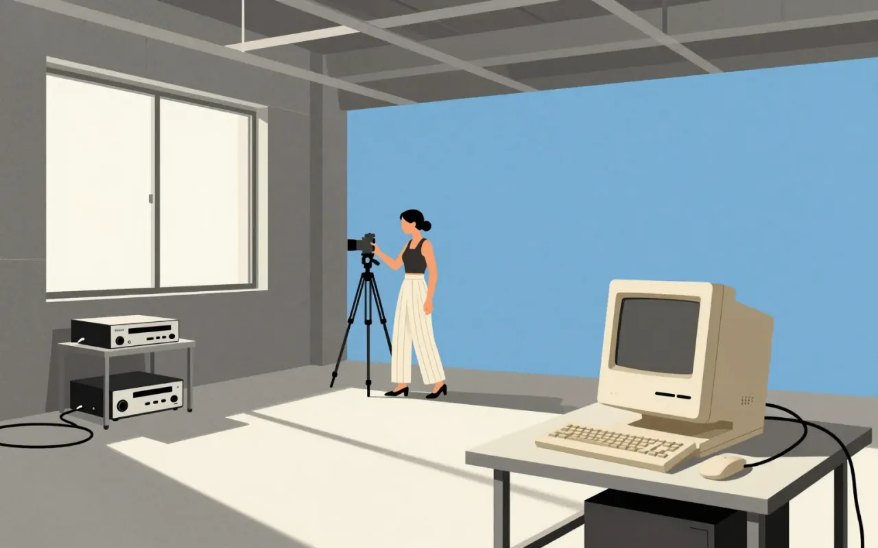
She used MacVision—a hardware/software interface—to digitise still frames from a video camera or VCR. She combined graphic elements using Apple Macintosh technology. She layered type with colour swatches, illustrations, photographs, and shapes to make words appear to float in space.
What works
The format emphatically counters objective, rational, and masculine tendencies of modernist design. Typelayering creates spatial ambiguity. The scale and unfolding mechanism force physical engagement. The use of MacVision anchors the work in a specific, early moment of digital mediation.
What does not
It does not resolve the tension between personal symbolism and public legibility. The life-sized nude image risks collapsing into spectacle without the surrounding context of its making, its institutional framing by Walker Art Center and MIT Press, or Greiman’s stated intent to counter modernist objectivity.
What it influenced
It influenced transmedia design practice—specifically the integration of digital toolchains into typographic and spatial experimentation—and helped import European New Wave aesthetics to the US.
Is it worth your time
Yes. It is a decisive, documented pivot point where digital tools entered editorial design as structural logic—not just output—and where the body became an organising principle for layout.