What the work is
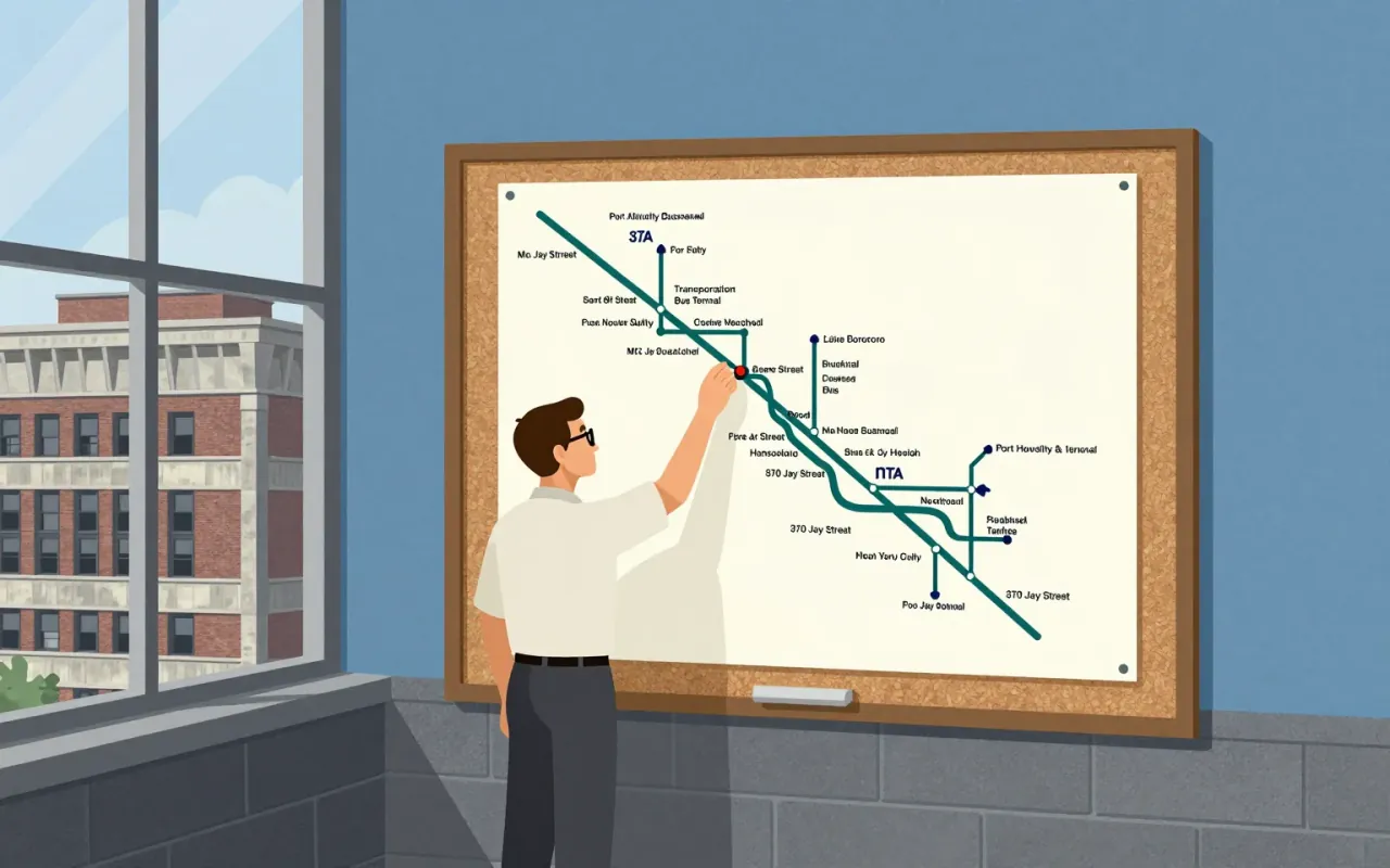
A diagrammatic map of London’s rapid transit network, designed in 1931 by Harry Beck. It is not a geographic map. It is a navigational tool that reduces the network to connections, sequence, and interchange points.
How it was made
Beck drew the map while unemployed, after being laid off by the Signalling Department of Underground Electric Railways of London. He treated the network as a topological structure, using only vertical, horizontal and 45° diagonal line segments. He marked ordinary stations with short ticks and interchange stations with diamonds. He used colour to distinguish routes and prioritised navigational clarity over geography.
What works
The strict geometry — vertical, horizontal and 45° lines — creates rhythm and legibility. Colour-coding routes prevents visual overload. Diamond markers for interchanges signal complexity without clutter. The map works because it answers one question: ‘How do I get from A to B and where do I change?’
What does not
The map does not show geographic distances or physical station locations. It does not represent surface geography beyond the River Thames. It makes no provision for future expansion, real-time changes, or accessibility information — none of which the sources mention as part of Beck’s 1931 design.
What it influenced
It established the permanent use of topological maps for the London Underground network. It set the precedent for diagrammatic transit mapping worldwide — though the sources do not name other cities or systems, they confirm the Underground has used topological maps ever since.
Is it worth your time
Yes. It redefined how complex transit systems are communicated — not by where they are, but how they connect. Its constraints (uncommissioned, spare-time, rejected twice) sharpen its logic. Its success was immediate and irreversible.