What the work is
Apple Union Square in San Francisco was unveiled in 2016 as a collaboration between Apple teams and Foster + Partners. The architect’s account identifies it as a model for future stores, connecting retail architecture with the company’s broader identity.
How it was made
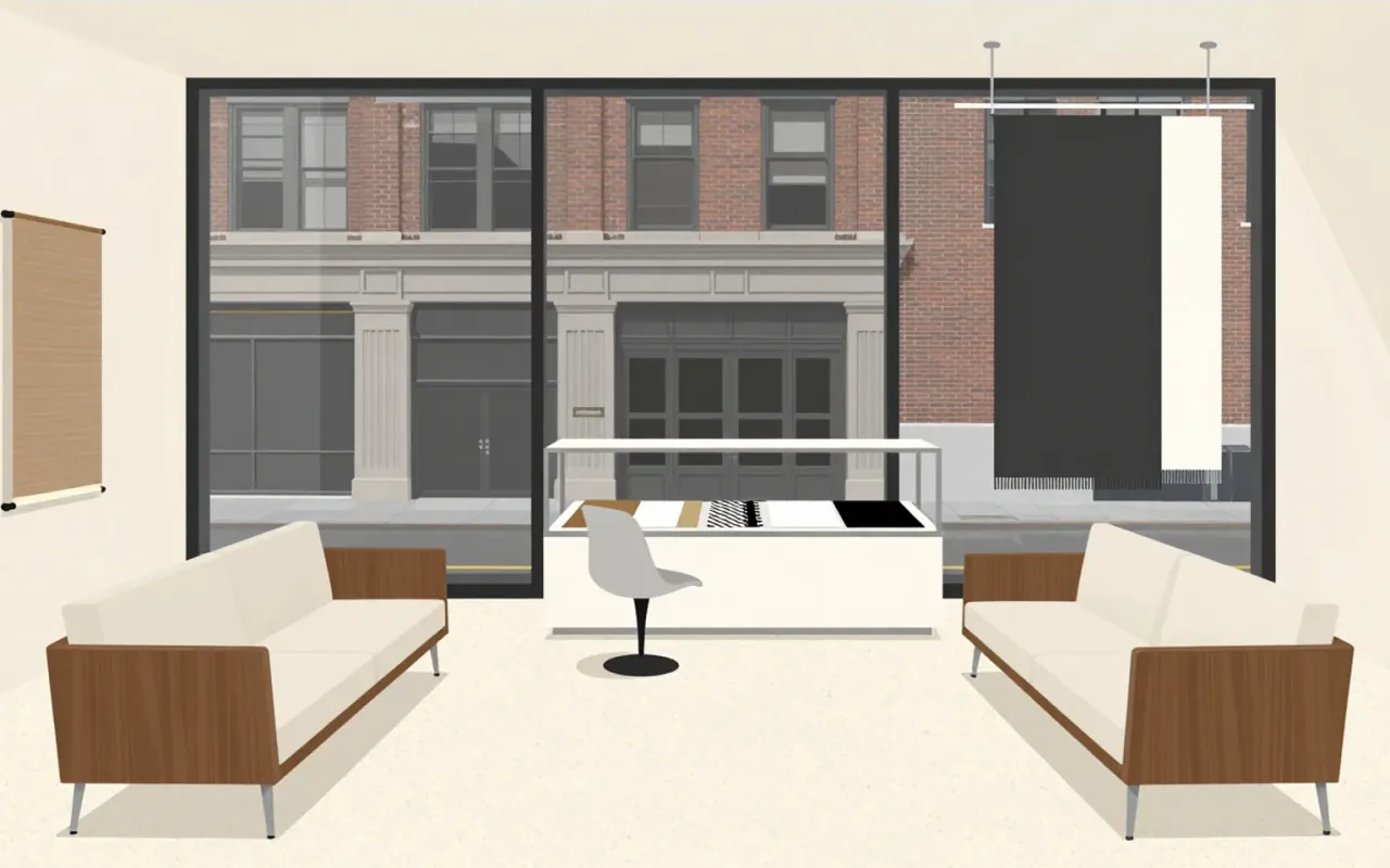
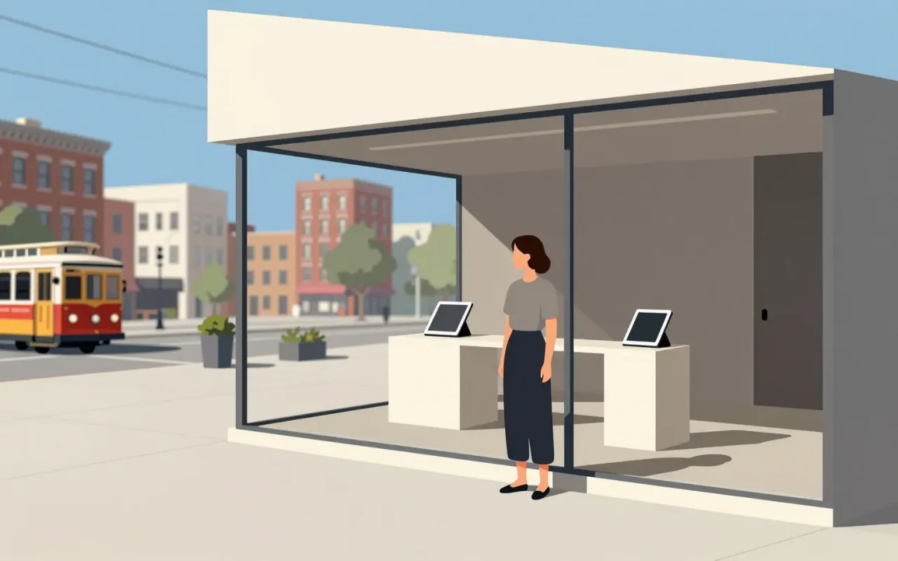
Large glazed openings address Union Square on one side and a new plaza on the other. The project uses the store’s edges, rather than only its internal displays, to organize the relationship between products, visitors and surrounding city space.
What works
The physical opening makes arrival legible. It can allow the interior to read as a continuation of an urban route, giving the experience of entering a store architectural weight.
What does not
A welcoming retail space is still operated by a private company. Descriptions of community and openness should be considered alongside the rules and commercial purpose governing the place.
What it influenced
Foster + Partners explicitly presented the project as a direction for subsequent Apple stores. Its significance lies in the store becoming a repeatable spatial expression of the brand, while responding to a particular prominent site.
Is it worth your time
Worth studying through the plan and the street edge. Trace how a person approaches, enters and passes through. The strongest question is how the architecture negotiates its simultaneous roles as shop, gathering place and brand statement.