What the work is
Caslon is a set of metal typefaces — roman and italic — cut in pica size and released by William Caslon in London by 1734. It is a functional, optically scaled system for body text, not a single font or digital revival.
How it was made
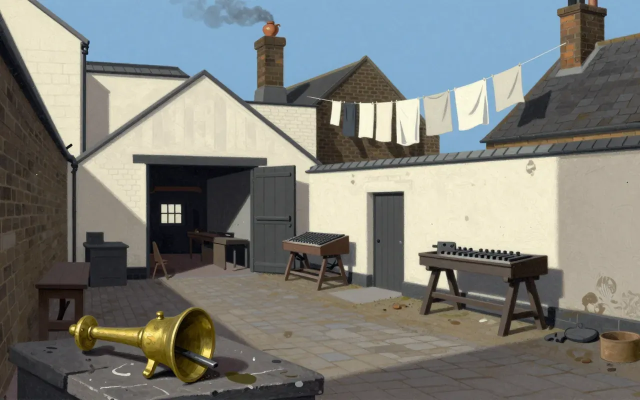
Caslon cut punches by hand in London to cast metal type matrices. He adapted Dutch Baroque models. His first Latin types were roman and italic in pica size (12pt), fully realised by 1734. He designed distinct optical sizes: larger sizes used higher stroke contrast and two-serifs on ‘C’; smaller sizes used a single half-arrow serif and reduced contrast.
What works
Caslon’s roman has a concave hollow in ‘A’, spurless ‘G’, straight ‘M’ sides, triple-terminal ‘W’, tapered ‘b’, ball-terminal ‘a’, short ascenders/descenders, and modest stroke contrast in body sizes. Its italic features an inward-folding ‘h’, sharply slanted ‘A’, swashed ‘Q’, ‘T’, ‘v’, ‘w’, ‘z’, crossbarred ‘J’, and a rotated pound sign. Long Primer No. 1 has generous proportions and open spacing, enabling readability in narrow columns and modest octavos.
What does not
The material does not establish any use of engraving tools beyond punchcutting, no involvement of assistants or workshop collaborators, no pricing, no production volume, no paper stock, no printing press specifications, and no typographic hierarchy beyond body text suitability.
What it influenced
Caslon’s typefaces transformed English type design and first established an English national typographic style. They ended British reliance on Dutch imports by 1733. They were used for the first printed U.S. Declaration of Independence.
Is it worth your time
Yes. It is the first English typeface system with documented optical sizing, formal coherence across roman and italic, and verified functional performance in narrow-column text — all established by 1734.