What the work is
A body of graphic design work spanning broadcast, corporate identity, cultural institution branding, retail packaging, and financial product design — all defined by intentional use of color, pattern, typography, and tactile material cues.
How it was made
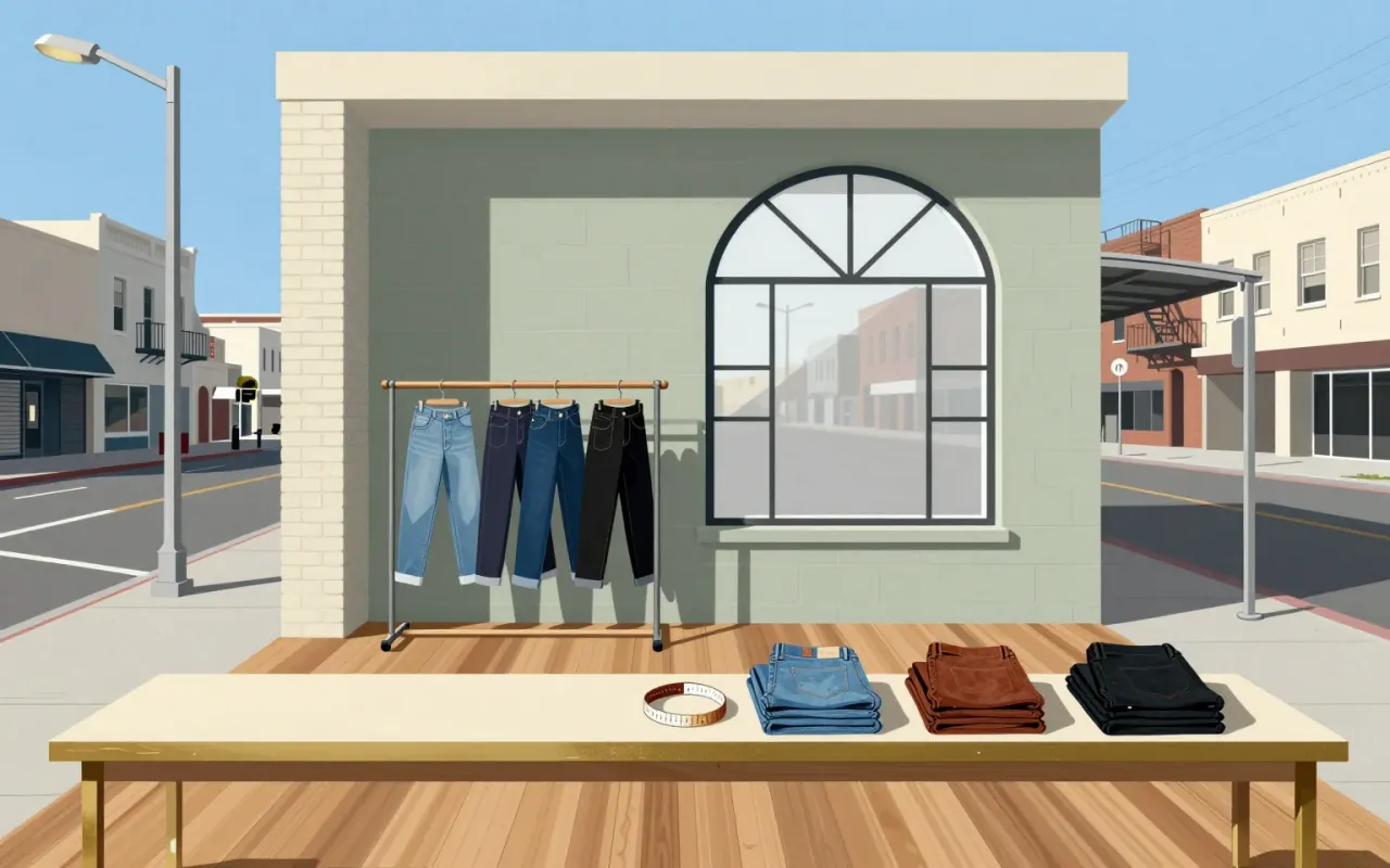
Morla worked across broadcast, corporate, cultural, academic, and retail contexts using typography, pattern, color, and material texture as primary tools. She designed on-air graphics and animated openings for KQED; store environments, logos, packaging, and labels for Levi Strauss & Co.; identities, books, and posters for conceptual art venues; and holographic credit cards, sustainability campaigns, and foil-textured chocolate packaging for later clients.
What works
Vibrant color and pattern consistently serve cultural reference (e.g., Mexican Museum poster) or brand reinvention (e.g., Nordstrom cards). Repetition of typeface and foil texture across K&M Confections packaging creates cohesion without homogeneity. Sustainability messaging for Design Within Reach was integrated into campaign development, not tacked on.
What does not
The material does not establish any singular object as definitive, nor does it show sustained formal innovation across decades. There is no evidence of system-wide typographic invention, structural engineering, or interface logic — the work stays within applied graphic design constraints.
What it influenced
The material does not state influence on other designers, movements, or disciplines. It documents client relationships and output types, but no lineage, pedagogy, or documented adoption by peers or successors.
Is it worth your time
Yes — if you need to understand how graphic design operates across institutional scale without defaulting to digital-first or minimalism. Morla’s work shows deliberate, repeatable decisions in service of audience, brand, and culture — not just aesthetic preference.