What the work is
A comprehensive visual identity system for the 1972 Munich Olympics, comprising pictograms, logo, colour-coding, and typography.
How it was made
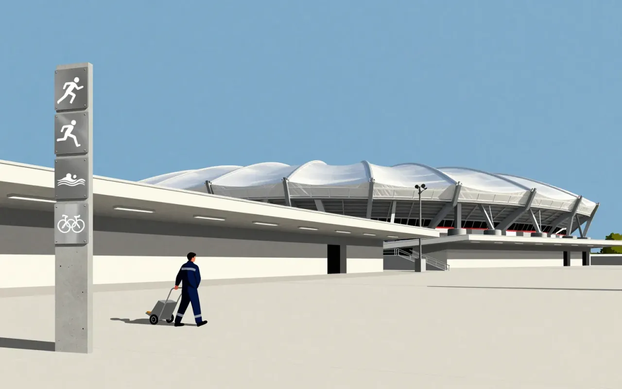
Aicher used grid systems and a bright colour palette selected to reflect the tones of the Alps. He applied the Univers typeface and helped design the Olympic logo. His pictograms were created for wayfinding by athletes and visitors across the Munich Olympic sites.
The organizers asked Aicher in 1966 to be lead designer, and the brief was to create a design that complemented the newly built stadium by Günther Behnisch. He consulted Masaru Katsumie, who had designed the 1964 Tokyo Games, and based his pictograms in part on the iconography of those Games. The colours also worked as a code: blue and white were joined by green, orange and silver, and colours marked themes such as media, technical services, celebrity hospitality or public functions, so visitors could tell the areas around the stadium and village apart. Uniforms followed the same coding, which let staff be identified by department from the colour they wore.
The emblem took several stages with his design team. Early ideas drew on the Münchner Kindl from the city’s coat of arms, or on the sun, mountains and landscape around Munich. The result was the “Strahlenkranz”, a garland that stood for the sun and also merged the five Olympic rings into a spiral. Designer Coordt von Mannstein reworked Aicher’s original through a mathematical calculation to join garland and spiral into the final design.
The team also produced 21 sports posters in the official colours, carrying the logo and “München 1972”. They used a manual technique called “posterization”, separating the tonal qualities from the images. The first poster, of the Olympic stadium, became the official poster, and the series hung in pairs alongside posters by artists such as David Hockney, R. B. Kitaj, Tom Wesselmann and Allen Jones. Aicher also created the first official Olympic mascot, a striped dachshund named Waldi.
What works
Each pictogram functions as a clear sign of its activity. The system uses consistent grids and a coherent colour palette tied to functional themes and alpine tones. Univers provides typographic clarity.
What does not
The material does not establish that the pictograms achieved universal comprehension in practice, nor that they functioned flawlessly across all contexts or user groups.
What it influenced
The work established pictograms as essential infrastructure for international mega-events and public wayfinding systems.
One direct line of descent is the DOT pictograms, developed in 1974 by the United States Department of Transportation, which applied the same principles to standard public signage such as toilets and telephones and have since been used around the world. Aicher’s wider career ran through corporate design: he is counted among its pioneers and was influential in the corporate identities of Braun and Lufthansa. He also designed logos for the University of Konstanz and the Munich Airport, and in 1988 created the Rotis typeface, named for the place near Leutkirch im Allgäu where he lived and kept his studio. Bulthaup, the kitchen manufacturer he consulted for from 1980, still uses it.
Is it worth your time
Yes. It is a foundational case study in how systematic visual language solves real-world navigation problems at scale.