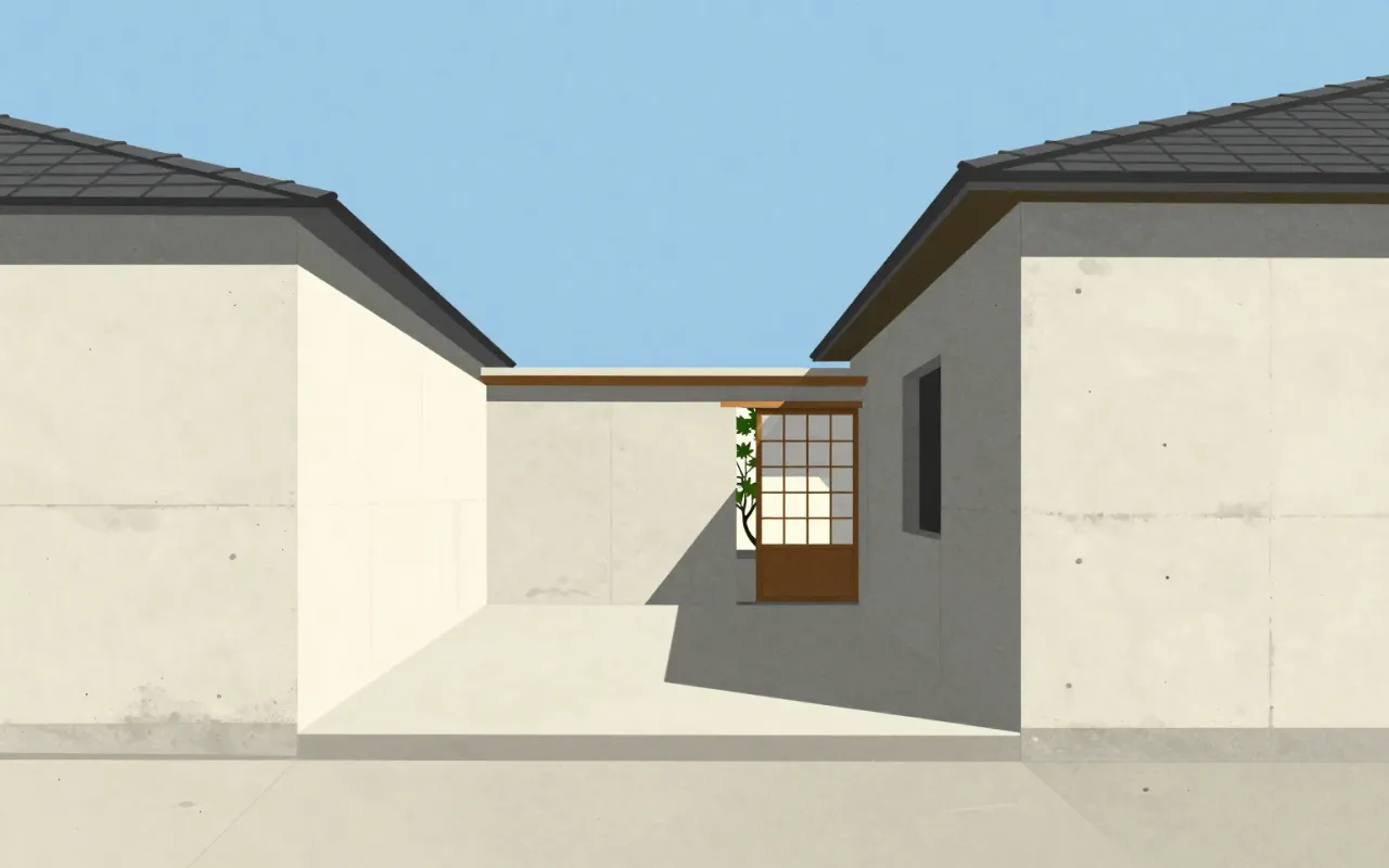
Tadao Ando
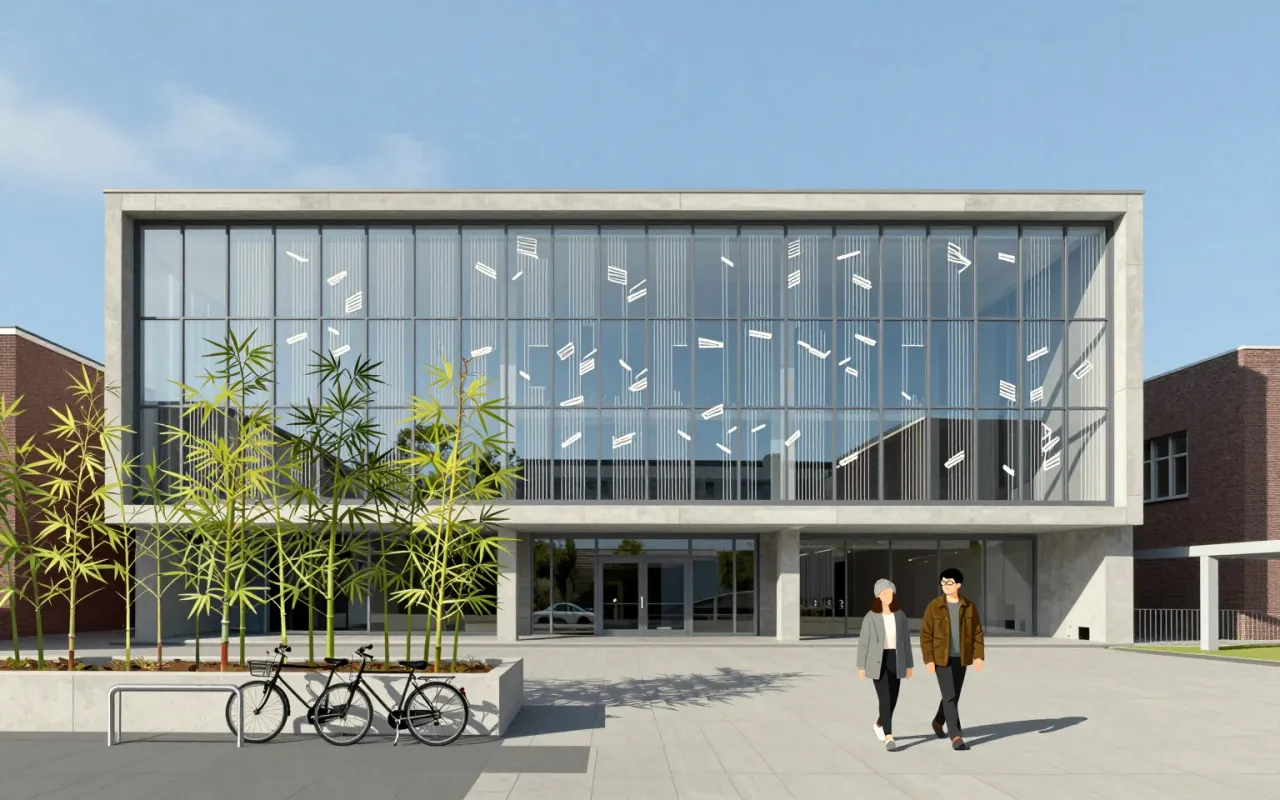
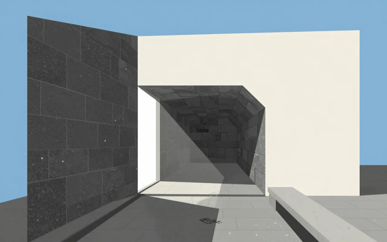
Ando’s architecture is not minimalism—it’s structural and sensory discipline under seismic constraint.
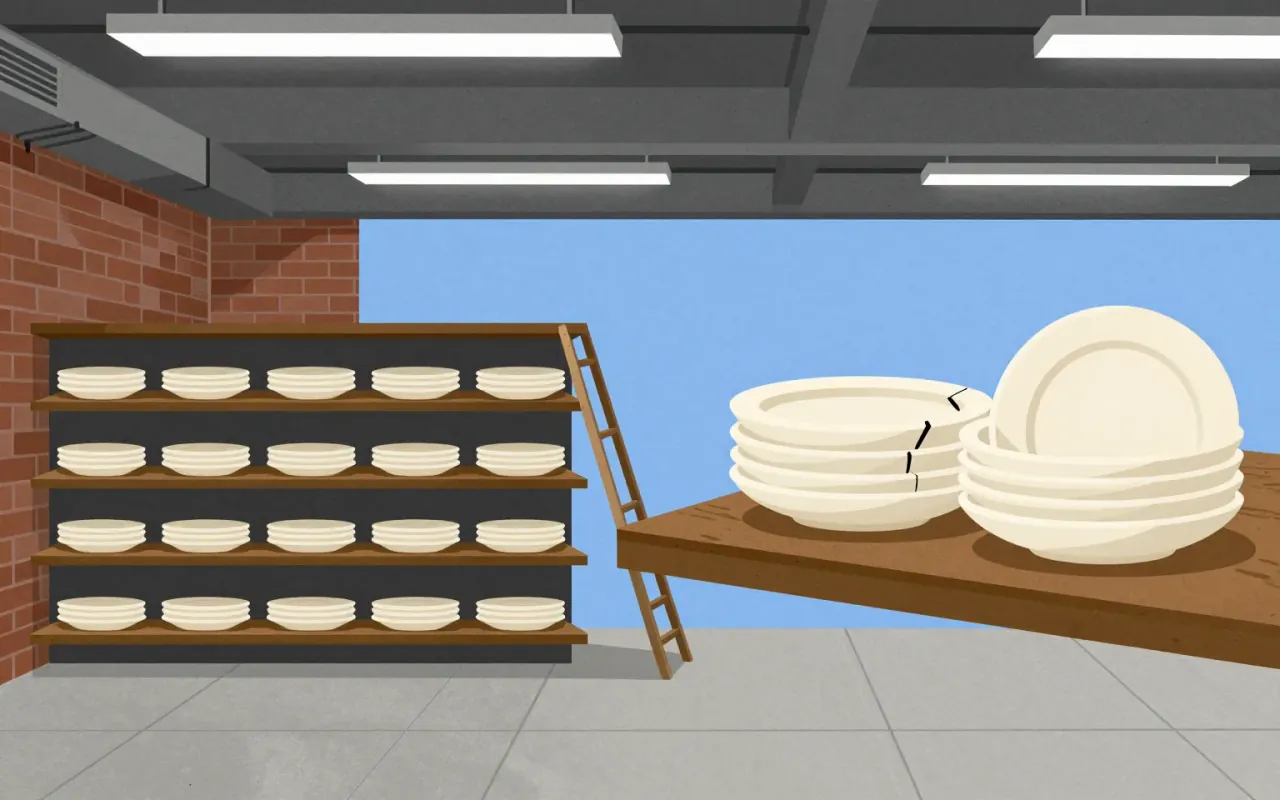
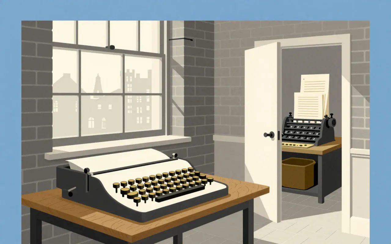
Times New Roman is a functional, collaborative, constraint-led typographic revision — not an origin story. Its power lies in what it omitted: flourish, novelty, and authorial ego. It succeeded by being invisible on the page and unavoidable in use.
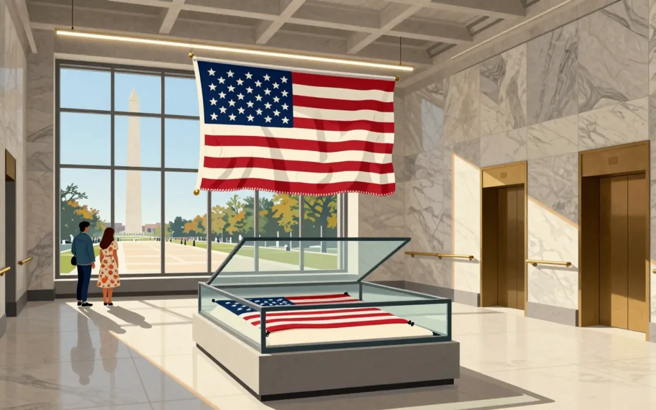
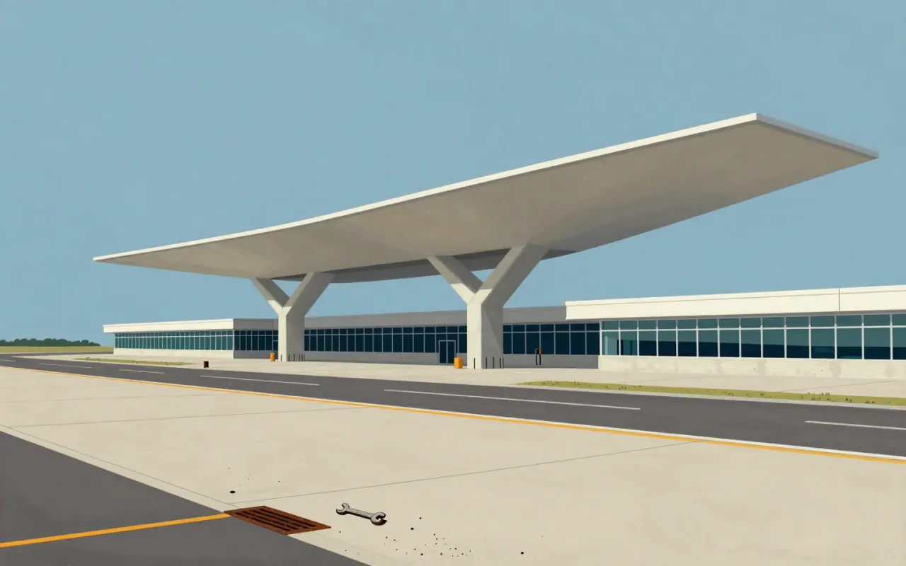
A terminal built for Trans World Airlines at JFK Airport in 1962. Designed by Eero Saarinen and Associates with Charles J. Parise. Its wing-shaped thin-shell concrete roof uses catenary curves and rests on four Y-shaped piers. Developed through physical modelling—not sketching—after empirical study of passenger movement. Adapted into the TWA Hotel in 2019, retaining Saarinen’s furniture.
Univers is a foundational typographic system — not a single face but a rigorously unified family. Its design decisions were driven by technical constraints (phototype + metal), conceptual ambition (a complete, logical family), and aesthetic rejection (of Futura’s geometry). It succeeded where others had only gestured: by delivering consistency, scalability, and clarity — all before a single character was cast or exposed.
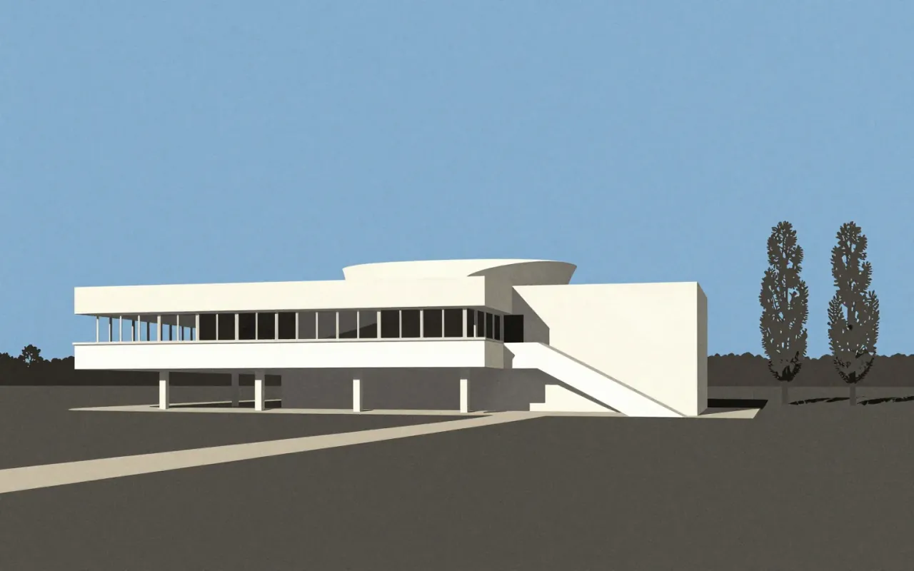
The Villa Savoye is the definitive built statement of Le Corbusier’s Five Points — executed with rare freedom, then adjusted under cost pressure. Its influence is verified; its compromises are documented. It is not timeless. It is specific, material, contested, and consequential.
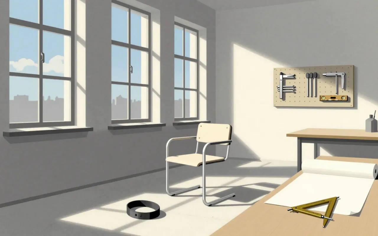
The Wassily chair is the first successful application of bent tubular steel as primary structure in furniture. Its material logic — steel for skeleton, Eisengarn for tensioned skin — replaced joinery with engineering. It was made possible by Mannesmann tubing, Reichardt’s textile work, and Thonet’s manufacturing capacity — not by theory alone. It is not about expression. It is about what happens when you treat furniture as a system of forces.


The Egg chair is a tightly constrained response to the SAS Royal Hotel commission: a sculptural, isolating seat made possible by new materials. Its couch variant reveals the cost of scaling that logic — a visible seam, limited production, and unresolved tension between form and upholstery. It belongs to design/furniture and design/interiors. Topics include furniture, industrial-design, and interiors.
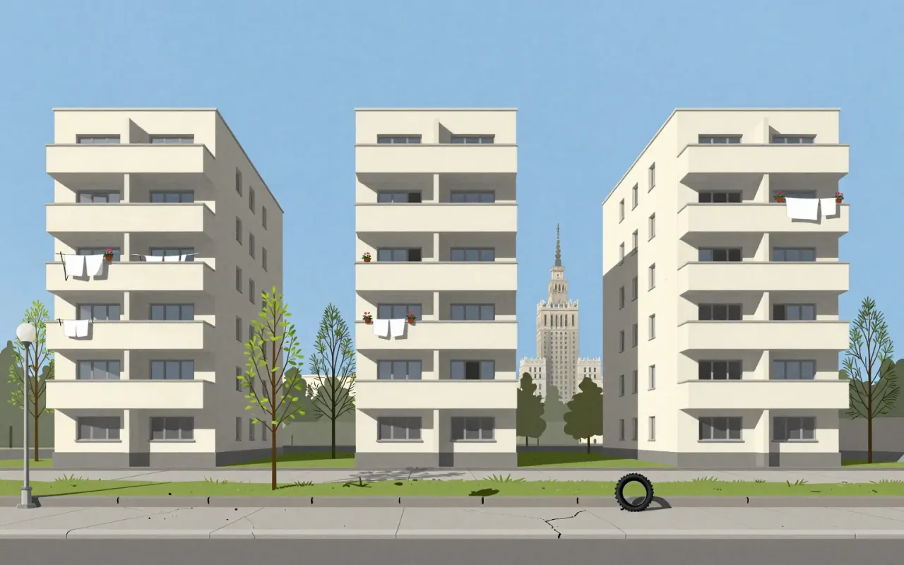
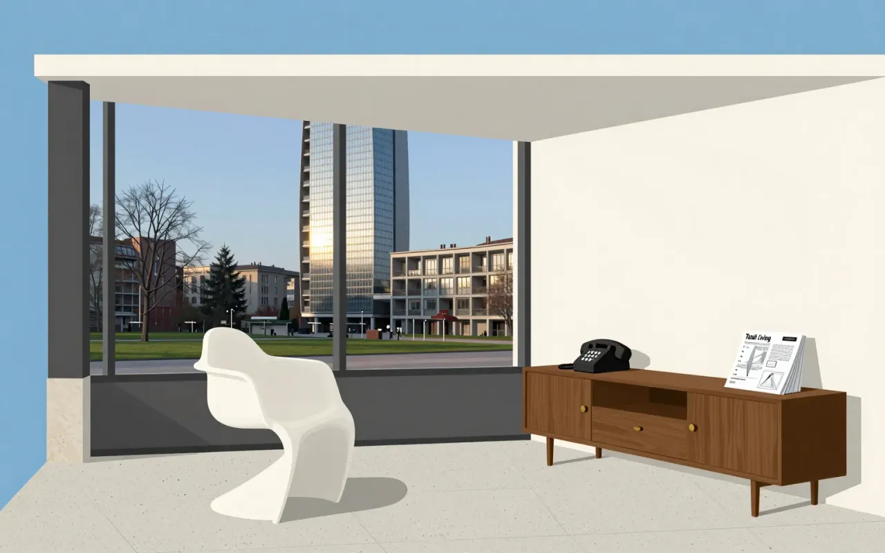
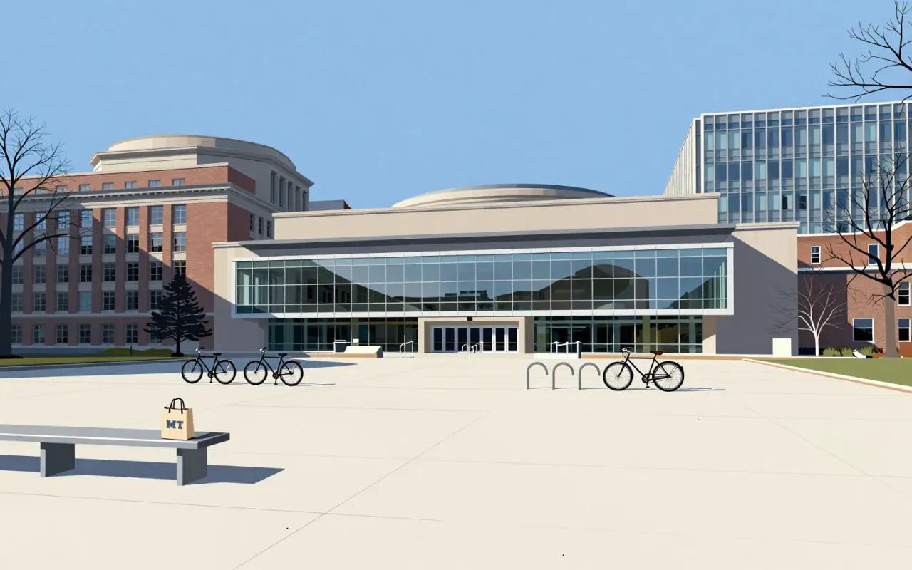
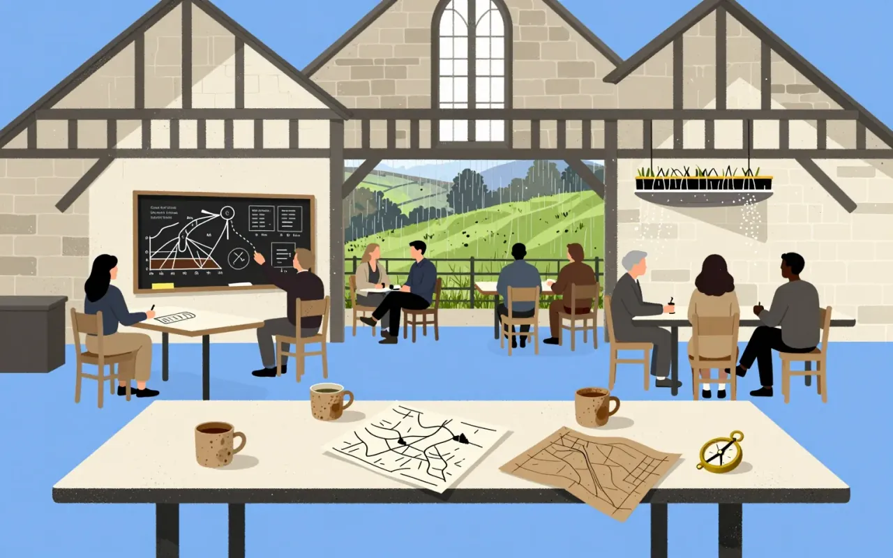
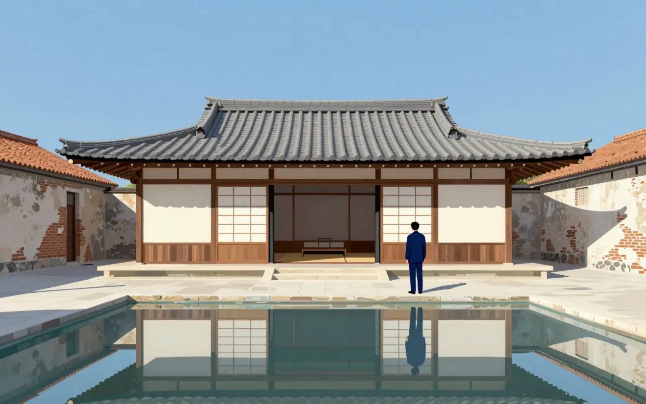
Lato is a humanist sans-serif typeface designed by Łukasz Dziedzic and released in 2010. It was commissioned by a Polish bank, then cancelled and published under the Open Font License. As of August 2018, it appeared on over 9.6 million websites and ranked third on Google Fonts by usage. It has been applied in physical media including election billboards and information signs, and adopted by Save the Children for its logotype since 2022.
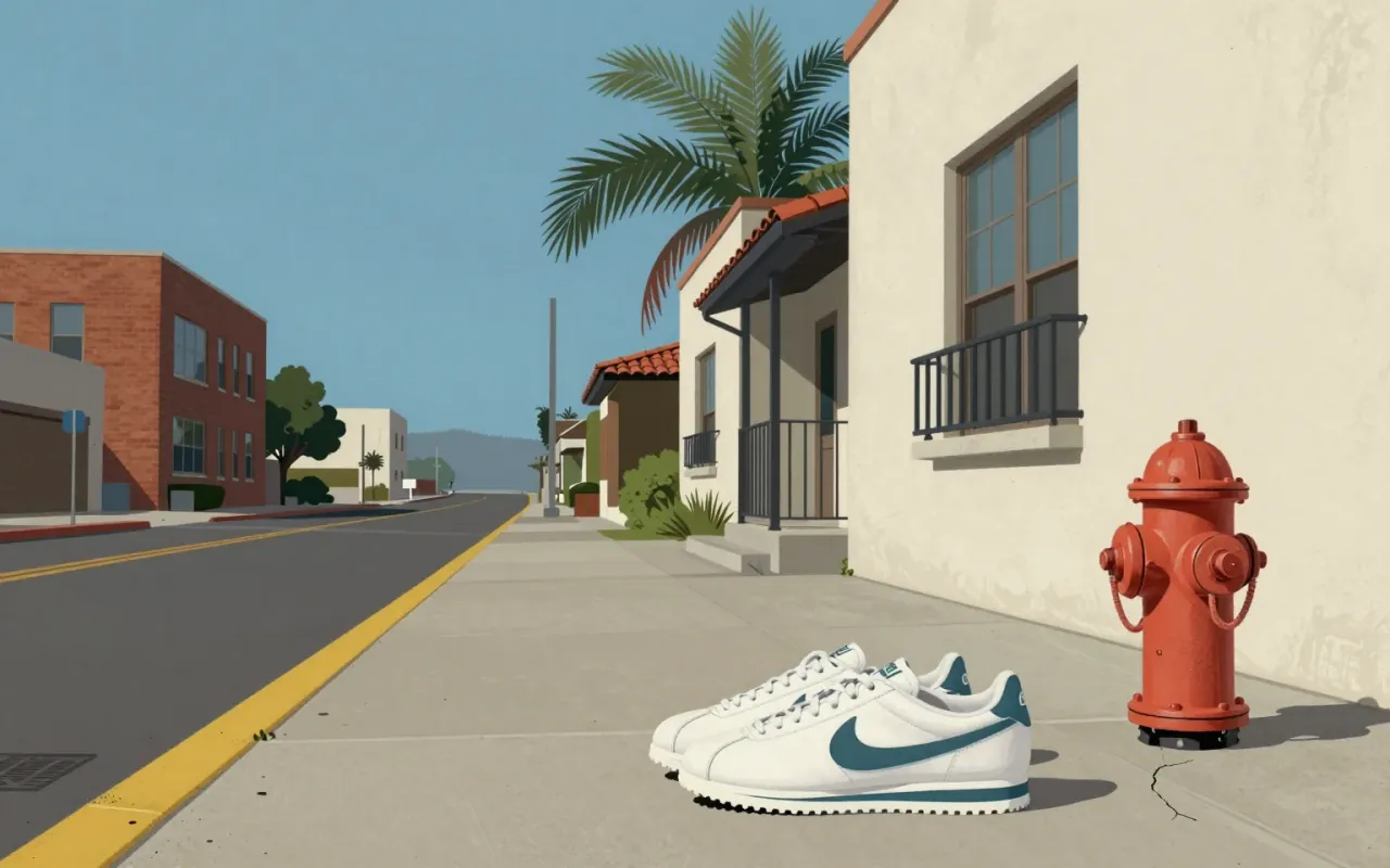
The Swoosh is a 1971 graphic design solution to a specific client request: motion, differentiation from Adidas, speed of execution. It succeeded not as an expression of personality or craft, but as a functional answer to a narrow constraint — and its longevity reveals more about brand consolidation than design innovation.
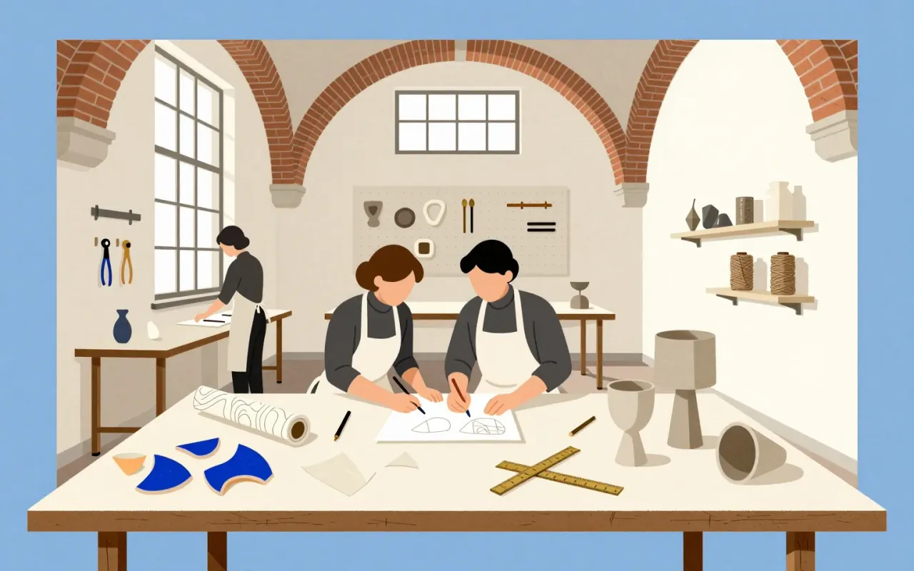
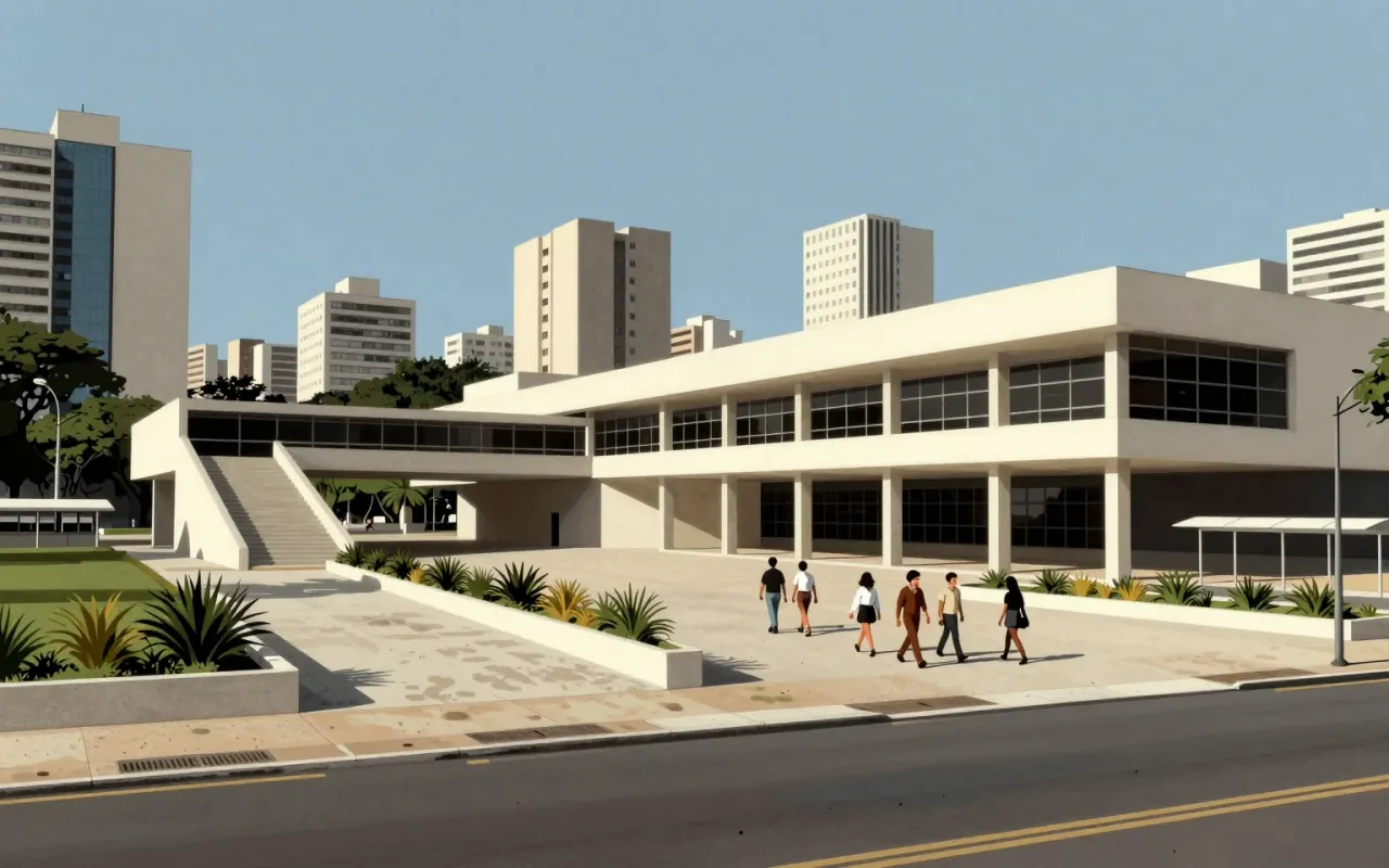
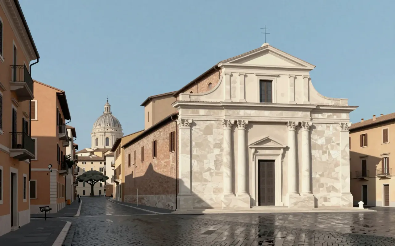
Tahoma is a humanist sans-serif typeface designed by Matthew Carter for Microsoft as the Windows interface typeface. It shipped with Office 97 and served as the default screen font in multiple Windows versions. Carter first designed it as a bitmap font, then wrapped TrueType outlines around those bitmaps. Its bold weight is based on double-pixel width. Ascender Corporation added italic and small caps versions in 2010. Tahoma has a narrower body, smaller counters, tighter letter spacing, and a more complete Unicode set than Verdana. The uppercase I is distinguishable from lowercase l — critical for technical clarity. Carter acknowledged similarities between Tahoma and his earlier Bell Centennial typeface. It was created to address specific technical challenges posed by early computers.
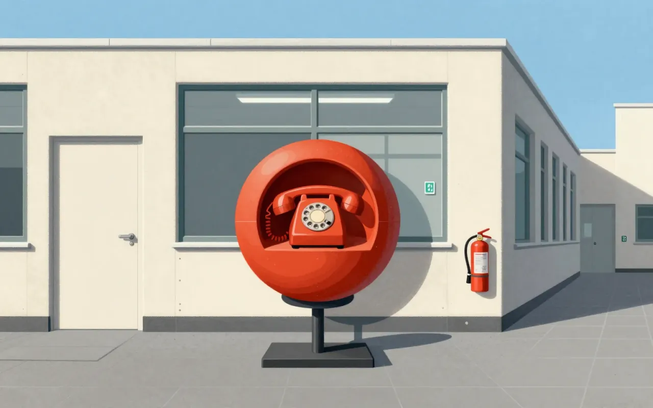
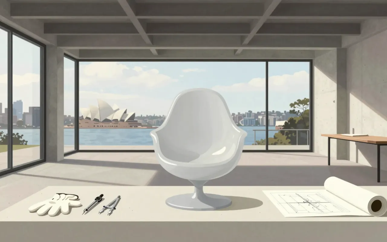
The Ball Chair is a 1963 domestic solution turned international icon — defined by constraint, not concept. Its value lies in how clearly its making answers a specific question: how to build a large, novel chair that fits through a door. Nothing more.

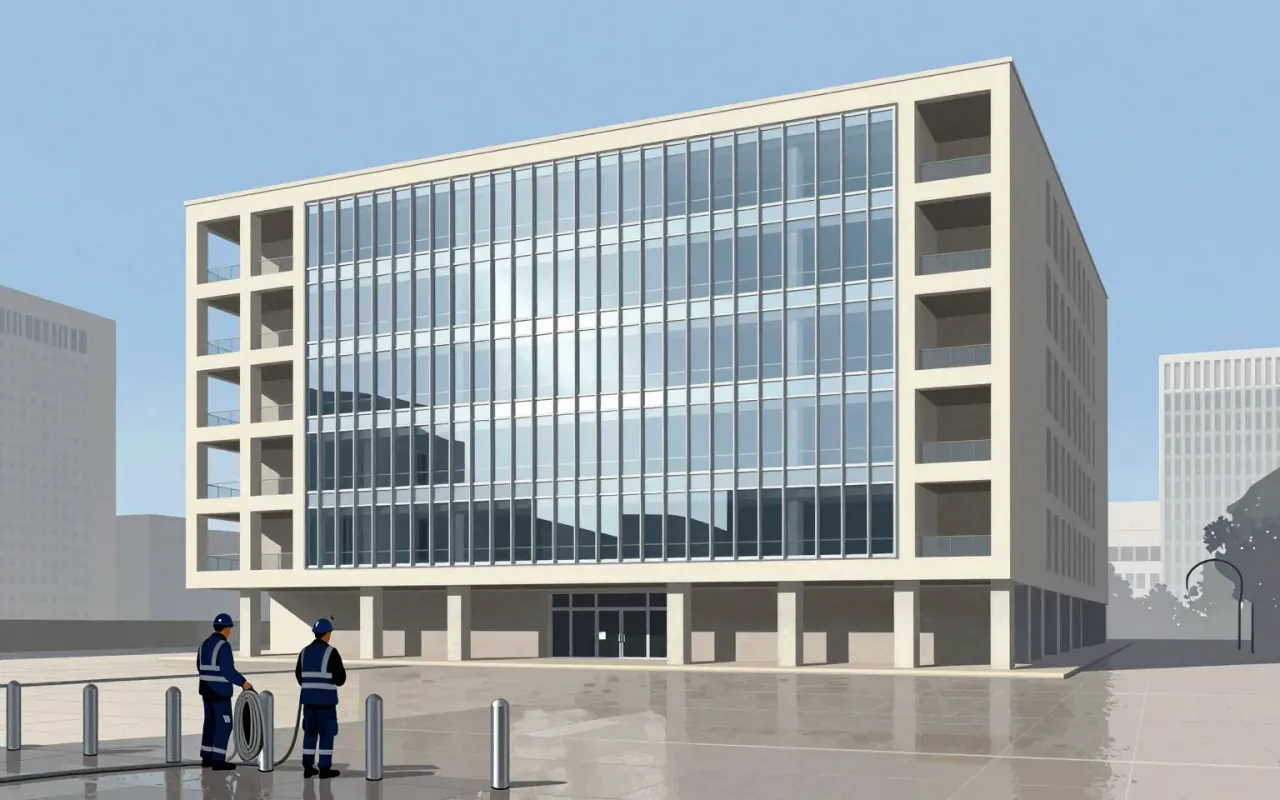

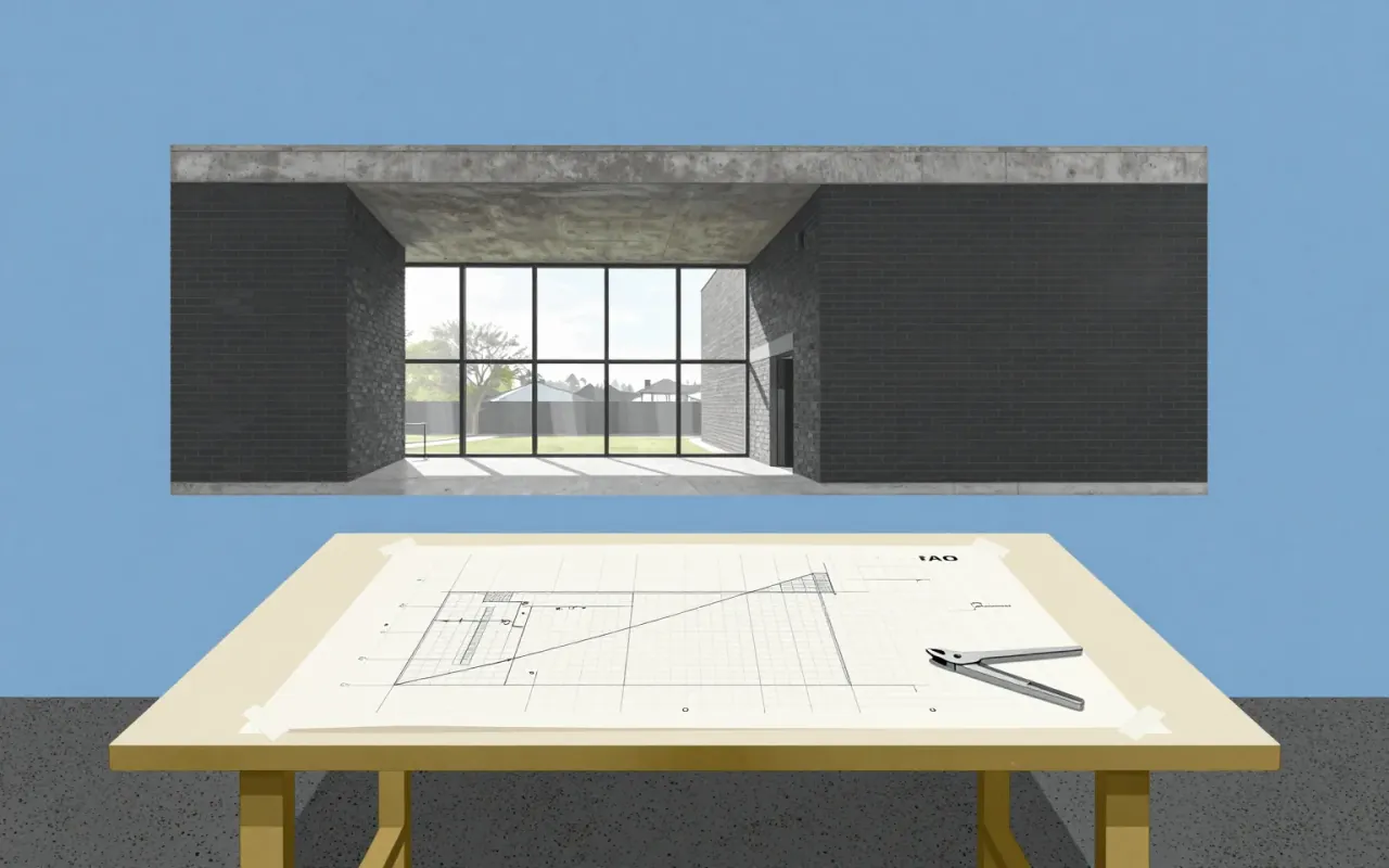

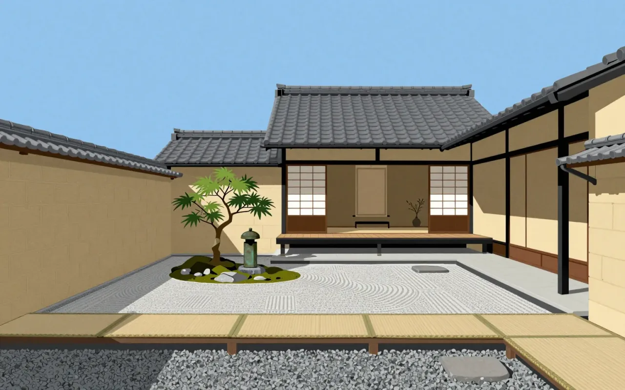
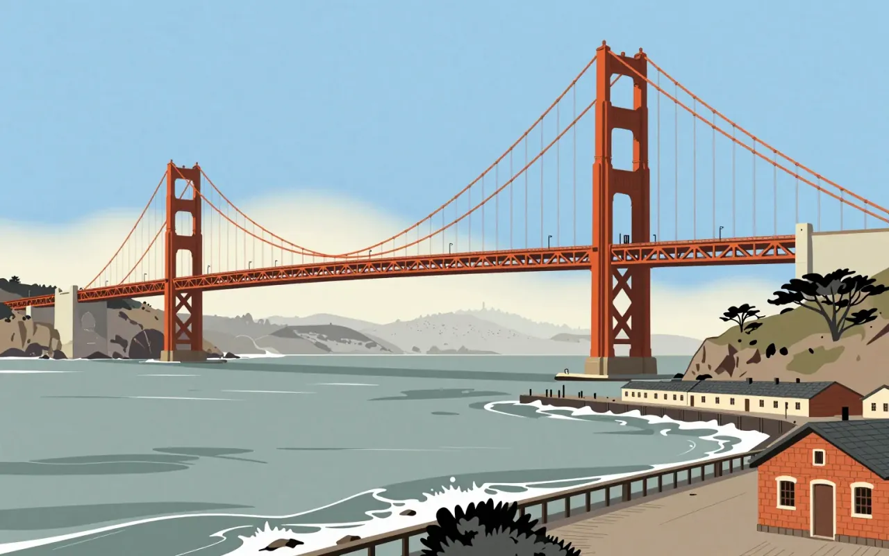
The Golden Gate Bridge is a suspension bridge completed in 1937. Joseph Strauss served as chief engineer, but the suspension design came from Leon Moisseiff. Charles Ellis resolved site-specific structural conflicts. Strauss introduced movable safety netting. No verified claim attributes aesthetic, metallurgical, or wind-theory innovation to Strauss.
IBM Plex is a corporate typeface designed to replace Helvetica across IBM’s global communications. Its rationale is financial and ideological: open-source licensing eliminates licence fees; typographic decisions reject expressive or historical categories in favour of functional clarity. It delivers a coherent, documented system — but only within the narrow frame of IBM’s internal brand requirements.
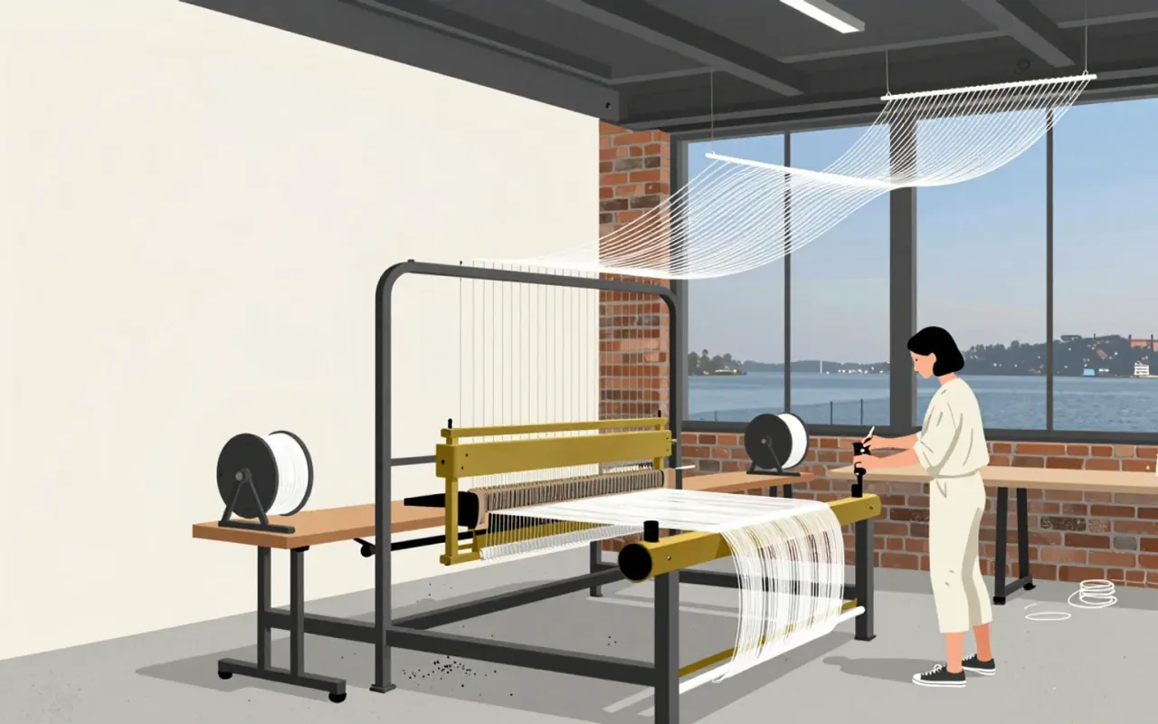
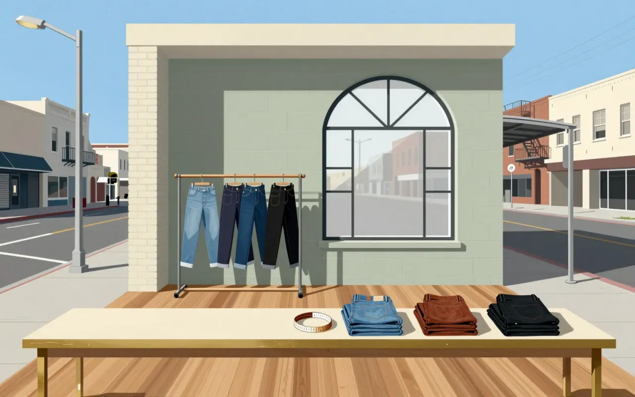
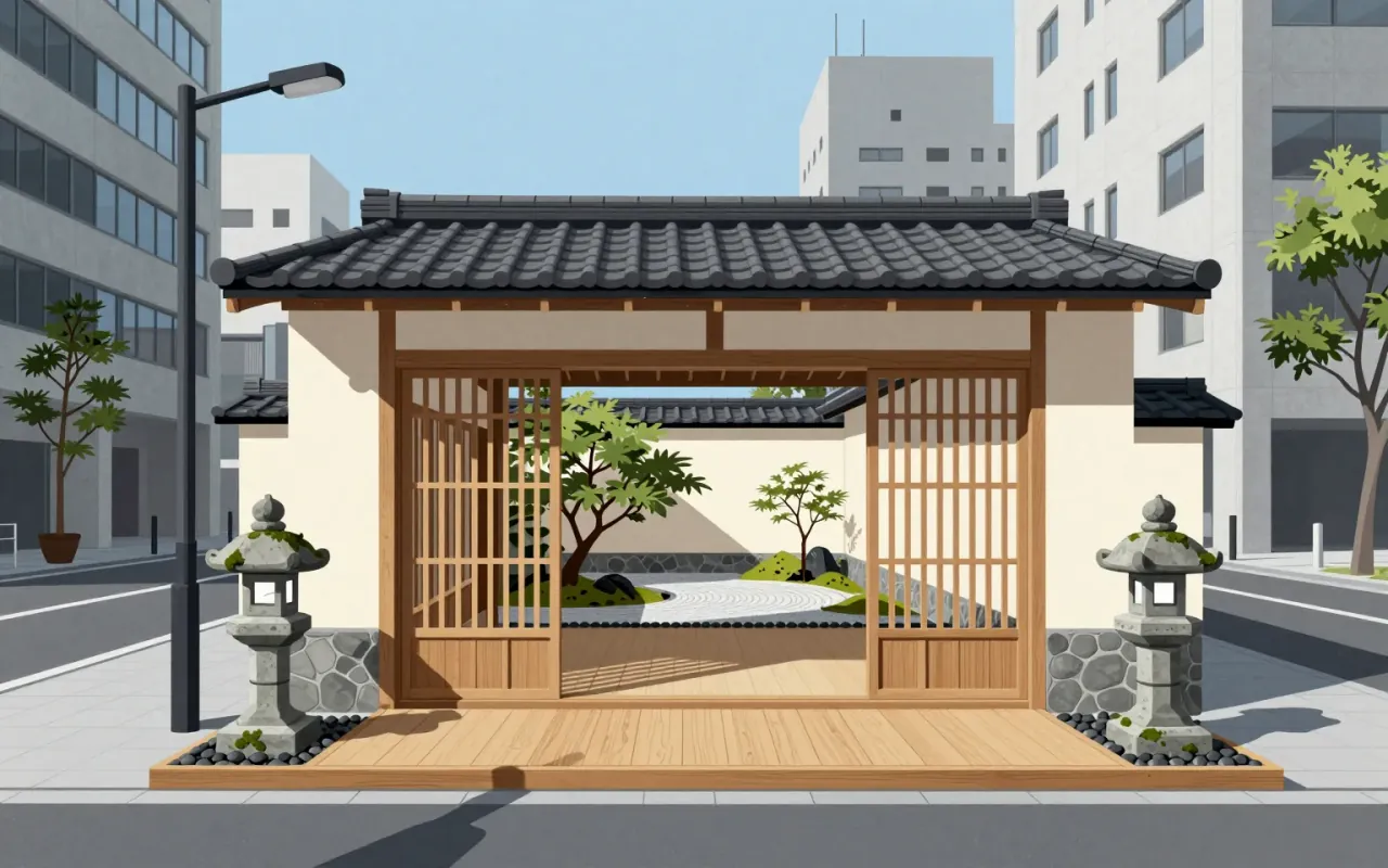
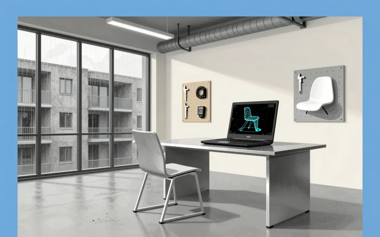
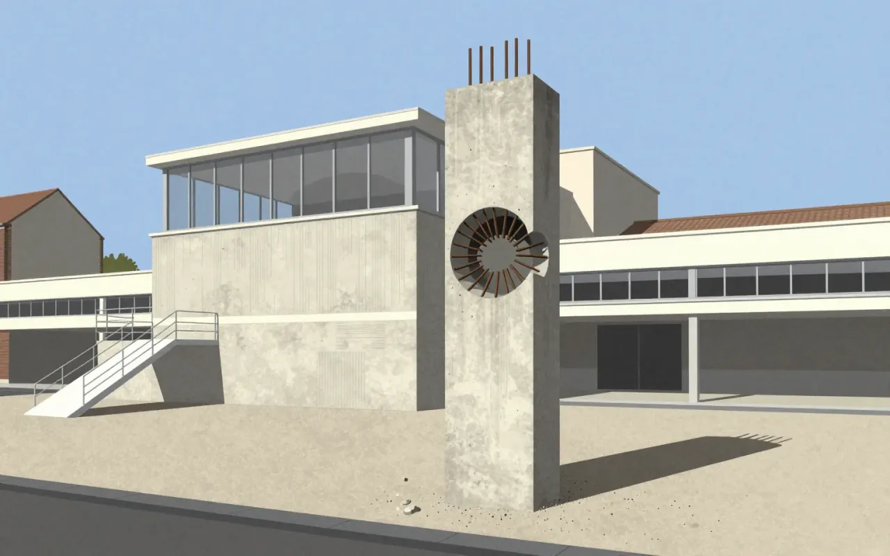
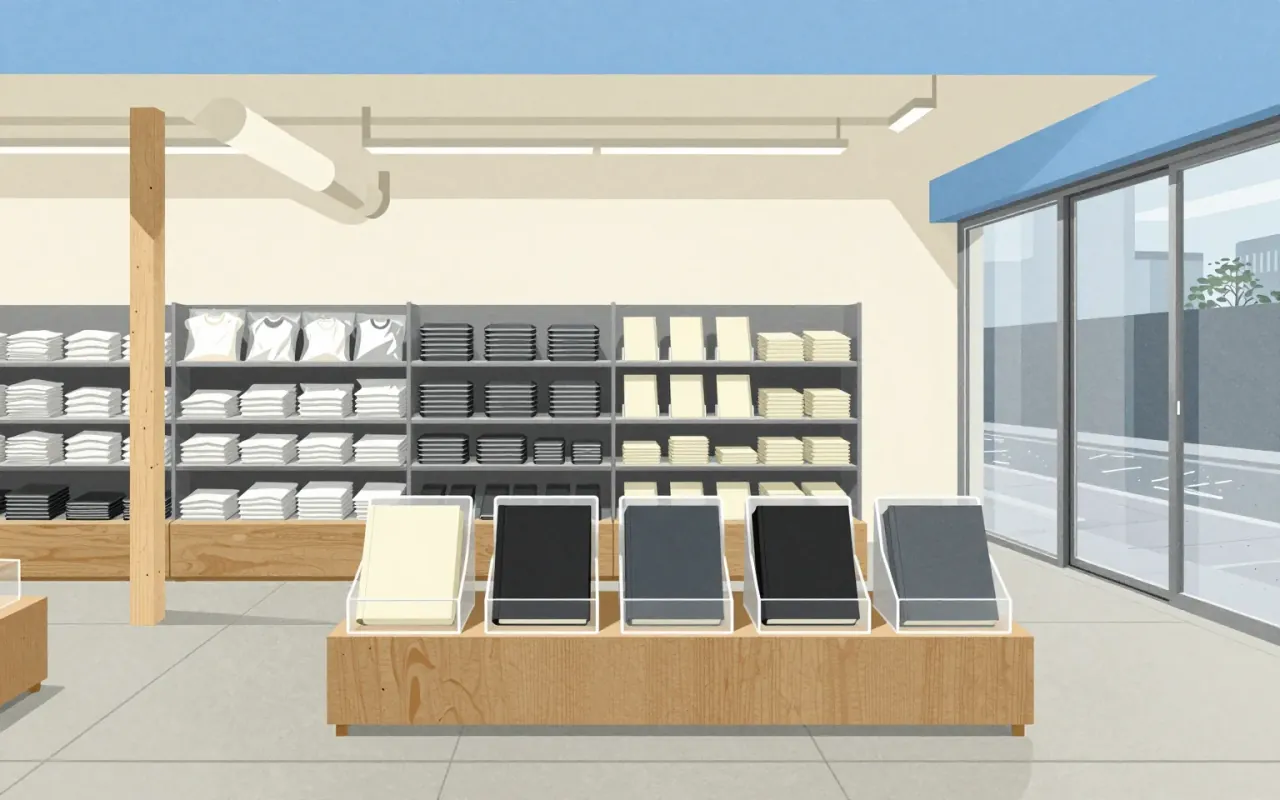
The work is Kenya Hara’s 2001 appointment as Muji’s art director — a strategic, graphic-led recalibration of a brand adrift from its 'No design' principle. He treated every object as designed, not neutral; replaced myth with method; and tightened coherence across 5,000 products and 250 stores. His posters — 'Horizon' (2003) and 'Natsure, Naturally, MUJI.' (2018) — are artefacts of that stance. Nothing in the sources supports claims about product design, architecture, or influence beyond Muji itself.
Open Sans is a functional, open-source humanist sans-serif designed by Steve Matteson for Google in 2011. It prioritises screen legibility through wide apertures and large x-height, supports Latin, Greek, Cyrillic (897 glyphs), gained Hebrew and variable font support in 2021, and manifests publicly via a Google Easter egg. It does not extend beyond those scripts. Its influence lies in normalising open-source, cross-platform typography — not aesthetic innovation.

Rockefeller Center is not a building but a coordination protocol disguised as architecture.