Jasper Morrison
Ordinariness is not neutral—it’s a design decision with teeth.

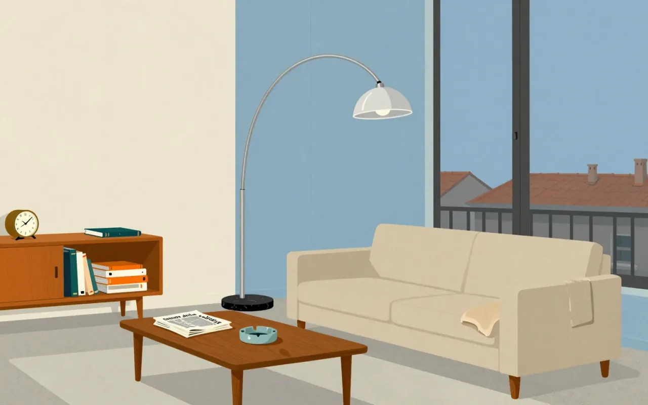
Achille and Pier Giacomo Castiglioni designed the Arco floor lamp for Flos in 1962. It connects a suspended spun-aluminium pendant to a Carrara marble base through an arching stainless-steel arm.
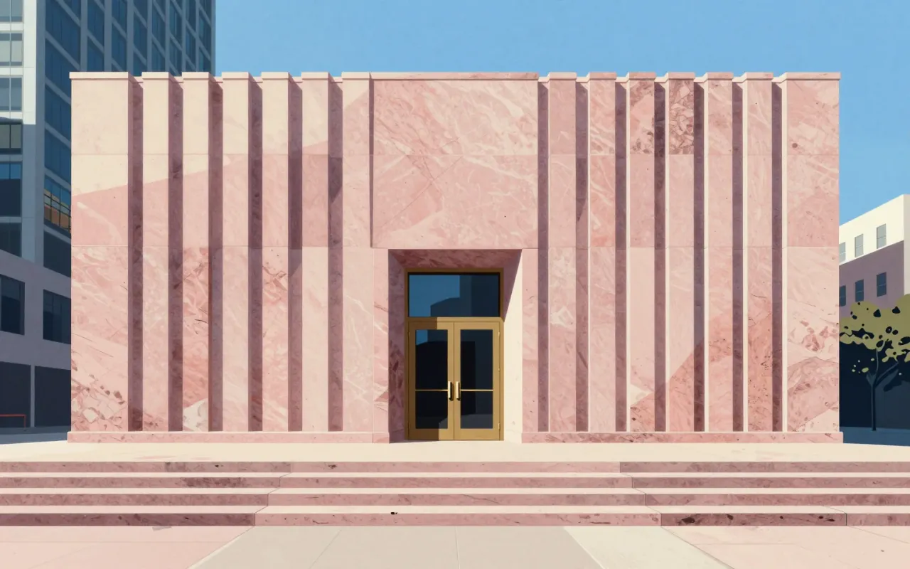
550 Madison Avenue is a postmodern skyscraper completed in 1982 by Philip Johnson and John Burgee. It uses pink Stony Creek granite cladding and features an eight-story arched entry and split pediment. It challenged modernist functionalism, complied with NYC zoning via an atrium, and reduced energy use versus glass towers. Though not the first postmodern building, its scale and location made it the movement’s most famous example. It was designated a NYC landmark in 2018.
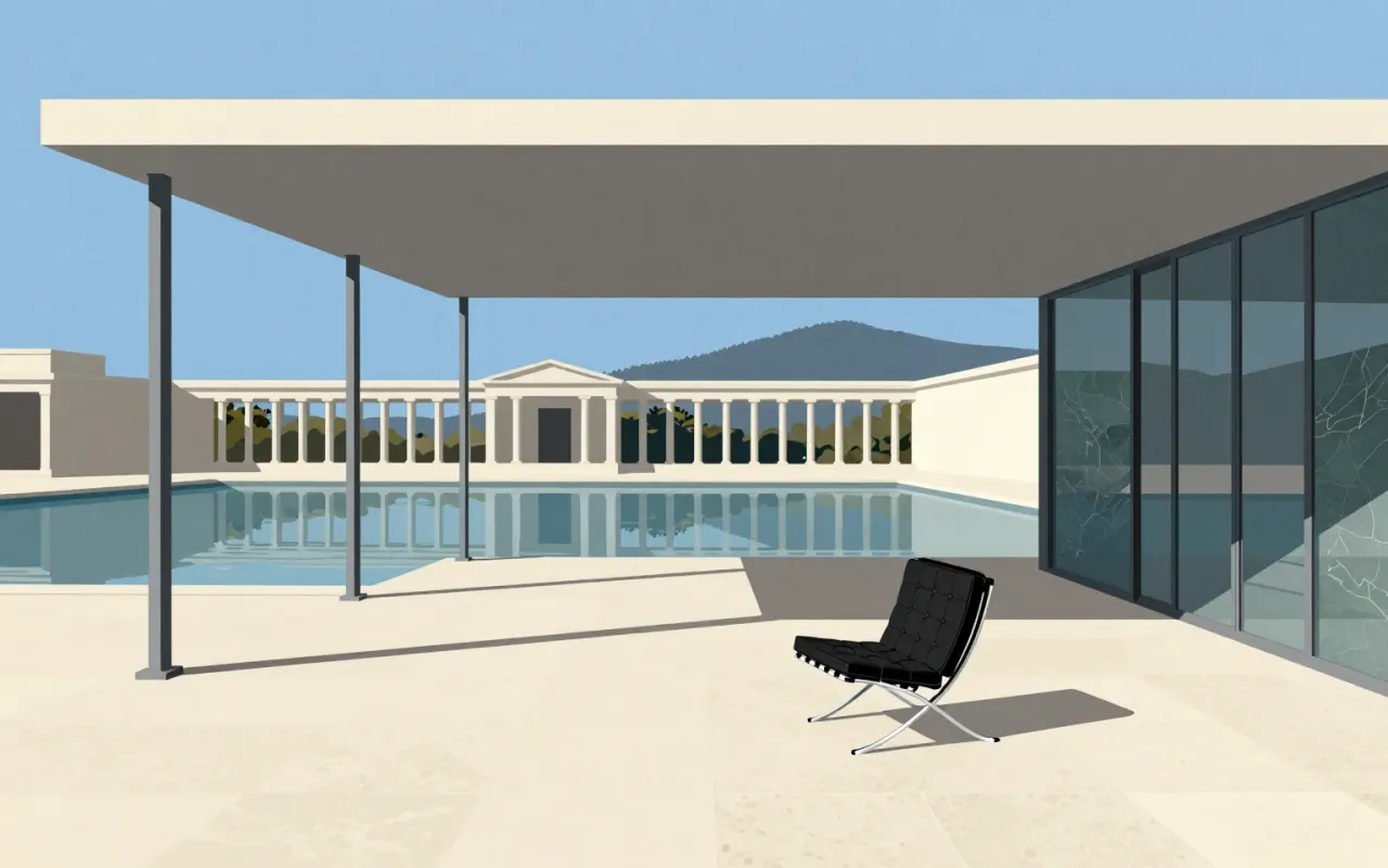
Associated with Ludwig Mies van der Rohe and Lilly Reich's work for the German Pavilion in Barcelona in 1929, the Barcelona chair combines a metal frame with leather upholstery. Its construction changed after the original design.
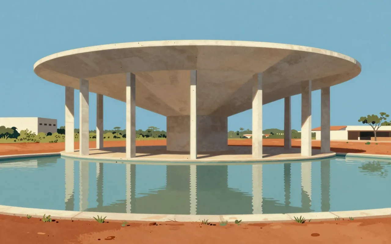
The Cathedral of Brasília is a hyperboloid concrete-framed structure designed by Oscar Niemeyer and engineered by Joaquim Cardozo, featuring subterranean massing, symbolic column geometry, passive thermal design via a reflecting pool, a fiberglass outer roof, and a large suspended stained-glass composition. It specifies construction methods, dimensional and material properties, spatial sequencing (tunnel entry), and symbolic intent tied directly to structural form.



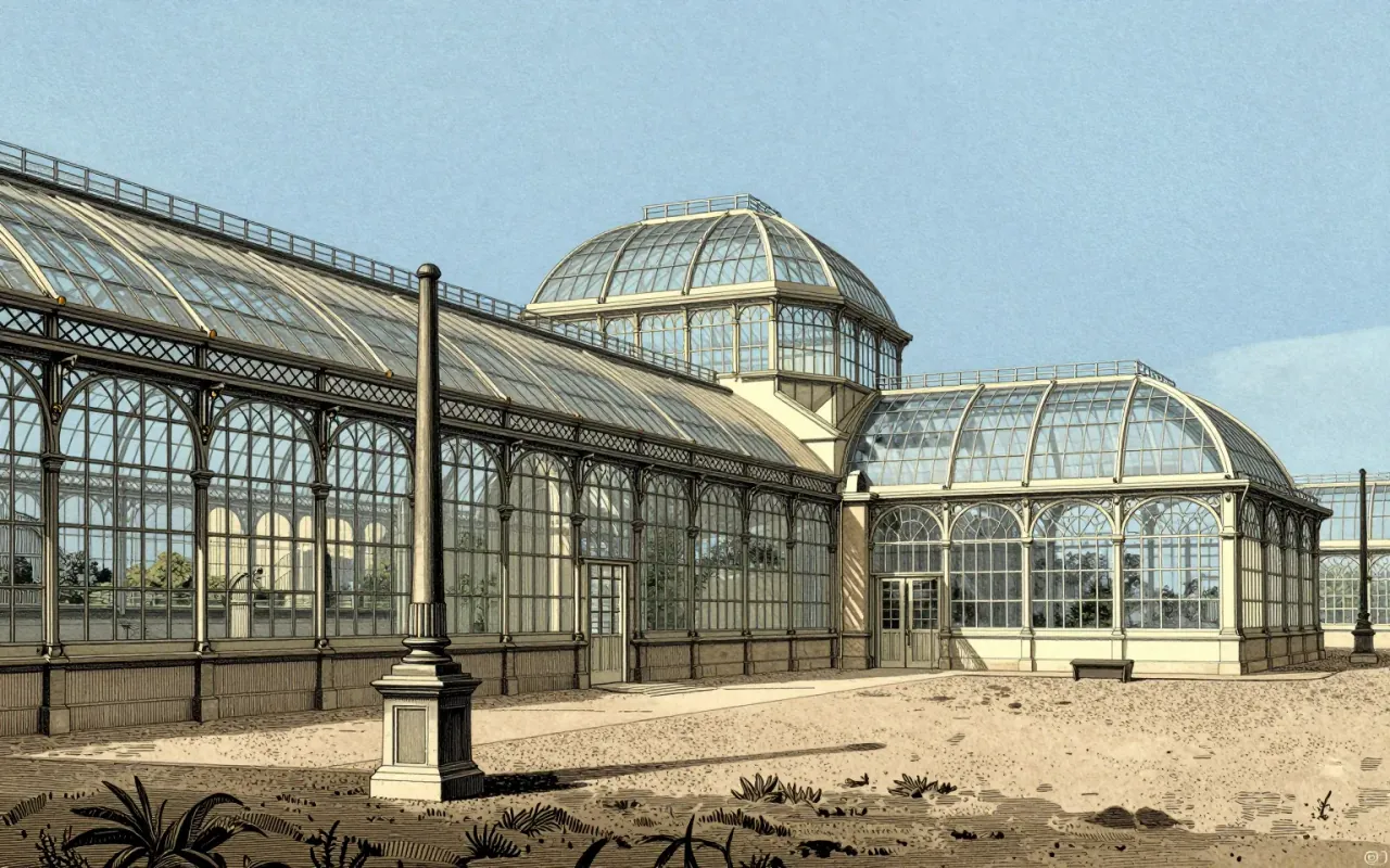
The Crystal Palace was a cast iron and plate glass exhibition hall built for the Great Exhibition of 1851. It measured 1,851 feet long and 128 feet high internally. Its modular design followed the dimensions of glass panes supplied by Chance Brothers. It was completed in thirty-nine weeks by 2,000 men at a cost of £79,800. It used 293,000 panes of glass—the greatest area ever seen in a building—and astonished visitors with clear walls and ceilings that required no interior lighting. Its construction relied on recent advances in glass and cast iron manufacturing and the abolition of the glass tax. It demonstrated British industrial capability in iron and glass.

DIN 1451 is a foundational typographic standard—not a font family, but a reproducible system. Its value lies in its constraint-driven clarity, not its aesthetic novelty.

Futura is a geometric sans-serif typeface designed by Paul Renner and released in 1927.

Georgia is a 1993 serif typeface designed by Matthew Carter for Microsoft, manually hinted by Thomas Rickner, specifically optimised for legibility on low-resolution screens through features including a large x-height, thicker thin strokes, reduced contrast, thickened serifs, and an unusually bold weight — all shaped by the binary bitmap constraints of mid-1990s screen rendering. Its design draws on 19th-century Scotch Roman models and shares lineage with Carter’s concurrent print typeface Miller.
Gotham is a geometric sans-serif typeface family designed in 2000 by Tobias Frere-Jones with Jesse Ragan and released in 2002. It was commissioned by GQ magazine to display a sans-serif with a 'geometric structure' that would look 'masculine, new, and fresh'. Its letterforms were inspired by examples of architectural signs of the mid-twentieth century, especially the sign on the Eighth Avenue façade of the Port Authority Bus Terminal. Frere-Jones based the font on lettering seen in older Manhattan buildings, and characterised the simplification as 'not the kind of letter a type designer would make. It's the kind of letter an engineer would make.' The letterforms Gotham was based on were geometric yet did not look like Futura; their widths were more uniform and less classical, bowls were larger. Reviews of Gotham focus on its identity as something both American and specific to New York City.
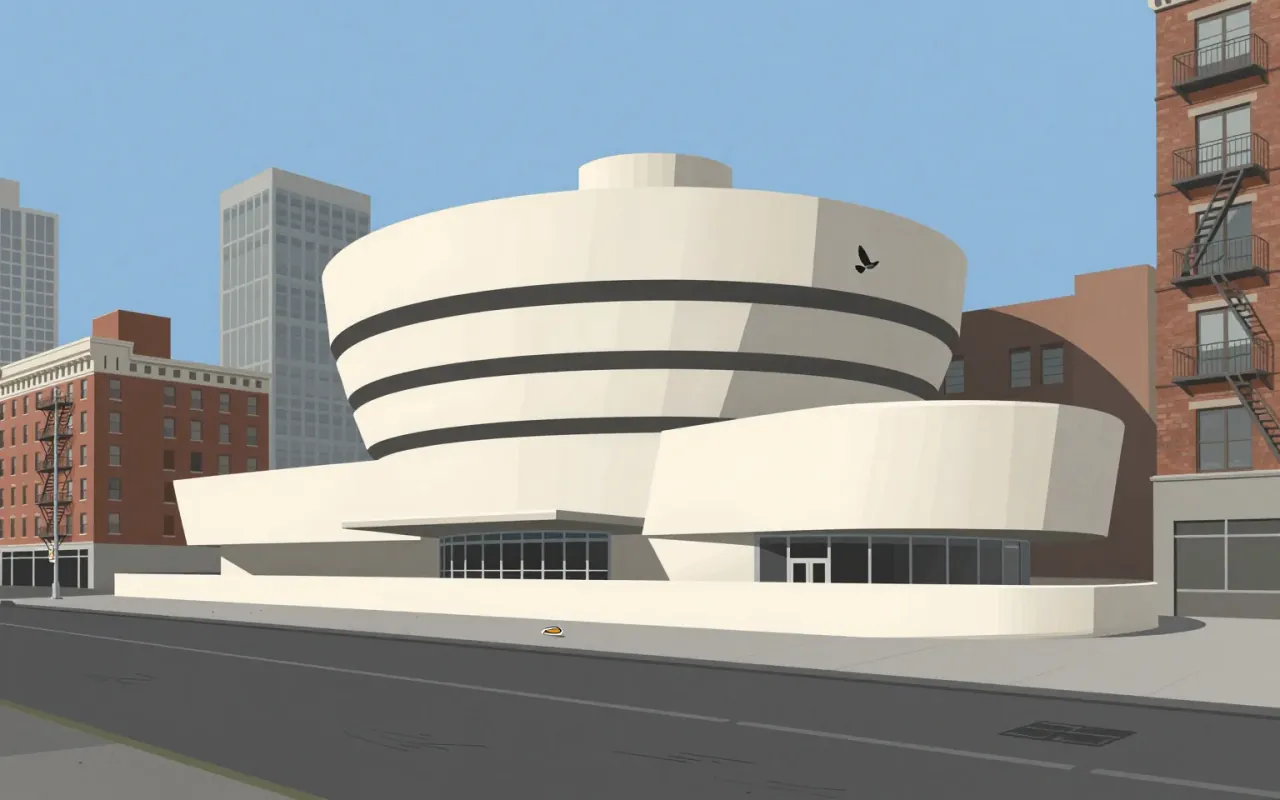
The Solomon R. Guggenheim Museum is Frank Lloyd Wright’s most recognized masterpiece. Built in New York City and completed in 1959, it features a helical ramp surrounding an open-air atrium. Wright designed it over 15 years, using more than 700 sketches and six sets of working drawings. The commission came from Hilla von Rebay, who envisioned a 'temple of spirit' enabling a new way of seeing modern art. Wright incorporated geometric motifs — squares, circles, rectangles, triangles, lozenges — each assigned symbolic meaning. Visitors ride an elevator to the top and descend the ramp, experiencing the gallery itself as a work of art. The building drew controversy for its unusual display spaces and remains a landmark of 20th-century architecture.

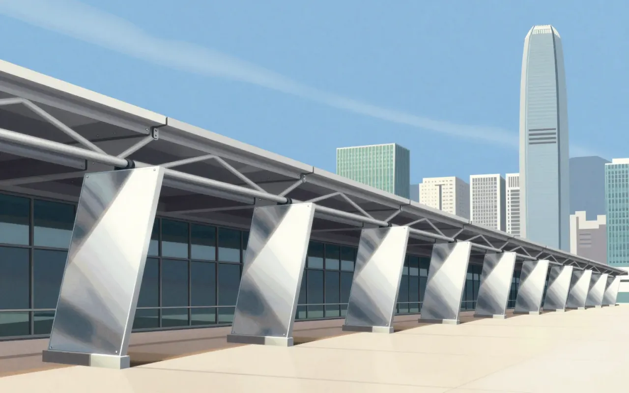
A suspended steel tower that replaced internal columns with external masts, prefabricated modules, and escalators—built at record cost to save a firm.
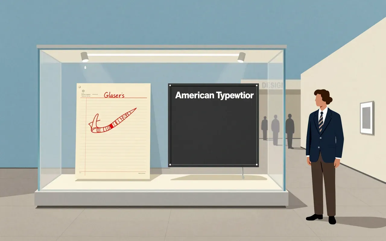
A graphic design brief must account for what is materially present—not reputation, not legacy, not what it ‘feels like’. This logo is three glyphs, one typeface, one colour, made in a taxi, given away, preserved in a museum, and later reactivated by trauma. Its power lies in what it omits: no skyline, no people, no narrative, no explanation.
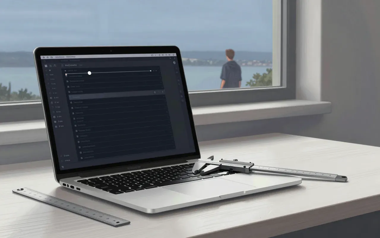
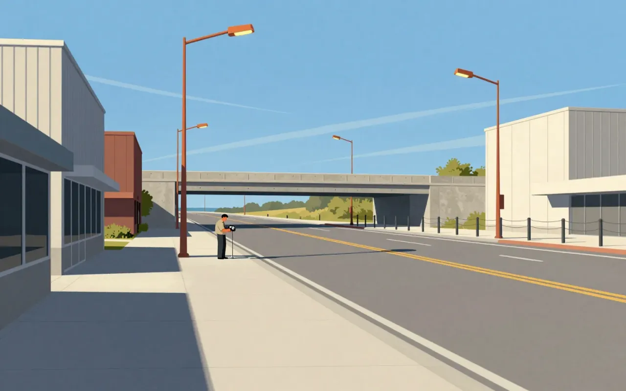
Interstate is a functional, legibility-first typeface built for versatility — not nostalgia. Its strength lies in disciplined departure from its source: the 1949 FHWA alphabets. It trades strict fidelity for readability in new contexts — but pays for that with constraints in text density. It is a defining typeface of its era not because it is novel, but because it answers a clear constraint: how to make road signage work on a magazine cover, a website headline, and a network logo — all without breaking.

A diagrammatic map of London's rapid transit network, designed in 1931 by Harry Beck. It is not a geographic map. It is a navigational tool that reduces the network to connections, sequence, and interchange points.
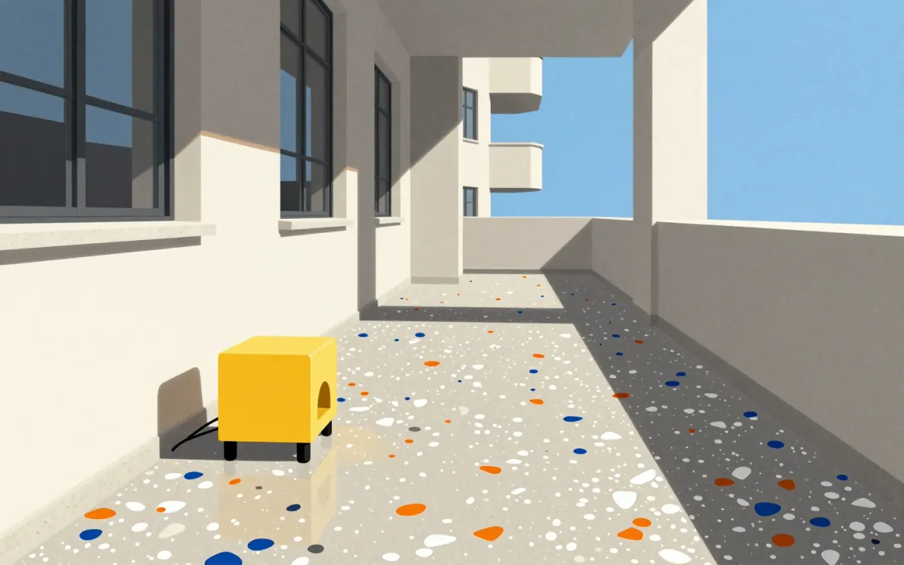
The Memphis Group was a short-lived but decisive intervention: a collective rejection of Modernist austerity, built on accessible materials, shared drawing, and irreverent references. Its durability lies not in longevity but in how precisely it named the limits of ‘good taste’ — then stepped past them.

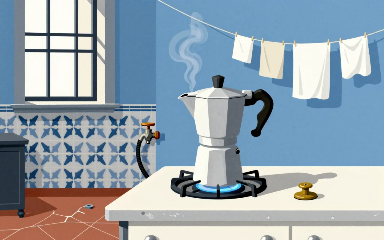
The Moka Express is a functional industrial object defined by constraint: it delivers espresso-style coffee without electricity, pumps, or bar pressure. Its success lies in aluminium’s lightness and manufacturability, its vertical stack’s thermodynamic inevitability, and its tolerance for user inconsistency. Its flaw — the strombolian phase — is inseparable from its mechanism. It is influential not because it is perfect, but because it is sufficient.


The Nintendo Entertainment System is an 8-bit home video game console. It began as the Family Computer (Famicom), released in Japan in July 1983. It was later redesigned and rebranded for Western markets as the NES.

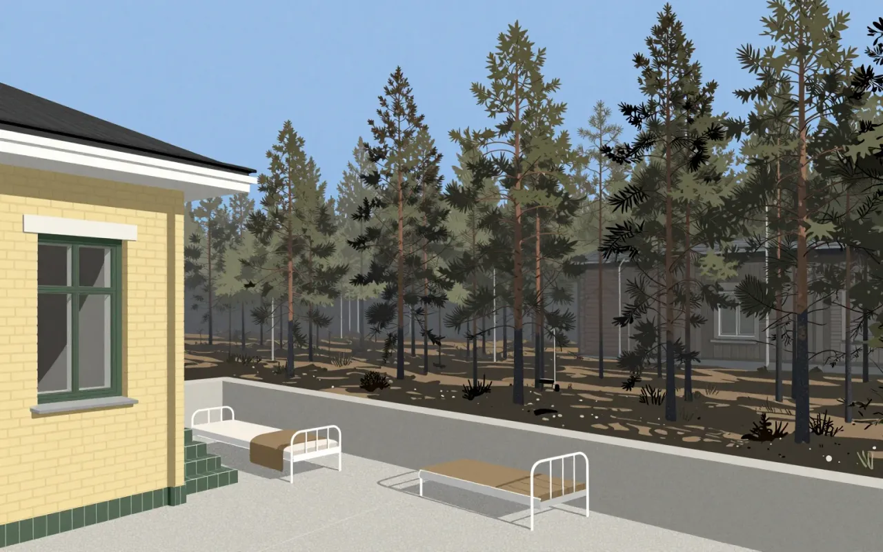
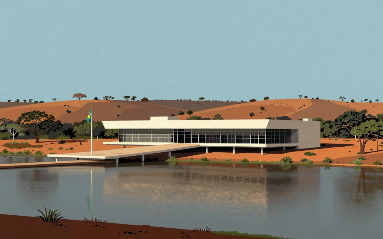



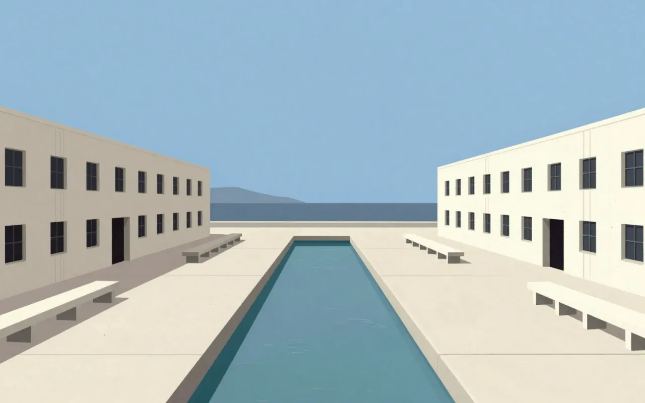
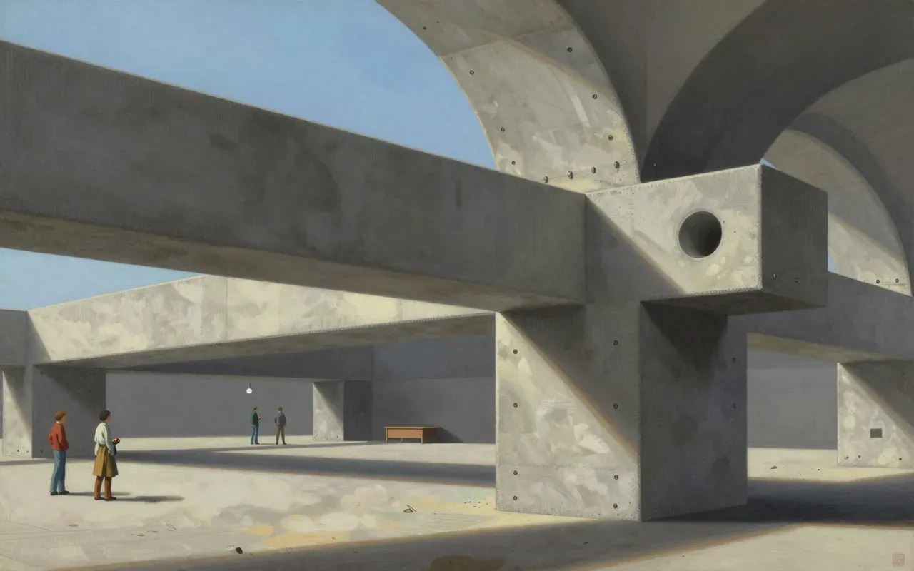
The Salk Institute is the laboratory cluster of Louis Kahn’s unrealised three-part campus. Built 1959–1965 in La Jolla, California, it uses column-free floors, integrated service floors supported by Komendant’s pre-stressed concrete Vierendeel trusses, and a Barragan-advised water court to focus attention on the Pacific Ocean. Only the lab cluster was realised. No source states what it influenced.
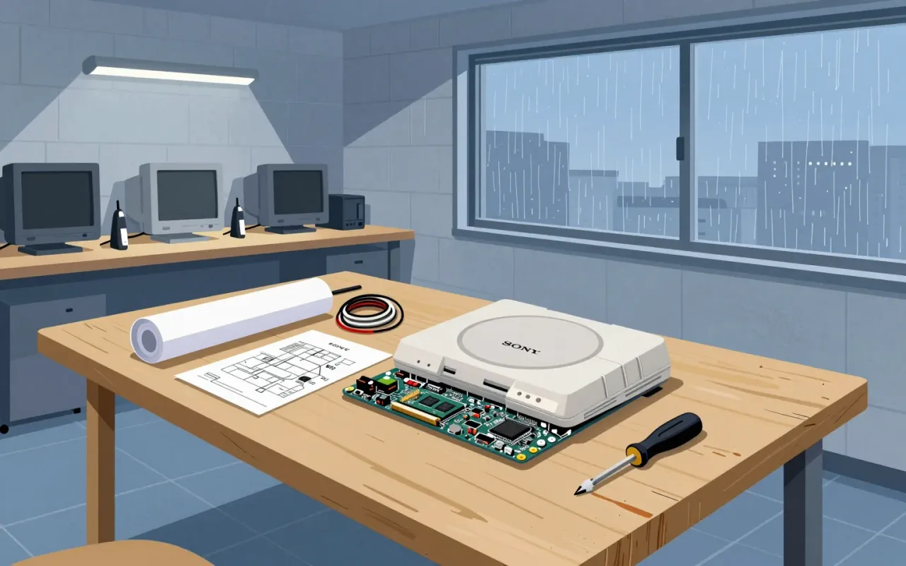
The PlayStation’s significance lies in its developer-centric architecture—not its industrial design. Teiyu Goto is not referenced in any verified source. The brief treats the console as a software platform first, a physical object second—and only what is documented is stated.

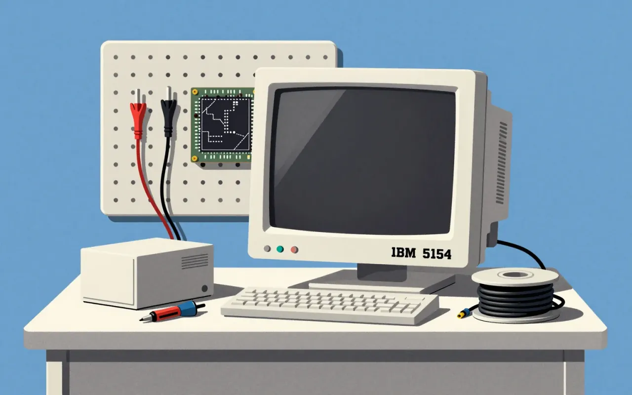
Trinitron is a CRT display technology defined by its single-gun three-cathode electron gun and vertically aligned steel aperture grille. It improved image sharpness by reducing beam obstruction and simplifying focus. Its patent ran until 1996. It launched as a branded line in 1968, powered televisions and monitors until 2005–2007, and marked the end of Sony’s analog display era.
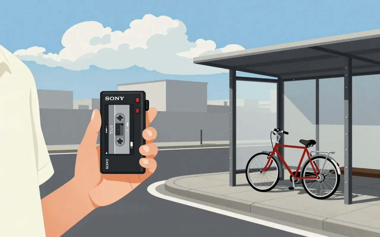
The Walkman is industrial design as behavioural intervention — minimal, specific, and consequential.
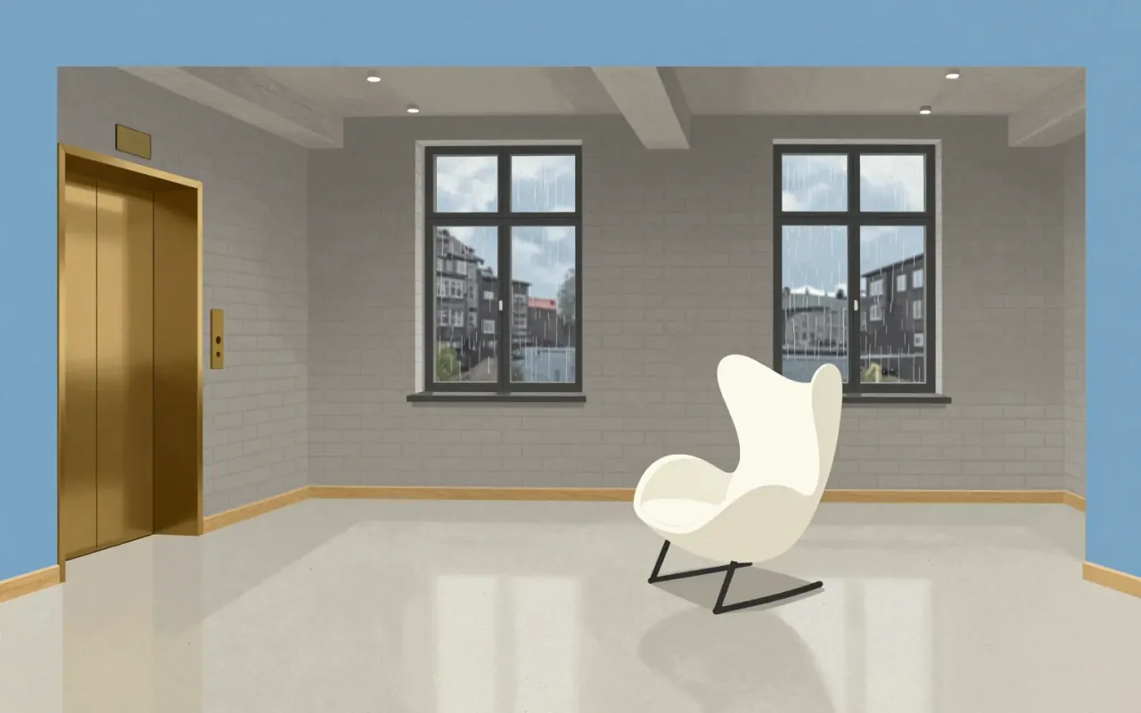
Arne Jacobsen designed the Swan lounge chair and sofa for Copenhagen's SAS Royal Hotel in 1958. The chair combines an upholstered body with a star-shaped satin-polished aluminium base.
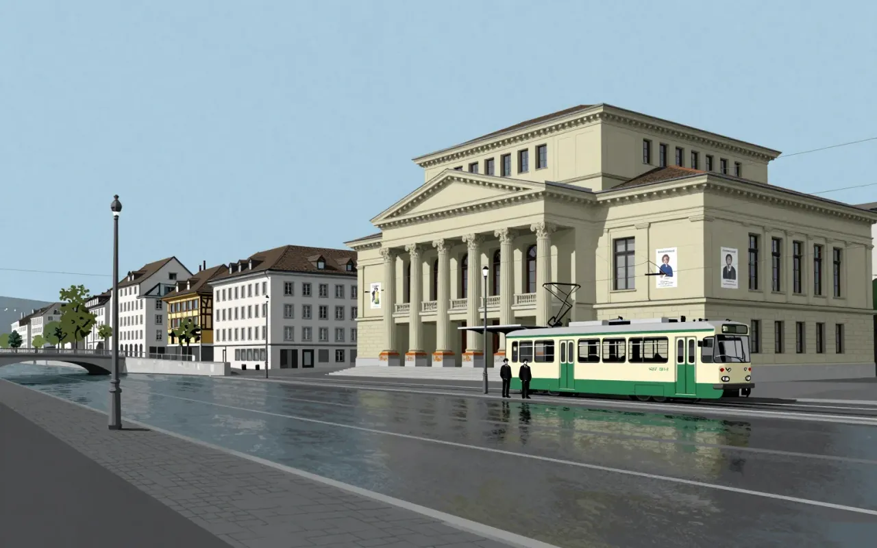
The International Typographic Style is a systemic, modernist graphic design approach that emerged during the 1930s–1950s. It prioritises objectivity, clarity, and universality through asymmetry, grid, sans-serif type, flush-left text, and photography. Josef Müller-Brockmann pioneered its application in works including the Tonhalle Series (1950) and the Accident Barometer (1952). His method relied on nonrepresentational abstraction, geometric elements, and musical structure—scale, rhythm, repetition—without illustration or embellishment.
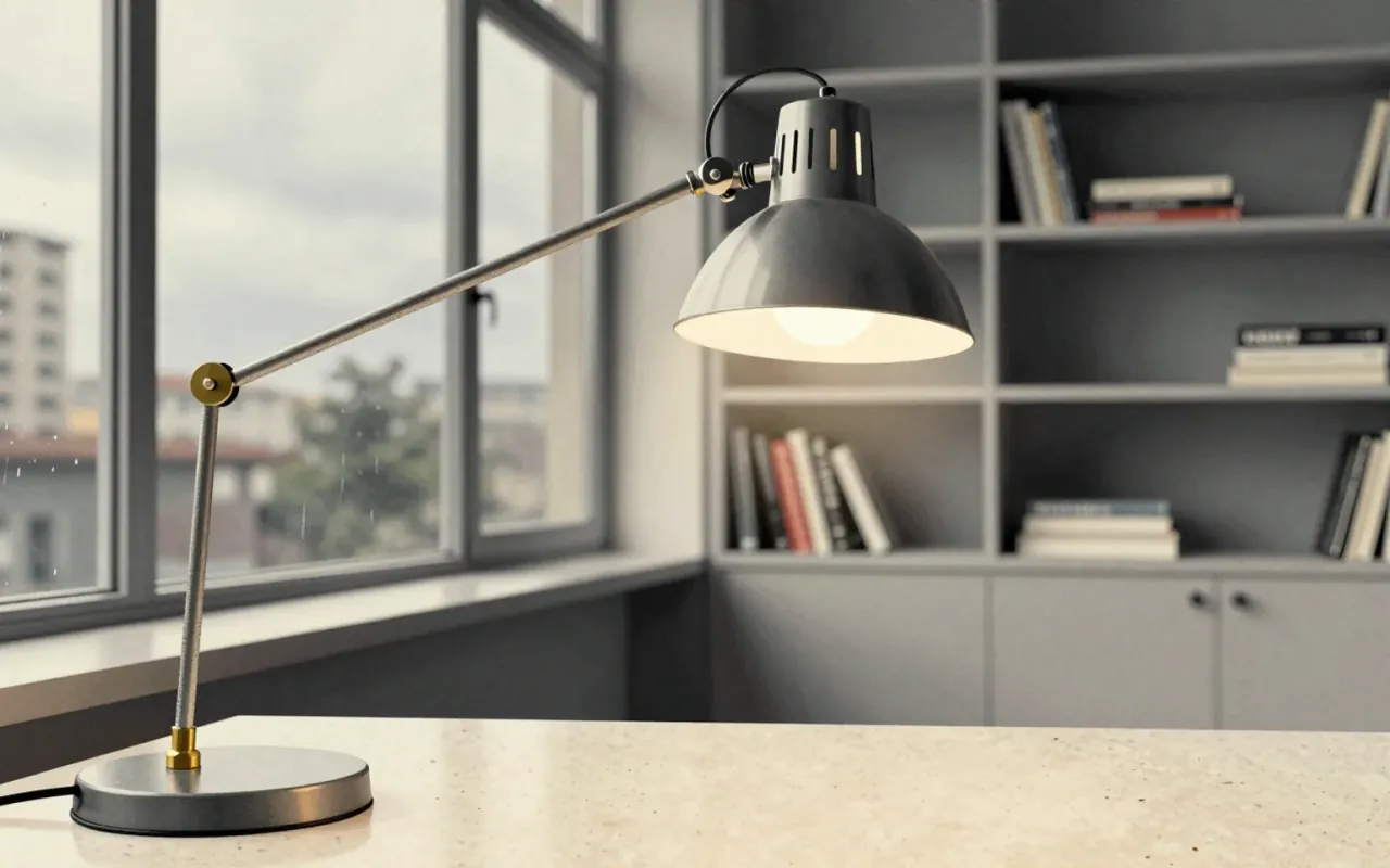
Michele De Lucchi and Giancarlo Fassina designed the Tolomeo desk lamp for Artemide in 1986. Its articulated aluminium arms, tension cables and swivelling reflector make it a useful study in adjustable task lighting.



The Zippo lighter is a tightly constrained industrial object defined by wind resistance, guaranteed longevity, and procedural repeatability — not novelty, aesthetics, or scale.

A foundational sans-serif typeface family released in 1898 for commercial print jobs, derived from a shadowed predecessor by removing the drop shadow and filing two design patents. Its monoline structure and single-storey 'g' prioritised mechanical reproducibility over typographic nuance. It prefigured neo-grotesques like Helvetica by fifty years—not as a stylistic ancestor, but as an operational prototype for scalable, patent-protected industrial typography.
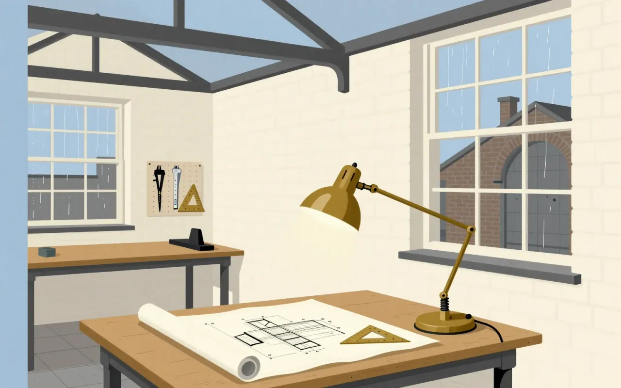
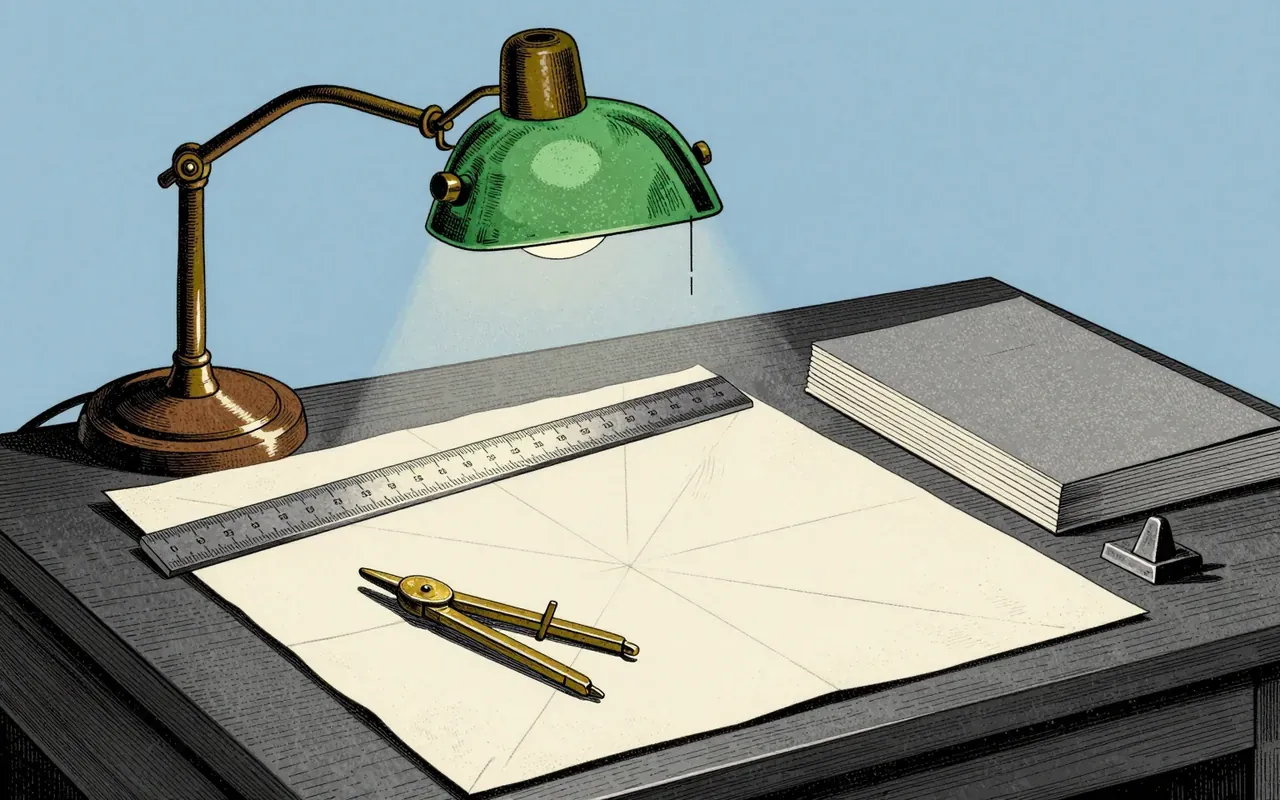
The Anglepoise lamp is a balanced-arm lamp designed in 1932 by George Carwardine, a vehicle suspension specialist. Its defining feature is the placement of all springs near the base — a direct transfer of suspension mechanics to lighting. It requires no clamps to hold position. Carwardine patented it, built it himself in Bath, then licensed it to Herbert Terry and Sons in 1934. Two versions exist: four-spring for professional use, three-spring for domestic use — both sharing the same spring-placement principle.
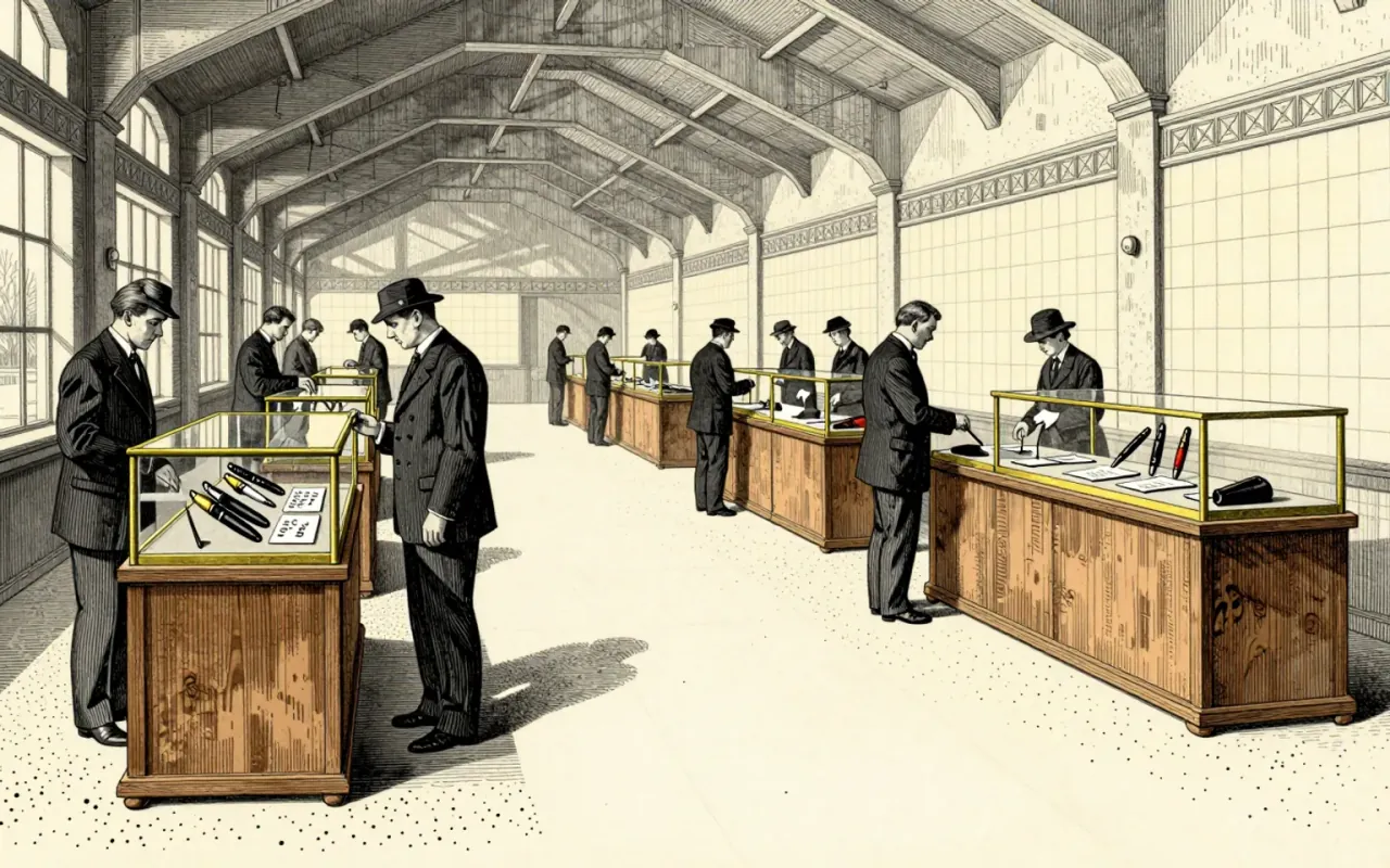
The ballpoint pen is a mechanical solution to ink viscosity. It replaces fountain-pen capillary action with a rotating ball that meters viscous, fast-drying newspaper ink. Bíró’s 1931 prototype and subsequent patents formalised this logic — not as refinement, but as substitution. It works where fountain pens fail: on absorbent paper, without blotting, with minimal maintenance. It does not solve line consistency or pressure sensitivity. Its influence is structural: it defined the cartridge-fed, disposable, low-tolerance writing tool that dominated global manufacturing after 1945.
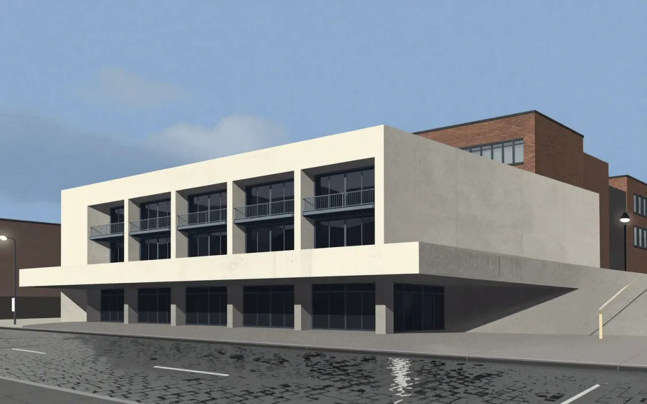
The Barbican Centre is a Brutalist arts complex in London, designed by Chamberlin, Powell & Bon. It features a concrete ziggurat form and complex multi-level layout. It was designated Grade II listed in September 2001 for its scale, cohesion, and ambition. It forms part of an integrated urban development including the Barbican Estate and Golden Lane Estate. Its design remains controversial and divisive.
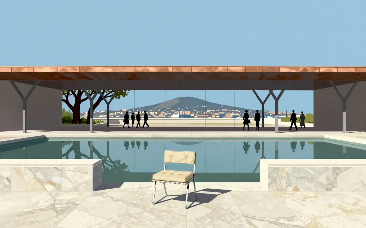
The Barcelona Pavilion is a temporary German Pavilion for the 1929 International Exposition in Barcelona, co-designed by Ludwig Mies van der Rohe and Lilly Reich. It used marble, red onyx, and travertine. It was demolished in 1930. A 1986 reconstruction now stands on the original site. It is one of Mies’s two European masterworks. Its spatial logic, material choices, and role as both exhibit and experiential space remain legible and instructive.

Baskerville is a 1757 serif typeface designed by John Baskerville in Birmingham and cut by John Handy. It is transitional — a refinement of Caslon’s old-style forms — with higher stroke contrast, sharper serifs, vertical axis shift, more circular curves, and greater character regularity. Its success depended on wove paper (co-developed with James Whatman), custom ink, and precise presswork. The 1757 Virgil edition demonstrated its capabilities and secured Baskerville’s 1758 appointment as University Printer to Cambridge. It set formal precedents for Bodoni and Didot, but its legibility limits at small sizes and material dependencies remain unaddressed.
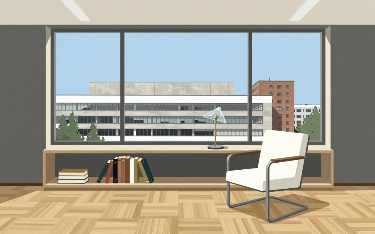
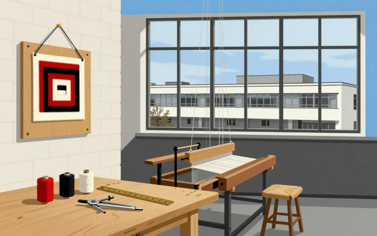
The Bauhaus was a German art school (1919–1933) founded by Walter Gropius in Weimar. It combined crafts and fine arts through an experimental, theory-led pedagogy centred on the Vorkurs. Its aim was to unify artistic vision with mass production, functionality, and industrial collaboration — producing functional, cheap, industrially viable objects like the F51 armchair (1920), Sommerfeld House (1920), and Gropius’s 1923 door handles. Its internal tensions — between expressionism and New Objectivity, craft and industry — were structural, not resolved. It established the principle that aesthetic quality must extend to every home via well-designed, industrially produced objects.
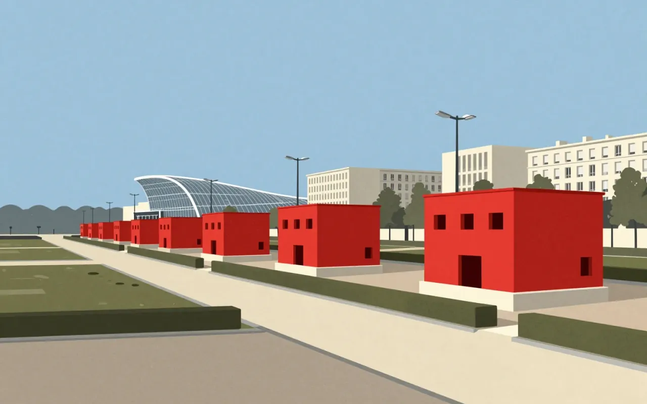
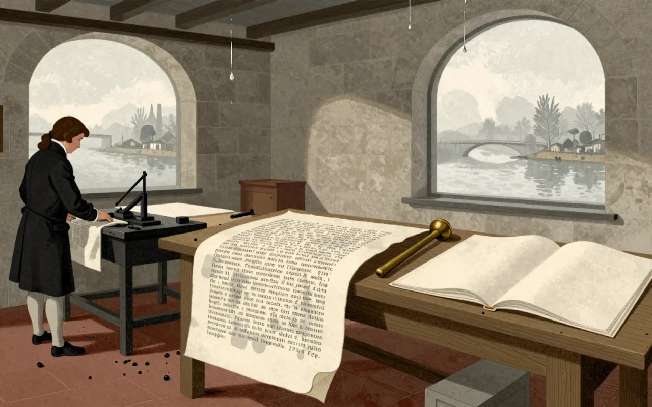
Bodoni is a late-eighteenth-century type system defined by extreme stroke contrast, flat unbracketed serifs, geometric construction, and rational structure. It was made possible by Bodoni’s technical mastery in cutting fine hairlines across many sizes—and by his aesthetic commitment to plainness and material purity. It works where size, paper, and ink support its optical demands: the 1808 Iliad and 1806 Oratio Dominica prove its fidelity and ambition. It fails where those conditions collapse: at small sizes, hairlines vanish and alternating strokes cause dazzle. It influenced all subsequent Didone typography—not as a timeless ideal, but as a precise, constrained, and unforgiving system. It is worth your time if you treat legibility as a condition, not a guarantee.


Caslon is the first English type system engineered for optical legibility in print, not screen.

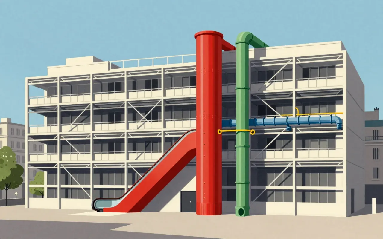
The Centre Pompidou is a 1977 building in Paris designed by Renzo Piano and Richard Rogers as a publicly accessible cultural 'town'. Its 'inside-out' strategy externalises and colour-codes structural, mechanical, and circulation systems. Green pipes carry water. Blue ducts manage climate. Yellow conduits house electricity. Red elements handle movement and safety. The design emerged from France’s first international architectural competition, judged by Niemeyer, Prouvé, and Johnson, and selected from 681 entries. It was intended for 8,000 daily visitors. In its first two decades, it attracted more than 145 million—over five times the projection. Its exposed systems improved interior space efficiency. Its stated aim was inclusivity: 'a place for all people – for the poor and rich, the young and old'.