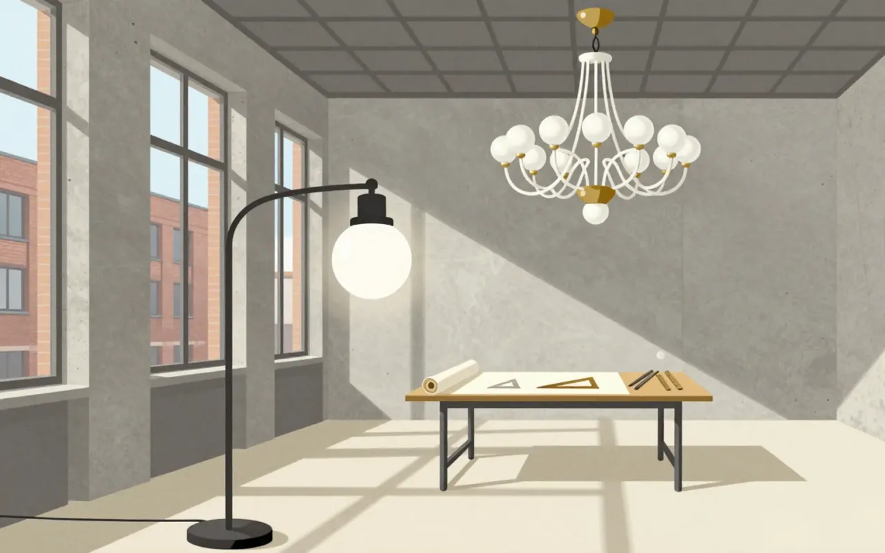
Achille Castiglioni
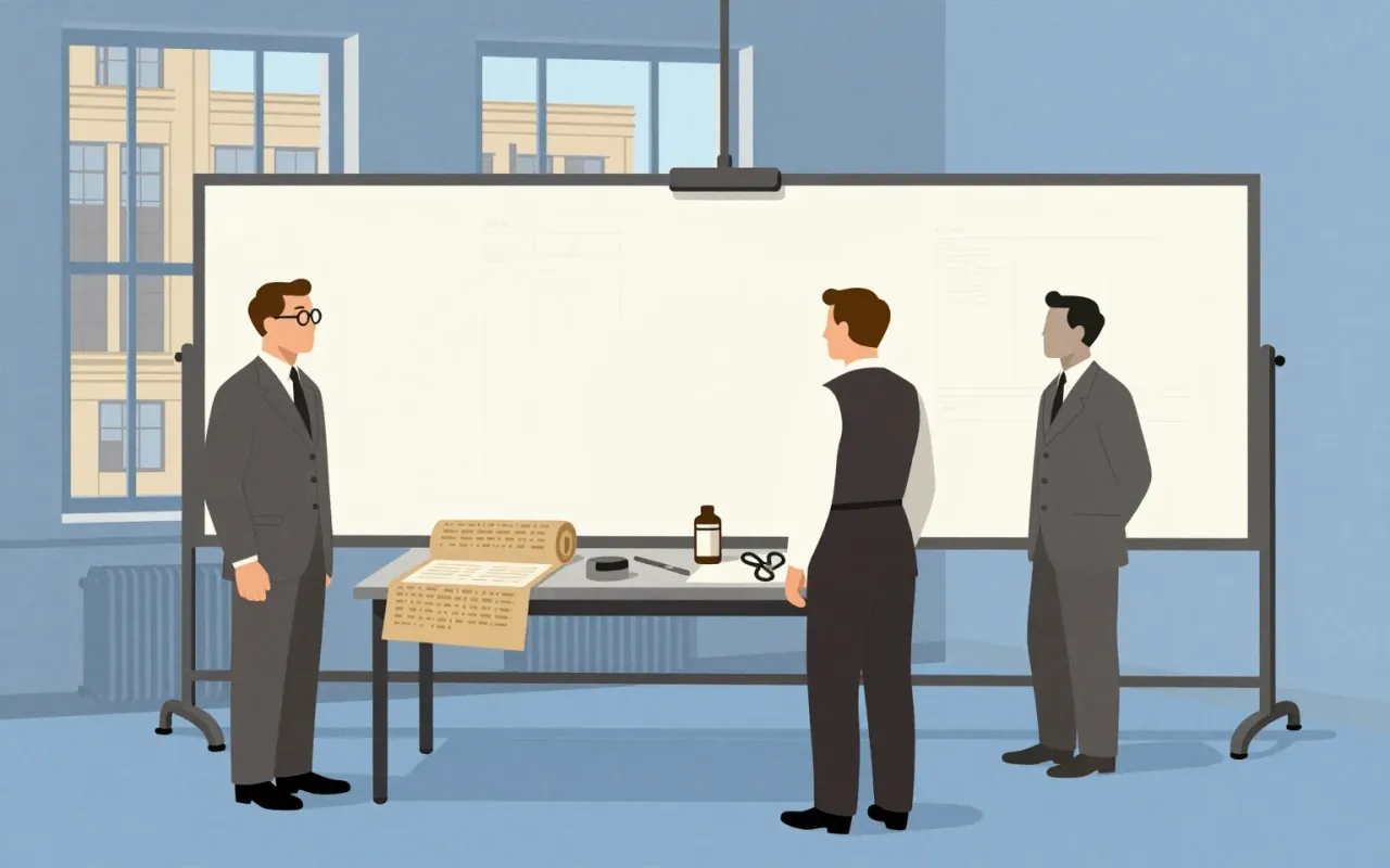
They did not invent forms—they hijacked them, and proved design begins where industry leaves something behind.
A foundational sans-serif typeface family released in 1898 for commercial print jobs, derived from a shadowed predecessor by removing the drop shadow and filing two design patents. Its monoline structure and single-storey 'g' prioritised mechanical reproducibility over typographic nuance. It prefigured neo-grotesques like Helvetica by fifty years—not as a stylistic ancestor, but as an operational prototype for scalable, patent-protected industrial typography.
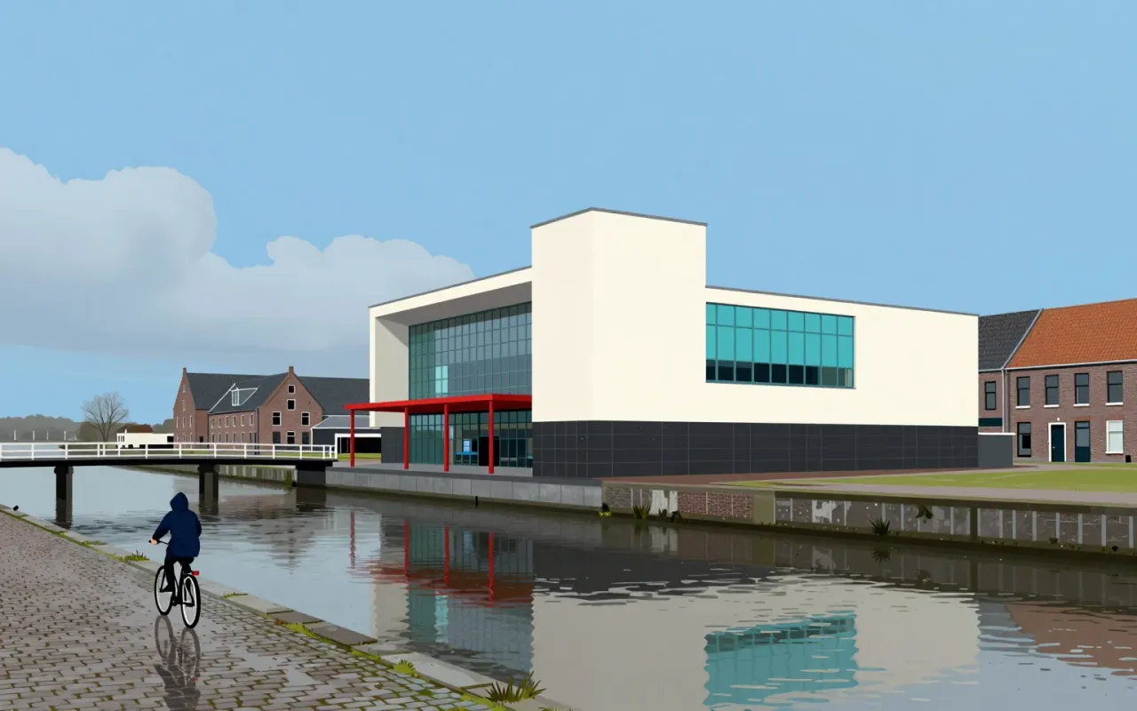
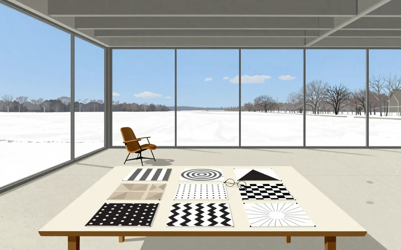
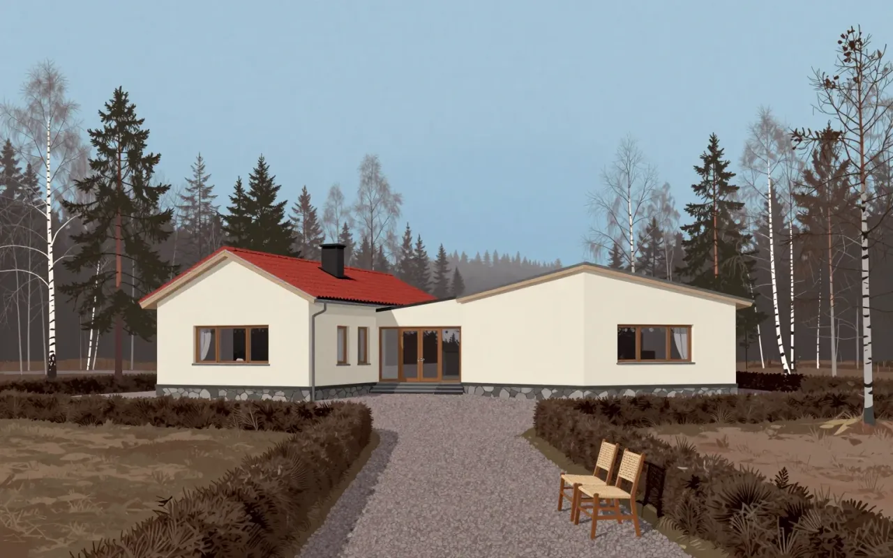
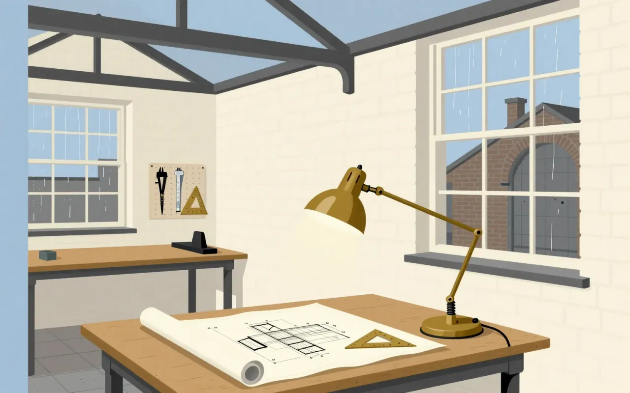
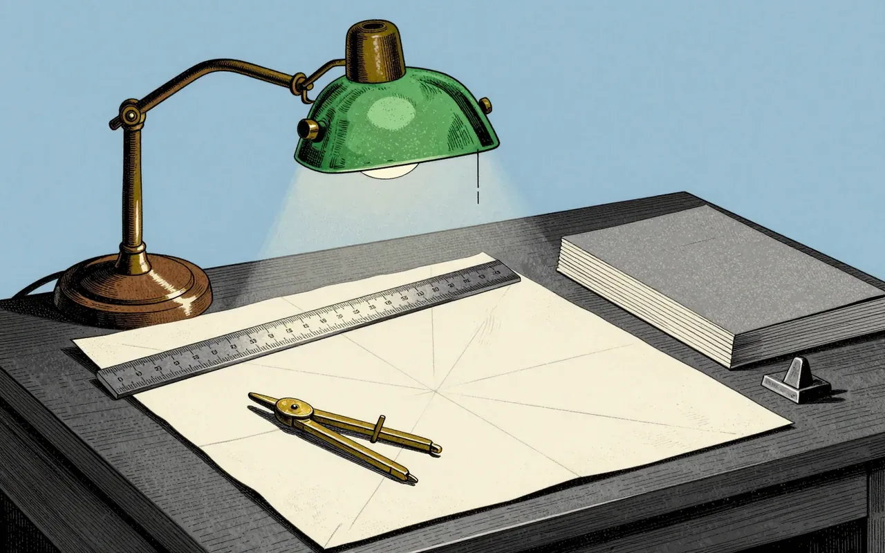
The Anglepoise lamp is a balanced-arm lamp designed in 1932 by George Carwardine, a vehicle suspension specialist. Its defining feature is the placement of all springs near the base — a direct transfer of suspension mechanics to lighting. It requires no clamps to hold position. Carwardine patented it, built it himself in Bath, then licensed it to Herbert Terry and Sons in 1934. Two versions exist: four-spring for professional use, three-spring for domestic use — both sharing the same spring-placement principle.
Arial is a neo-grotesque sans-serif typeface designed in 1982 by Robin Nicholas and Patricia Saunders at Monotype Typography as a metrically compatible alternative to Helvetica for the IBM 3800–3 laser printer.
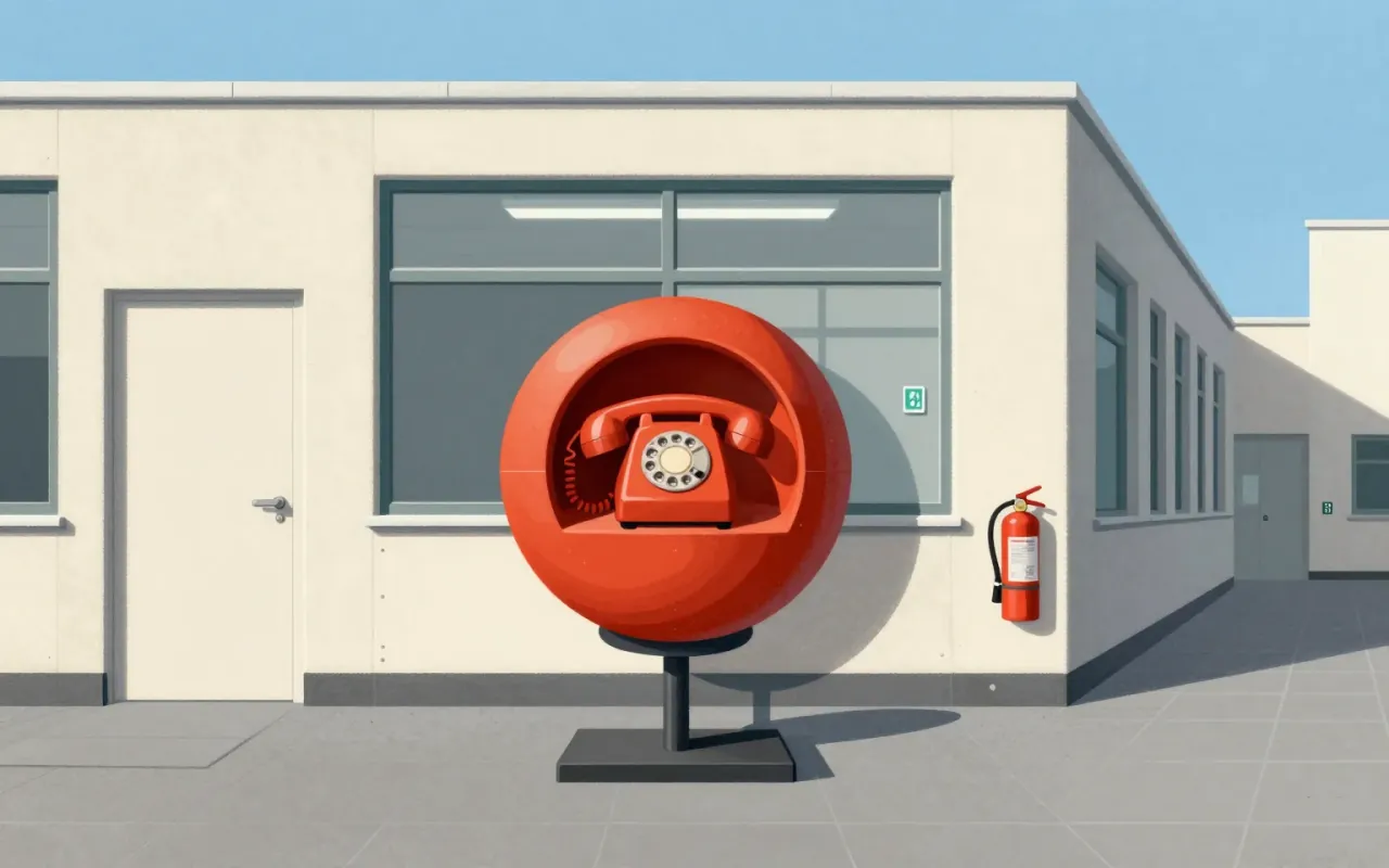
The Ball Chair is a 1963 domestic solution turned international icon — defined by constraint, not concept. Its value lies in how clearly its making answers a specific question: how to build a large, novel chair that fits through a door. Nothing more.
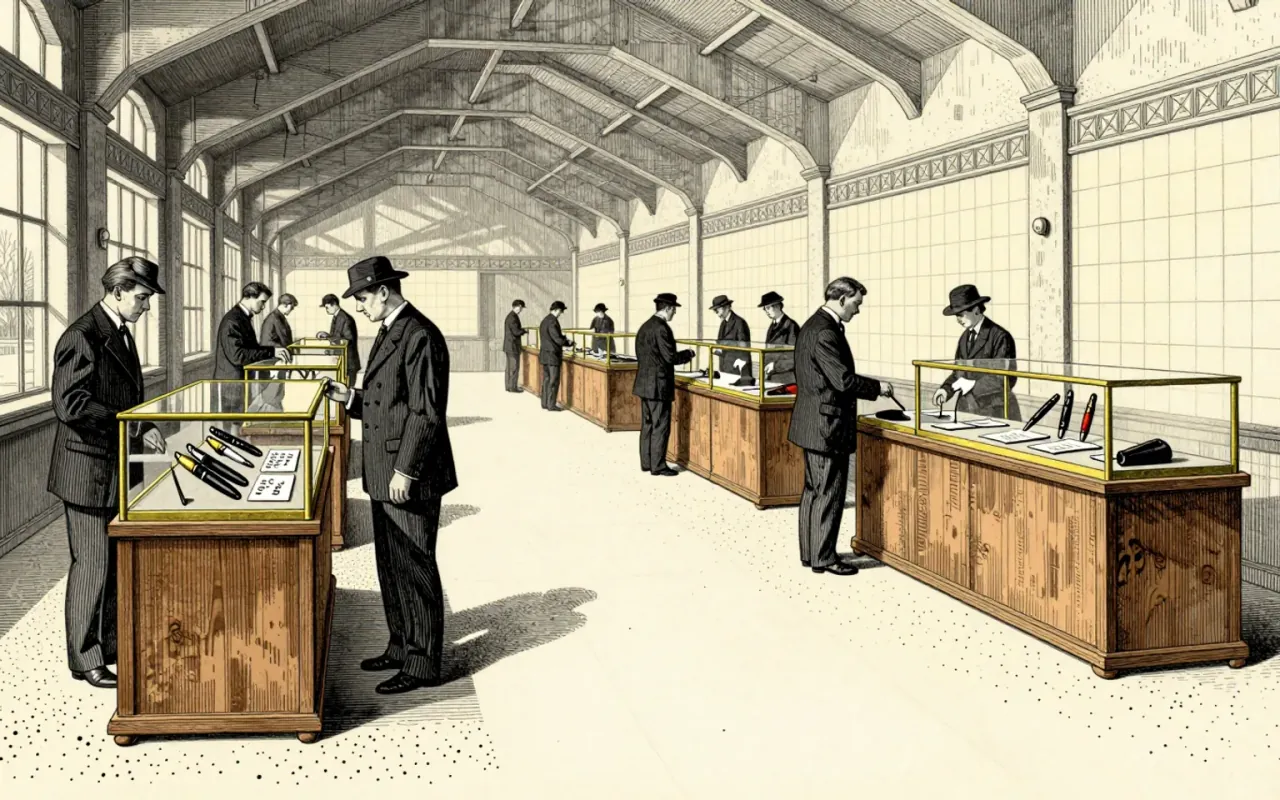
The ballpoint pen is a mechanical solution to ink viscosity. It replaces fountain-pen capillary action with a rotating ball that meters viscous, fast-drying newspaper ink. Bíró’s 1931 prototype and subsequent patents formalised this logic — not as refinement, but as substitution. It works where fountain pens fail: on absorbent paper, without blotting, with minimal maintenance. It does not solve line consistency or pressure sensitivity. Its influence is structural: it defined the cartridge-fed, disposable, low-tolerance writing tool that dominated global manufacturing after 1945.
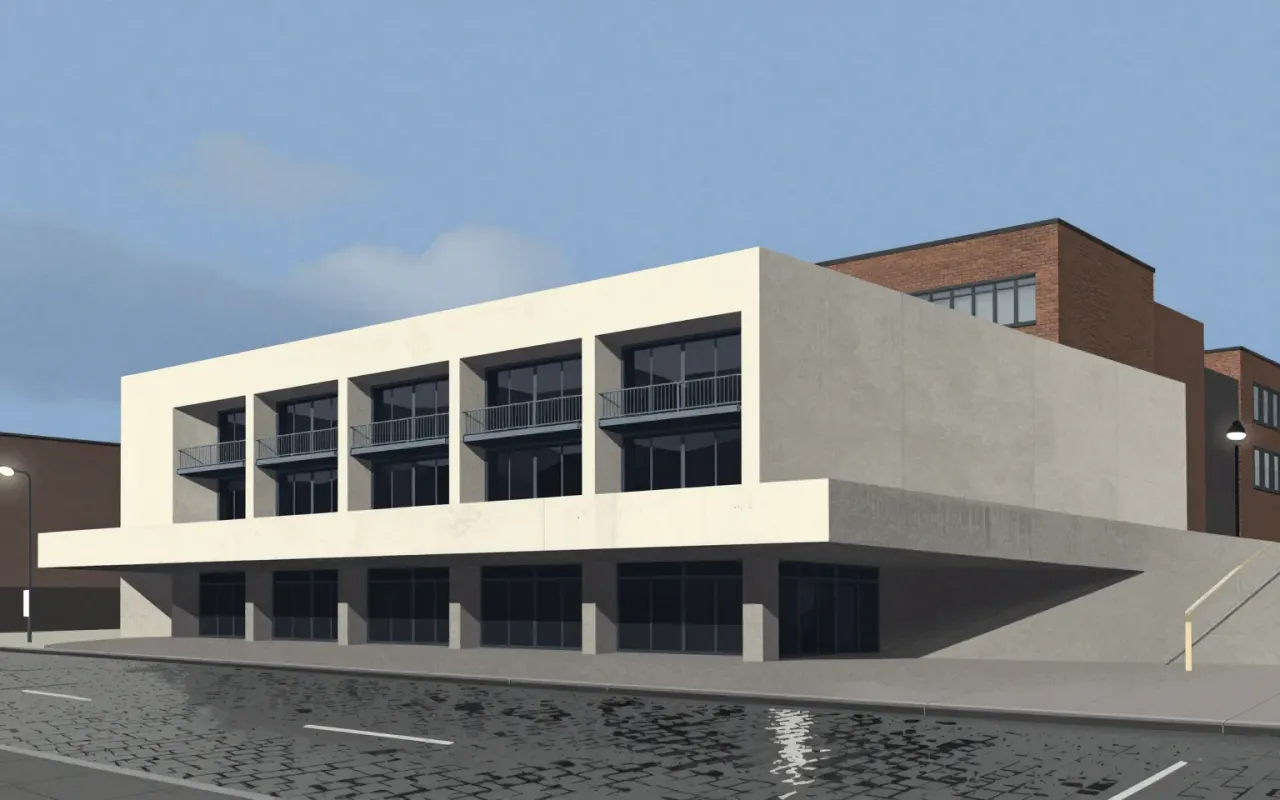
The Barbican Centre is a Brutalist arts complex in London, designed by Chamberlin, Powell & Bon. It features a concrete ziggurat form and complex multi-level layout. It was designated Grade II listed in September 2001 for its scale, cohesion, and ambition. It forms part of an integrated urban development including the Barbican Estate and Golden Lane Estate. Its design remains controversial and divisive.
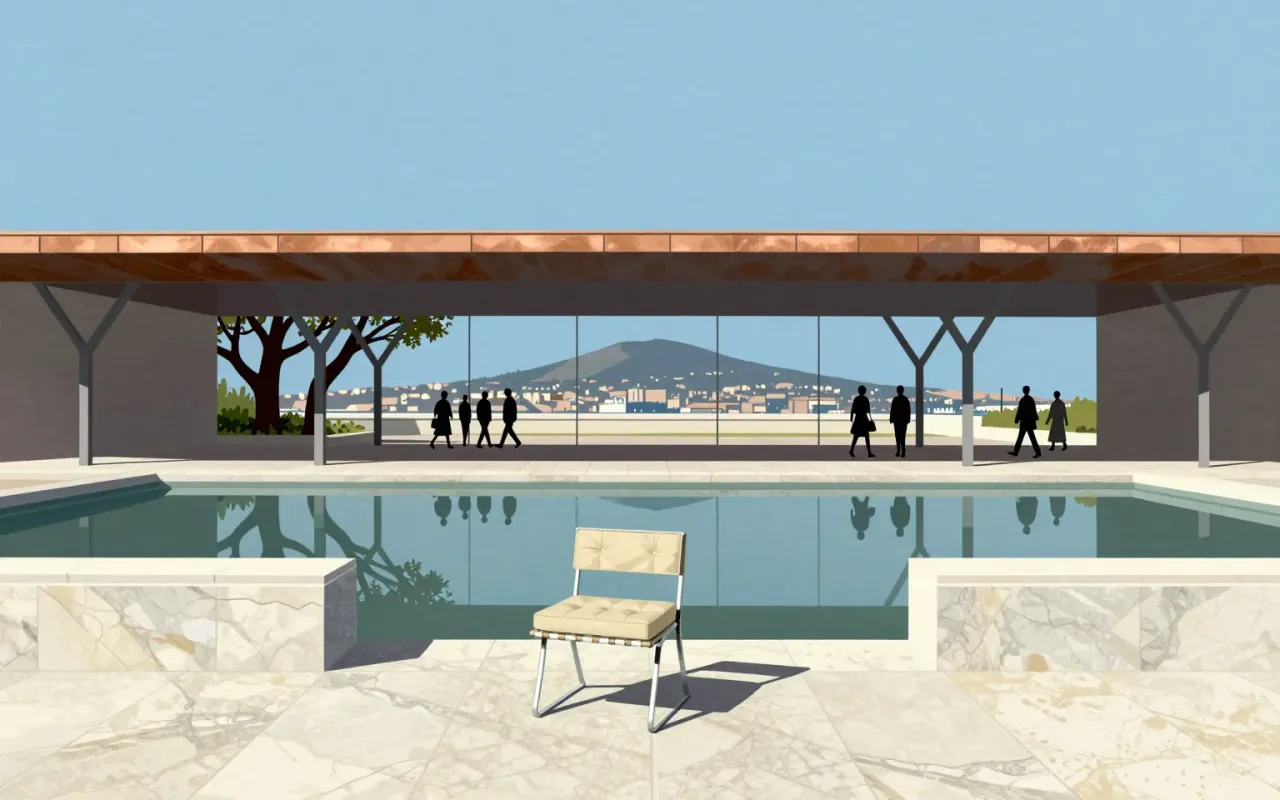
The Barcelona Pavilion is a temporary German Pavilion for the 1929 International Exposition in Barcelona, co-designed by Ludwig Mies van der Rohe and Lilly Reich. It used marble, red onyx, and travertine. It was demolished in 1930. A 1986 reconstruction now stands on the original site. It is one of Mies’s two European masterworks. Its spatial logic, material choices, and role as both exhibit and experiential space remain legible and instructive.

Baskerville is a 1757 serif typeface designed by John Baskerville in Birmingham and cut by John Handy. It is transitional — a refinement of Caslon’s old-style forms — with higher stroke contrast, sharper serifs, vertical axis shift, more circular curves, and greater character regularity. Its success depended on wove paper (co-developed with James Whatman), custom ink, and precise presswork. The 1757 Virgil edition demonstrated its capabilities and secured Baskerville’s 1758 appointment as University Printer to Cambridge. It set formal precedents for Bodoni and Didot, but its legibility limits at small sizes and material dependencies remain unaddressed.
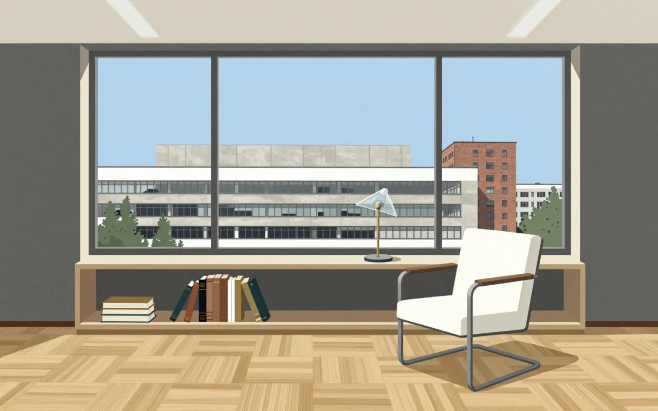
The Bauhaus was a German art school (1919–1933) founded by Walter Gropius in Weimar. It combined crafts and fine arts through an experimental, theory-led pedagogy centred on the Vorkurs. Its aim was to unify artistic vision with mass production, functionality, and industrial collaboration — producing functional, cheap, industrially viable objects like the F51 armchair (1920), Sommerfeld House (1920), and Gropius’s 1923 door handles. Its internal tensions — between expressionism and New Objectivity, craft and industry — were structural, not resolved. It established the principle that aesthetic quality must extend to every home via well-designed, industrially produced objects.

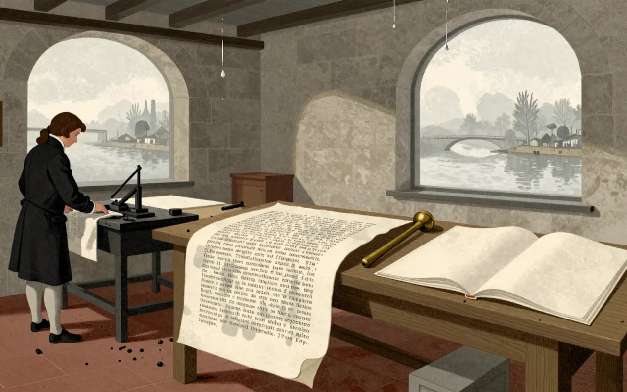
Bodoni is a late-eighteenth-century type system defined by extreme stroke contrast, flat unbracketed serifs, geometric construction, and rational structure. It was made possible by Bodoni’s technical mastery in cutting fine hairlines across many sizes—and by his aesthetic commitment to plainness and material purity. It works where size, paper, and ink support its optical demands: the 1808 Iliad and 1806 Oratio Dominica prove its fidelity and ambition. It fails where those conditions collapse: at small sizes, hairlines vanish and alternating strokes cause dazzle. It influenced all subsequent Didone typography—not as a timeless ideal, but as a precise, constrained, and unforgiving system. It is worth your time if you treat legibility as a condition, not a guarantee.
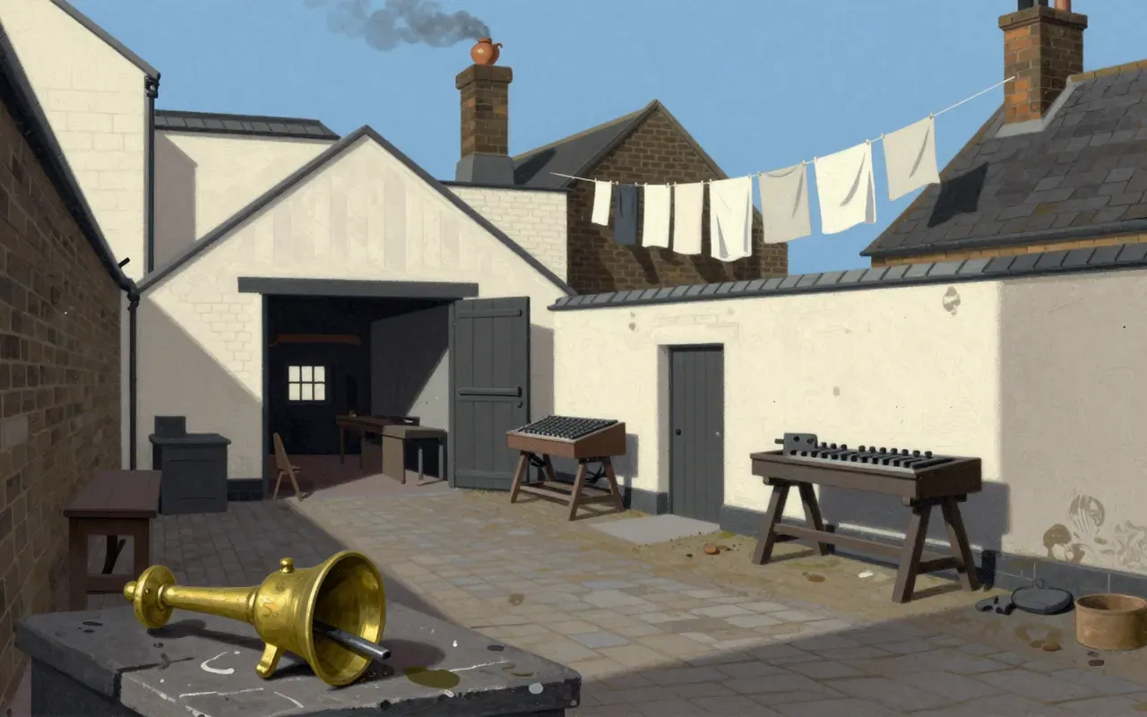
Caslon is the first English type system engineered for optical legibility in print, not screen.
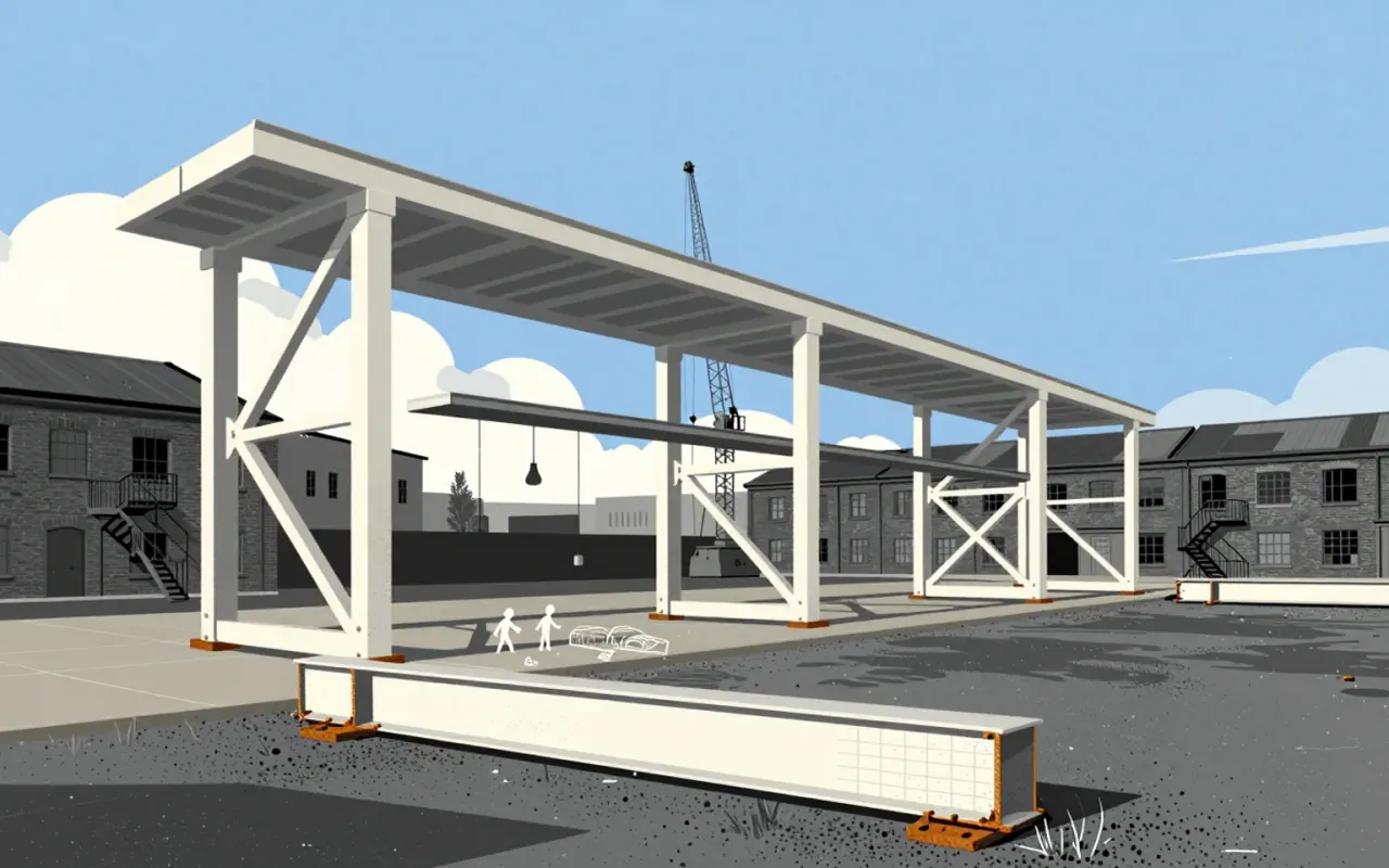
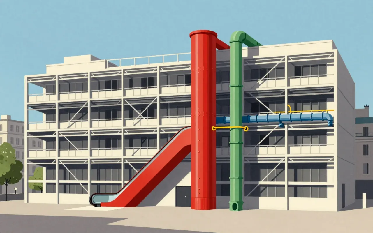
The Centre Pompidou is a 1977 building in Paris designed by Renzo Piano and Richard Rogers as a publicly accessible cultural 'town'. Its 'inside-out' strategy externalises and colour-codes structural, mechanical, and circulation systems. Green pipes carry water. Blue ducts manage climate. Yellow conduits house electricity. Red elements handle movement and safety. The design emerged from France’s first international architectural competition, judged by Niemeyer, Prouvé, and Johnson, and selected from 681 entries. It was intended for 8,000 daily visitors. In its first two decades, it attracted more than 145 million—over five times the projection. Its exposed systems improved interior space efficiency. Its stated aim was inclusivity: 'a place for all people – for the poor and rich, the young and old'.
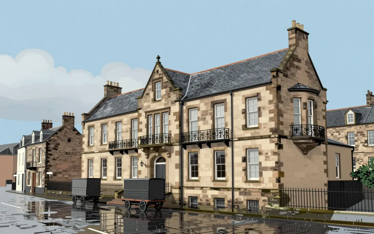
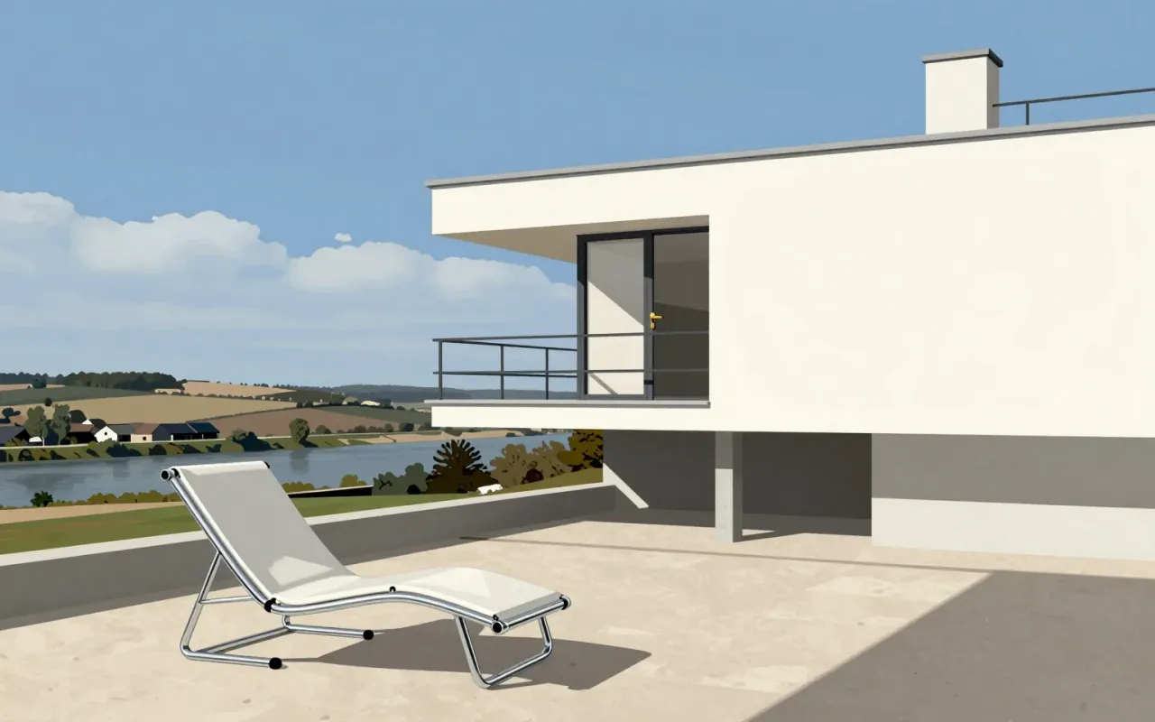
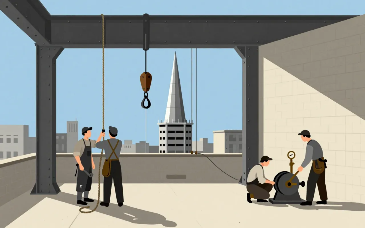
The Chrysler Building is a 1,046-foot-tall steel-framed brick skyscraper in New York City, designed by William Van Alen in the Art Deco style and completed in 1930. Van Alen used Nirosta stainless steel—the first such use in an American project—as an integral design element. He secretly built a 125-foot spire inside the frame and assembled it in 90 minutes on October 23, 1929. The building served as a real-world test site for stainless steel durability, with formal inspections every five years from 1929 to 1960. It became the world’s tallest building for 11 months and remains the tallest steel-framed brick building in the world. Critics responded with mixed reactions—including praise for Van Alen personally and criticism of the building as superficial and lacking serious design significance.
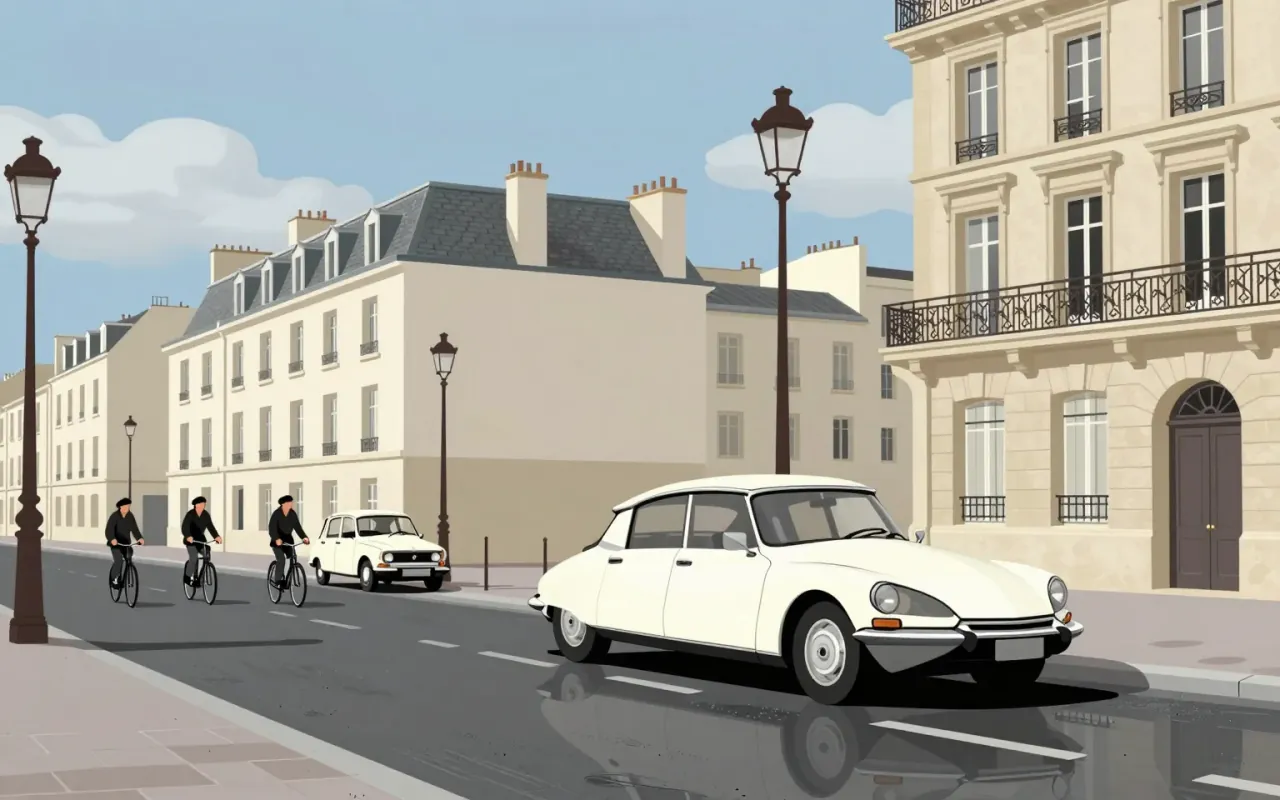
The Citroën DS is an industrial design for a mass-production automobile. Flaminio Bertoni co-styled it with André Lefèbvre. Paul Magès developed its hydropneumatic self-levelling suspension. It used hydropneumatic suspension and disc brakes — the first mass-production car to do so. It set new standards in ride quality, handling, and braking. It pushed the envelope in the ride vs. handling compromise possible in a motor vehicle. Its body design was aerodynamic and futuristic. Roland Barthes described it as looking as if it had 'fallen from the sky'. The DS Series 3 introduced directional headlights to automotive mass-production.
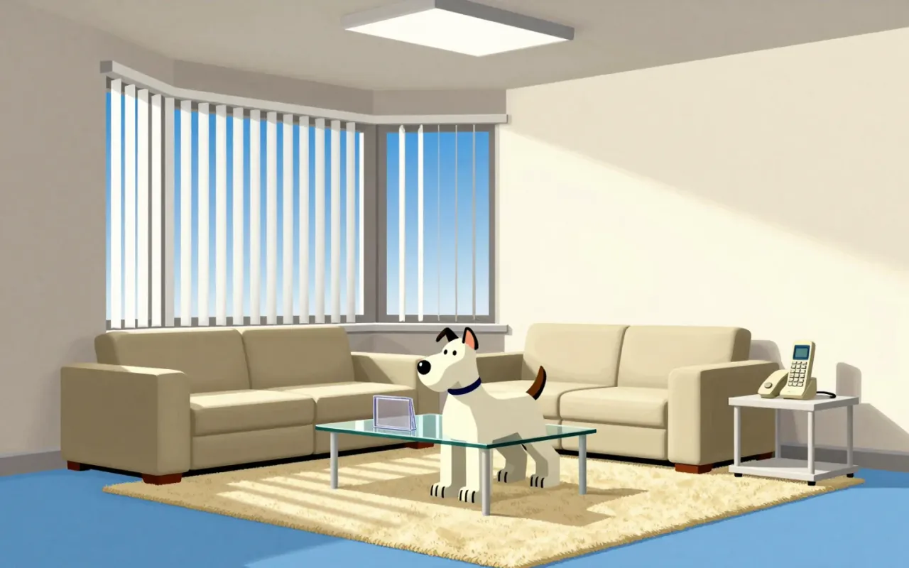
Comic Sans is a 1994 Microsoft typeface designed by Vincent Connare to replace Times New Roman in Microsoft Bob’s cartoon interface. It was drawn manually with a mouse, inspired by The Dark Knight Returns and Watchmen, and intended to be informal and child-friendly. Though it missed Bob, it shipped with Windows 95 and gained broad use in education and dyslexia support. A 2010 Princeton study found Comic Sans Italic improved information retention versus Helvetica. It demonstrates how narrow constraints — aesthetic, technical, and audience-specific — can yield unexpectedly robust functional outcomes.
Cooper Black is an ultrabold serif typeface designed for display use, drawn as an extra-bold weight of the Cooper Old Style family. It originated from Oswald Cooper’s lettering practice in 1920s Chicago and the Midwest. Its low stroke contrast and soft, 'muddy' appearance distinguish it from nineteenth-century fat faces. It quickly became popular in newspaper advertising and later in pop culture — notably on the 1966 Pet Sounds album cover. It was the second-best-selling typeface for American Type Founders and polarised typographic opinion: rejected by conservative typographers but embraced so enthusiastically by graphic designers that supply could not meet demand.
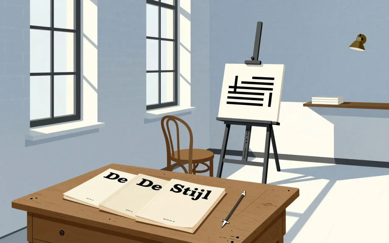
De Stijl is a publishing project that became a movement by enforcing absence. Its power lies in how precisely it names what it excludes — and how visibly it abandons those exclusions later.

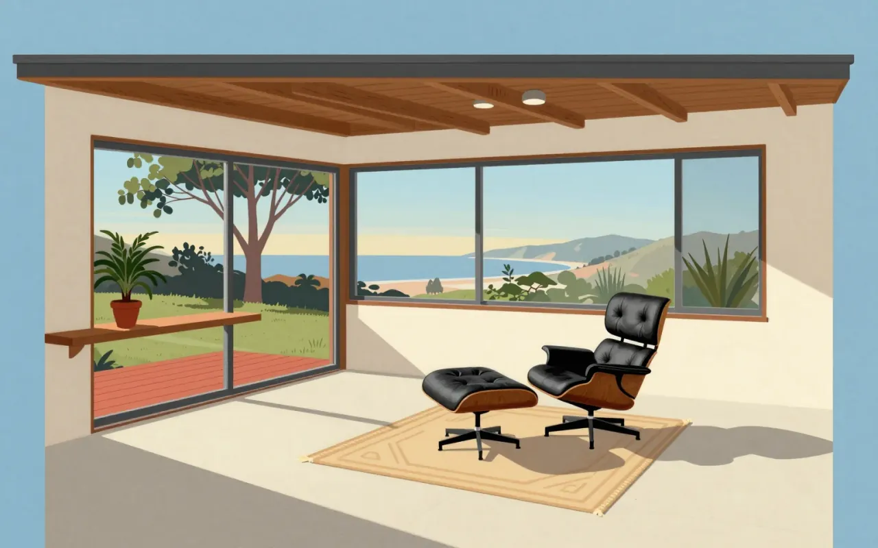
A high-end lounge chair and ottoman introduced in 1956 by Herman Miller, designed by Charles and Ray Eames, composed of three veneered molded plywood shells and leather-upholstered cushioning.

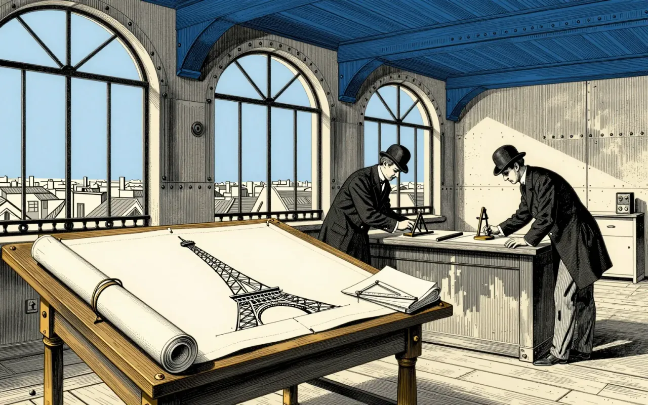
The Eiffel Tower is a feat of delegated authorship, procedural manipulation, and industrial discipline — not solitary genius.
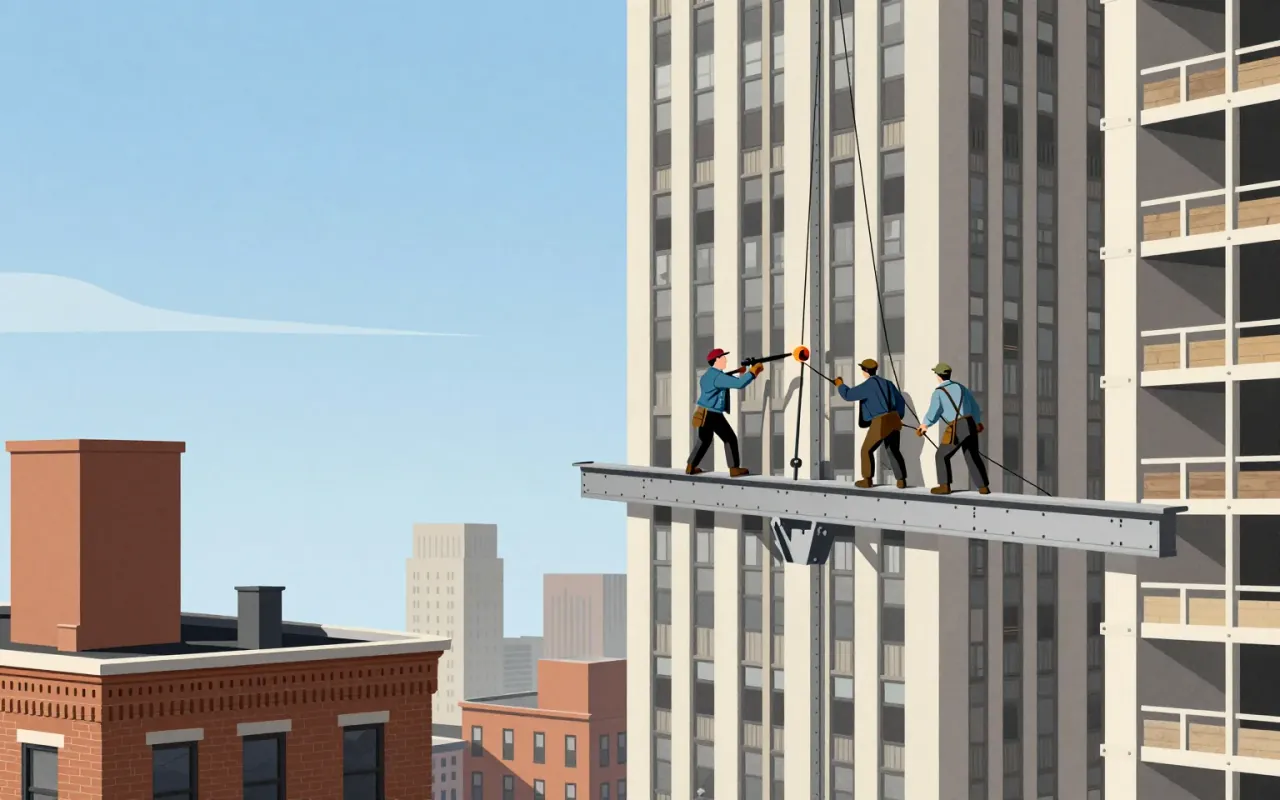
The Empire State Building is a 102-storey Art Deco skyscraper in New York City. It was the first building over 100 stories tall. It held the title of world’s tallest building from 1931 until 1970.

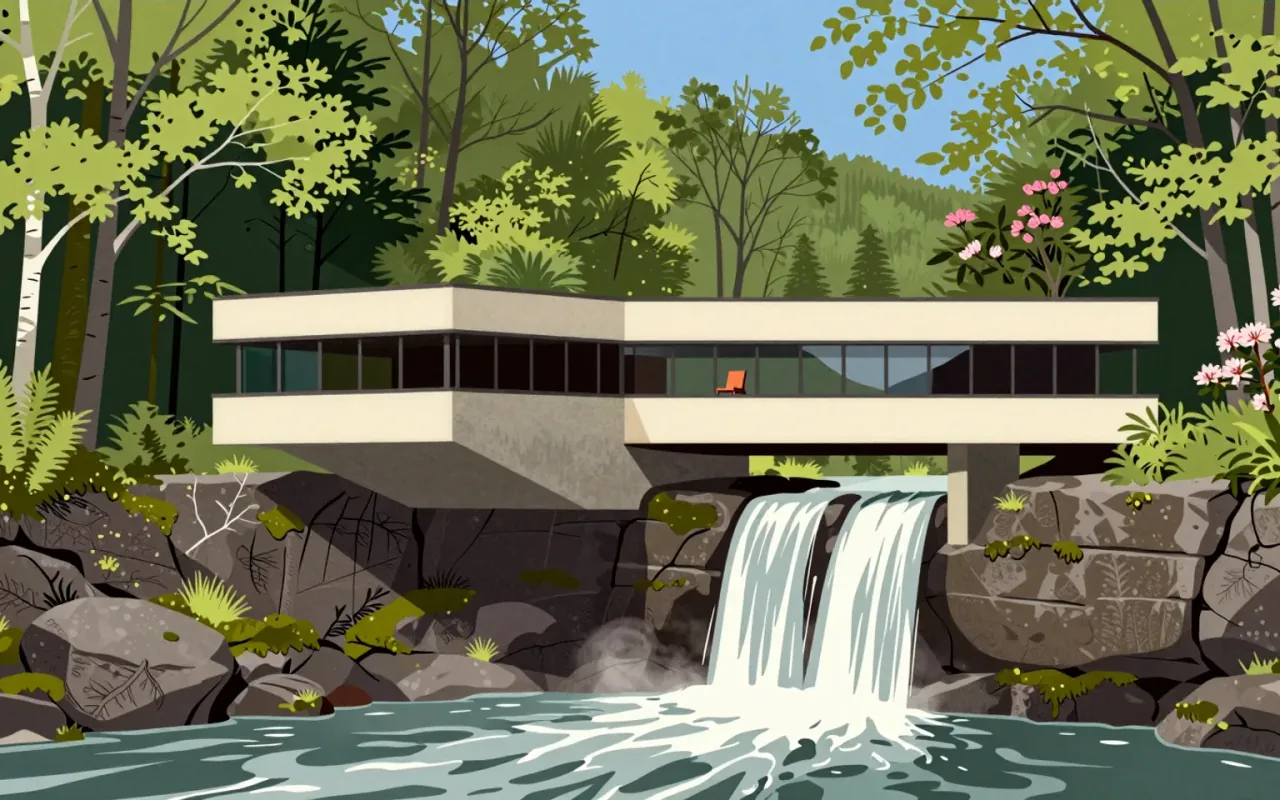
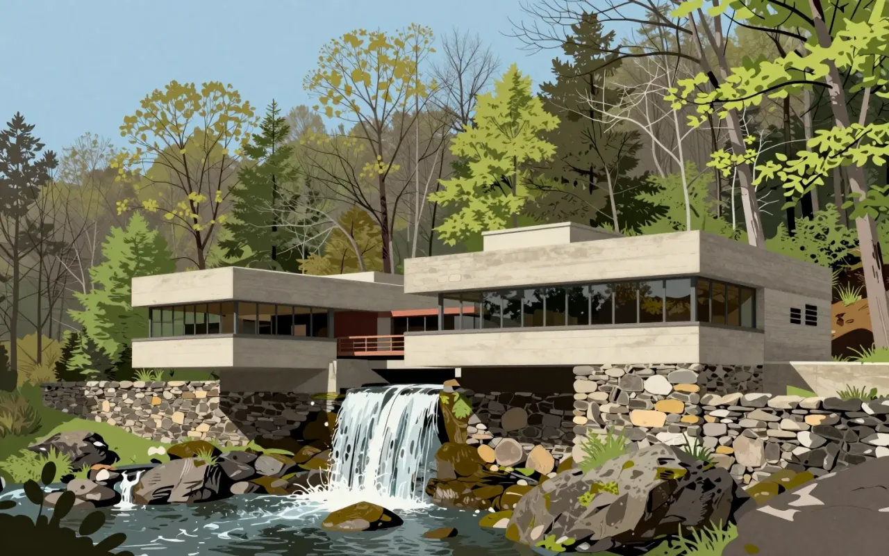
Fallingwater is a weekend retreat built over a 20-foot waterfall on Bear Run in Stewart Township, southwestern Pennsylvania. Designed by Frank Lloyd Wright for Edgar J. Kaufmann Sr. and Liliane Kaufmann, it uses exposed cantilevers, sandstone verticals, and concrete horizontals. Its 30° counterclockwise orientation ensures natural light in all rooms. Wright insisted occupants live *with* the waterfall — not look at it — using identical materials inside and out to dissolve boundaries. Trees were preserved via adaptive detailing. The design was judged unsound by Kaufmann’s engineers; the contractor secretly reinforced concrete elements. Structural vulnerabilities confirmed in 1994 led to steel supports and post-tensioning by 2002. At $155,000, it was one of Wright’s most expensive commissions.
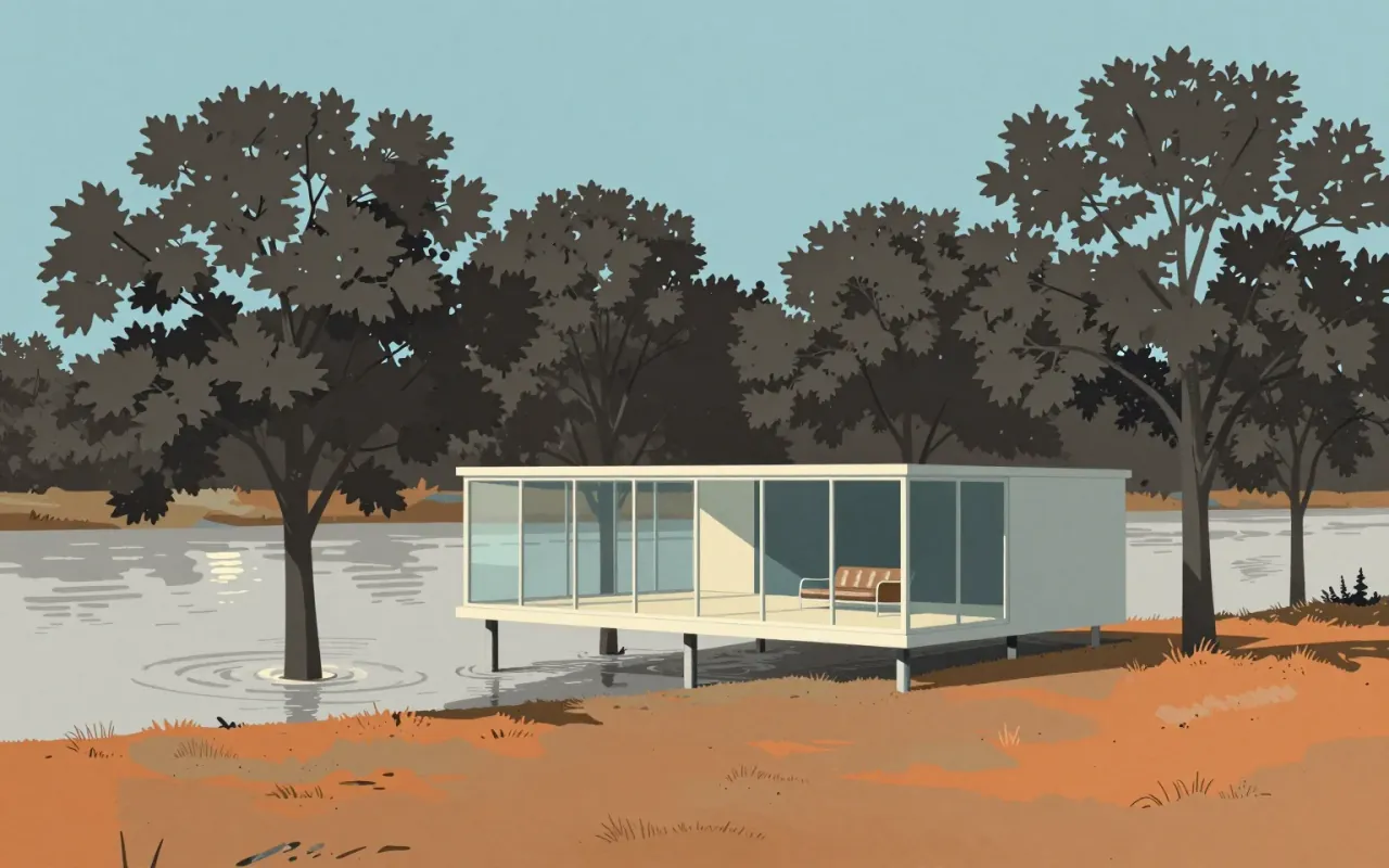
The Farnsworth House is a radical distillation of architectural intent: a frame, a slab, and glass — nothing more. It answers a site constraint (flooding) with elevation, then uses that elevation to advance a philosophy: shelter as transparency, not enclosure. It works as an idea. It fails as a home. Its influence is structural and rhetorical — not technical, not ergonomic, not climatic.

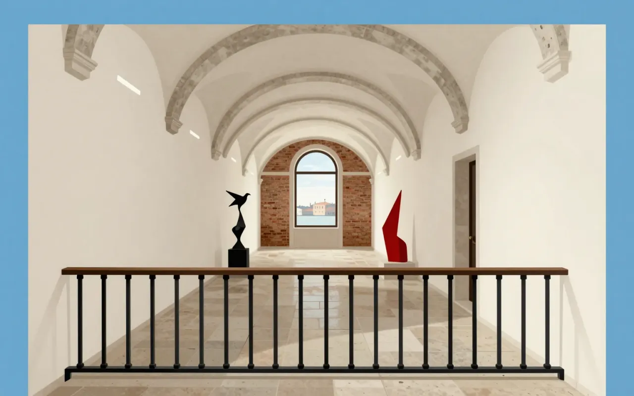
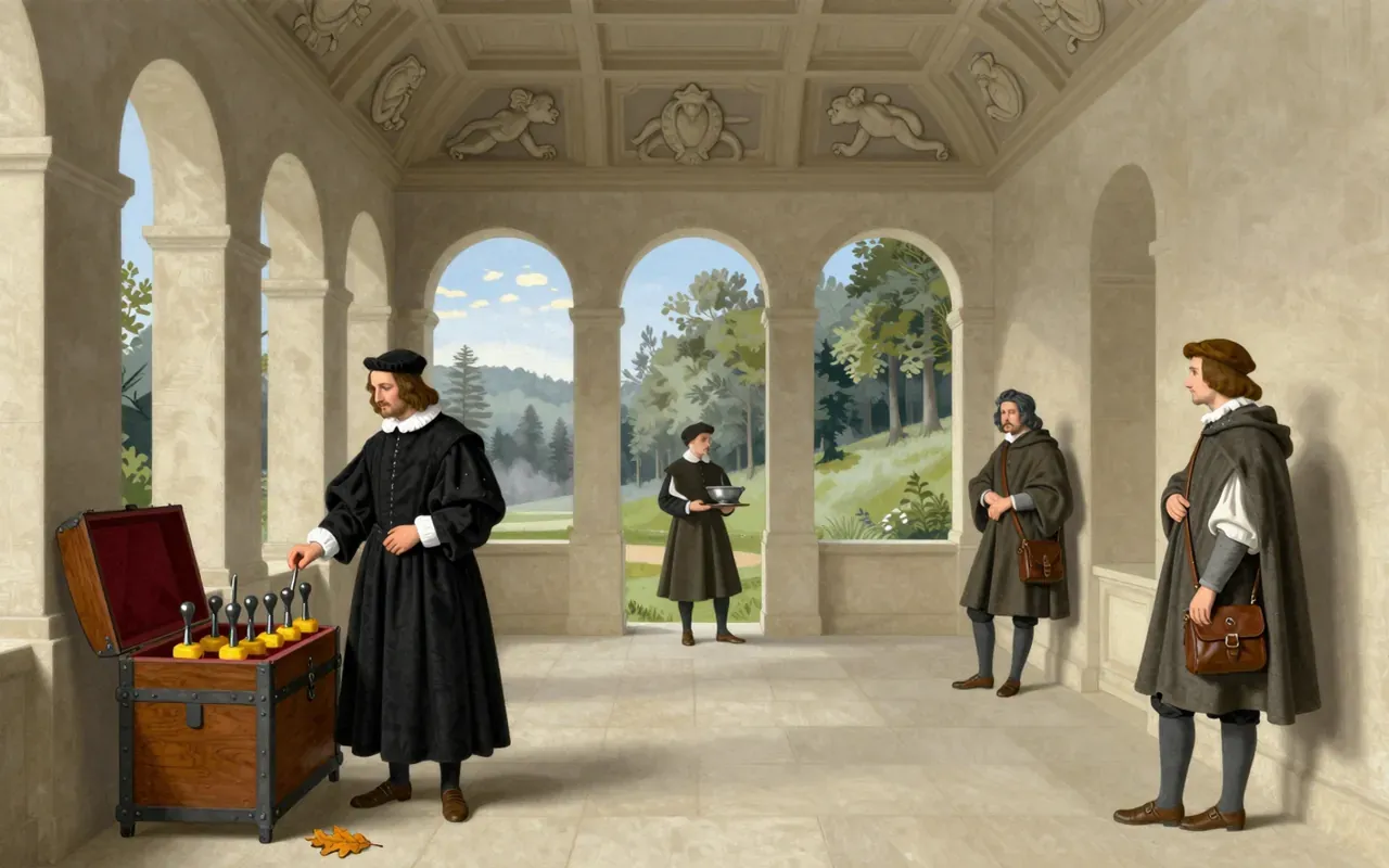
Garamond is a group of 34 metal typefaces cut by Claude Garamond (Garamont) in sixteenth-century Paris. They follow Griffo’s 1495 design, belong to the old-style serif category, and were made by hand-engraved punches used to stamp matrices for casting type. The Grecs du roi Greek typeface replicates Angelo Vergecio’s handwriting using an unusually large number of alternates and ligatures. Swash forms exist only in the parangonne. Small capitals appear in all preserved types except the gros-canon. Garamond’s independence as a punchcutter helped define typefounding as a distinct commercial industry.

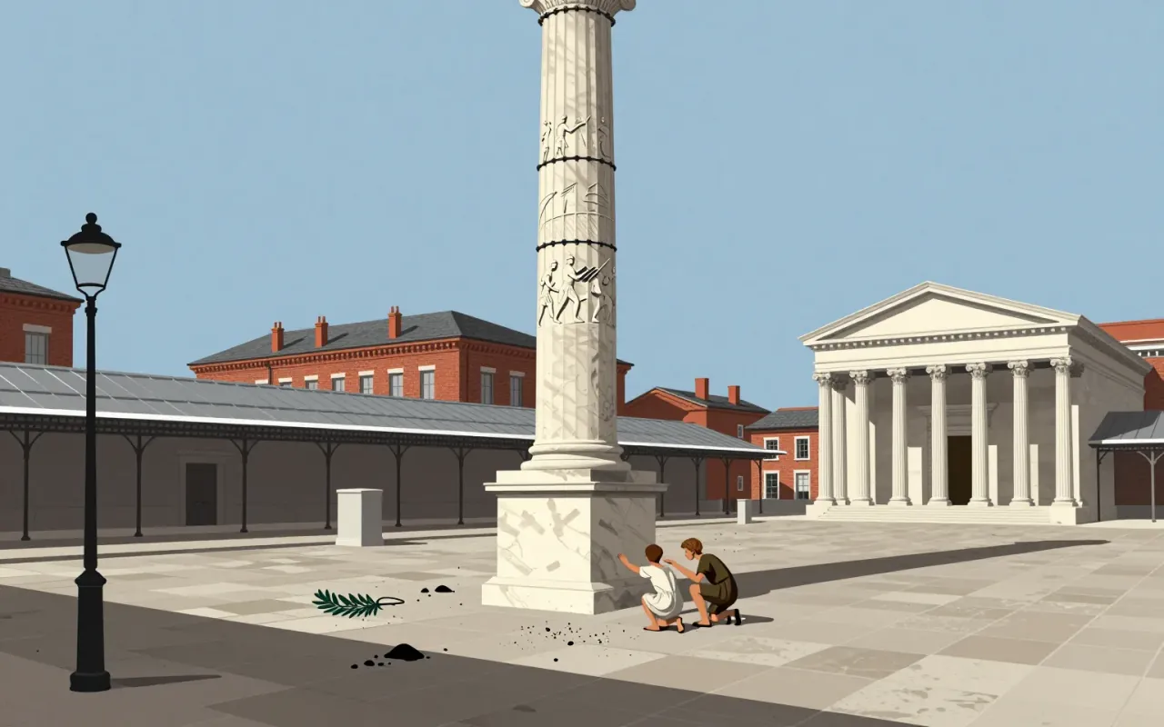
Gill Sans is a humanist sans-serif typeface designed by Eric Gill and released by Monotype in 1928, based on Edward Johnston's 1916 Underground Alphabet and Roman inscriptions, with lowercase forms derived from old-style serifs and uppercase proportions drawn from Trajan’s Column.
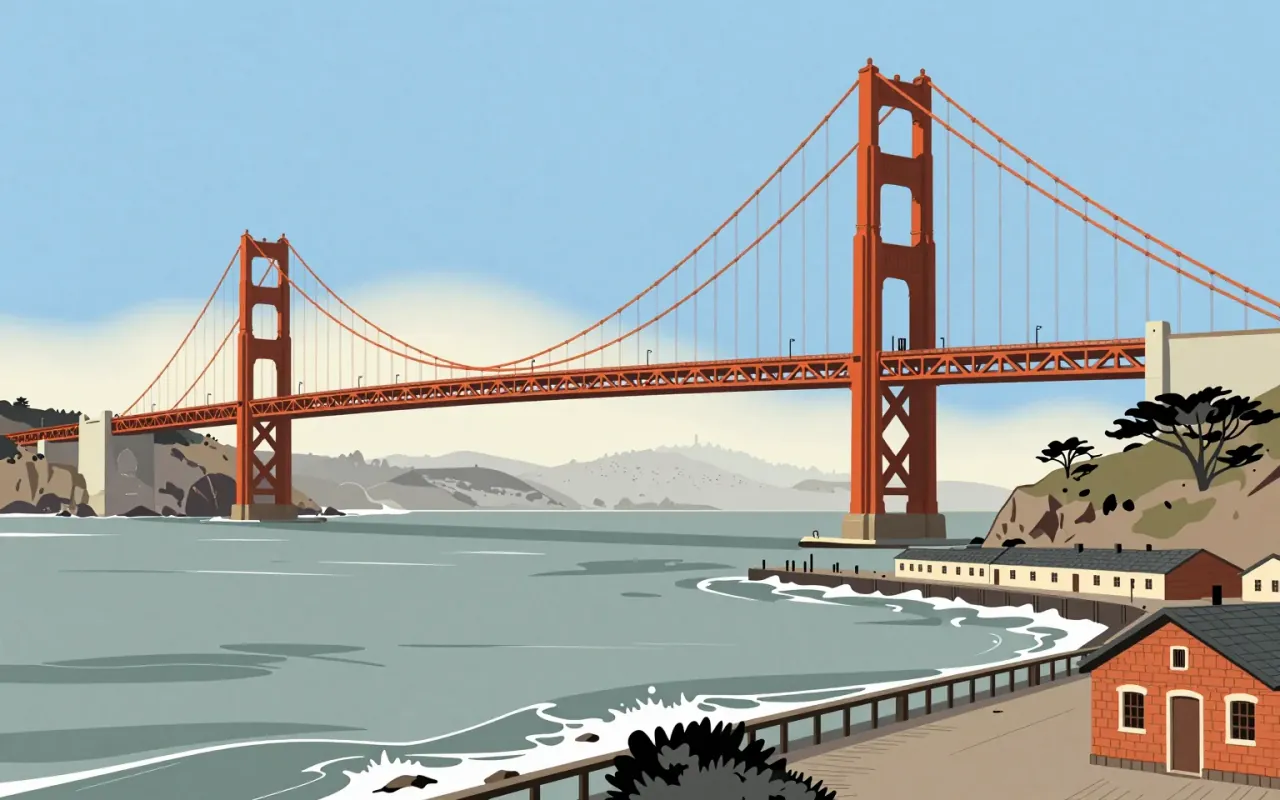
The Golden Gate Bridge is a suspension bridge completed in 1937. Joseph Strauss served as chief engineer, but the suspension design came from Leon Moisseiff. Charles Ellis resolved site-specific structural conflicts. Strauss introduced movable safety netting. No verified claim attributes aesthetic, metallurgical, or wind-theory innovation to Strauss.

Helvetica is a deliberately constrained sans-serif, made to erase voice — not to express it.
IBM Plex is a corporate typeface designed to replace Helvetica across IBM’s global communications. Its rationale is financial and ideological: open-source licensing eliminates licence fees; typographic decisions reject expressive or historical categories in favour of functional clarity. It delivers a coherent, documented system — but only within the narrow frame of IBM’s internal brand requirements.
The iMac G3 is not a nostalgic icon — it is a tightly constrained industrial design response to market irrelevance, manufacturing pressure, and strategic reset. Its decisions were specific, costly, and reversible. Its influence is factual, not mythical.
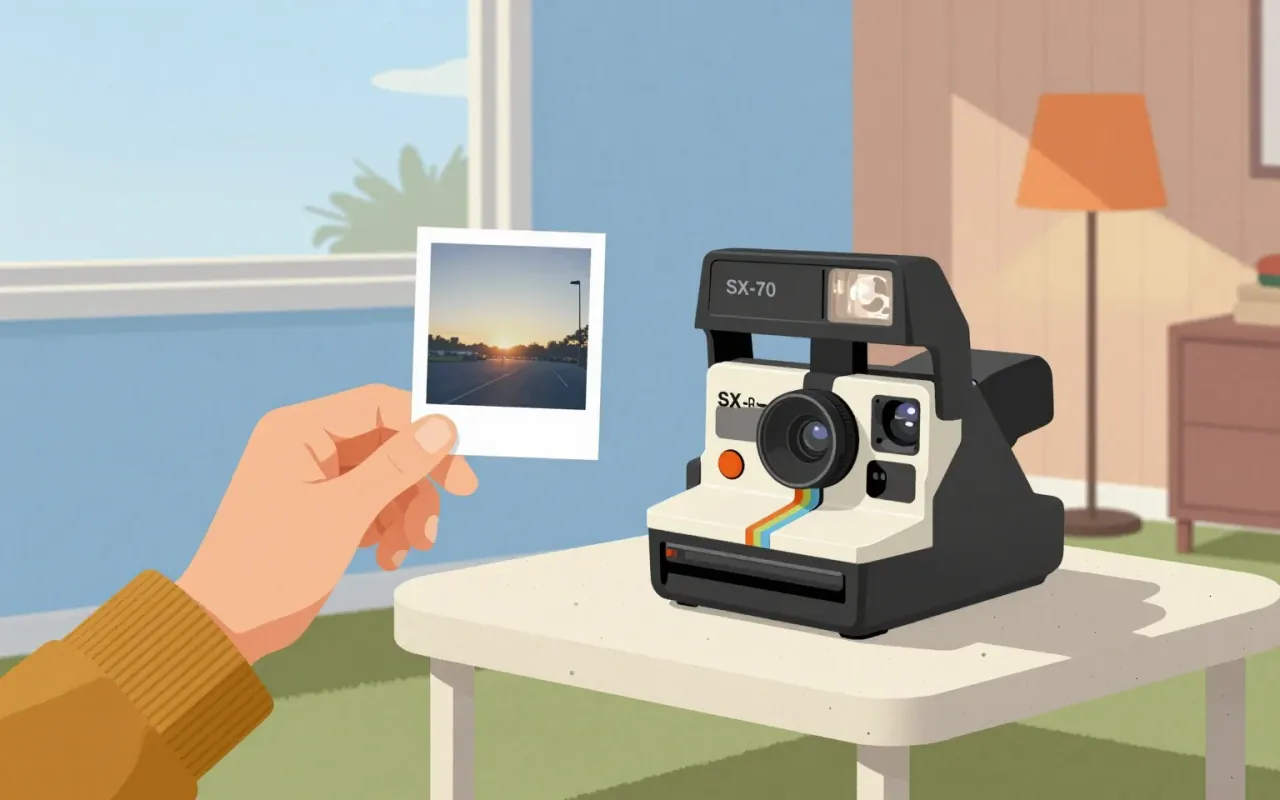
The SX-70 and model 95 Land Camera are industrial design decisions that replaced photographic process with photographic moment. They achieved seamlessness by embedding chemistry, timing, and ejection into hardware — not software, not service, not instruction. No claim is made about aesthetics, mass production, or longevity. Only this: they moved development from darkroom to device, and from ritual to reflex.
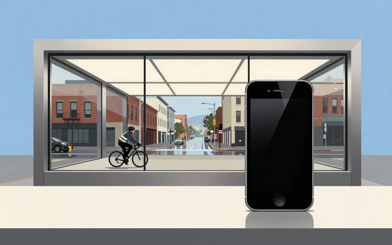
The iPhone is a pivotal industrial design and interface product defined by its introduction of multi-touch, its establishment of iOS as a global platform, and its role in standardising the slate form factor and launching the app economy. Jony Ive played a vital role in its design. No material, dimension, year of release, manufacturing method, or functional limitation is stated in the sources beyond those verified claims.
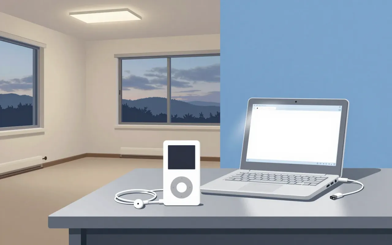
The iPod is a landmark industrial design object whose longevity and scale emerged from disciplined constraint-handling — not originality of form or interaction. Its lineage, licensing, and timing are better documented than its materials or mechanics. It belongs in industrial design history not as a breakthrough, but as a benchmark for execution under real-world limits.