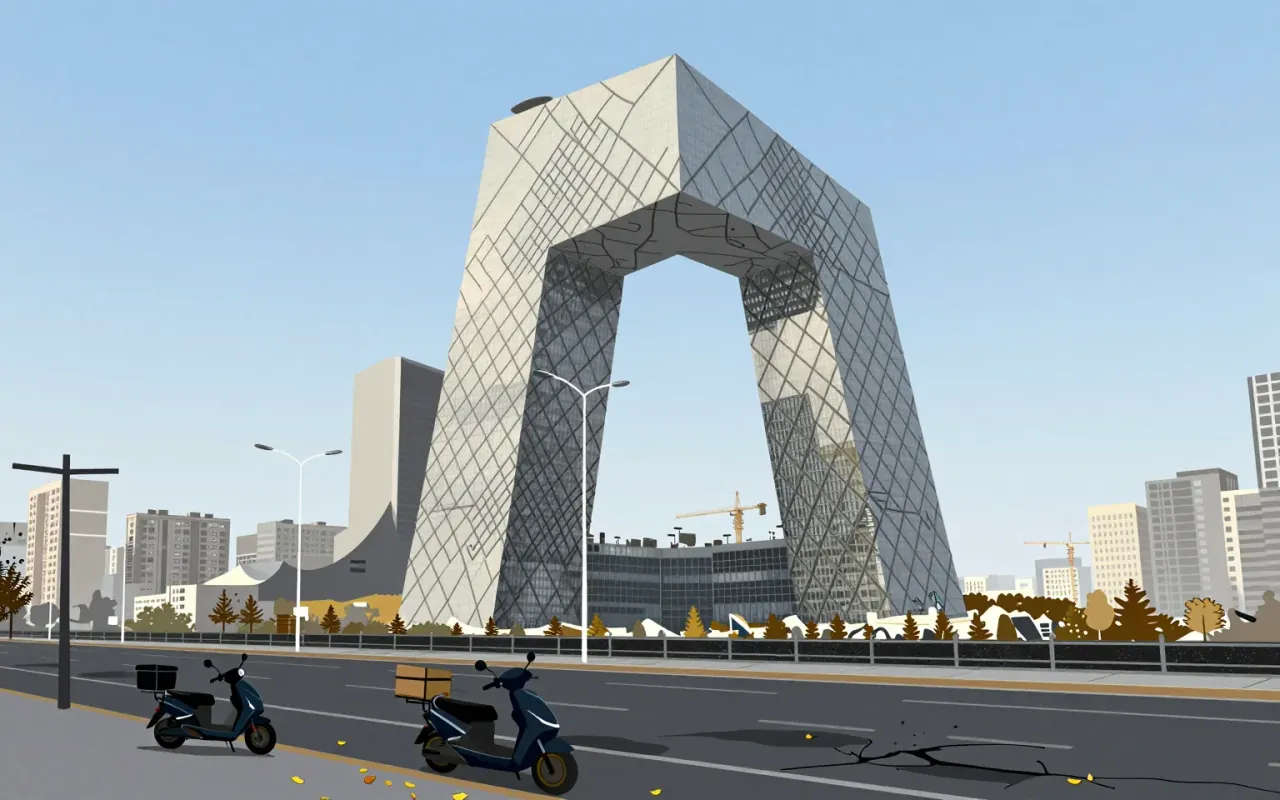
CCTV Headquarters
A skyscraper that refuses to stand up straight — and proves it doesn’t have to.

The Wassily chair is the first successful application of bent tubular steel as primary structure in furniture. Its material logic — steel for skeleton, Eisengarn for tensioned skin — replaced joinery with engineering. It was made possible by Mannesmann tubing, Reichardt’s textile work, and Thonet’s manufacturing capacity — not by theory alone. It is not about expression. It is about what happens when you treat furniture as a system of forces.
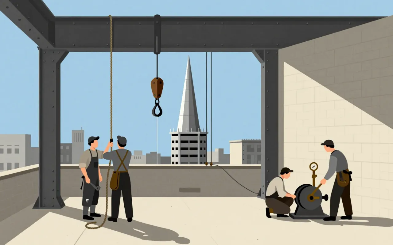
The Chrysler Building is a 1,046-foot-tall steel-framed brick skyscraper in New York City, designed by William Van Alen in the Art Deco style and completed in 1930. Van Alen used Nirosta stainless steel—the first such use in an American project—as an integral design element. He secretly built a 125-foot spire inside the frame and assembled it in 90 minutes on October 23, 1929. The building served as a real-world test site for stainless steel durability, with formal inspections every five years from 1929 to 1960. It became the world’s tallest building for 11 months and remains the tallest steel-framed brick building in the world. Critics responded with mixed reactions—including praise for Van Alen personally and criticism of the building as superficial and lacking serious design significance.

The Moka Express is a functional industrial object defined by constraint: it delivers espresso-style coffee without electricity, pumps, or bar pressure. Its success lies in aluminium’s lightness and manufacturability, its vertical stack’s thermodynamic inevitability, and its tolerance for user inconsistency. Its flaw — the strombolian phase — is inseparable from its mechanism. It is influential not because it is perfect, but because it is sufficient.

Trinitron is a CRT display technology defined by its single-gun three-cathode electron gun and vertically aligned steel aperture grille. It improved image sharpness by reducing beam obstruction and simplifying focus. Its patent ran until 1996. It launched as a branded line in 1968, powered televisions and monitors until 2005–2007, and marked the end of Sony’s analog display era.
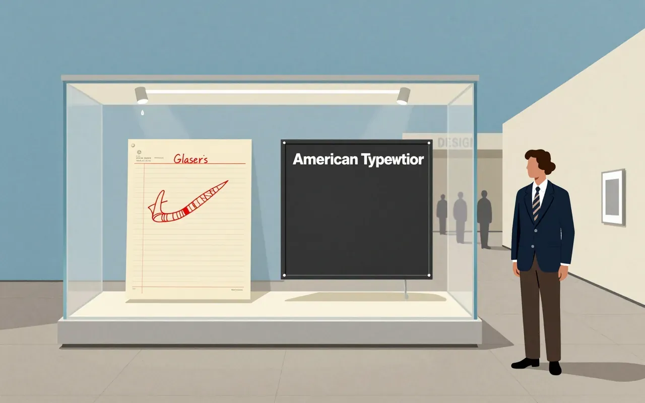
A graphic design brief must account for what is materially present—not reputation, not legacy, not what it ‘feels like’. This logo is three glyphs, one typeface, one colour, made in a taxi, given away, preserved in a museum, and later reactivated by trauma. Its power lies in what it omits: no skyline, no people, no narrative, no explanation.

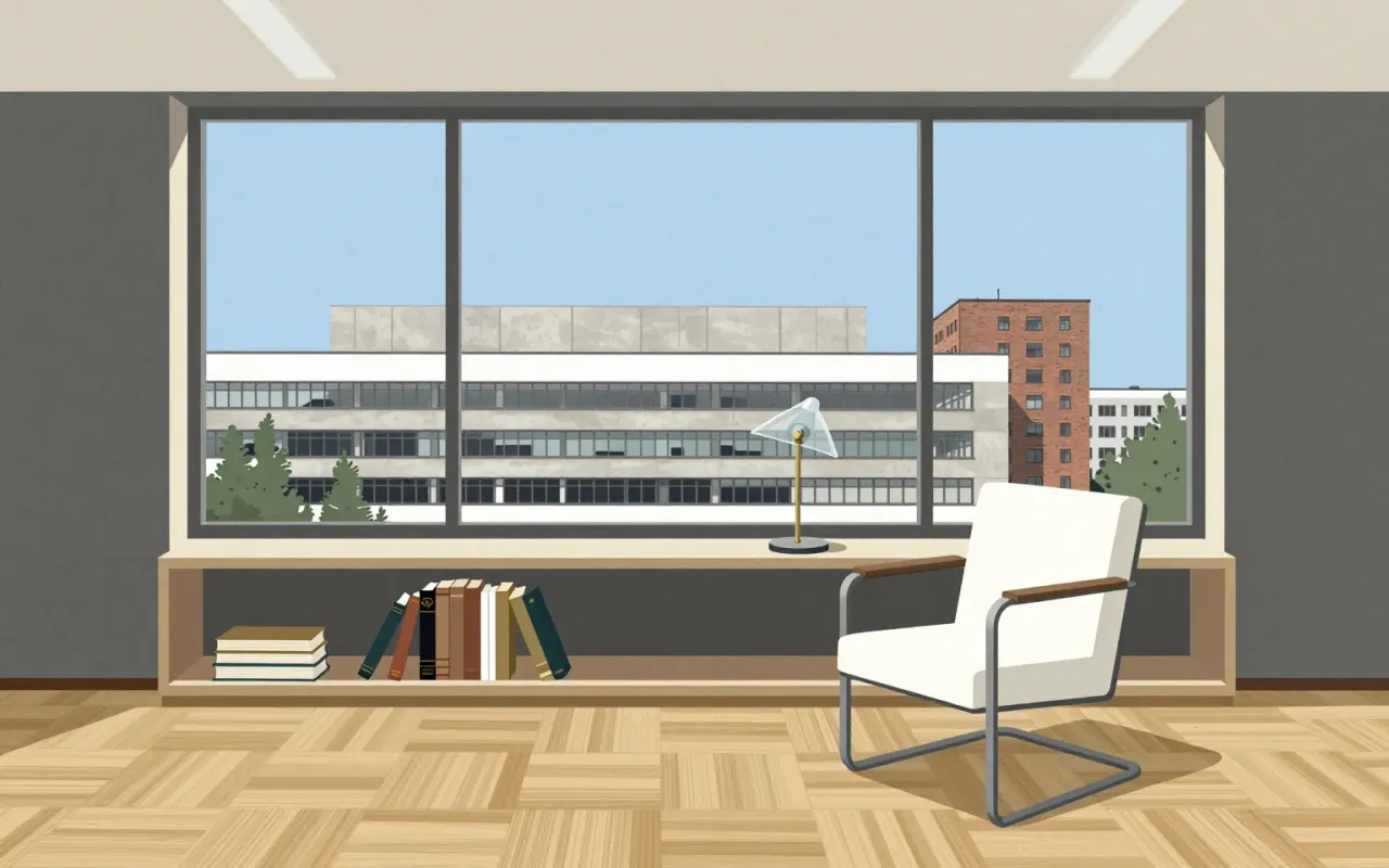
The Bauhaus was a German art school (1919–1933) founded by Walter Gropius in Weimar. It combined crafts and fine arts through an experimental, theory-led pedagogy centred on the Vorkurs. Its aim was to unify artistic vision with mass production, functionality, and industrial collaboration — producing functional, cheap, industrially viable objects like the F51 armchair (1920), Sommerfeld House (1920), and Gropius’s 1923 door handles. Its internal tensions — between expressionism and New Objectivity, craft and industry — were structural, not resolved. It established the principle that aesthetic quality must extend to every home via well-designed, industrially produced objects.
IBM Plex is a corporate typeface designed to replace Helvetica across IBM’s global communications. Its rationale is financial and ideological: open-source licensing eliminates licence fees; typographic decisions reject expressive or historical categories in favour of functional clarity. It delivers a coherent, documented system — but only within the narrow frame of IBM’s internal brand requirements.

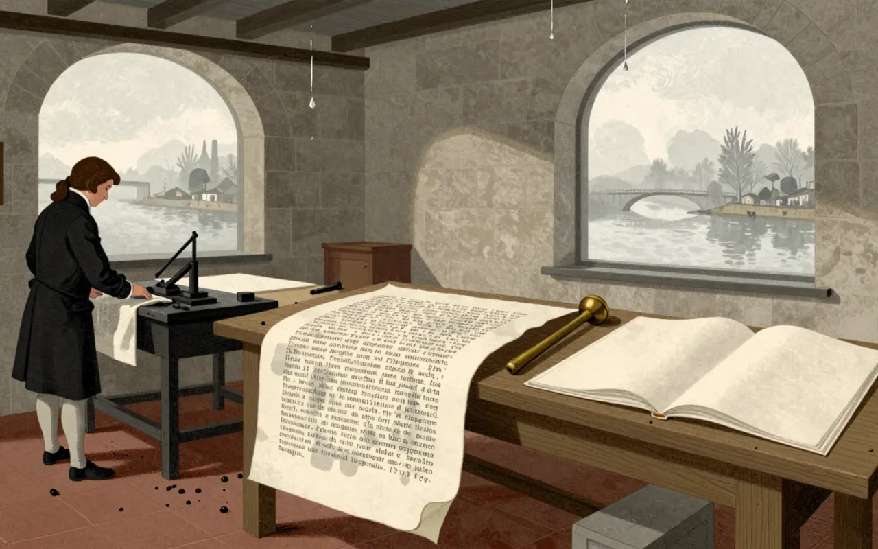
Bodoni is a late-eighteenth-century type system defined by extreme stroke contrast, flat unbracketed serifs, geometric construction, and rational structure. It was made possible by Bodoni’s technical mastery in cutting fine hairlines across many sizes—and by his aesthetic commitment to plainness and material purity. It works where size, paper, and ink support its optical demands: the 1808 Iliad and 1806 Oratio Dominica prove its fidelity and ambition. It fails where those conditions collapse: at small sizes, hairlines vanish and alternating strokes cause dazzle. It influenced all subsequent Didone typography—not as a timeless ideal, but as a precise, constrained, and unforgiving system. It is worth your time if you treat legibility as a condition, not a guarantee.

Roboto is a functional, open, and pervasive sans-serif typeface family designed by Christian Robertson for Google in 2011. It succeeded by solving a narrow problem well — legibility on early Android screens — then scaled through permissive licensing and platform integration.
The Memphis Group was a short-lived but decisive intervention: a collective rejection of Modernist austerity, built on accessible materials, shared drawing, and irreverent references. Its durability lies not in longevity but in how precisely it named the limits of ‘good taste’ — then stepped past them.

Caslon is the first English type system engineered for optical legibility in print, not screen.
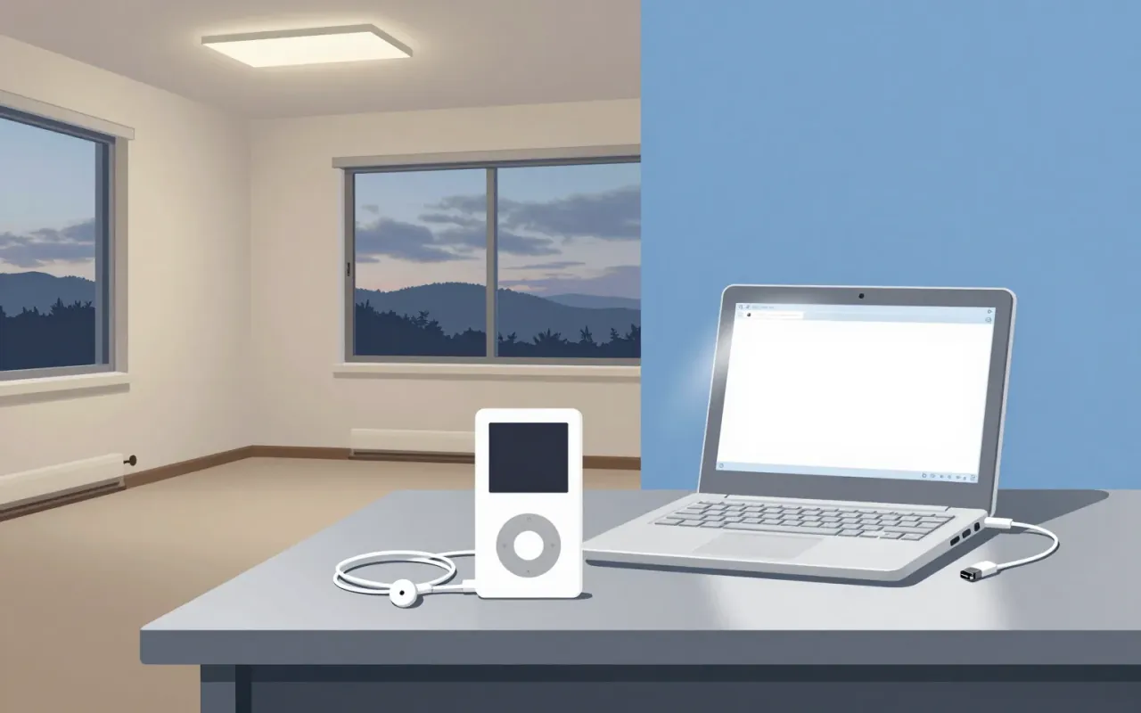
The iPod is a landmark industrial design object whose longevity and scale emerged from disciplined constraint-handling — not originality of form or interaction. Its lineage, licensing, and timing are better documented than its materials or mechanics. It belongs in industrial design history not as a breakthrough, but as a benchmark for execution under real-world limits.

Trebuchet MS is a functional, context-bound typeface — defined by its distribution, its contrast with Verdana, and its role in Windows XP. Its influence lies in reach, not revision.
Interstate is a functional, legibility-first typeface built for versatility — not nostalgia. Its strength lies in disciplined departure from its source: the 1949 FHWA alphabets. It trades strict fidelity for readability in new contexts — but pays for that with constraints in text density. It is a defining typeface of its era not because it is novel, but because it answers a clear constraint: how to make road signage work on a magazine cover, a website headline, and a network logo — all without breaking.

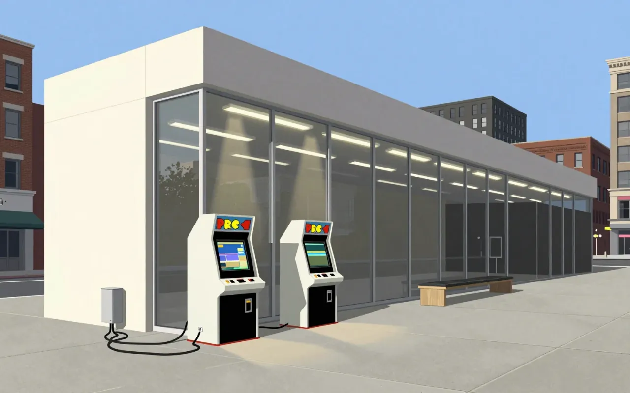
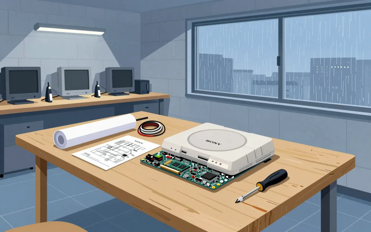
The PlayStation’s significance lies in its developer-centric architecture—not its industrial design. Teiyu Goto is not referenced in any verified source. The brief treats the console as a software platform first, a physical object second—and only what is documented is stated.
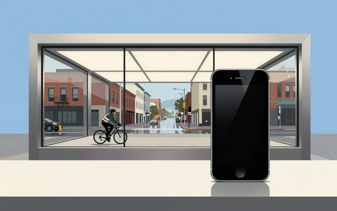
The iPhone is a pivotal industrial design and interface product defined by its introduction of multi-touch, its establishment of iOS as a global platform, and its role in standardising the slate form factor and launching the app economy. Jony Ive played a vital role in its design. No material, dimension, year of release, manufacturing method, or functional limitation is stated in the sources beyond those verified claims.
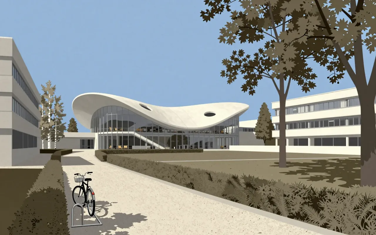

Rockefeller Center is not a building but a coordination protocol disguised as architecture.


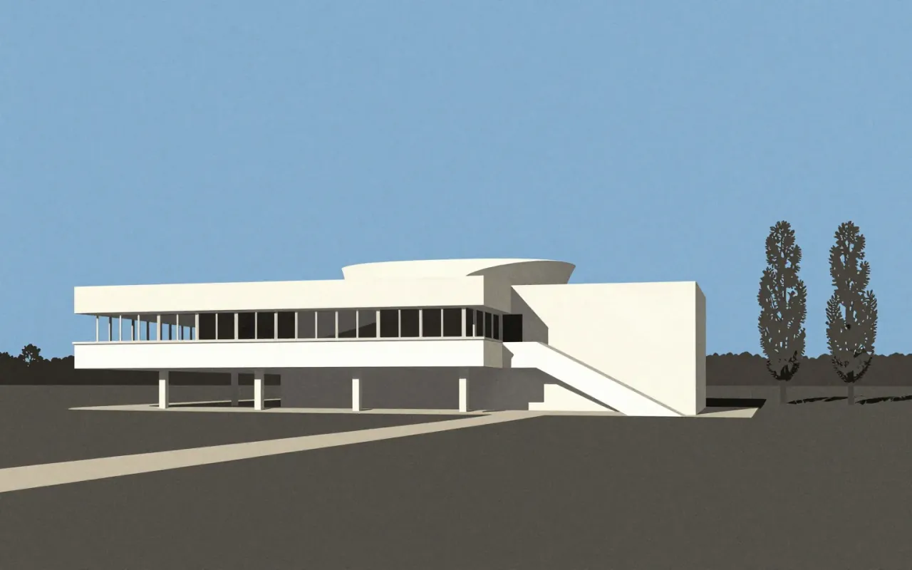
The Villa Savoye is the definitive built statement of Le Corbusier’s Five Points — executed with rare freedom, then adjusted under cost pressure. Its influence is verified; its compromises are documented. It is not timeless. It is specific, material, contested, and consequential.
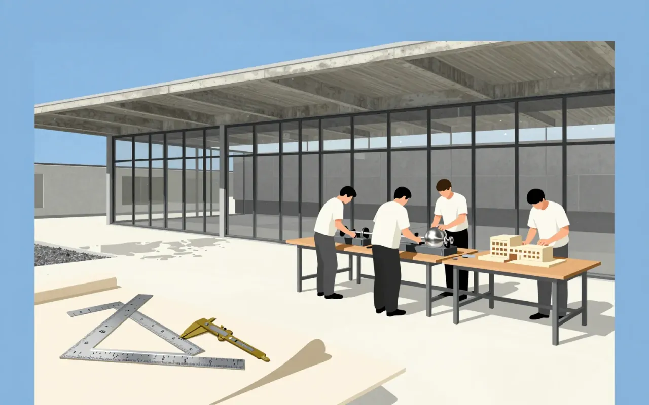

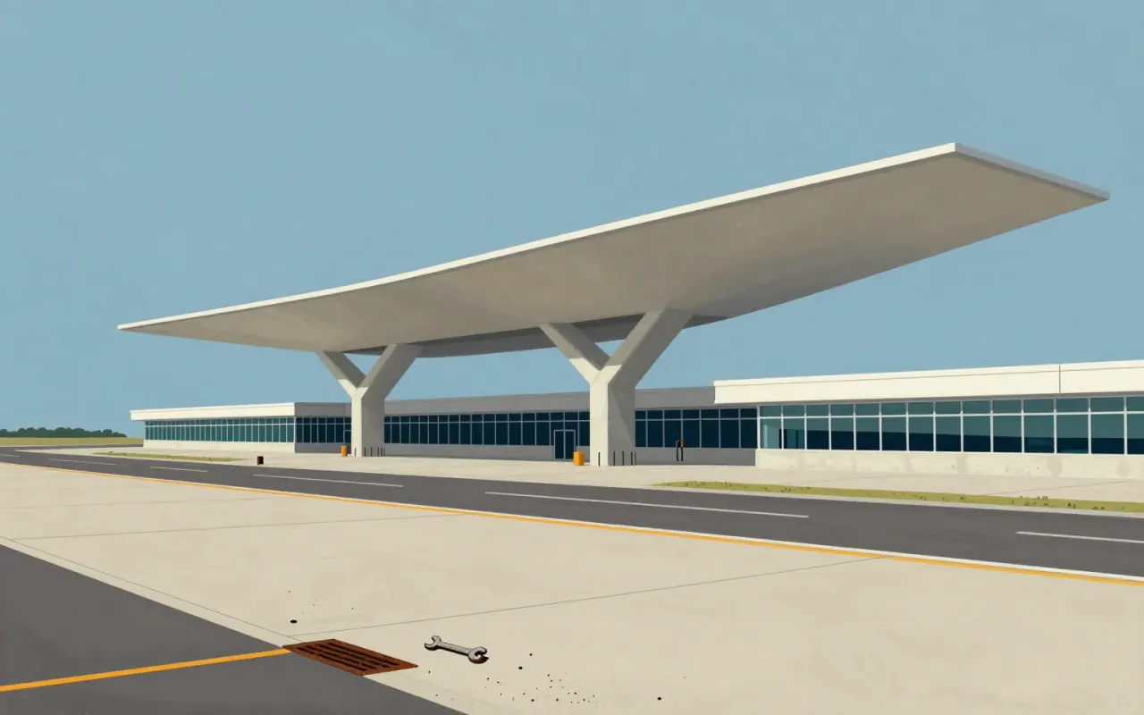
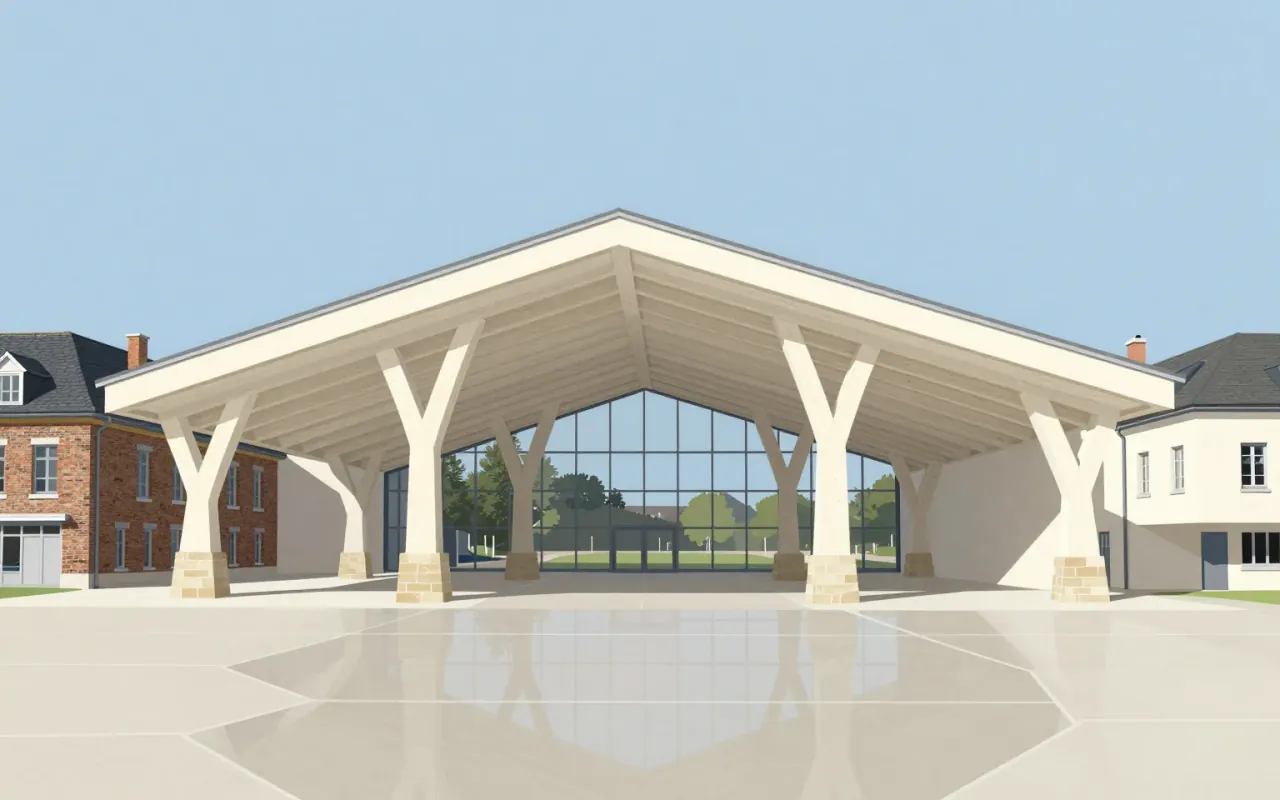
A terminal built for Trans World Airlines at JFK Airport in 1962. Designed by Eero Saarinen and Associates with Charles J. Parise. Its wing-shaped thin-shell concrete roof uses catenary curves and rests on four Y-shaped piers. Developed through physical modelling—not sketching—after empirical study of passenger movement. Adapted into the TWA Hotel in 2019, retaining Saarinen’s furniture.



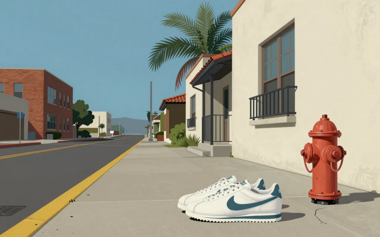
The Swoosh is a 1971 graphic design solution to a specific client request: motion, differentiation from Adidas, speed of execution. It succeeded not as an expression of personality or craft, but as a functional answer to a narrow constraint — and its longevity reveals more about brand consolidation than design innovation.
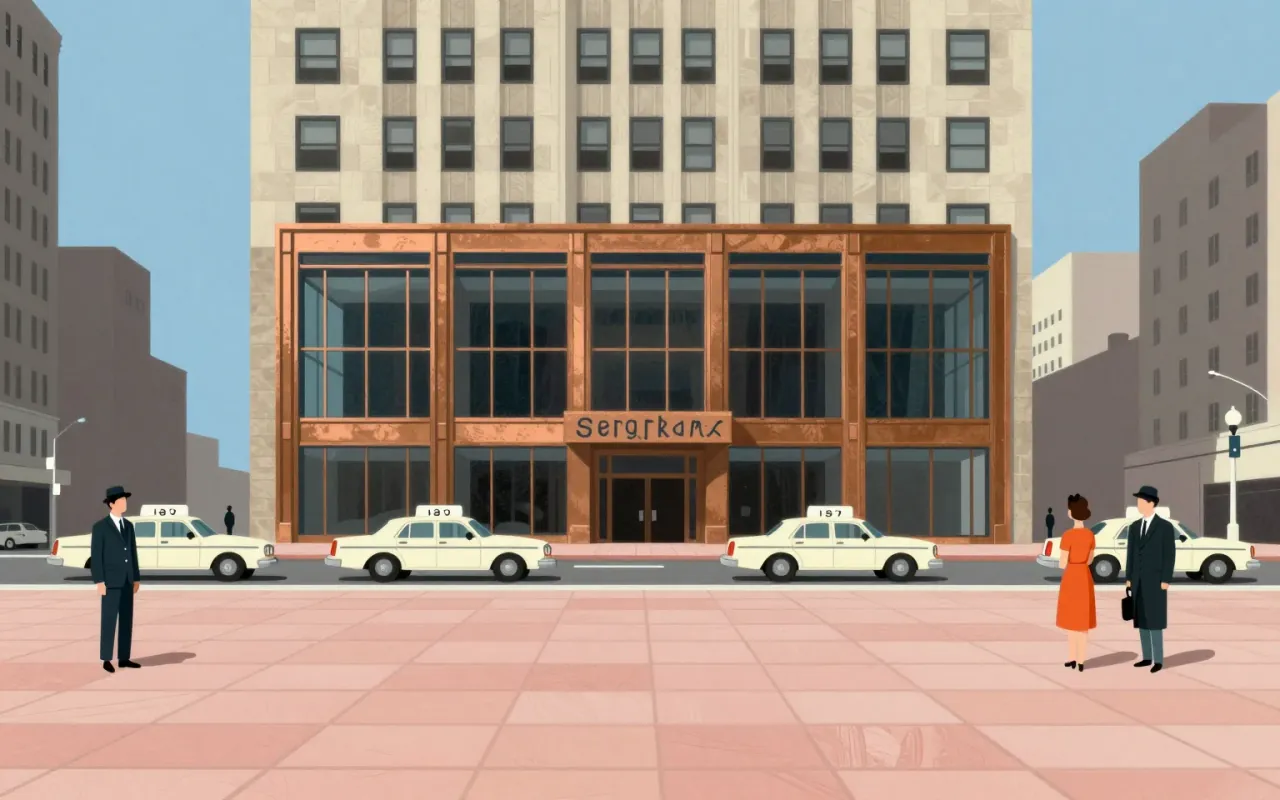
The Seagram Building is a methodologically rigorous application of International Style principles — sited, tested, and materialised with explicit constraints and innovations. Its influence is unverified. Its success lies in its documented departures: from structural facade integration, from NYC window conventions, and from untested corporate monumentality.

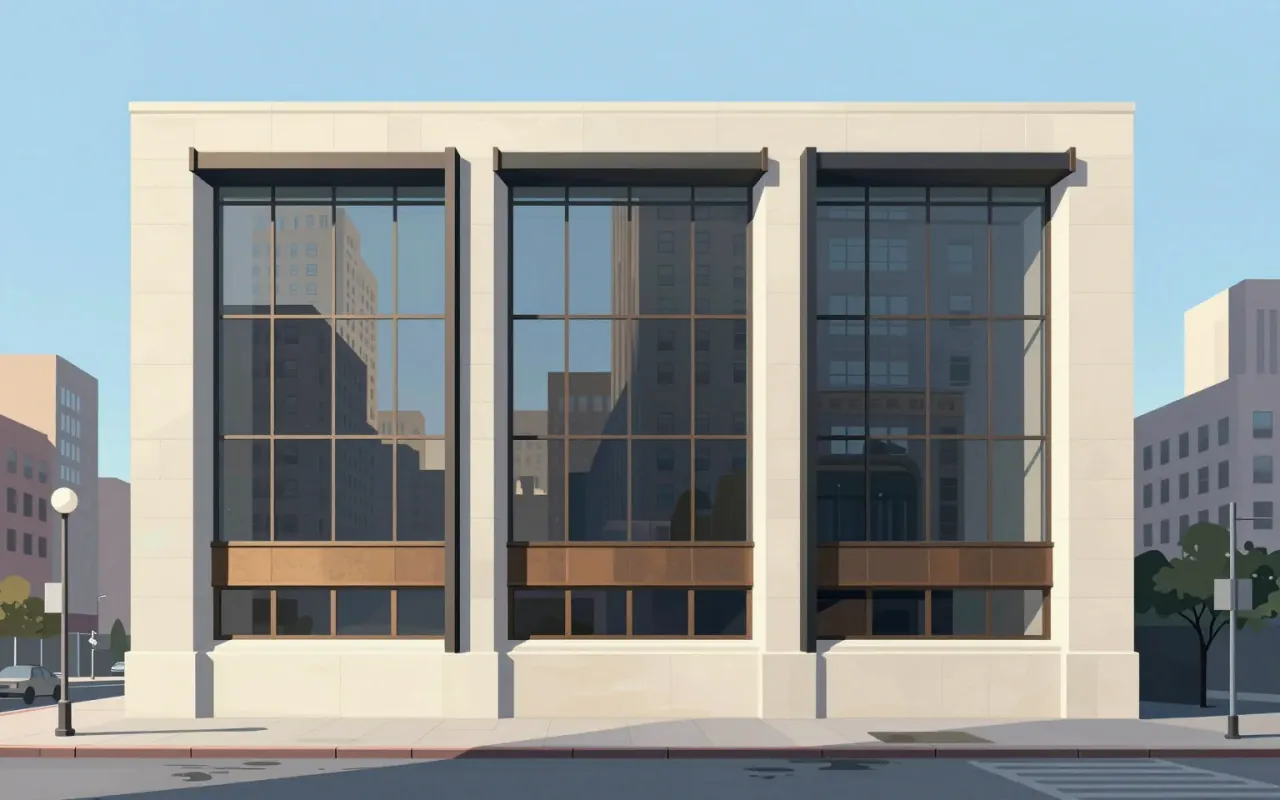


Helvetica is a deliberately constrained sans-serif, made to erase voice — not to express it.
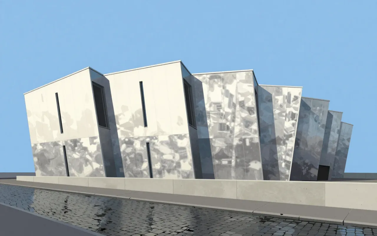


The iMac G3 is not a nostalgic icon — it is a tightly constrained industrial design response to market irrelevance, manufacturing pressure, and strategic reset. Its decisions were specific, costly, and reversible. Its influence is factual, not mythical.
Univers is a foundational typographic system — not a single face but a rigorously unified family. Its design decisions were driven by technical constraints (phototype + metal), conceptual ambition (a complete, logical family), and aesthetic rejection (of Futura’s geometry). It succeeded where others had only gestured: by delivering consistency, scalability, and clarity — all before a single character was cast or exposed.
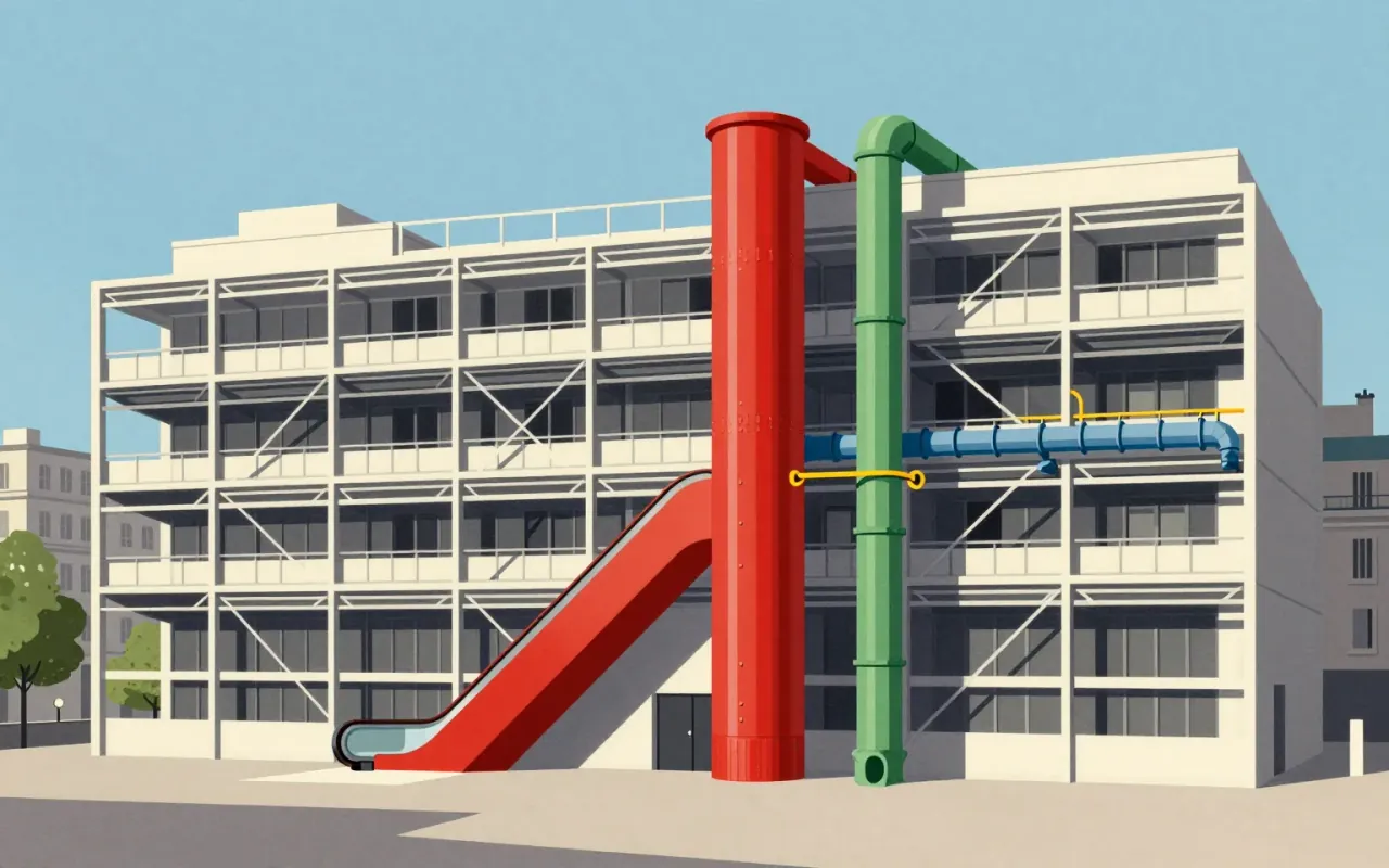
The Centre Pompidou is a 1977 building in Paris designed by Renzo Piano and Richard Rogers as a publicly accessible cultural 'town'. Its 'inside-out' strategy externalises and colour-codes structural, mechanical, and circulation systems. Green pipes carry water. Blue ducts manage climate. Yellow conduits house electricity. Red elements handle movement and safety. The design emerged from France’s first international architectural competition, judged by Niemeyer, Prouvé, and Johnson, and selected from 681 entries. It was intended for 8,000 daily visitors. In its first two decades, it attracted more than 145 million—over five times the projection. Its exposed systems improved interior space efficiency. Its stated aim was inclusivity: 'a place for all people – for the poor and rich, the young and old'.
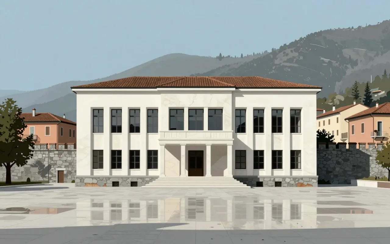
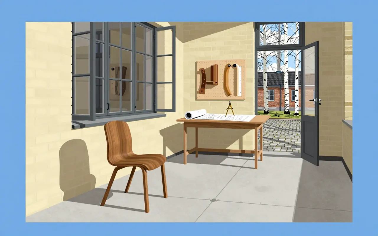

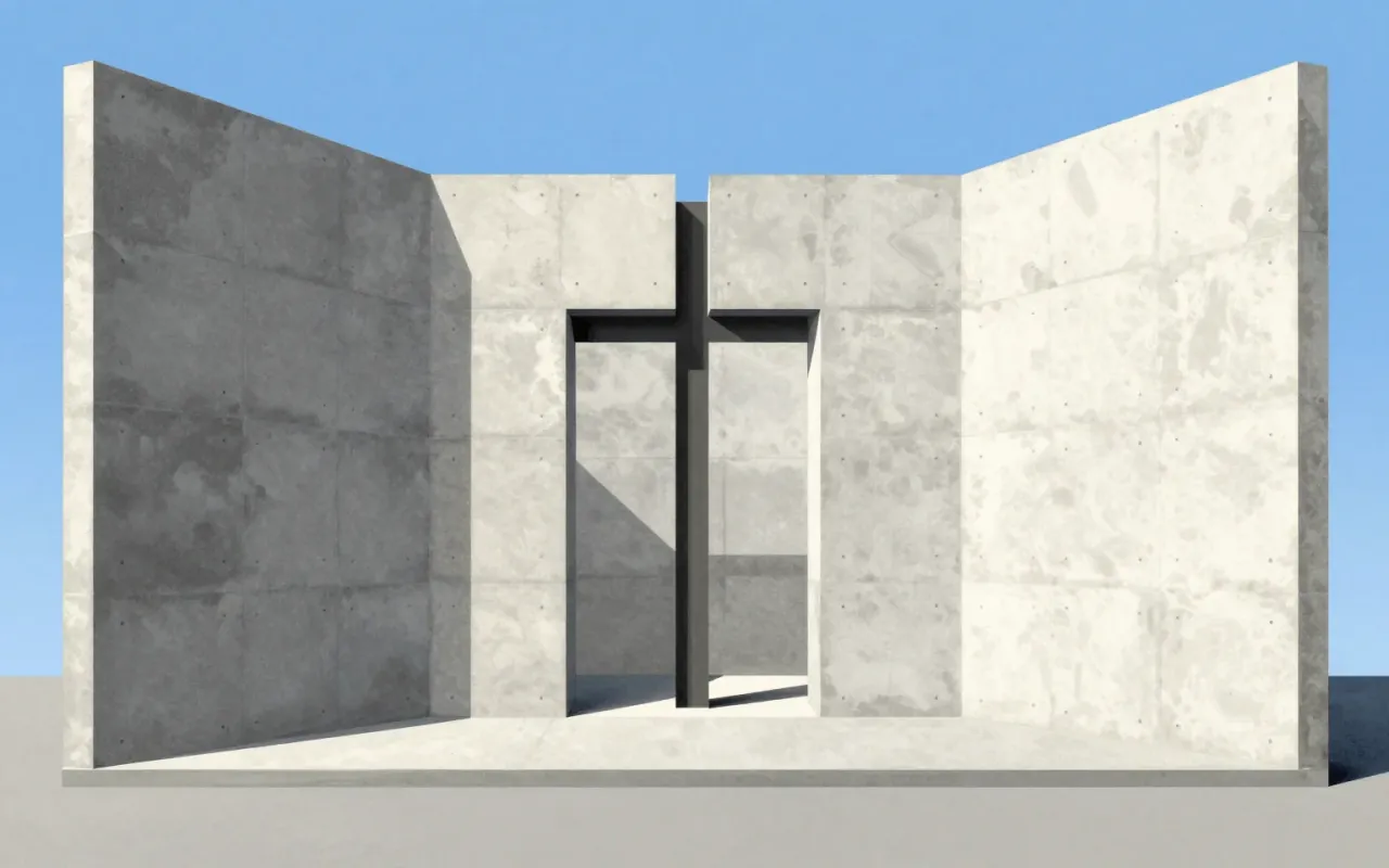
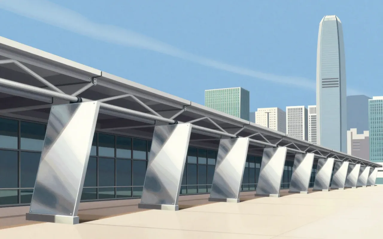
A suspended steel tower that replaced internal columns with external masts, prefabricated modules, and escalators—built at record cost to save a firm.
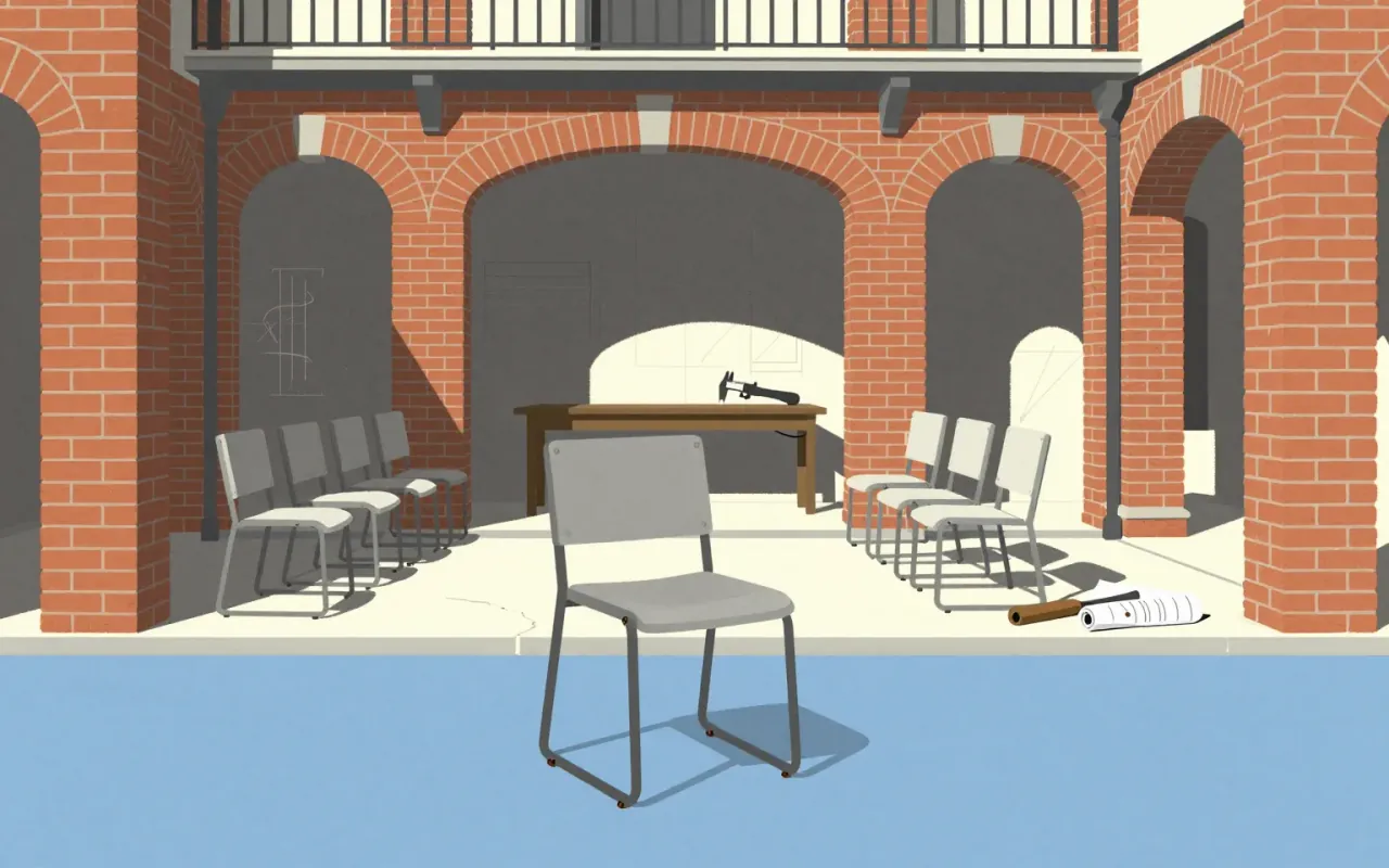
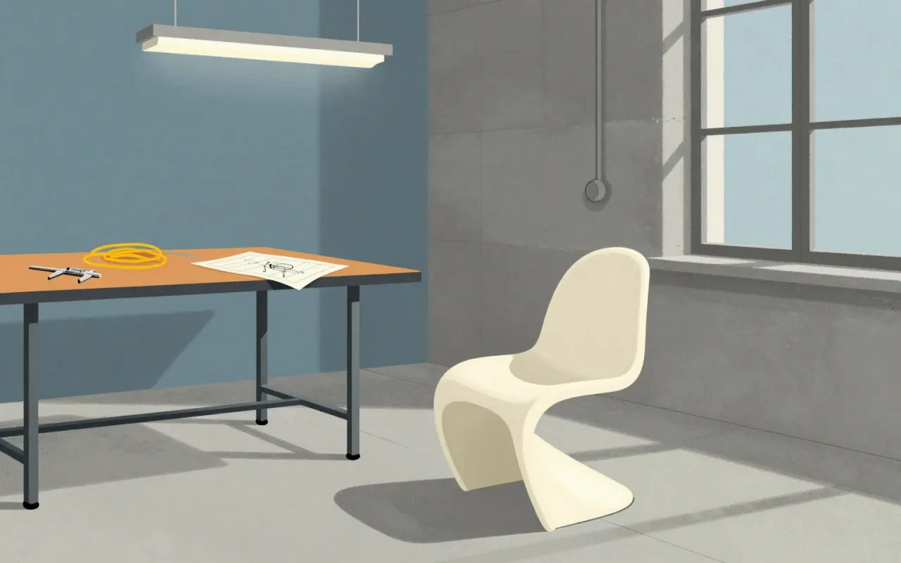
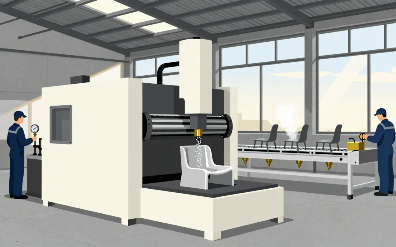
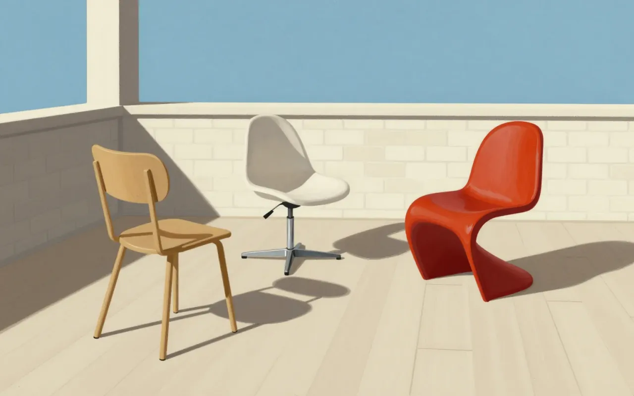
The Panton Chair is the world’s first single-piece moulded plastic chair — a continuous S-shaped shell with no legs, no joints, no assembly. Designed by Verner Panton in the 1960s, it emerged from iterative prototyping in plaster and fibreglass-reinforced polyester, then scaled via thermoplastic polystyrene injection moulding. Its success lies in resolving stackability, cantilever, and monolithic form — but its fixed geometry sacrifices adaptability and long-term durability. It proved plastic could carry structure and identity at scale, influencing decades of industrial seating. It is worth your time: not as a relic, but as a decisive answer to a tight set of material and manufacturing constraints.

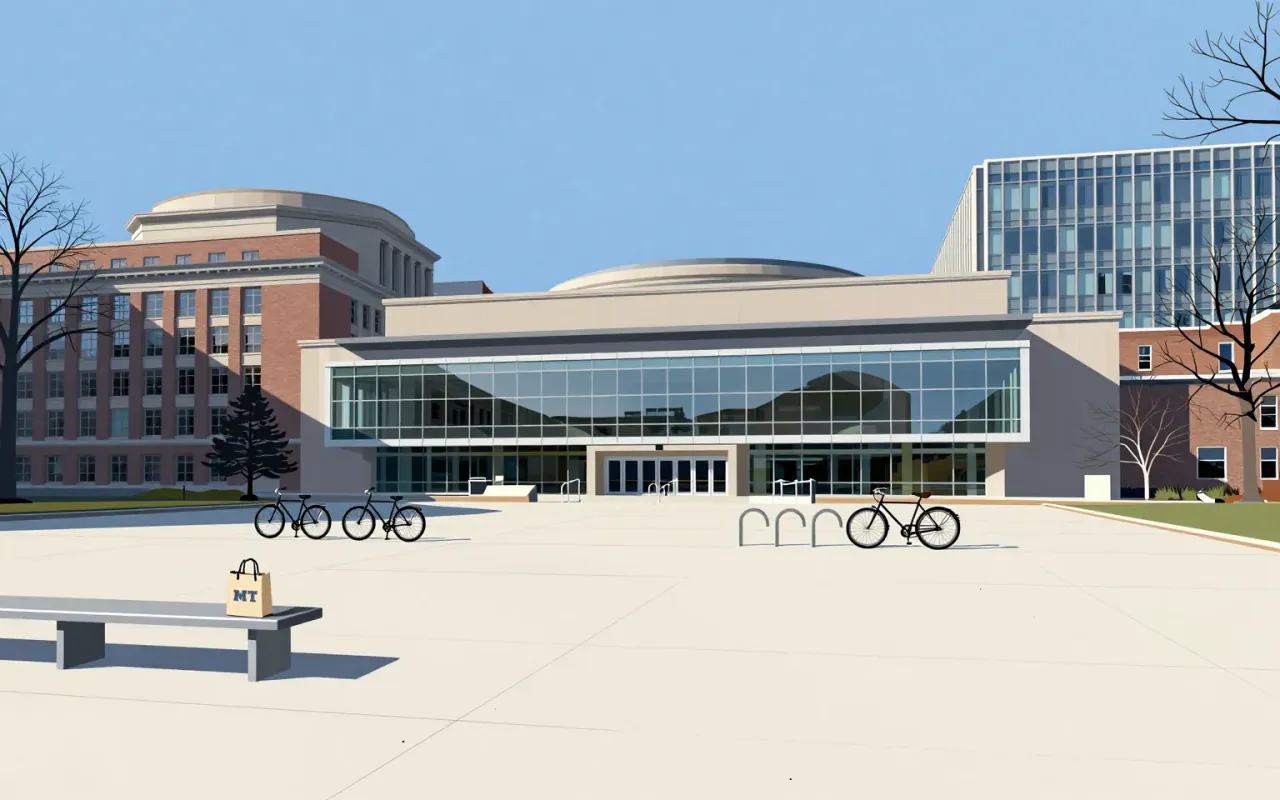
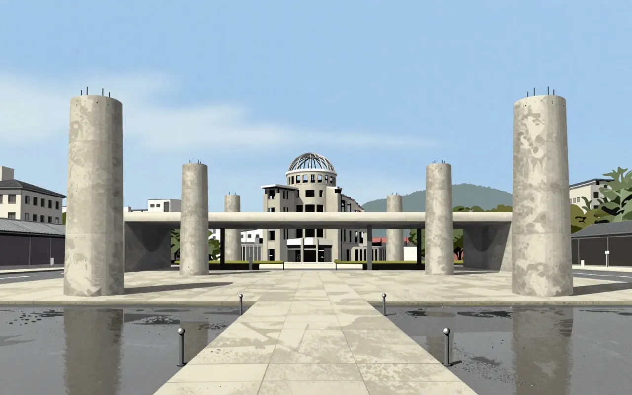
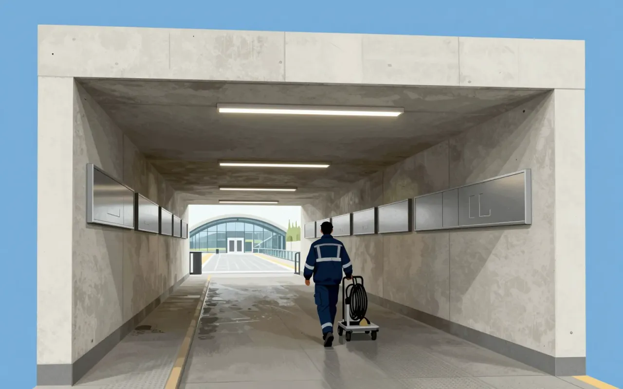

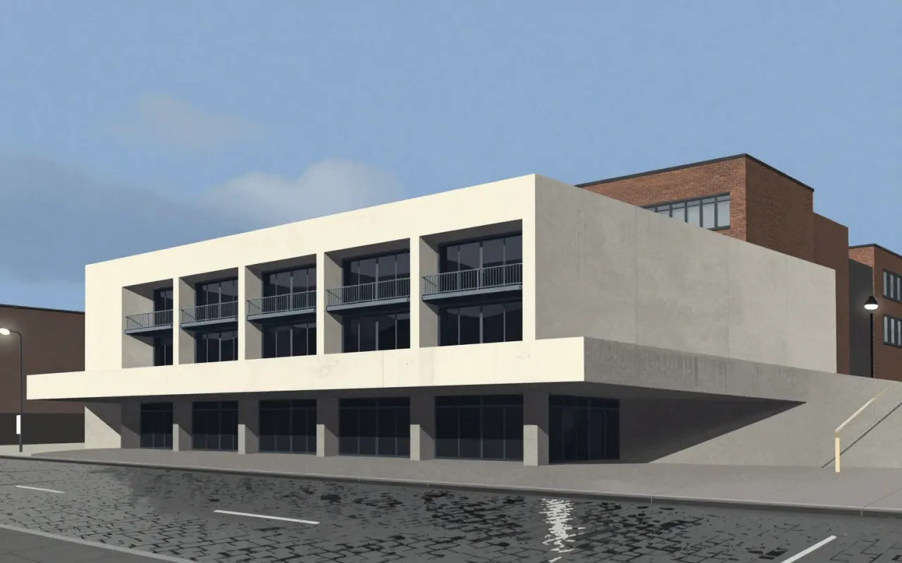
The Barbican Centre is a Brutalist arts complex in London, designed by Chamberlin, Powell & Bon. It features a concrete ziggurat form and complex multi-level layout. It was designated Grade II listed in September 2001 for its scale, cohesion, and ambition. It forms part of an integrated urban development including the Barbican Estate and Golden Lane Estate. Its design remains controversial and divisive.
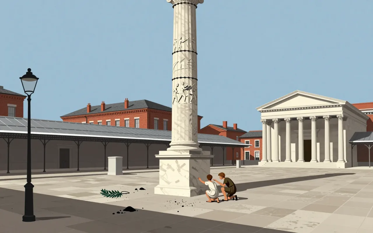
Gill Sans is a humanist sans-serif typeface designed by Eric Gill and released by Monotype in 1928, based on Edward Johnston's 1916 Underground Alphabet and Roman inscriptions, with lowercase forms derived from old-style serifs and uppercase proportions drawn from Trajan’s Column.

Fallingwater is a weekend retreat built over a 20-foot waterfall on Bear Run in Stewart Township, southwestern Pennsylvania. Designed by Frank Lloyd Wright for Edgar J. Kaufmann Sr. and Liliane Kaufmann, it uses exposed cantilevers, sandstone verticals, and concrete horizontals. Its 30° counterclockwise orientation ensures natural light in all rooms. Wright insisted occupants live *with* the waterfall — not look at it — using identical materials inside and out to dissolve boundaries. Trees were preserved via adaptive detailing. The design was judged unsound by Kaufmann’s engineers; the contractor secretly reinforced concrete elements. Structural vulnerabilities confirmed in 1994 led to steel supports and post-tensioning by 2002. At $155,000, it was one of Wright’s most expensive commissions.