designbriefs
Longest first

All briefs

479 briefs · 3191 min · 193–288 on page 3 of 5
9:27

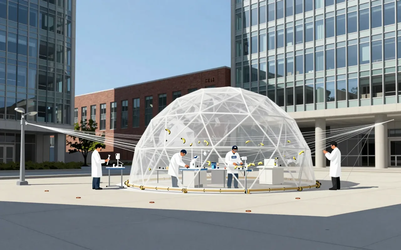
Neri Oxman

Design research as hypothesis-testing—not product development.
9:26

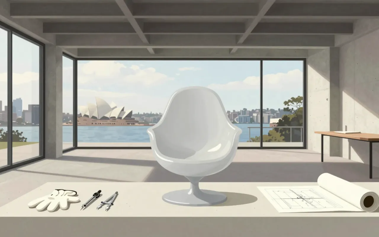
Marc Newson

Newson’s style isn’t about curves—it’s about knowing the right one before it’s drawn.
9:25

Jürgen Mayer

Architecture that treats the body, technology, and nature as inseparable — not as themes, but as structural conditions.
9:25

Hermann Zapf

Zapf didn’t adapt type to technology — he rebuilt it each time the machine changed.
9:25

Konstantin Melnikov

Melnikov didn’t follow Constructivism—he outmanoeuvred its dogma with sawtooths, slopes, and glass.
9:24

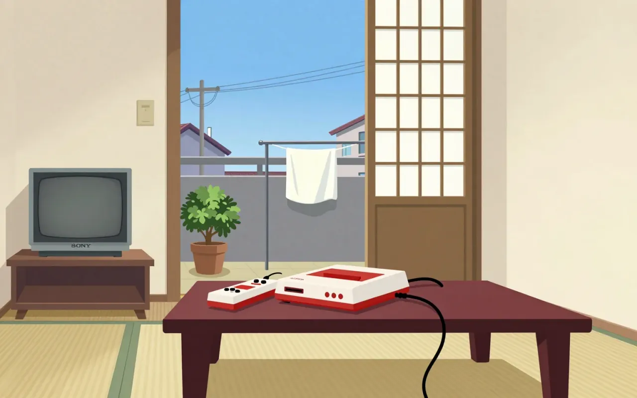
Nintendo Entertainment System

Masayuki Uemura

The Nintendo Entertainment System is an 8-bit home video game console. It began as the Family Computer (Famicom), released in Japan in July 1983. It was later redesigned and rebranded for Western markets as the NES.
9:24

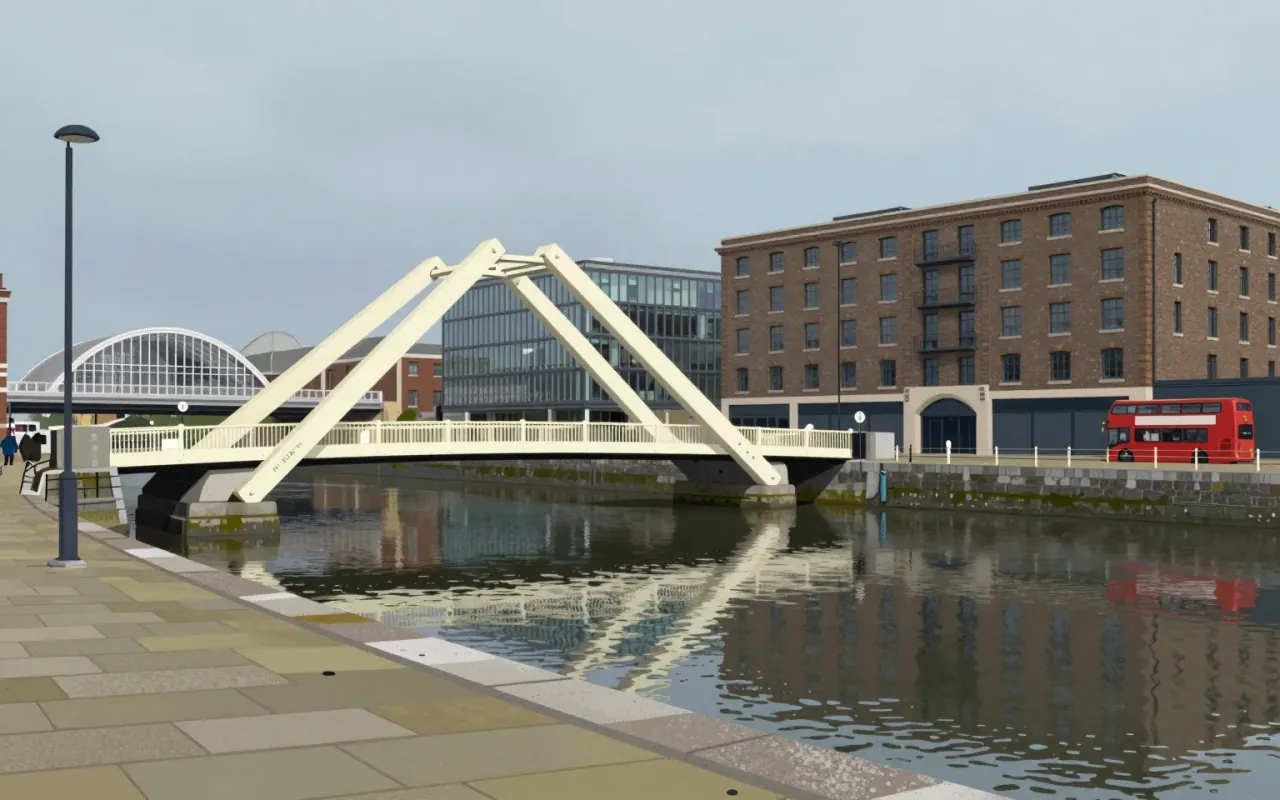
The Rolling Bridge

A bridge that curls like a fern — and proves infrastructure can be art only when it stops pretending to be useful.
9:24

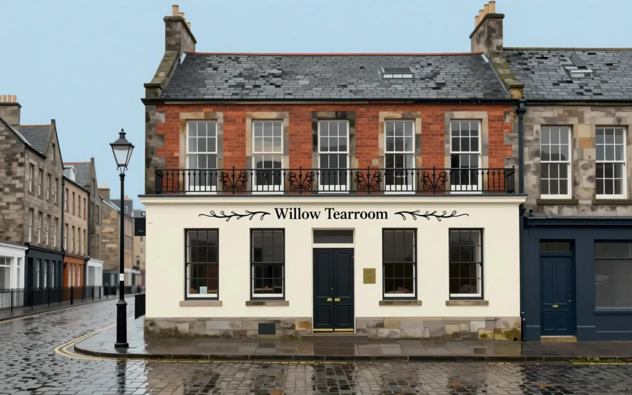
Willow Tearooms

Mackintosh didn’t just design a tearoom — he designed a brand, a service, and a building, all at once, in 1903.
9:24

Armin Hofmann

Hofmann didn’t invent Swiss Style — he built the syllabus that exported it.
9:24

Otl Aicher

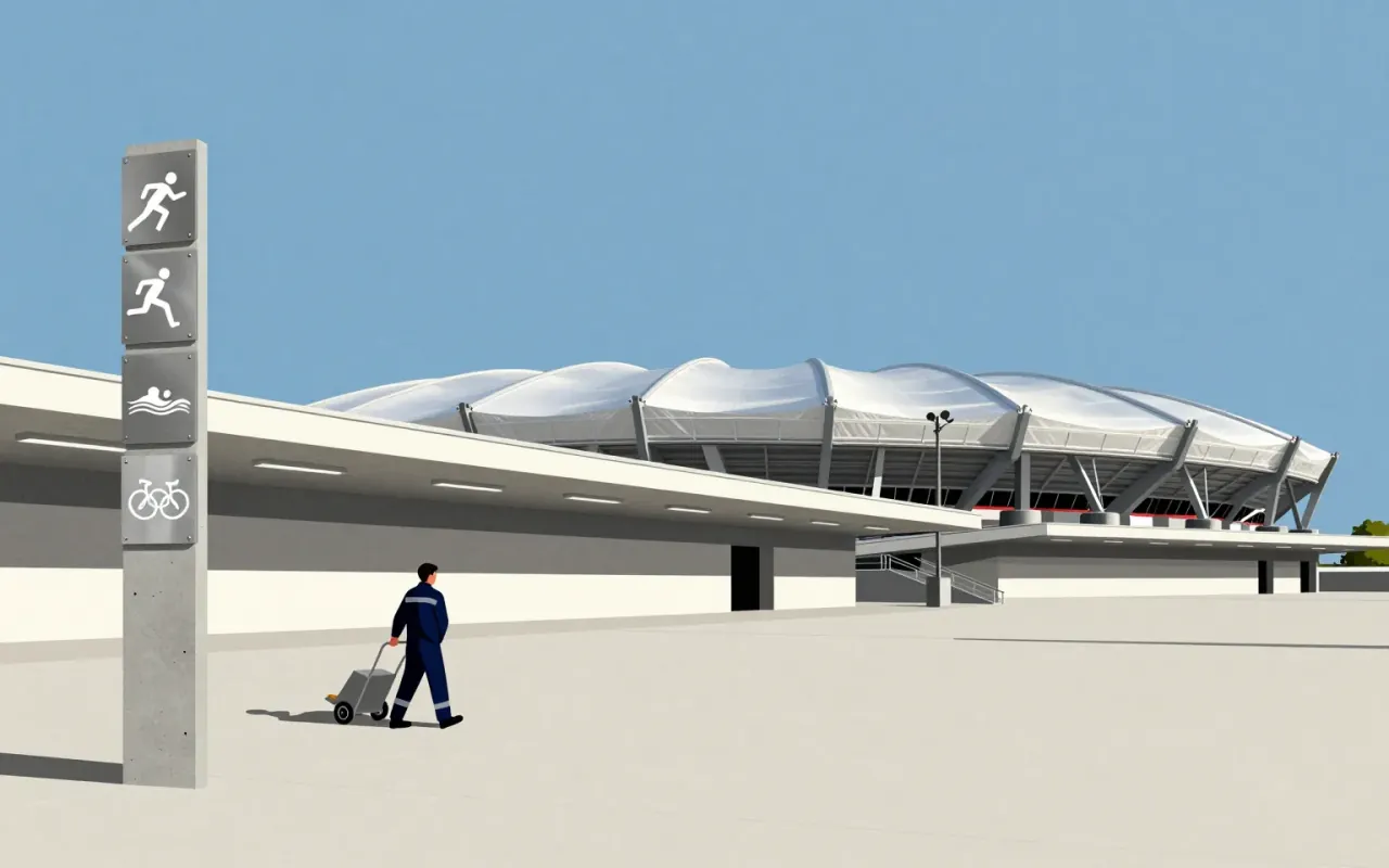
Aicher’s Olympic system proved pictograms could be both precise tools and shared language — not art, not decoration, but operational infrastructure.
9:23

Arne Jacobsen

Total design is not style—it’s the refusal to outsource a single decision.
9:23

Kunlé Adeyemi

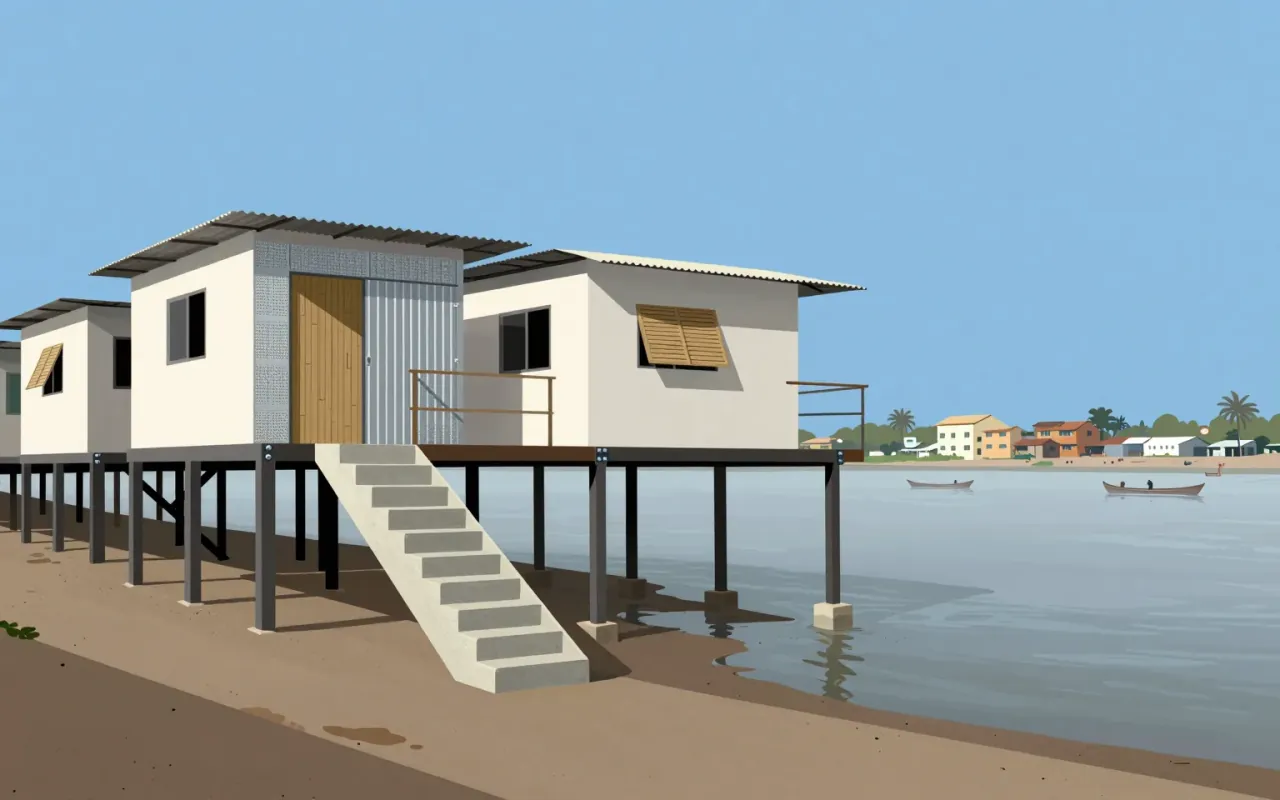
Architecture as fieldwork—not fix—but reading, prototyping, and collapsing.
9:21

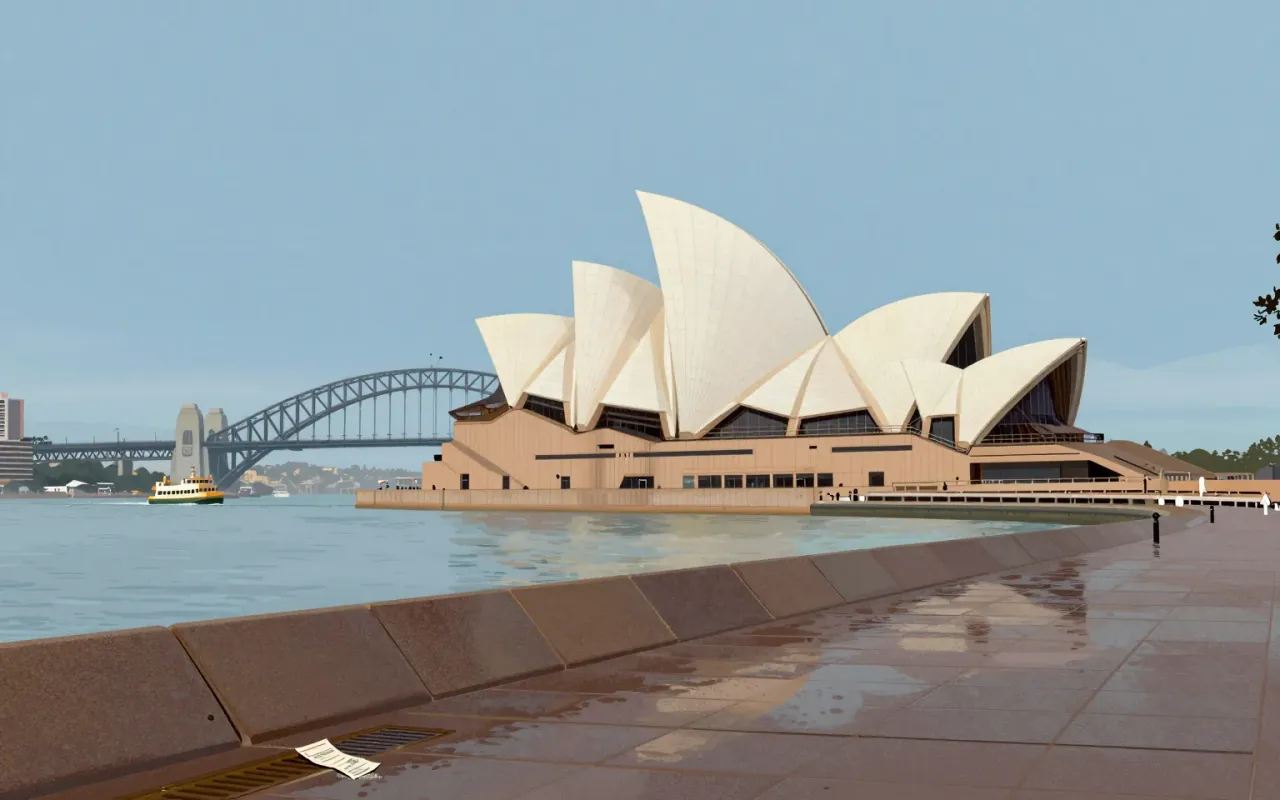
Sydney Opera House

Jørn Utzon · 1973

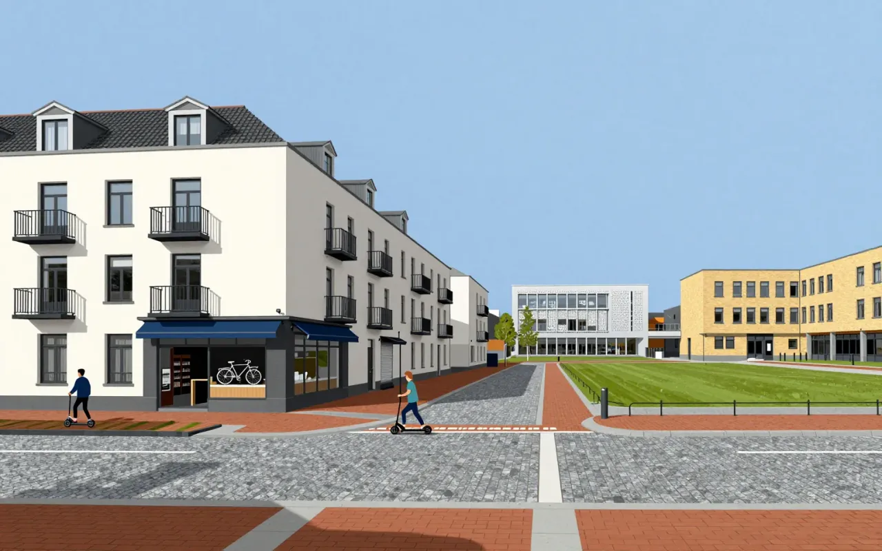
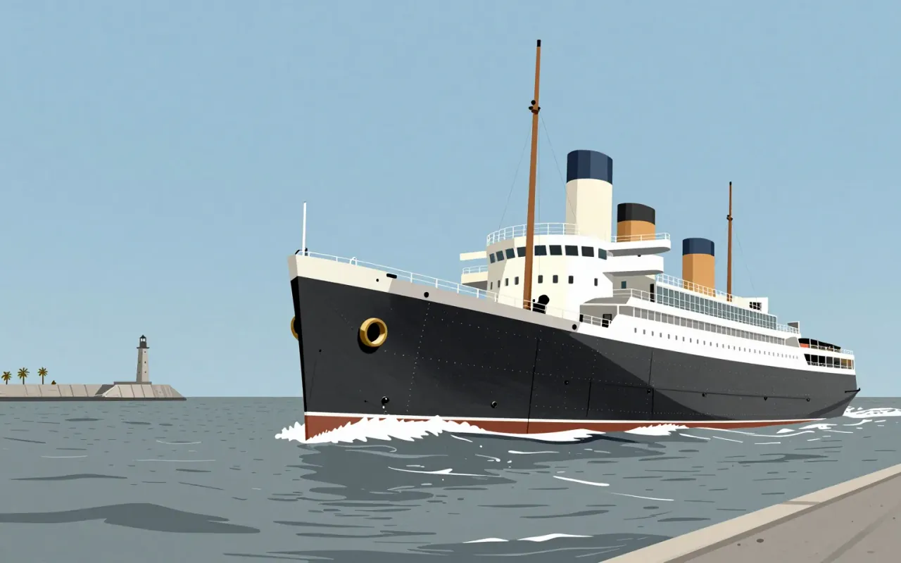
The Sydney Opera House is a landmark where aesthetic conviction collided with structural reality—and where resolution required iteration, computation, material innovation, and shared authorship.
9:20

Kees Christiaanse

Christiaanse treats urban form as a social contract—walkable, mixed, unstyled—but never proves it works beyond assertion.
9:20

Streamline Moderne

Streamline Moderne wasn’t about beauty—it was about selling motion during a depression.
9:19

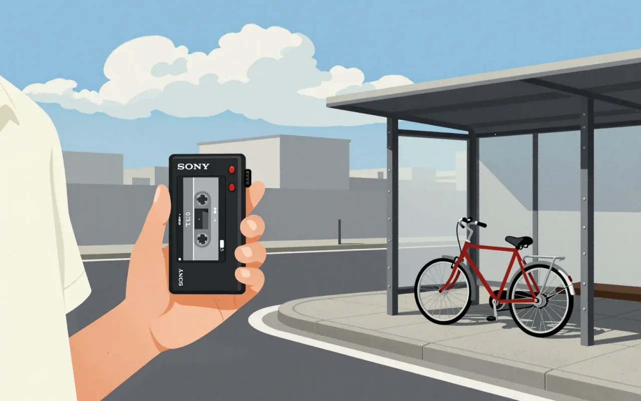
Walkman

Sony Design Team · 1979

The Walkman is industrial design as behavioural intervention — minimal, specific, and consequential.
9:18

Ineke Hans

A designer abandons the object to build a platform — and delivers twelve mottos instead of a chair.
9:18

Sigurd Lewerentz

Lewerentz didn’t find essence—he relearned restraint by walking away, then building two churches that refuse to explain themselves.
9:18

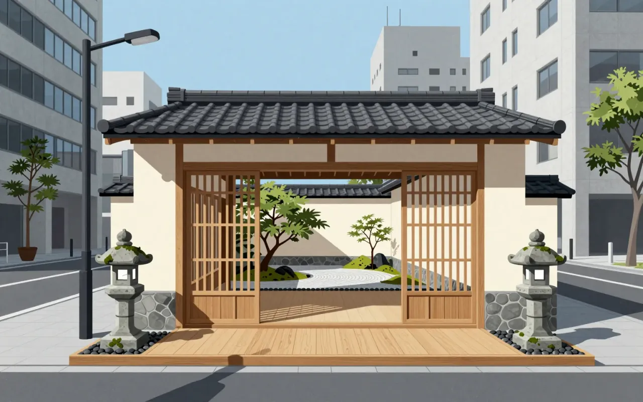
Kengo Kuma

Kuma doesn’t build buildings — he builds frames for nature, using technology to make stone disappear.
9:18

Post-it note

Spencer Silver & Art Fry / 3M

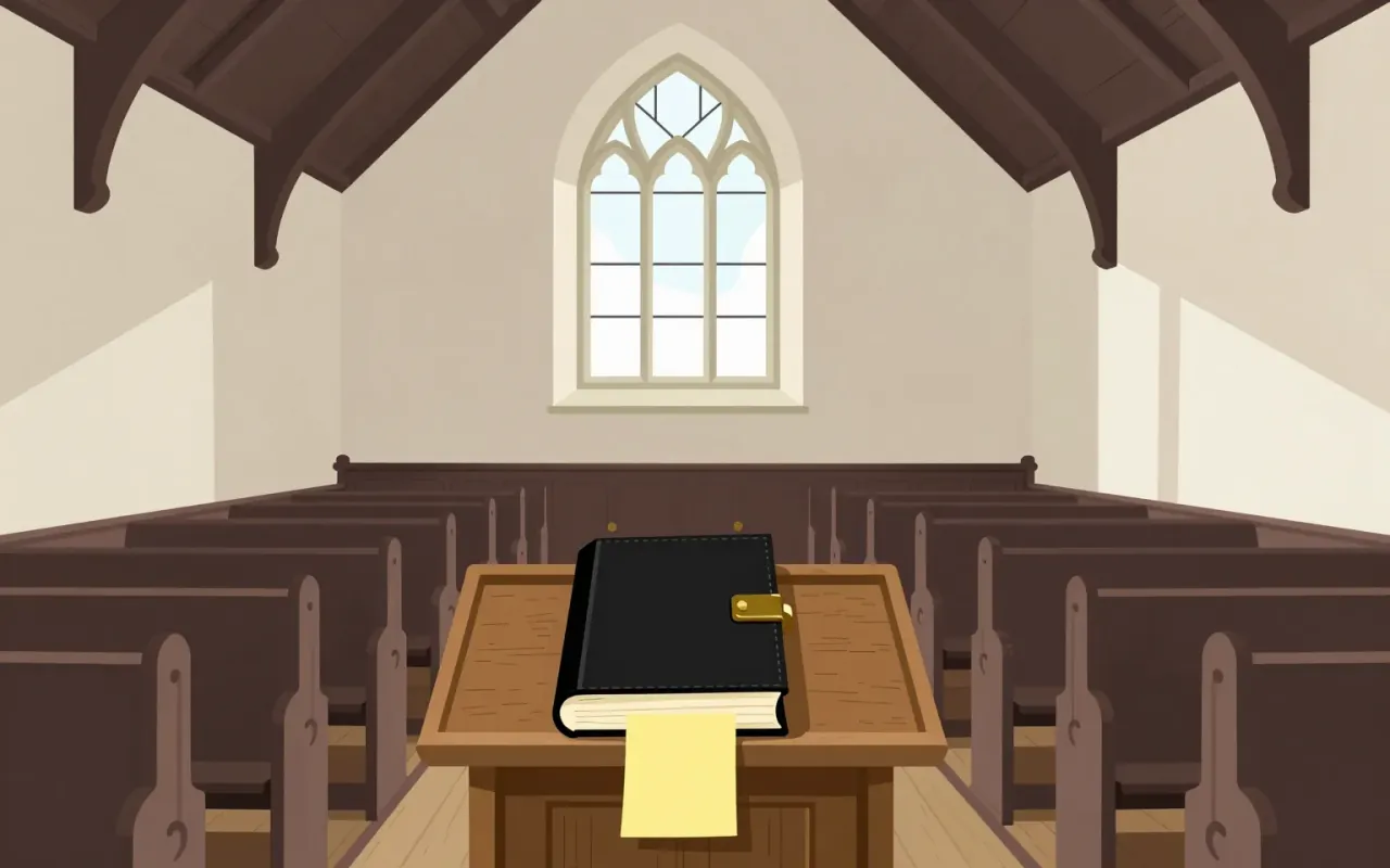
The Post-it note is a small sheet of paper with a low-tack, reusable, pressure-sensitive adhesive. It emerged from a failed adhesive experiment (1968), five years of internal neglect, a hymn-book insight (1974), bootleg development, and opportunistic colour selection. Its communicative function was proven through employee message exchange—not market testing. The 1977 'Press 'n Peel' test failed; the 1978 Boise Blitz succeeded only after renaming and free-sample distribution. It is worth attention because it reveals how industrial innovation depends less on intention than on permission, accident, and low-fidelity validation.
9:18

Reichstag dome

Norman Foster · 1999

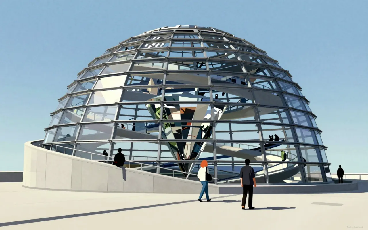
The Reichstag dome is a reconstructed glass structure on the Reichstag building in Berlin. Norman Foster designed it from Gottfried Böhm’s idea. Waagner-Biro built it. It features a mirrored cone, two steel spiral ramps, an electronically tracked sun shield, and daylight-driven energy efficiency. It provides a 360° view of Berlin. It makes the Bundestag chamber visible from above. It symbolises German reunification and democratic transparency.
9:17

Rosa Barba

Cinema is not a window—it’s scaffolding, and Rosa Barba builds with it.
9:14

Golden Gate Bridge

Joseph Strauss · 1937

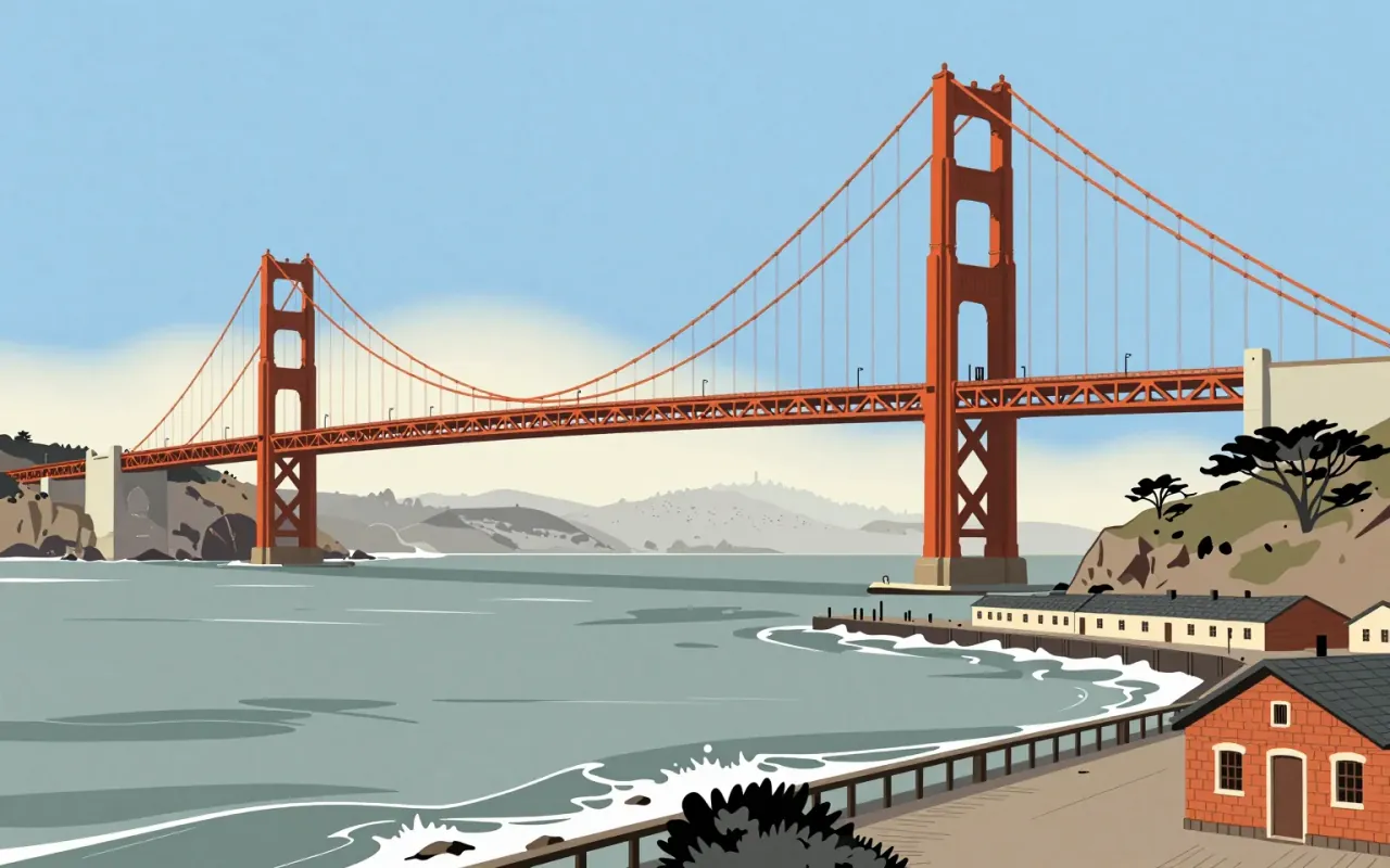
The Golden Gate Bridge is a suspension bridge completed in 1937. Joseph Strauss served as chief engineer, but the suspension design came from Leon Moisseiff. Charles Ellis resolved site-specific structural conflicts. Strauss introduced movable safety netting. No verified claim attributes aesthetic, metallurgical, or wind-theory innovation to Strauss.
9:14

Koloman Moser

Moser didn’t make style — he made syntax: a repeatable grammar for everyday things.
9:14

Peter Zumthor

Zumthor treats light as a material—and silence as a publishing policy.
9:13

Florence Knoll

She didn’t design chairs. She designed the logic of the office—and made interior design a profession.
9:13

Oscar Niemeyer

Niemeyer didn’t bend concrete—he bent architectural dogma, then left function behind.
9:12

FF Meta

FF Meta is not anti-Helvetica ideology — it’s anti-blurry-printing pragmatism.
9:12

Verdana

Verdana is not a font for beauty — it is a font for survival on 90s screens.
9:12

Arata Isozaki

Architecture as fiction, not form — Isozaki weaponised absurdism before he built a thing.
9:12

Jil Sander

Minimalism succeeded commercially only after surviving public indifference — then failed under its own scale.
9:11

Ellen Lupton

Ellen Lupton is a graphic designer, curator, writer and educator known for her love of typography, who directs the Graphic Design MFA program at the Maryland Institute College of Art.
9:11

Isamu Noguchi

Noguchi’s real innovation wasn’t borrowing from Asia — it was treating craft training, not iconography, as transferable method.
9:11

Swiss Army knife

Karl Elsener

The Schweizer Offiziers- und Sportmesser is a pivotal industrial response: a compact, spring-driven, dual-sided tool system developed in Ibach, Switzerland in 1896. It solved production dependency on German suppliers, used cellulose fibre instead of imported materials, and achieved commercial viability without military adoption. Its influence lies not in novelty but in disciplined constraint — one spring, two sides, no commission, global reach.
9:08

Georgia (typeface)

Matthew Carter · 1993

Georgia is a 1993 serif typeface designed by Matthew Carter for Microsoft, manually hinted by Thomas Rickner, specifically optimised for legibility on low-resolution screens through features including a large x-height, thicker thin strokes, reduced contrast, thickened serifs, and an unusually bold weight — all shaped by the binary bitmap constraints of mid-1990s screen rendering. Its design draws on 19th-century Scotch Roman models and shares lineage with Carter’s concurrent print typeface Miller.
9:07

TeamLab (art collective)

TeamLab doesn’t simulate nature—it stages a dependency: the artwork only coheres when people move through it.
9:06

Anni Albers

Cellophane wasn’t just new—it was impractical. Her wall covering proved utility could emerge from constraint, not compromise.
9:06

Shigeru Ban

Paper tubing isn’t poetic scaffolding — it’s a calibrated response to scarcity, theft, deforestation, and bureaucracy.
9:05

Game Boy

Gunpei Yokoi

The Game Boy is industrial design as strategic subtraction.

9:04

Palatino

Palatino was built for bad paper—not books—and became a book face anyway.
9:04

Anglepoise lamp

George Carwardine · 1933

The Anglepoise lamp is a balanced-arm lamp designed in 1932 by George Carwardine, a vehicle suspension specialist. Its defining feature is the placement of all springs near the base — a direct transfer of suspension mechanics to lighting. It requires no clamps to hold position. Carwardine patented it, built it himself in Bath, then licensed it to Herbert Terry and Sons in 1934. Two versions exist: four-spring for professional use, three-spring for domestic use — both sharing the same spring-placement principle.
9:04

Dominique Perrault

Perrault doesn’t simplify form — he strips syntax to let meaning emerge from landscape, light, and uncertainty.
9:02

Alvar Aalto

Aalto didn’t soften modernism—he rebuilt it from the inside out, using wood, patents, and total control.
9:02

April Greiman

A magazine that is an artwork, which is an object, which is... crazy.
9:00

Michael Graves

Postmodernism wasn’t theory — it was a red bird whistling on your stove.
8:59

Charles Correa

Correa’s architecture refuses imported aesthetics — but builds no system for replicating its cultural logic.
8:57

7132 Thermal Baths

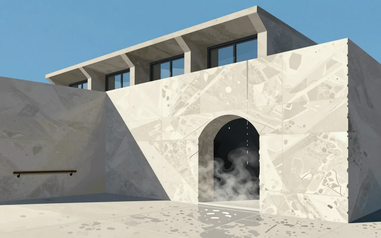
A quarry made habitable — where every gap is deliberate, every weight accounted for, and every visitor is made aware of gravity.
8:57

Wolfgang Weingart

He didn’t break Swiss typography—he weaponised its discipline to make disobedience legible.
8:56

Josef Müller-Brockmann

Abstraction was his syntax — not a style, but a system for translating music and statistics into public space.
8:55

Akzidenz-Grotesk

Berthold Type Foundry · 1896

A foundational sans-serif typeface family released in 1898 for commercial print jobs, derived from a shadowed predecessor by removing the drop shadow and filing two design patents. Its monoline structure and single-storey 'g' prioritised mechanical reproducibility over typographic nuance. It prefigured neo-grotesques like Helvetica by fifty years—not as a stylistic ancestor, but as an operational prototype for scalable, patent-protected industrial typography.
8:55

Bruce Mau

Design is not about making things—it’s about making sense of what already exists.
8:55

Lúcio Costa

A jury chose Costa’s sketch over detailed rivals — not for precision, but for scalability.
8:54

International Typographic Style

Josef Müller-Brockmann

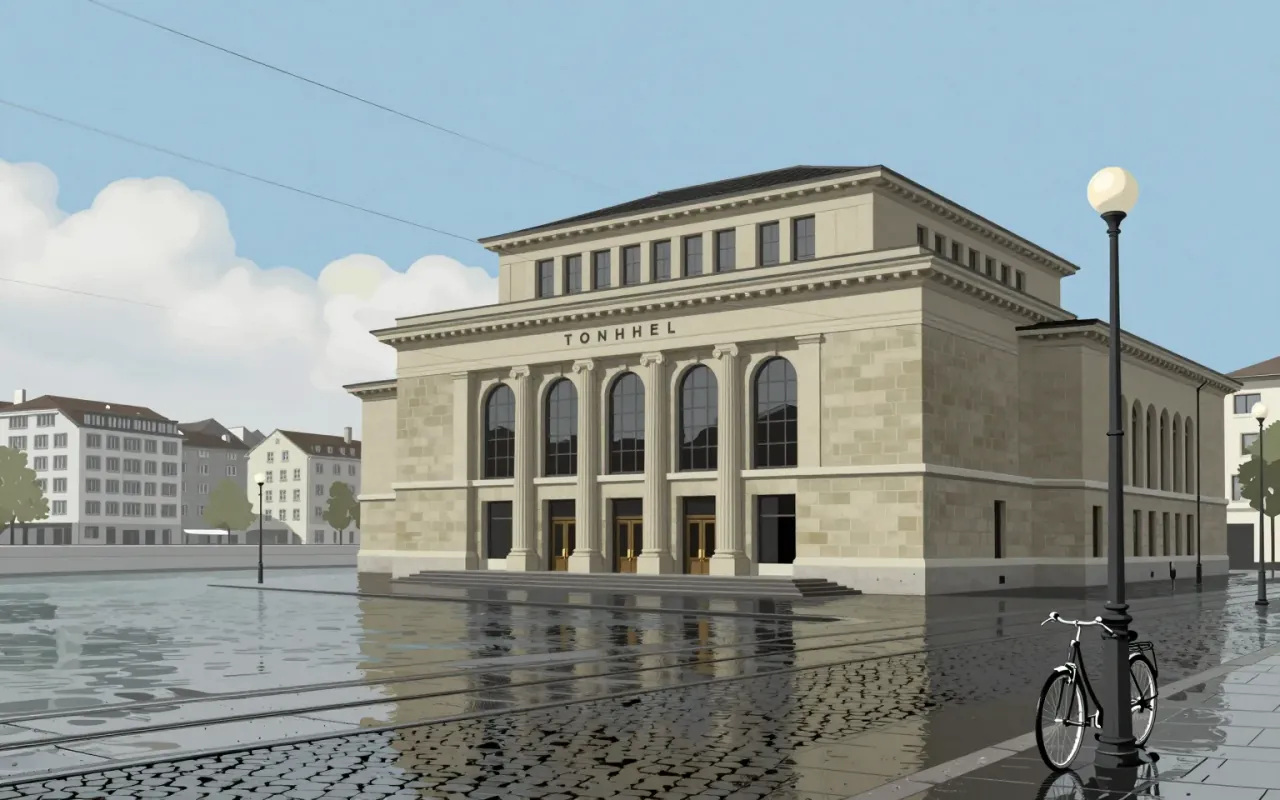
The International Typographic Style is a systemic, modernist graphic design approach that emerged during the 1930s–1950s. It prioritises objectivity, clarity, and universality through asymmetry, grid, sans-serif type, flush-left text, and photography. Josef Müller-Brockmann pioneered its application in works including the Tonhalle Series (1950) and the Accident Barometer (1952). His method relied on nonrepresentational abstraction, geometric elements, and musical structure—scale, rhythm, repetition—without illustration or embellishment.
8:54

Janet Echelman

She makes buildings breathe by hanging data-driven nets in the wind—and proves volumetric sculpture doesn’t need weight to hold meaning.
8:54

Lina Bo Bardi

She made museums uncomfortable on purpose—and proved modernism could be both raw and socially urgent.
8:54

Peter Eisenman

Eisenman didn’t break architecture—he broke its assumptions about coherence.
8:53

Ball Chair

Eero Aarnio · 1963

The Ball Chair is a 1963 domestic solution turned international icon — defined by constraint, not concept. Its value lies in how clearly its making answers a specific question: how to build a large, novel chair that fits through a door. Nothing more.
8:53

Rei Kawakubo

Kawakubo’s work is not feminist expression — it is a deliberate refusal to let femininity define design.
8:51

Gae Aulenti

Aulenti didn’t restore the Gare d'Orsay — she edited it like a film reel: cutting ornament, splicing levels, and dialling up light until the building served the art, not its own history.
8:48

Sophie Taeuber-Arp

She didn’t just join Dada — she wove it from textile grids, turned wood, and polka dots.
8:43

Mingei

Mingei is not folk art — it is a discipline of refusal: against named authorship, against intellectual mediation, against beauty as exception.
8:37

Enric Miralles

Miralles treated detail as meaning—and refused to separate architecture from the ground it stood on.
8:36

Laurie Baker

Laurie Baker didn’t design buildings — he designed responses to termites, monsoons and cow dung.
8:36

Gerrit Rietveld

Rietveld treated furniture and architecture as the same problem: how to make space, form, and function legible through subtraction and system.
8:35

Ryoji Ikeda

Ikeda doesn’t make music you feel in your chest—he makes music you measure in hertz.
8:29

Marcel Wanders

Wanders’ design method is a deliberate tension—not between old and new, but between material sophistication and making simplicity.
8:26

Frutiger (typeface)

Frutiger is not a universal font — it is a precise answer to one problem: reading signs in motion.
8:16

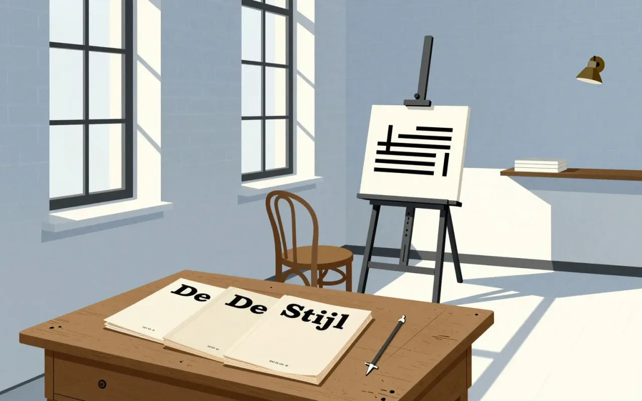
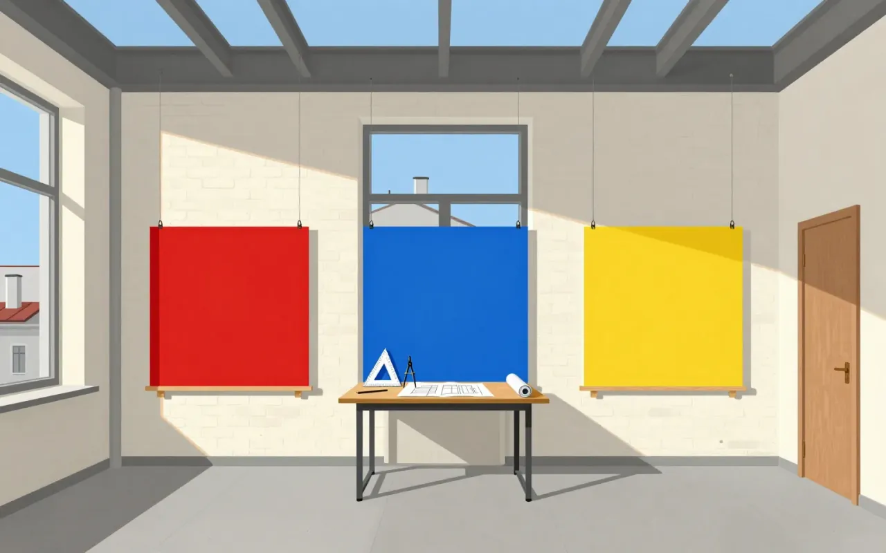
De Stijl

Piet Mondrian & Theo van Doesburg · 1917

De Stijl is a publishing project that became a movement by enforcing absence. Its power lies in how precisely it names what it excludes — and how visibly it abandons those exclusions later.
8:14

Andrée Putman

Essentialism is not minimalism—it’s choosing what to keep, then telling a story with the rest.
8:08

Hans Wegner

Wegner’s chairs are not minimalist—they are obsessive negotiations between joinery, history, and refusal to delegate.
8:05

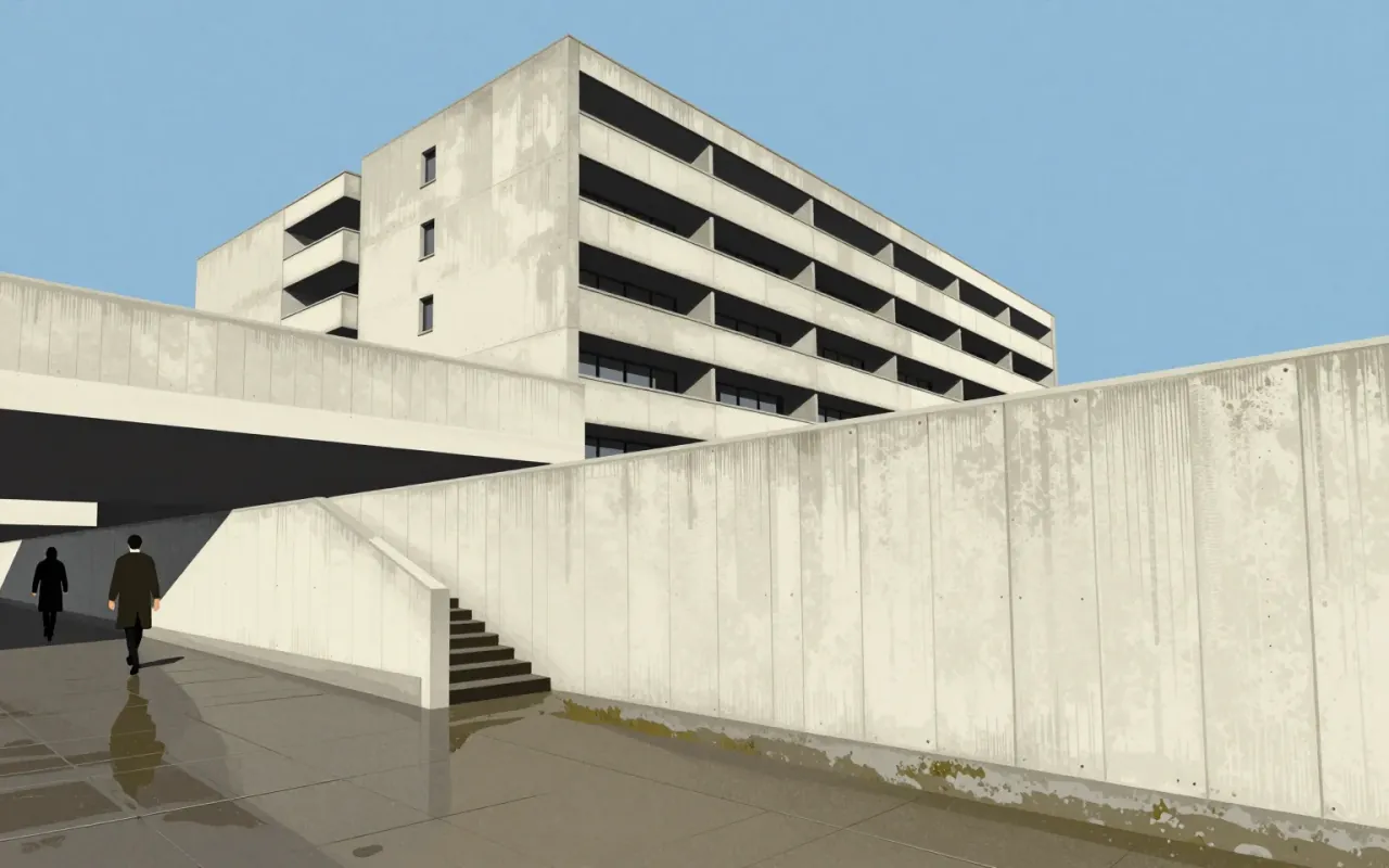
Brutalist architecture

Brutalism isn’t ugly — it’s unbendingly honest about what a building is made of and why it stands there.
8:04

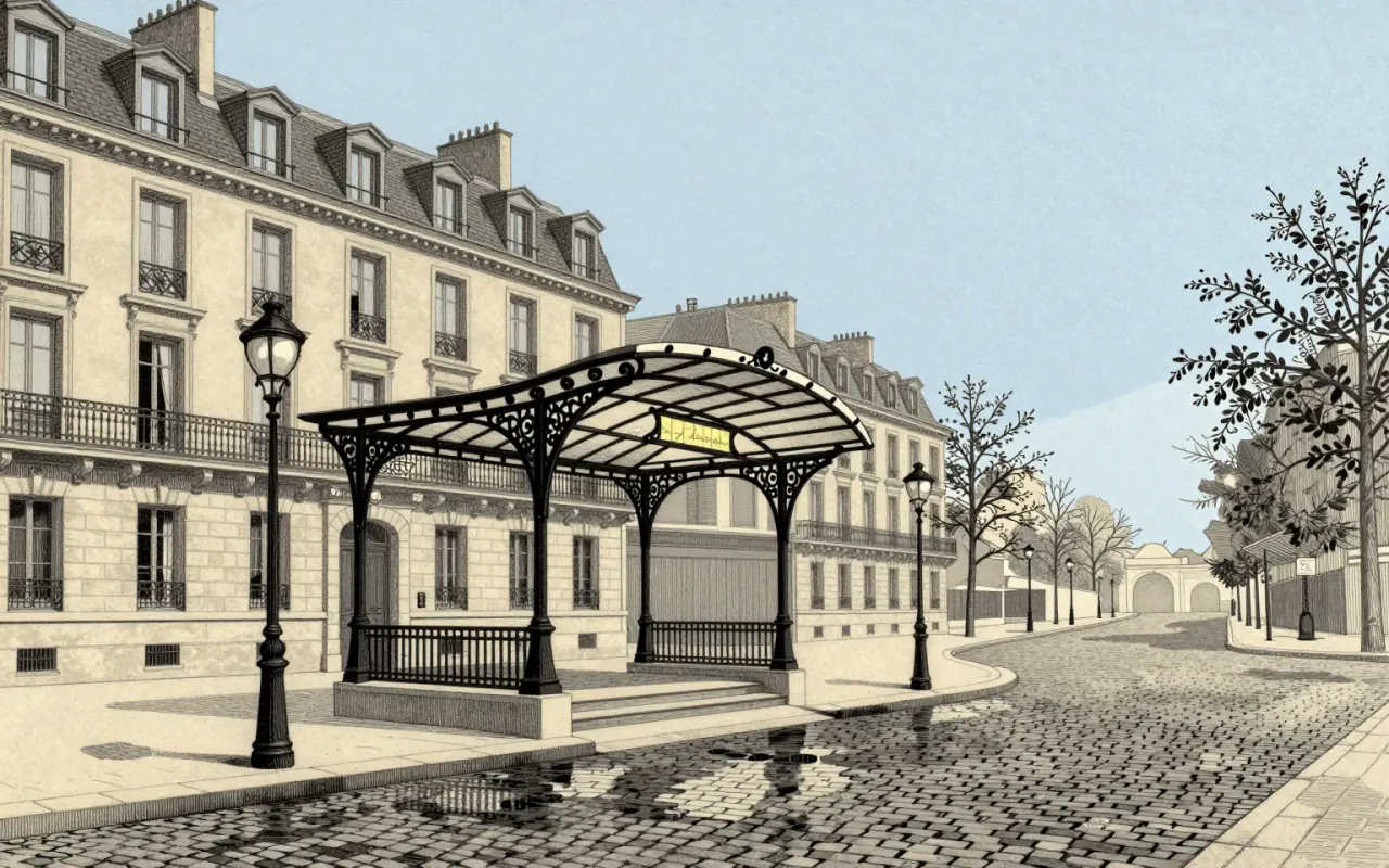
Art Nouveau

Art Nouveau didn’t invent new forms — it weaponised natural curves to dissolve the hierarchy between art and craft.
7:56

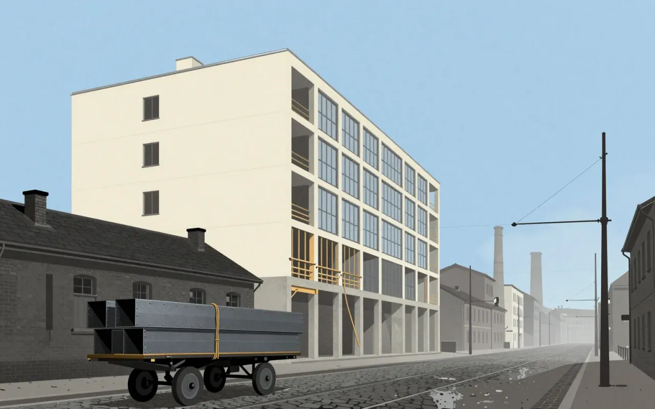
Modernism

Modernism isn’t a look—it’s a refusal to accept that art, design, or society must work the way they always have.
7:47

Shōji Hamada

Hamada’s work is not about making pots — it’s about making a world where pots belong.
7:18

Jessica Helfand

Portraiture as method acting—dignity reasserted through archival discipline, not artistic flair.
7:08

IDEO

IDEO’s 1999 shopping cart wasn’t built to shop — it was built to be watched.
6:40

Source Sans

A pragmatic open-source sans-serif built to fix News Gothic’s uneven colour — not to reinvent typography.