Tom Geismar
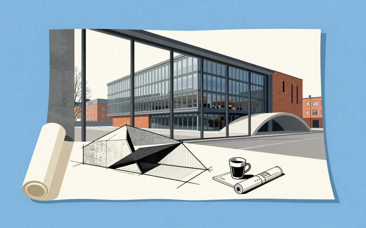
Abstraction wasn’t aesthetic choice for Geismar — it was operational logic.
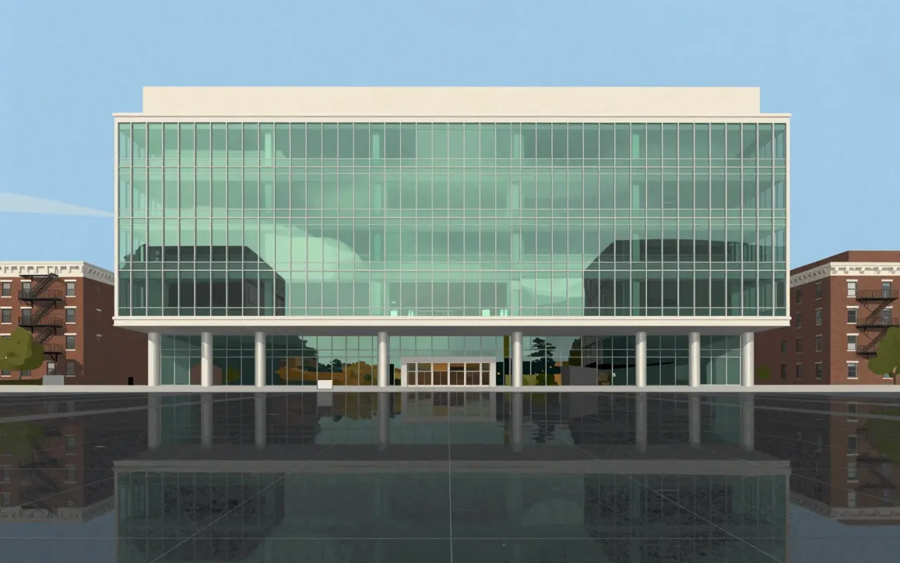
Lever House is a 21-storey New York City office building completed in 1952. It is a glass-clad slab, built for Unilever, that uses fixed glazing, concealed HVAC, and a custom window-cleaning system.

Garamond is a group of 34 metal typefaces cut by Claude Garamond (Garamont) in sixteenth-century Paris. They follow Griffo’s 1495 design, belong to the old-style serif category, and were made by hand-engraved punches used to stamp matrices for casting type. The Grecs du roi Greek typeface replicates Angelo Vergecio’s handwriting using an unusually large number of alternates and ligatures. Swash forms exist only in the parangonne. Small capitals appear in all preserved types except the gros-canon. Garamond’s independence as a punchcutter helped define typefounding as a distinct commercial industry.
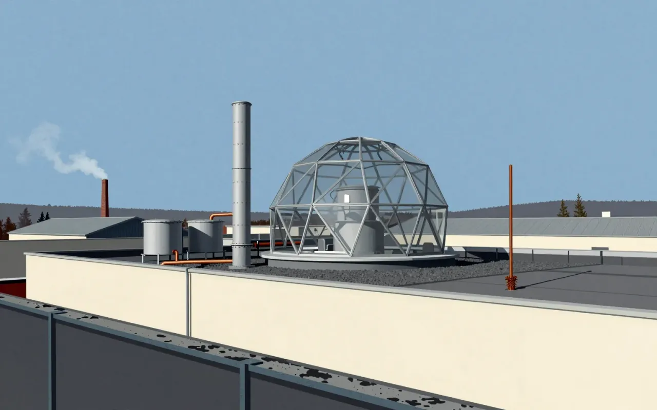
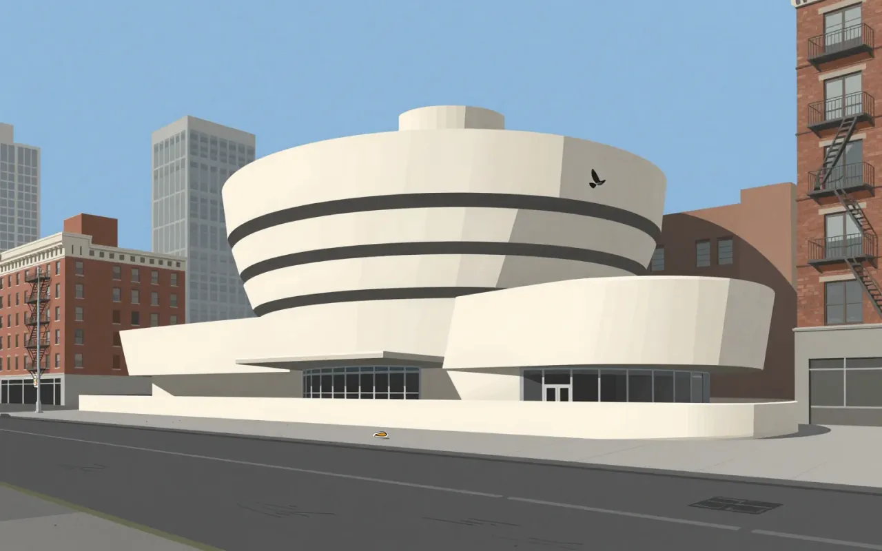
The Solomon R. Guggenheim Museum is Frank Lloyd Wright’s most recognized masterpiece. Built in New York City and completed in 1959, it features a helical ramp surrounding an open-air atrium. Wright designed it over 15 years, using more than 700 sketches and six sets of working drawings. The commission came from Hilla von Rebay, who envisioned a 'temple of spirit' enabling a new way of seeing modern art. Wright incorporated geometric motifs — squares, circles, rectangles, triangles, lozenges — each assigned symbolic meaning. Visitors ride an elevator to the top and descend the ramp, experiencing the gallery itself as a work of art. The building drew controversy for its unusual display spaces and remains a landmark of 20th-century architecture.
Open Sans is a functional, open-source humanist sans-serif designed by Steve Matteson for Google in 2011. It prioritises screen legibility through wide apertures and large x-height, supports Latin, Greek, Cyrillic (897 glyphs), gained Hebrew and variable font support in 2021, and manifests publicly via a Google Easter egg. It does not extend beyond those scripts. Its influence lies in normalising open-source, cross-platform typography — not aesthetic innovation.
Robert Venturi’s ‘Postmodernism’ is two books — not a style, not a movement, not a building. It is a method for reading complexity into architecture where modernism saw only noise. It trades certainty for interpretation. It trades universality for local meaning. It trades elegance for richness. Its power lies in what it permits, not what it prescribes.
Optima is a deliberate hybrid: a sans-serif built from serif sources, calibrated by mathematical proportion, and tested in real textual labour. It does not invent new categories — it occupies the gap between them with precision.
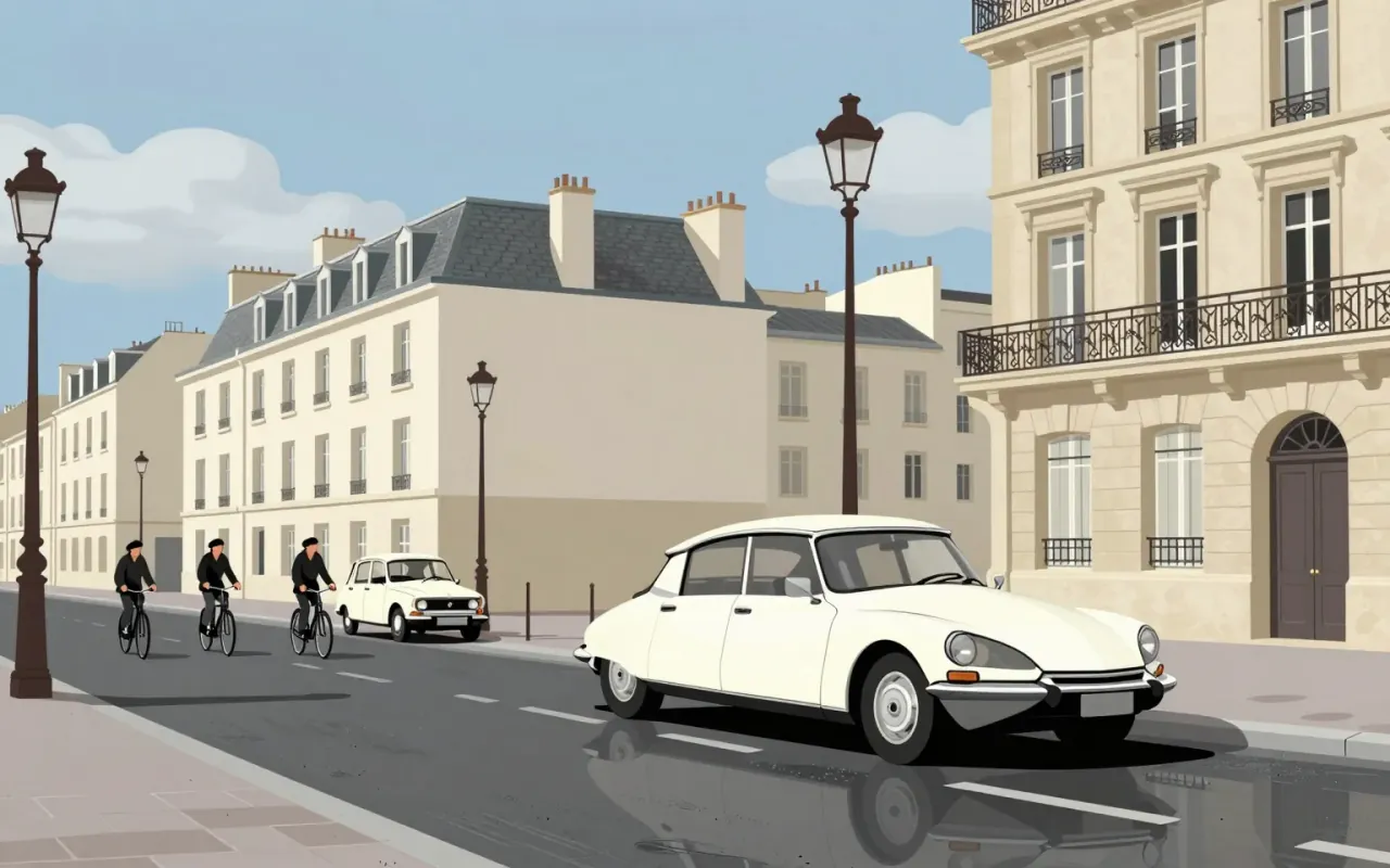
The Citroën DS is an industrial design for a mass-production automobile. Flaminio Bertoni co-styled it with André Lefèbvre. Paul Magès developed its hydropneumatic self-levelling suspension. It used hydropneumatic suspension and disc brakes — the first mass-production car to do so. It set new standards in ride quality, handling, and braking. It pushed the envelope in the ride vs. handling compromise possible in a motor vehicle. Its body design was aerodynamic and futuristic. Roland Barthes described it as looking as if it had 'fallen from the sky'. The DS Series 3 introduced directional headlights to automotive mass-production.
Cooper Black is an ultrabold serif typeface designed for display use, drawn as an extra-bold weight of the Cooper Old Style family. It originated from Oswald Cooper’s lettering practice in 1920s Chicago and the Midwest. Its low stroke contrast and soft, 'muddy' appearance distinguish it from nineteenth-century fat faces. It quickly became popular in newspaper advertising and later in pop culture — notably on the 1966 Pet Sounds album cover. It was the second-best-selling typeface for American Type Founders and polarised typographic opinion: rejected by conservative typographers but embraced so enthusiastically by graphic designers that supply could not meet demand.
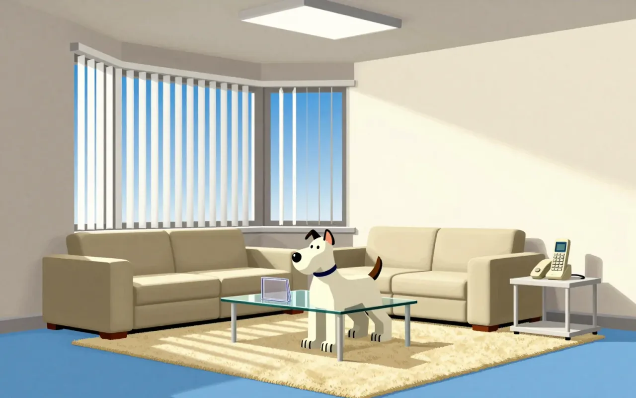
Comic Sans is a 1994 Microsoft typeface designed by Vincent Connare to replace Times New Roman in Microsoft Bob’s cartoon interface. It was drawn manually with a mouse, inspired by The Dark Knight Returns and Watchmen, and intended to be informal and child-friendly. Though it missed Bob, it shipped with Windows 95 and gained broad use in education and dyslexia support. A 2010 Princeton study found Comic Sans Italic improved information retention versus Helvetica. It demonstrates how narrow constraints — aesthetic, technical, and audience-specific — can yield unexpectedly robust functional outcomes.

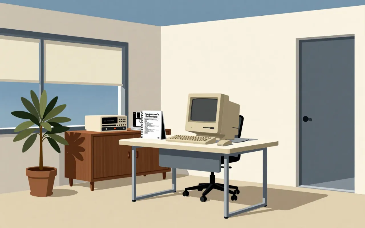
The Macintosh 128K is the original Macintosh personal computer from Apple. It is the first successful mass-market all-in-one desktop personal computer with a graphical user interface, built-in screen and mouse. It was pivotal in establishing desktop publishing as a general office function. Its hardware includes a 9-inch, 512×342 pixel monochrome CRT display, a Motorola 68000 microprocessor running at 7.8336 MHz, 128 KB RAM shared by the processor and display controller, and 64 KB ROM containing the boot procedure, OS routines, and the complete QuickDraw picture language and interpreter. The RAM consists of sixteen 64-kilobit modules soldered to the logic board. It ships with MacPaint and MacWrite to showcase its GUI and mouse-driven workflow.
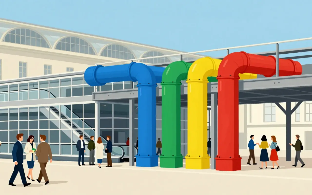
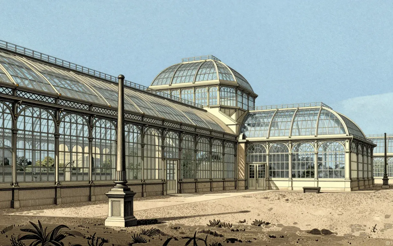
The Crystal Palace was a cast iron and plate glass exhibition hall built for the Great Exhibition of 1851. It measured 1,851 feet long and 128 feet high internally. Its modular design followed the dimensions of glass panes supplied by Chance Brothers. It was completed in thirty-nine weeks by 2,000 men at a cost of £79,800. It used 293,000 panes of glass—the greatest area ever seen in a building—and astonished visitors with clear walls and ceilings that required no interior lighting. Its construction relied on recent advances in glass and cast iron manufacturing and the abolition of the glass tax. It demonstrated British industrial capability in iron and glass.
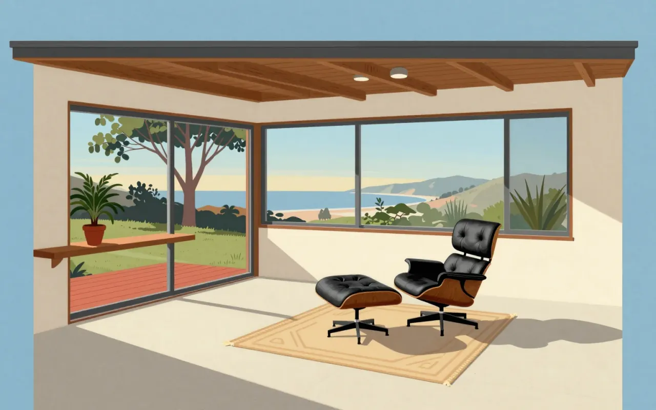
A high-end lounge chair and ottoman introduced in 1956 by Herman Miller, designed by Charles and Ray Eames, composed of three veneered molded plywood shells and leather-upholstered cushioning.
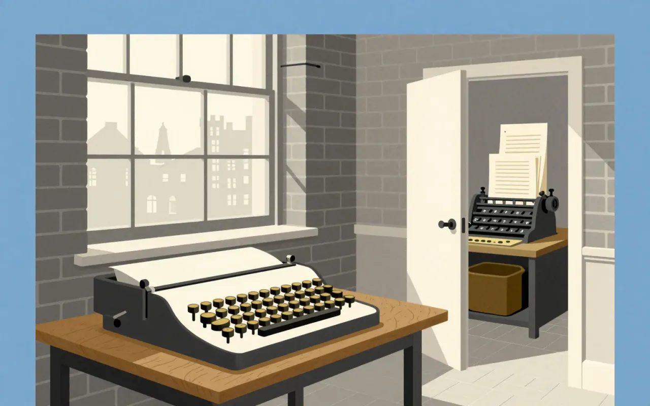
Times New Roman is a functional, collaborative, constraint-led typographic revision — not an origin story. Its power lies in what it omitted: flourish, novelty, and authorial ego. It succeeded by being invisible on the page and unavoidable in use.
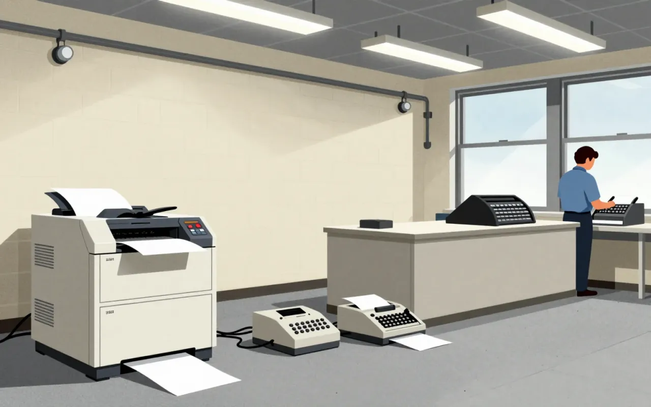
Arial is a neo-grotesque sans-serif typeface designed in 1982 by Robin Nicholas and Patricia Saunders at Monotype Typography as a metrically compatible alternative to Helvetica for the IBM 3800–3 laser printer.
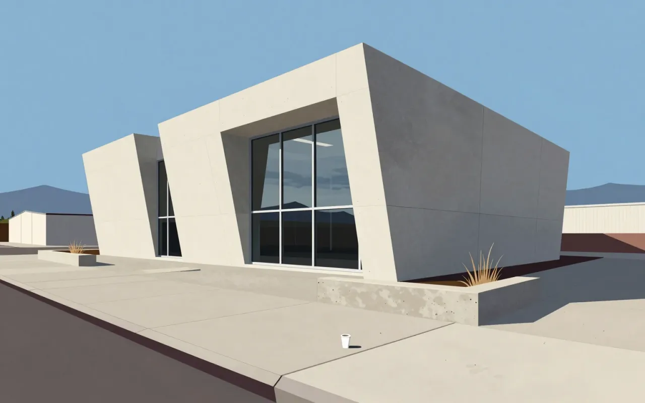
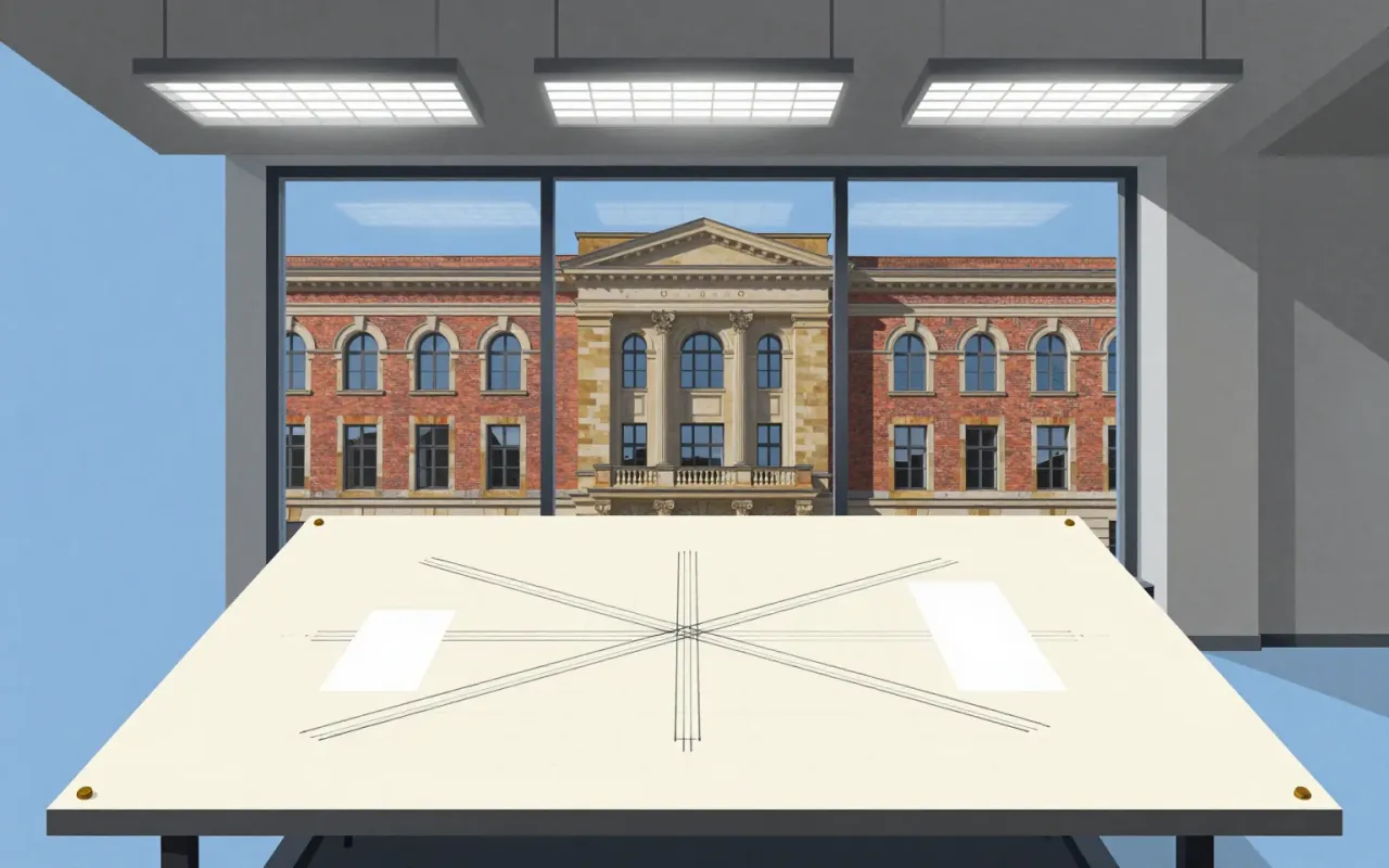
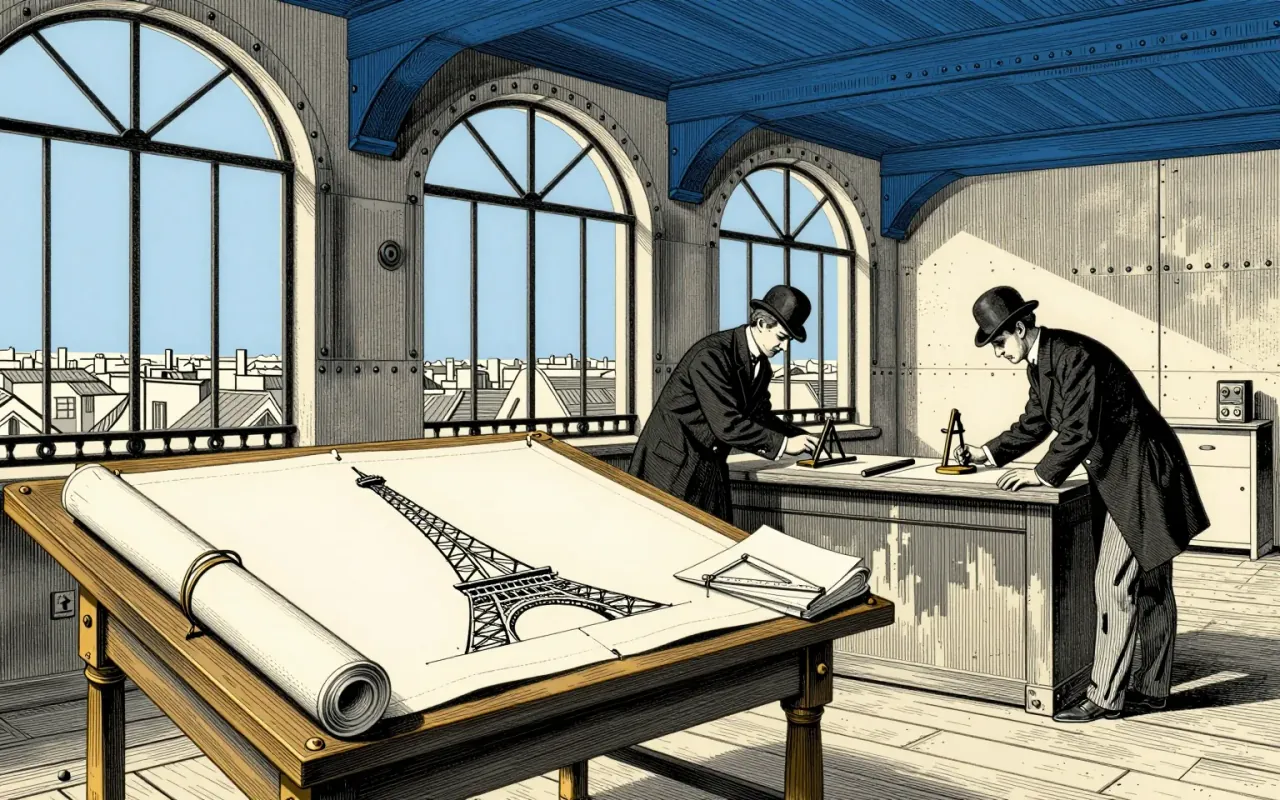
The Eiffel Tower is a feat of delegated authorship, procedural manipulation, and industrial discipline — not solitary genius.
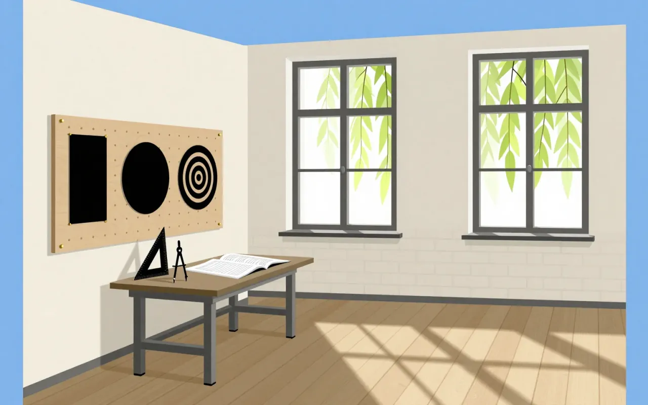
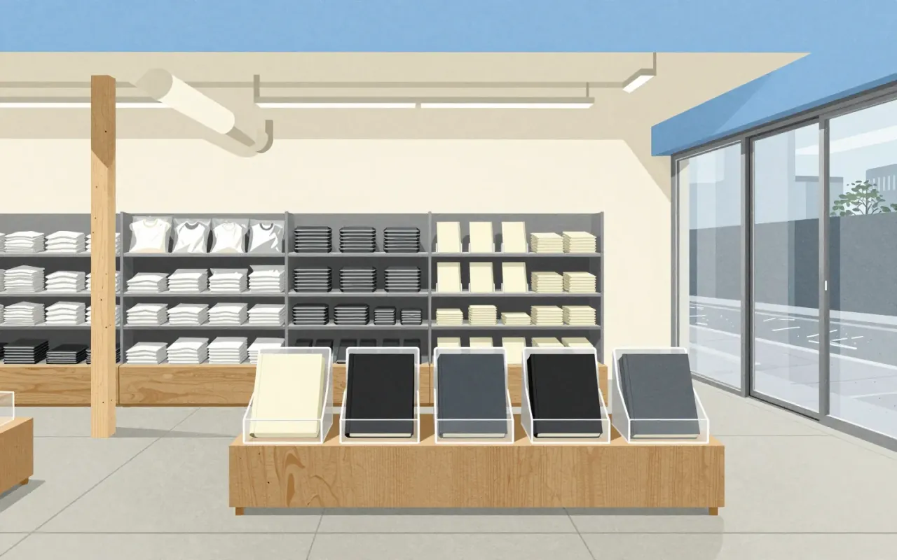
The work is Kenya Hara’s 2001 appointment as Muji’s art director — a strategic, graphic-led recalibration of a brand adrift from its 'No design' principle. He treated every object as designed, not neutral; replaced myth with method; and tightened coherence across 5,000 products and 250 stores. His posters — 'Horizon' (2003) and 'Natsure, Naturally, MUJI.' (2018) — are artefacts of that stance. Nothing in the sources supports claims about product design, architecture, or influence beyond Muji itself.
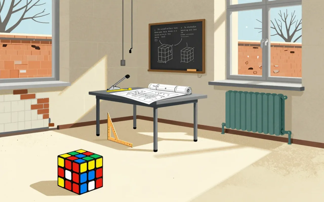
The Rubik's Cube is an industrial design solution to a structural problem — not a toy conceived for entertainment. Its puzzle nature was discovered retroactively. Its success rests on a durable, self-contained mechanical system made possible by interlocking plastic — a deliberate departure from earlier magnetic designs. It entered culture via student and enthusiast adoption in Budapest, not marketing or pedagogy. Its influence lies in proving that constraint-driven engineering can generate enduring cultural objects.
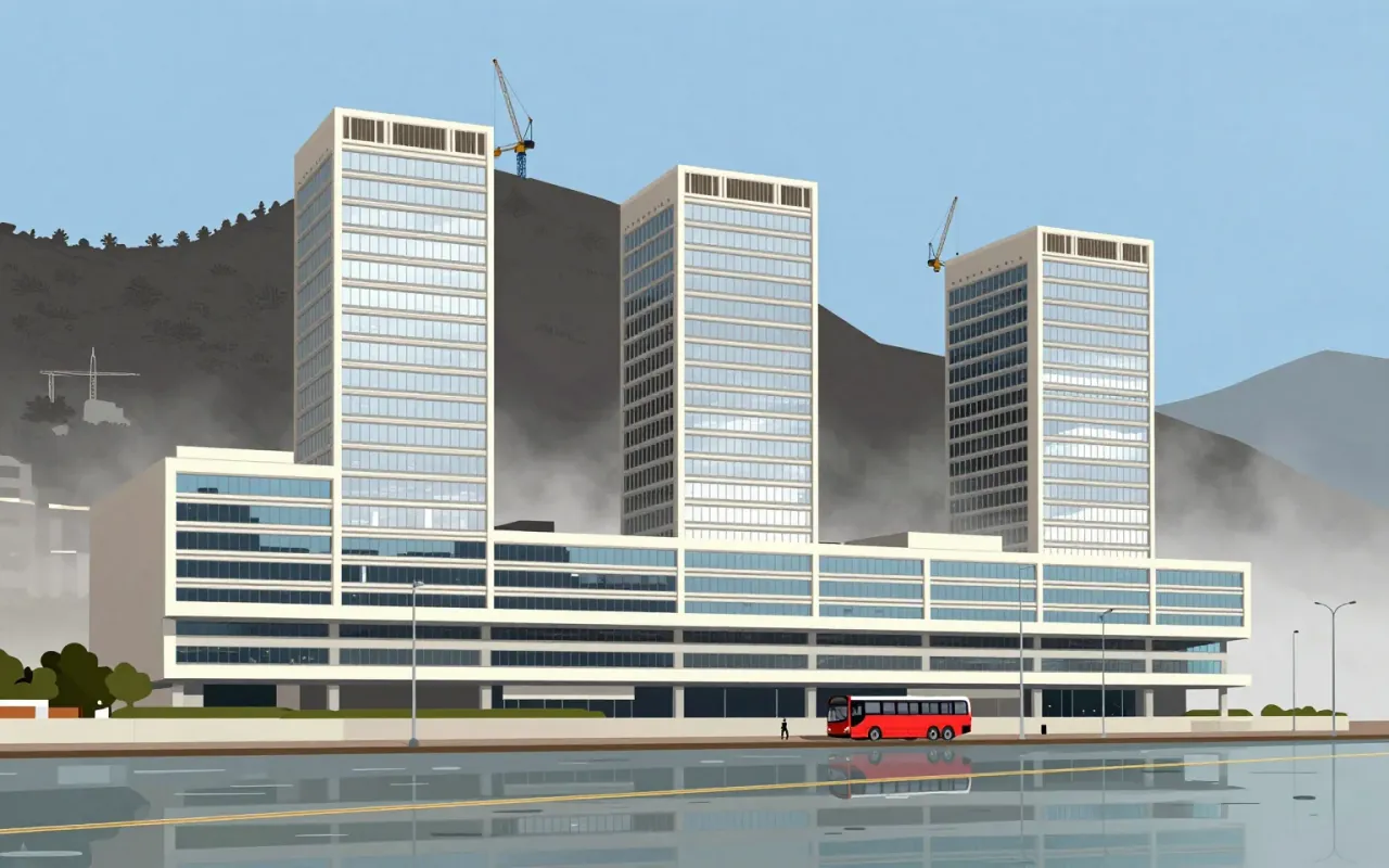
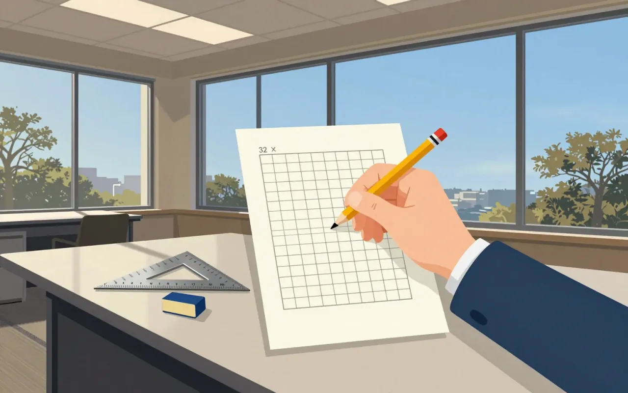
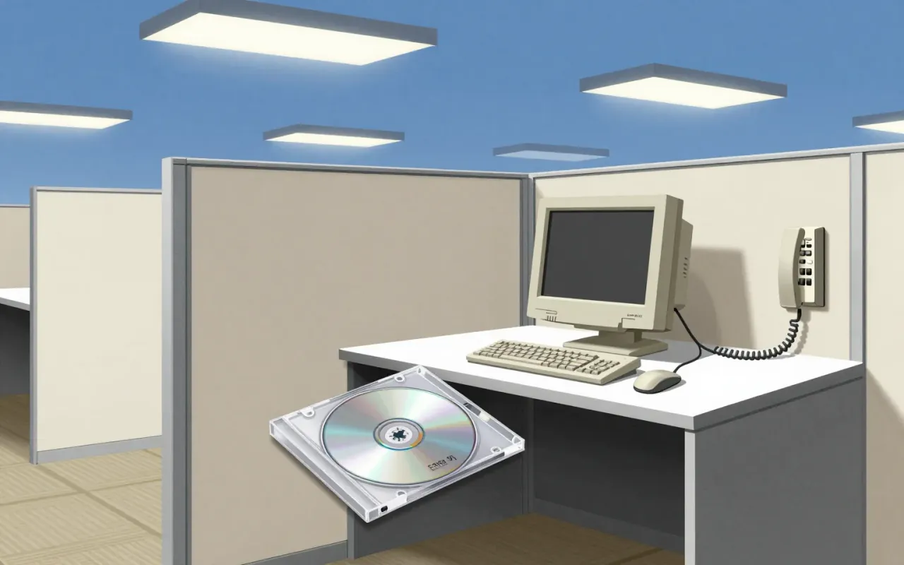
Tahoma is a humanist sans-serif typeface designed by Matthew Carter for Microsoft as the Windows interface typeface. It shipped with Office 97 and served as the default screen font in multiple Windows versions. Carter first designed it as a bitmap font, then wrapped TrueType outlines around those bitmaps. Its bold weight is based on double-pixel width. Ascender Corporation added italic and small caps versions in 2010. Tahoma has a narrower body, smaller counters, tighter letter spacing, and a more complete Unicode set than Verdana. The uppercase I is distinguishable from lowercase l — critical for technical clarity. Carter acknowledged similarities between Tahoma and his earlier Bell Centennial typeface. It was created to address specific technical challenges posed by early computers.
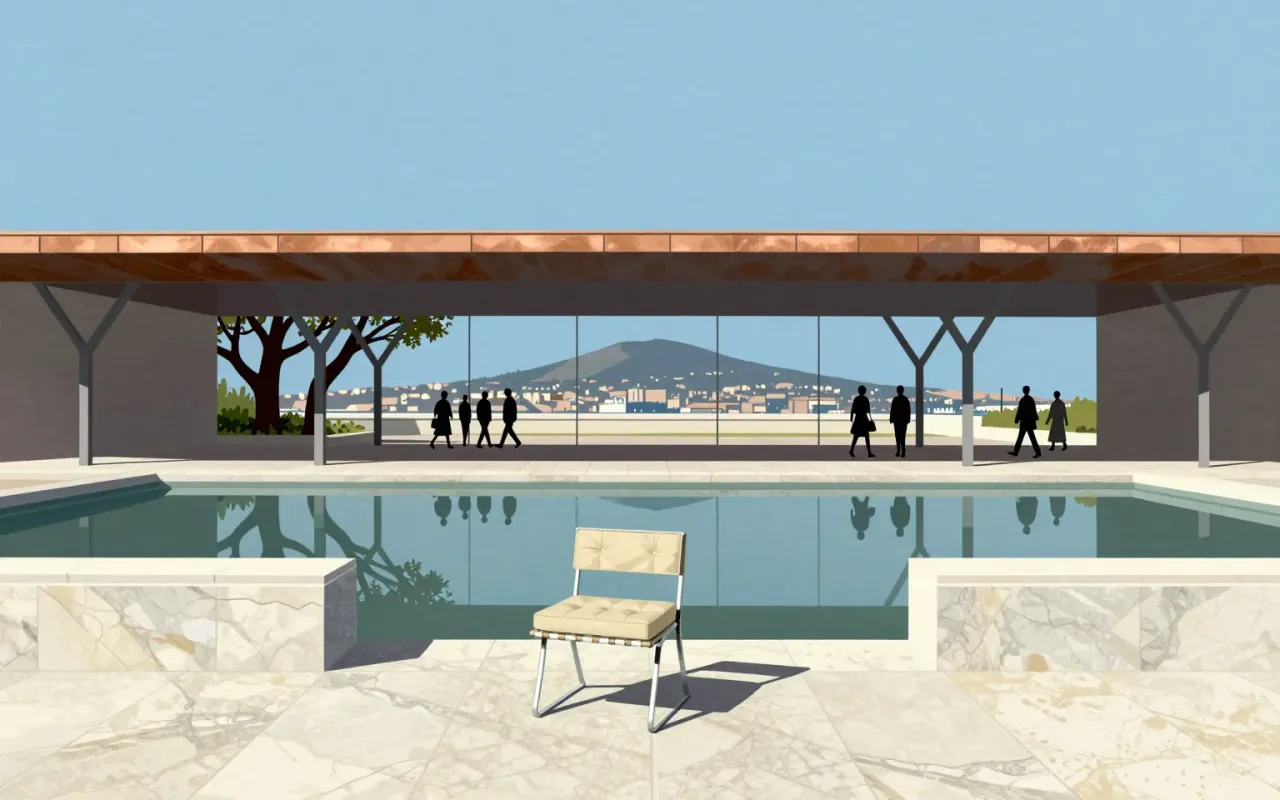
The Barcelona Pavilion is a temporary German Pavilion for the 1929 International Exposition in Barcelona, co-designed by Ludwig Mies van der Rohe and Lilly Reich. It used marble, red onyx, and travertine. It was demolished in 1930. A 1986 reconstruction now stands on the original site. It is one of Mies’s two European masterworks. Its spatial logic, material choices, and role as both exhibit and experiential space remain legible and instructive.

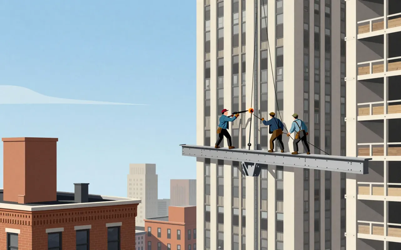
The Empire State Building is a 102-storey Art Deco skyscraper in New York City. It was the first building over 100 stories tall. It held the title of world’s tallest building from 1931 until 1970.
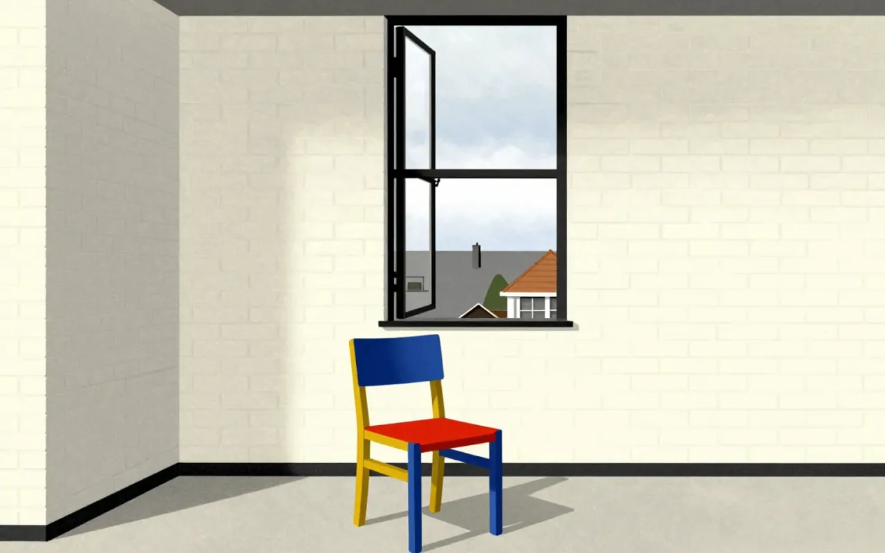
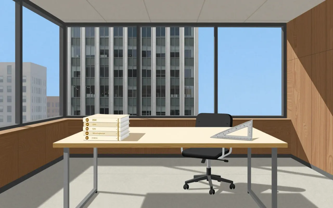

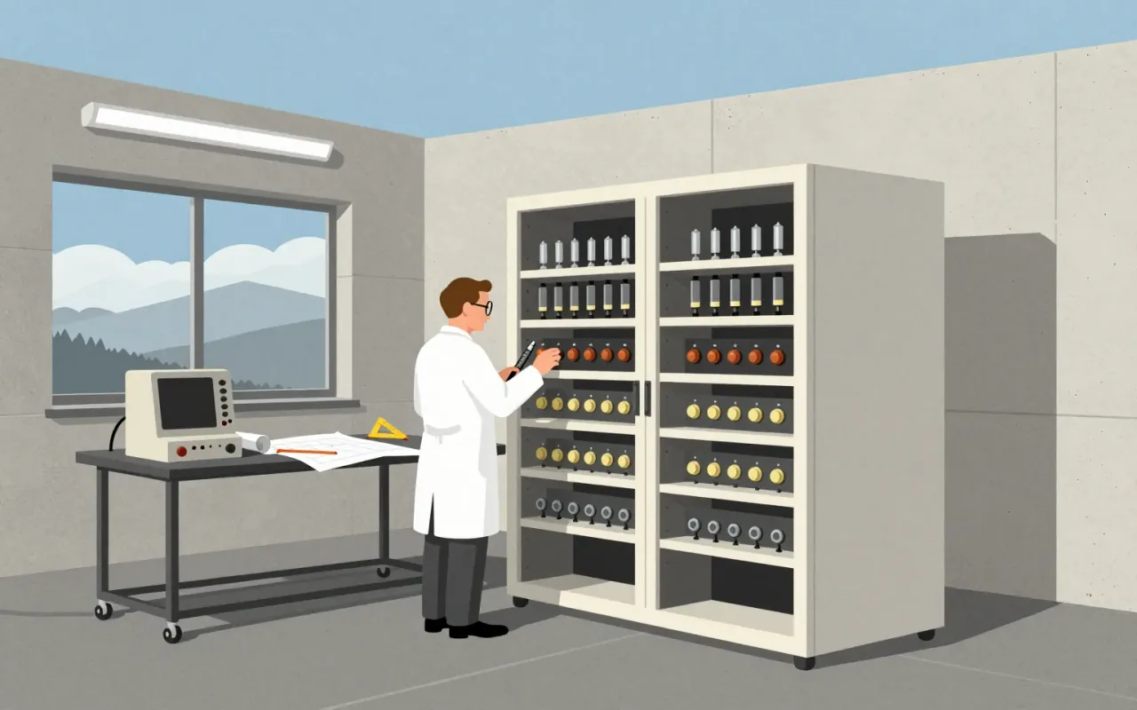
Adriano Olivetti’s work is a coherent, documented system of industrial organisation, spatial planning, and political theory — not a collection of iconic objects. Its strength lies in the linkage between departmental structure, worker housing, advertising partnerships, and published doctrine. Its limitation is that none of the celebrated products (Lettera 22, Programma 101, Valentine, Elea 9003) are attributed to him directly in the source material. The influence is structural, not stylistic.

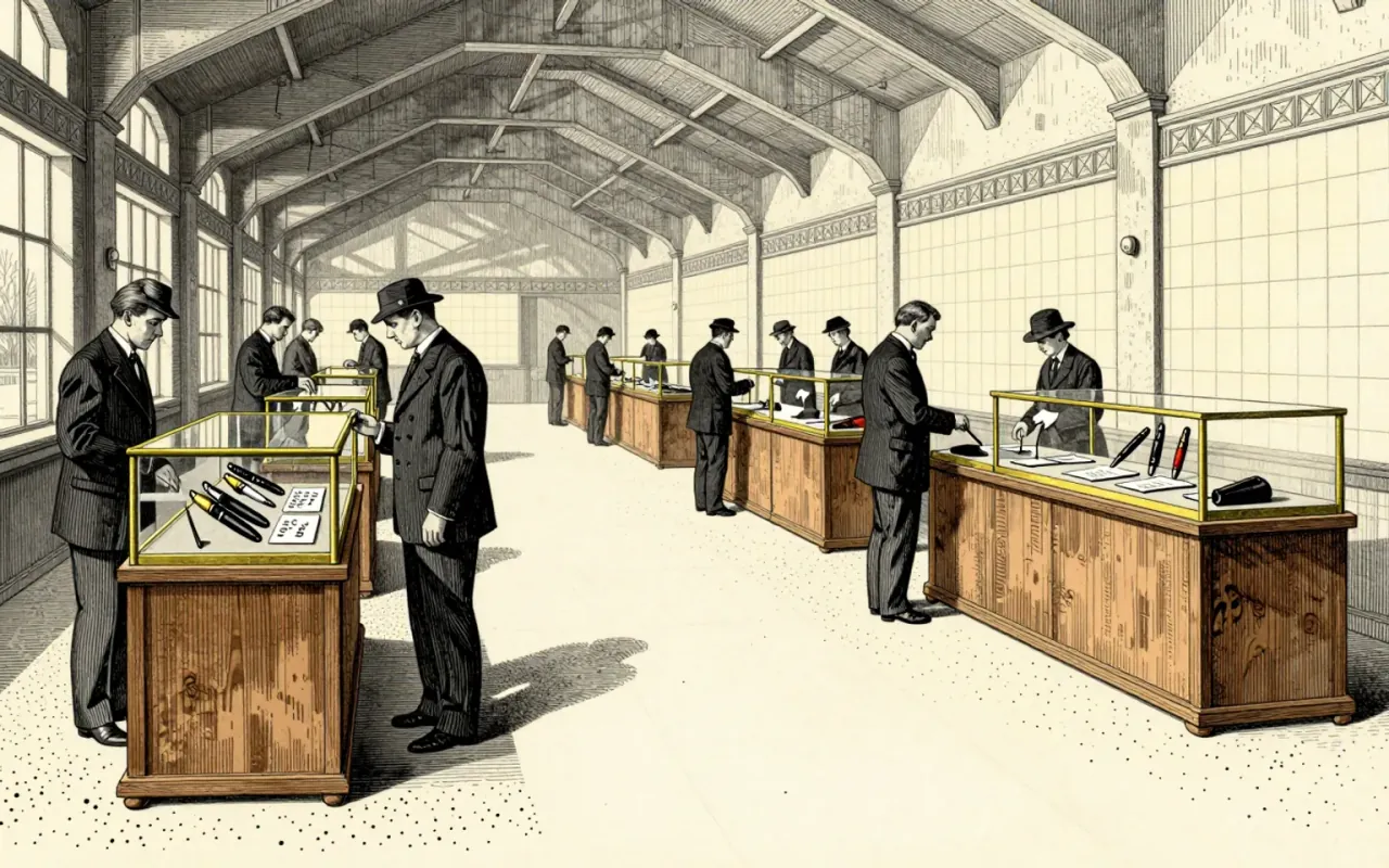
The ballpoint pen is a mechanical solution to ink viscosity. It replaces fountain-pen capillary action with a rotating ball that meters viscous, fast-drying newspaper ink. Bíró’s 1931 prototype and subsequent patents formalised this logic — not as refinement, but as substitution. It works where fountain pens fail: on absorbent paper, without blotting, with minimal maintenance. It does not solve line consistency or pressure sensitivity. Its influence is structural: it defined the cartridge-fed, disposable, low-tolerance writing tool that dominated global manufacturing after 1945.
Futura is a geometric sans-serif typeface designed by Paul Renner and released in 1927.
A diagrammatic map of London's rapid transit network, designed in 1931 by Harry Beck. It is not a geographic map. It is a navigational tool that reduces the network to connections, sequence, and interchange points.
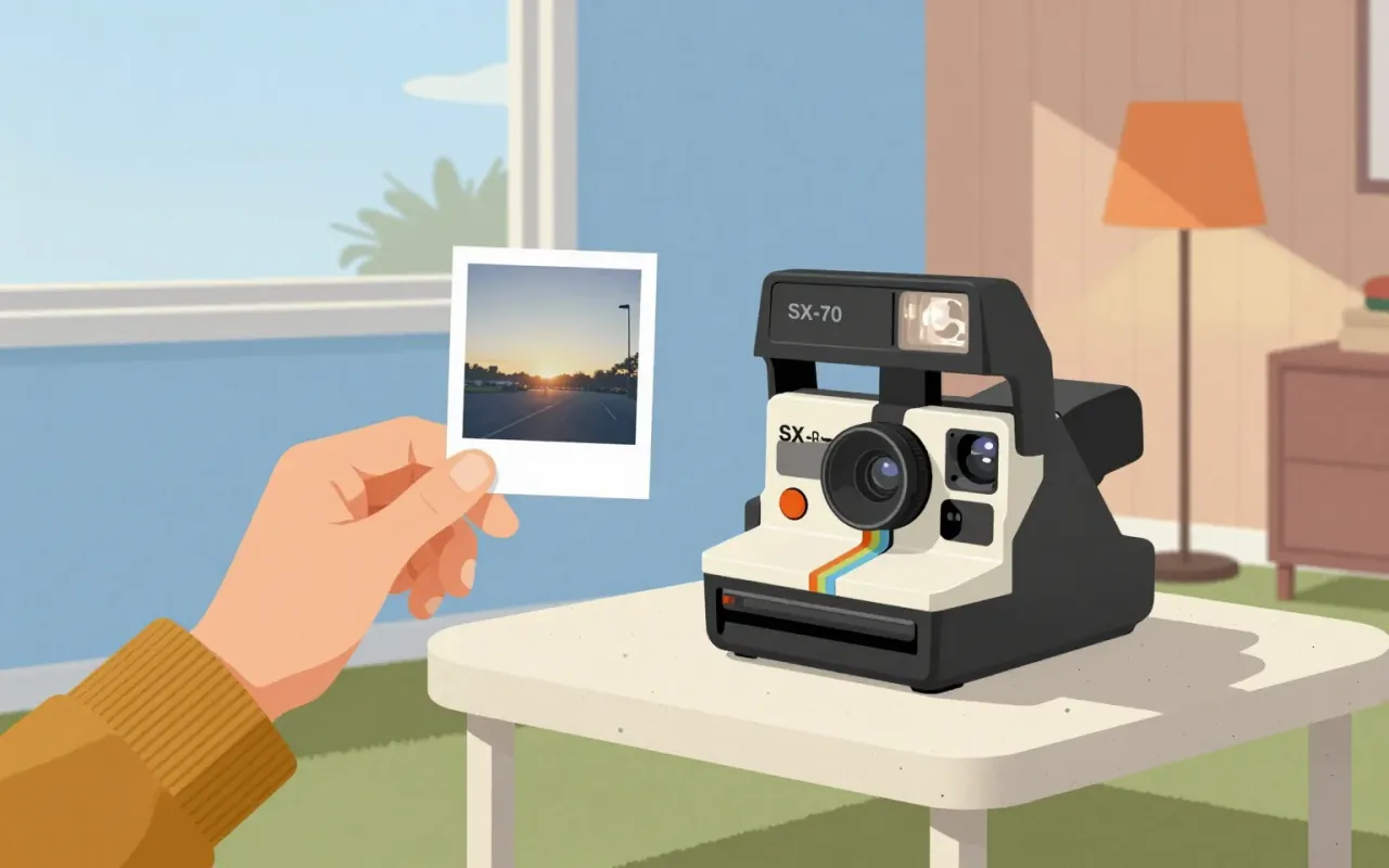
The SX-70 and model 95 Land Camera are industrial design decisions that replaced photographic process with photographic moment. They achieved seamlessness by embedding chemistry, timing, and ejection into hardware — not software, not service, not instruction. No claim is made about aesthetics, mass production, or longevity. Only this: they moved development from darkroom to device, and from ritual to reflex.
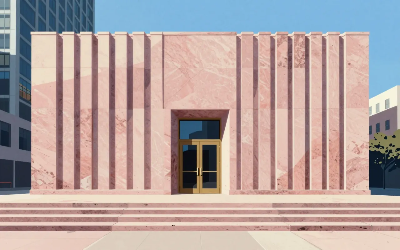
550 Madison Avenue is a postmodern skyscraper completed in 1982 by Philip Johnson and John Burgee. It uses pink Stony Creek granite cladding and features an eight-story arched entry and split pediment. It challenged modernist functionalism, complied with NYC zoning via an atrium, and reduced energy use versus glass towers. Though not the first postmodern building, its scale and location made it the movement’s most famous example. It was designated a NYC landmark in 2018.
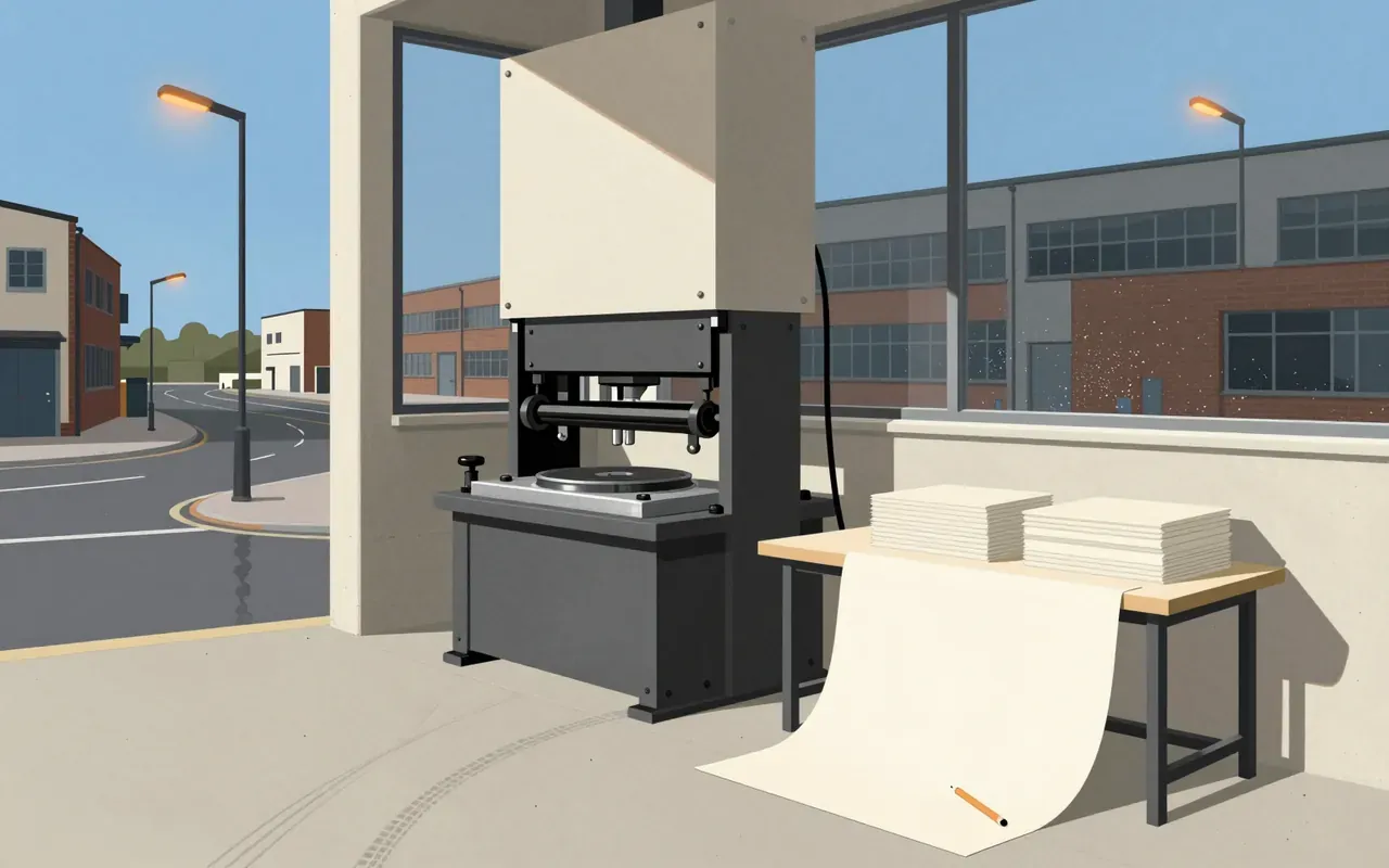
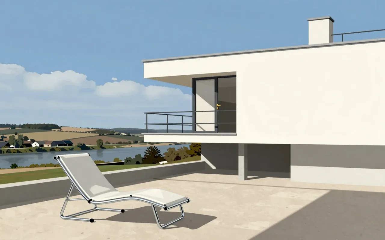
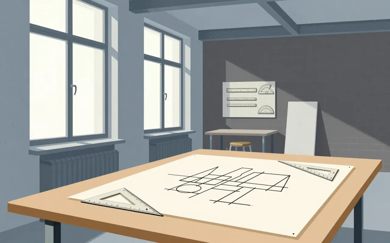
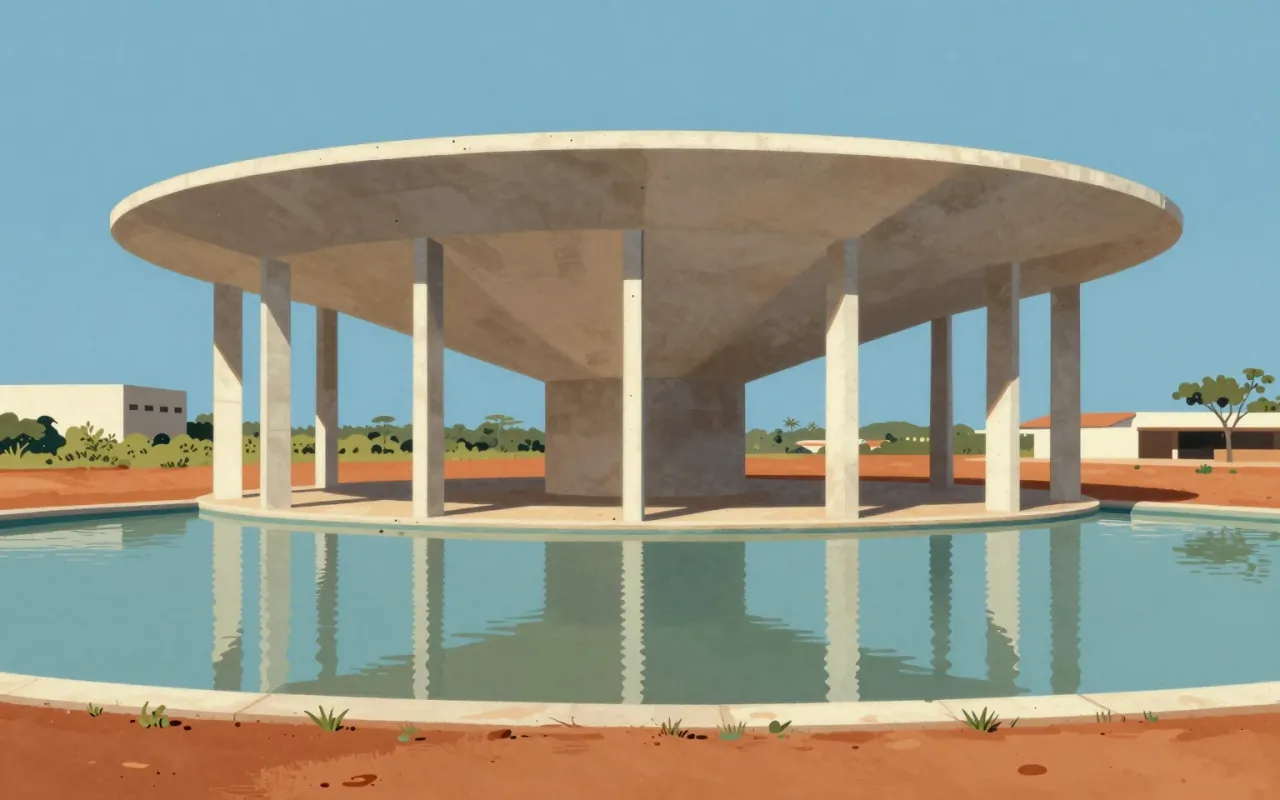
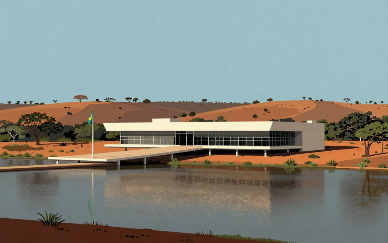
The Cathedral of Brasília is a hyperboloid concrete-framed structure designed by Oscar Niemeyer and engineered by Joaquim Cardozo, featuring subterranean massing, symbolic column geometry, passive thermal design via a reflecting pool, a fiberglass outer roof, and a large suspended stained-glass composition. It specifies construction methods, dimensional and material properties, spatial sequencing (tunnel entry), and symbolic intent tied directly to structural form.
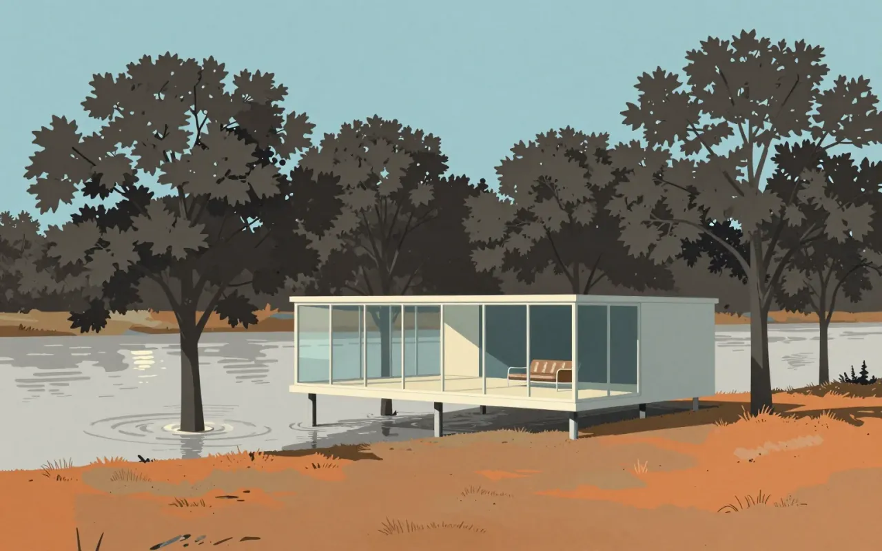
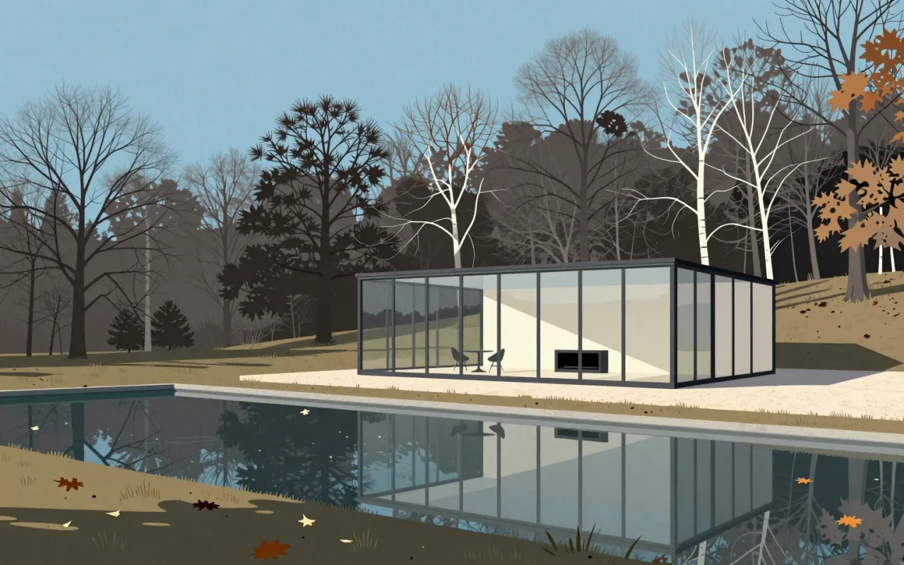
The Farnsworth House is a radical distillation of architectural intent: a frame, a slab, and glass — nothing more. It answers a site constraint (flooding) with elevation, then uses that elevation to advance a philosophy: shelter as transparency, not enclosure. It works as an idea. It fails as a home. Its influence is structural and rhetorical — not technical, not ergonomic, not climatic.

Baskerville is a 1757 serif typeface designed by John Baskerville in Birmingham and cut by John Handy. It is transitional — a refinement of Caslon’s old-style forms — with higher stroke contrast, sharper serifs, vertical axis shift, more circular curves, and greater character regularity. Its success depended on wove paper (co-developed with James Whatman), custom ink, and precise presswork. The 1757 Virgil edition demonstrated its capabilities and secured Baskerville’s 1758 appointment as University Printer to Cambridge. It set formal precedents for Bodoni and Didot, but its legibility limits at small sizes and material dependencies remain unaddressed.

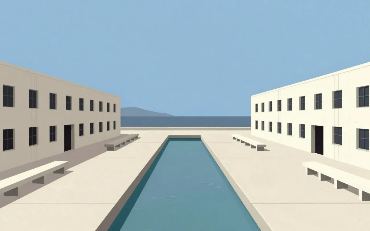
The Salk Institute is the laboratory cluster of Louis Kahn’s unrealised three-part campus. Built 1959–1965 in La Jolla, California, it uses column-free floors, integrated service floors supported by Komendant’s pre-stressed concrete Vierendeel trusses, and a Barragan-advised water court to focus attention on the Pacific Ocean. Only the lab cluster was realised. No source states what it influenced.