designbriefs
Highest rated

All briefs

479 briefs · 3191 min · 97–192 on page 2 of 5
12:00

Chrysler Building

William Van Alen · 1930

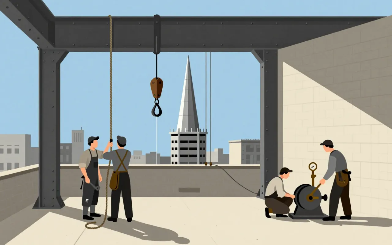
The Chrysler Building is a 1,046-foot-tall steel-framed brick skyscraper in New York City, designed by William Van Alen in the Art Deco style and completed in 1930. Van Alen used Nirosta stainless steel—the first such use in an American project—as an integral design element. He secretly built a 125-foot spire inside the frame and assembled it in 90 minutes on October 23, 1929. The building served as a real-world test site for stainless steel durability, with formal inspections every five years from 1929 to 1960. It became the world’s tallest building for 11 months and remains the tallest steel-framed brick building in the world. Critics responded with mixed reactions—including praise for Van Alen personally and criticism of the building as superficial and lacking serious design significance.

10:02

Citroën DS

Flaminio Bertoni

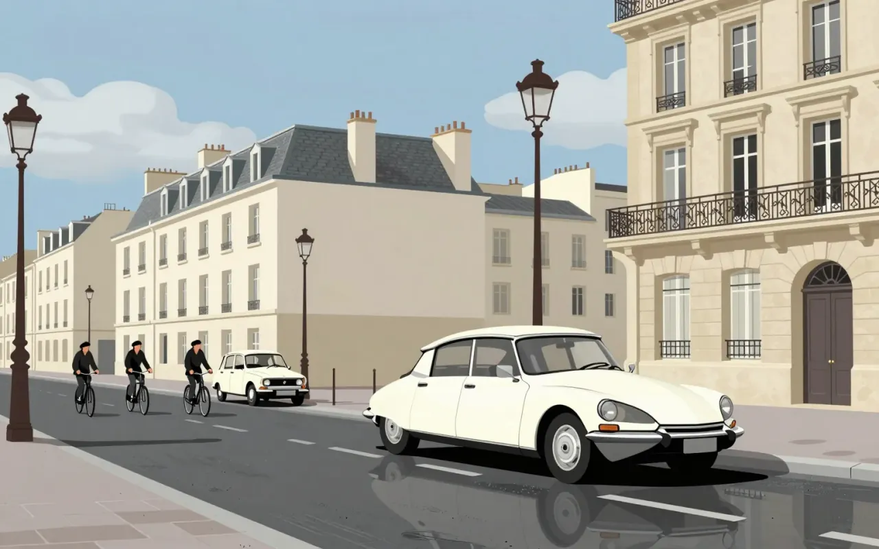
The Citroën DS is an industrial design for a mass-production automobile. Flaminio Bertoni co-styled it with André Lefèbvre. Paul Magès developed its hydropneumatic self-levelling suspension. It used hydropneumatic suspension and disc brakes — the first mass-production car to do so. It set new standards in ride quality, handling, and braking. It pushed the envelope in the ride vs. handling compromise possible in a motor vehicle. Its body design was aerodynamic and futuristic. Roland Barthes described it as looking as if it had 'fallen from the sky'. The DS Series 3 introduced directional headlights to automotive mass-production.

10:00

Comic Sans

Vincent Connare · 1994

Comic Sans is a 1994 Microsoft typeface designed by Vincent Connare to replace Times New Roman in Microsoft Bob’s cartoon interface. It was drawn manually with a mouse, inspired by The Dark Knight Returns and Watchmen, and intended to be informal and child-friendly. Though it missed Bob, it shipped with Windows 95 and gained broad use in education and dyslexia support. A 2010 Princeton study found Comic Sans Italic improved information retention versus Helvetica. It demonstrates how narrow constraints — aesthetic, technical, and audience-specific — can yield unexpectedly robust functional outcomes.

10:01

Cooper Black

Oswald Cooper · 1922

Cooper Black is an ultrabold serif typeface designed for display use, drawn as an extra-bold weight of the Cooper Old Style family. It originated from Oswald Cooper’s lettering practice in 1920s Chicago and the Midwest. Its low stroke contrast and soft, 'muddy' appearance distinguish it from nineteenth-century fat faces. It quickly became popular in newspaper advertising and later in pop culture — notably on the 1966 Pet Sounds album cover. It was the second-best-selling typeface for American Type Founders and polarised typographic opinion: rejected by conservative typographers but embraced so enthusiastically by graphic designers that supply could not meet demand.

8:16

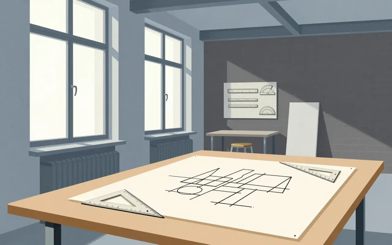
De Stijl

Piet Mondrian & Theo van Doesburg · 1917

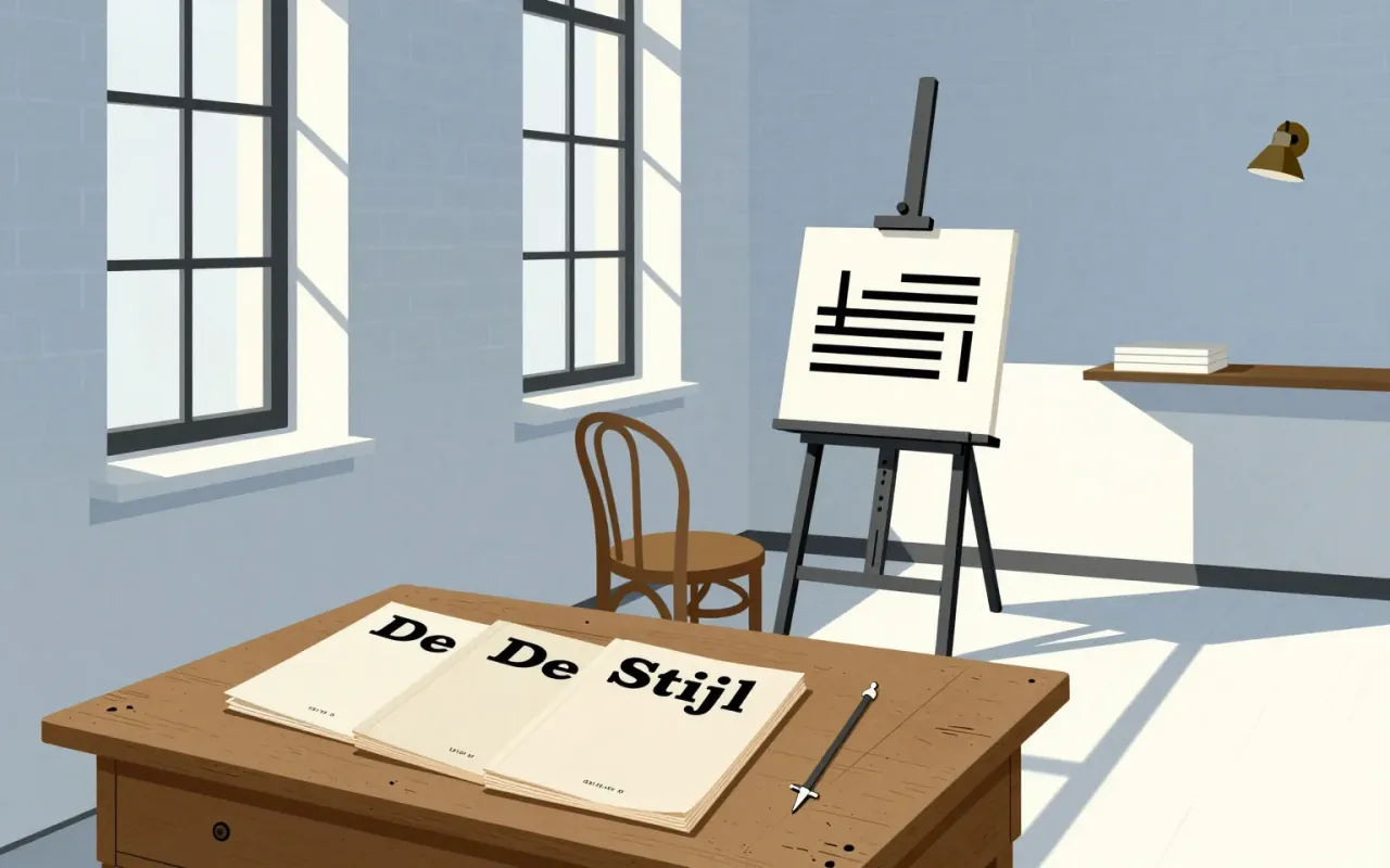
De Stijl is a publishing project that became a movement by enforcing absence. Its power lies in how precisely it names what it excludes — and how visibly it abandons those exclusions later.

9:42

Diébédo Francis Kéré

Architecture that cools classrooms by 8°C without AC — because it was drawn in sand and built by everyone who would use it.
10:37

Dieter Rams

Functionalism was not a style Rams chose — it was the only way to make electronics legible, durable, and scalable in postwar Europe.
9:54

Eames Lounge Chair

Charles Eames, Ray Eames · 1956

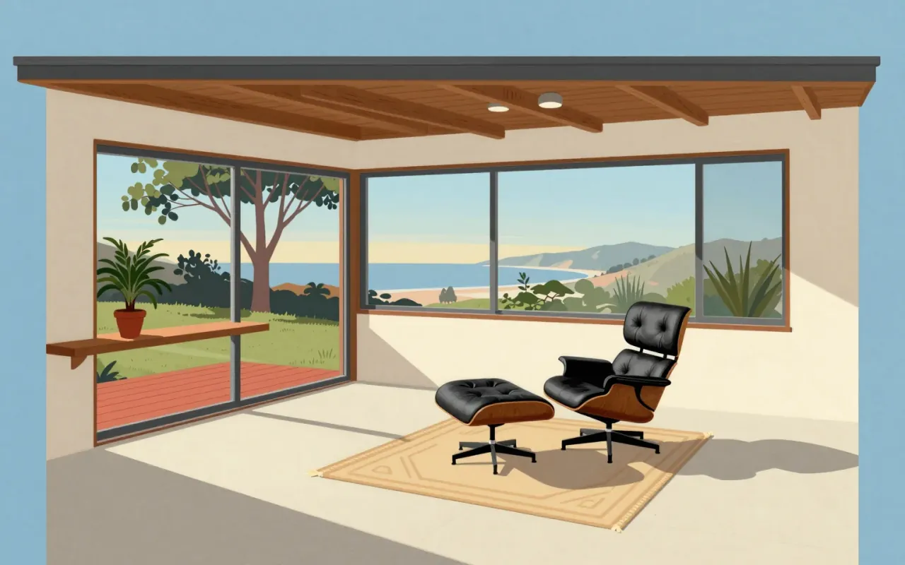
A high-end lounge chair and ottoman introduced in 1956 by Herman Miller, designed by Charles and Ray Eames, composed of three veneered molded plywood shells and leather-upholstered cushioning.

11:35

Eero Saarinen

Saarinen didn’t invent a style—he invented a method for making form answer function, then insisted others do the same.
9:50

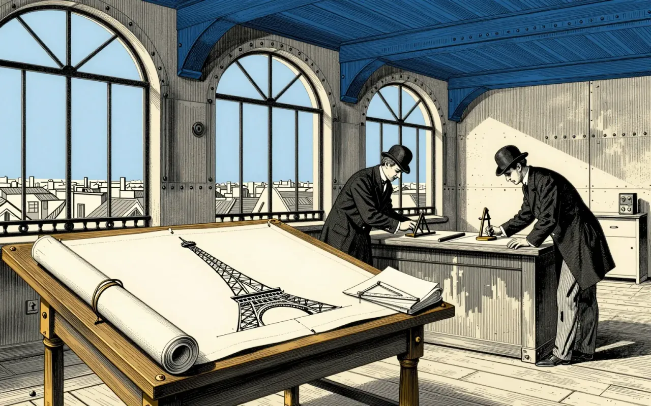
Eiffel Tower

Gustave Eiffel · 1887

The Eiffel Tower is a feat of delegated authorship, procedural manipulation, and industrial discipline — not solitary genius.

9:42

Eiko Ishioka

Surrealism anchored in historical form—not abstraction—gave her authority across Olympics, film, and advertising.
9:34

El Lissitzky

Lissitzky didn’t make art to be looked at — he made it to be walked into, reoriented by, and reconstructed in the mind.
10:09

Emil Ruder

Emil Ruder didn’t design posters—he designed the rules for how to teach typography as communication.
9:46

Empire State Building

Shreve, Lamb & Harmon · 1931

The Empire State Building is a 102-storey Art Deco skyscraper in New York City. It was the first building over 100 stories tall. It held the title of world’s tallest building from 1931 until 1970.

9:59

Ettore Sottsass

Sottsass didn’t break design — he weaponised its tools against consumerism.
10:16

Fallingwater

Frank Lloyd Wright · 1936

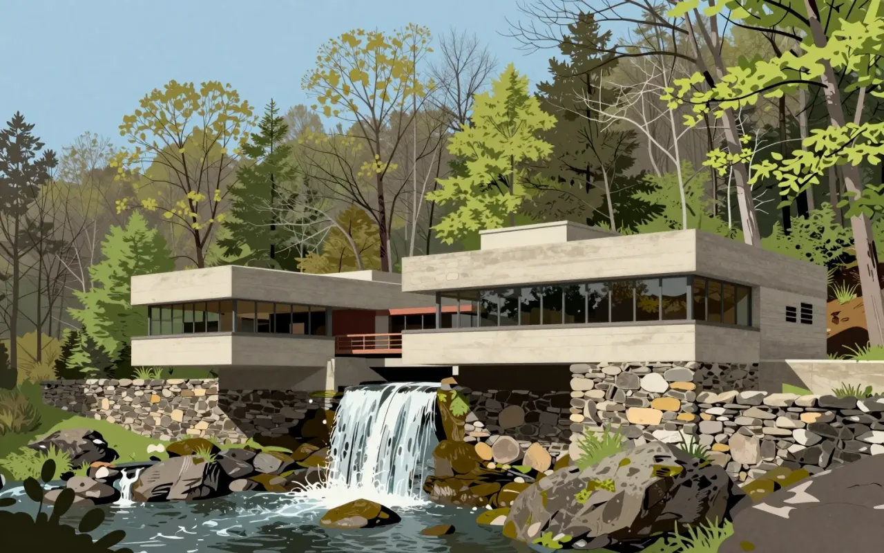
Fallingwater is a weekend retreat built over a 20-foot waterfall on Bear Run in Stewart Township, southwestern Pennsylvania. Designed by Frank Lloyd Wright for Edgar J. Kaufmann Sr. and Liliane Kaufmann, it uses exposed cantilevers, sandstone verticals, and concrete horizontals. Its 30° counterclockwise orientation ensures natural light in all rooms. Wright insisted occupants live *with* the waterfall — not look at it — using identical materials inside and out to dissolve boundaries. Trees were preserved via adaptive detailing. The design was judged unsound by Kaufmann’s engineers; the contractor secretly reinforced concrete elements. Structural vulnerabilities confirmed in 1994 led to steel supports and post-tensioning by 2002. At $155,000, it was one of Wright’s most expensive commissions.

9:32

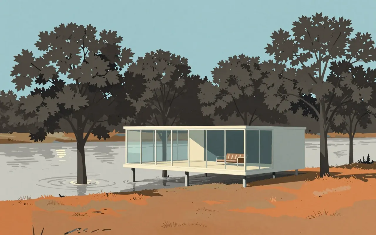
Farnsworth House

Ludwig Mies van der Rohe · 1951

The Farnsworth House is a radical distillation of architectural intent: a frame, a slab, and glass — nothing more. It answers a site constraint (flooding) with elevation, then uses that elevation to advance a philosophy: shelter as transparency, not enclosure. It works as an idea. It fails as a home. Its influence is structural and rhetorical — not technical, not ergonomic, not climatic.

9:13

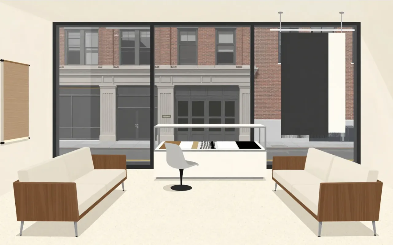
Florence Knoll

She didn’t design chairs. She designed the logic of the office—and made interior design a profession.
10:19

Frank Lloyd Wright

Wright didn’t build houses—he built systems for living, constrained by philosophy, not physics.
8:51

Gae Aulenti

Aulenti didn’t restore the Gare d'Orsay — she edited it like a film reel: cutting ornament, splicing levels, and dialling up light until the building served the art, not its own history.
10:10

Garamond

Claude Garamond · 1530

Garamond is a group of 34 metal typefaces cut by Claude Garamond (Garamont) in sixteenth-century Paris. They follow Griffo’s 1495 design, belong to the old-style serif category, and were made by hand-engraved punches used to stamp matrices for casting type. The Grecs du roi Greek typeface replicates Angelo Vergecio’s handwriting using an unusually large number of alternates and ligatures. Swash forms exist only in the parangonne. Small capitals appear in all preserved types except the gros-canon. Garamond’s independence as a punchcutter helped define typefounding as a distinct commercial industry.

8:36

Gerrit Rietveld

Rietveld treated furniture and architecture as the same problem: how to make space, form, and function legible through subtraction and system.
10:17

Gill Sans

Eric Gill · 1928

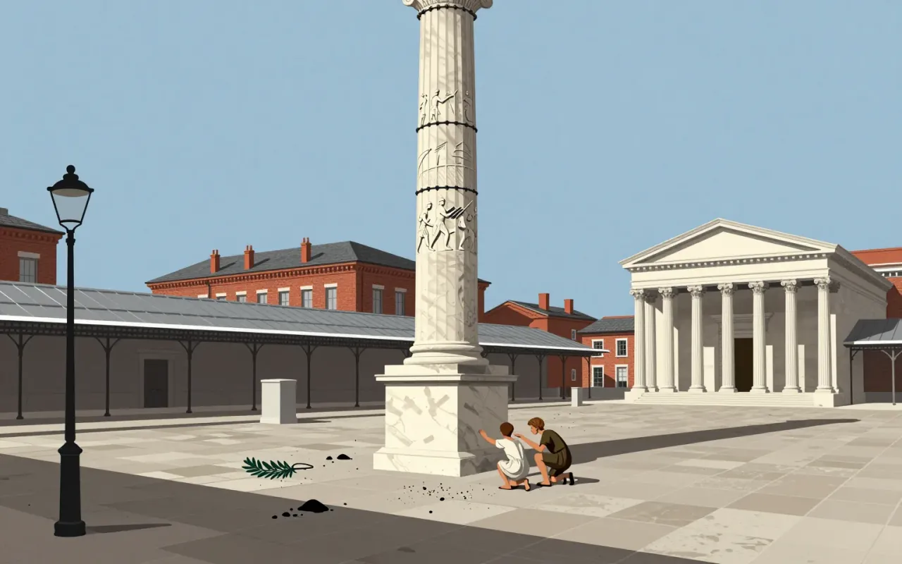
Gill Sans is a humanist sans-serif typeface designed by Eric Gill and released by Monotype in 1928, based on Edward Johnston's 1916 Underground Alphabet and Roman inscriptions, with lowercase forms derived from old-style serifs and uppercase proportions drawn from Trajan’s Column.

10:48

Golan Levin

Levin didn’t build interfaces—he built mirrors for how machines see, hear, and misread us.
8:08

Hans Wegner

Wegner’s chairs are not minimalist—they are obsessive negotiations between joinery, history, and refusal to delegate.
10:30

Helvetica

Max Miedinger · 1957

Helvetica is a deliberately constrained sans-serif, made to erase voice — not to express it.

9:40

Herbert Bayer

Bayer didn’t simplify type to look clean — he cut capitals to speed up writing, and his fonetik alphabet failed because English refused to relearn itself.
9:25

Hermann Zapf

Zapf didn’t adapt type to technology — he rebuilt it each time the machine changed.
10:27

IMac G3

Jonathan Ive

The iMac G3 is not a nostalgic icon — it is a tightly constrained industrial design response to market irrelevance, manufacturing pressure, and strategic reset. Its decisions were specific, costly, and reversible. Its influence is factual, not mythical.

9:37

Instant camera

Edwin Land / Polaroid

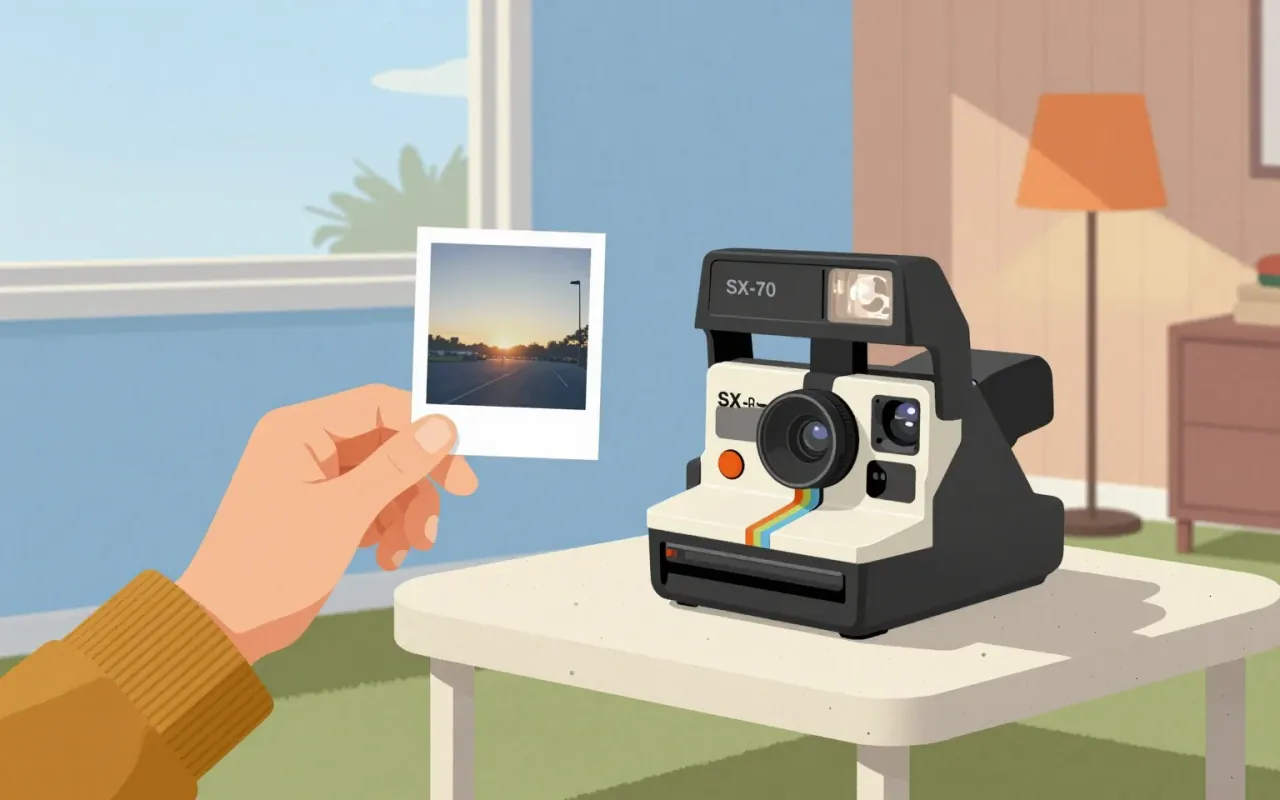
The SX-70 and model 95 Land Camera are industrial design decisions that replaced photographic process with photographic moment. They achieved seamlessness by embedding chemistry, timing, and ejection into hardware — not software, not service, not instruction. No claim is made about aesthetics, mass production, or longevity. Only this: they moved development from darkroom to device, and from ritual to reflex.

9:52

International Style

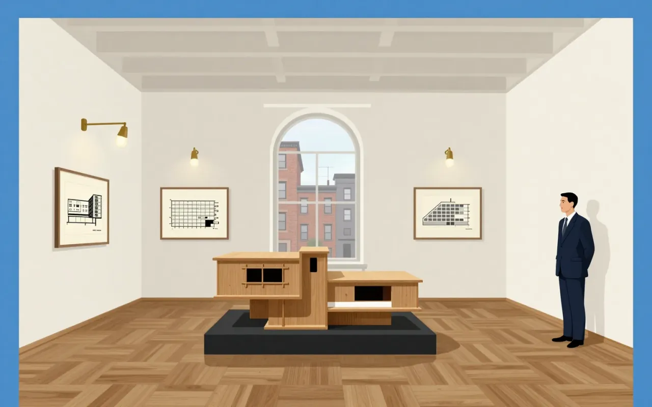
The International Style was not invented by architects — it was edited into existence by two men at MoMA in 1932.
10:52

IPhone

Jonathan Ive

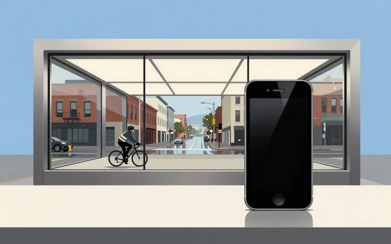
The iPhone is a pivotal industrial design and interface product defined by its introduction of multi-touch, its establishment of iOS as a global platform, and its role in standardising the slate form factor and launching the app economy. Jony Ive played a vital role in its design. No material, dimension, year of release, manufacturing method, or functional limitation is stated in the sources beyond those verified claims.

11:12

IPod

Jonathan Ive · 2001

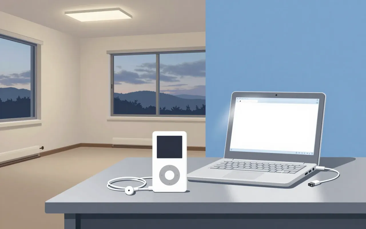
The iPod is a landmark industrial design object whose longevity and scale emerged from disciplined constraint-handling — not originality of form or interaction. Its lineage, licensing, and timing are better documented than its materials or mechanics. It belongs in industrial design history not as a breakthrough, but as a benchmark for execution under real-world limits.

9:11

Isamu Noguchi

Noguchi’s real innovation wasn’t borrowing from Asia — it was treating craft training, not iconography, as transferable method.
9:49

Johannes Itten

Itten didn’t teach colour—he taught how to see it, then how to unlearn what you thought you knew.
8:56

Josef Müller-Brockmann

Abstraction was his syntax — not a style, but a system for translating music and statistics into public space.
10:20

Kenzō Tange

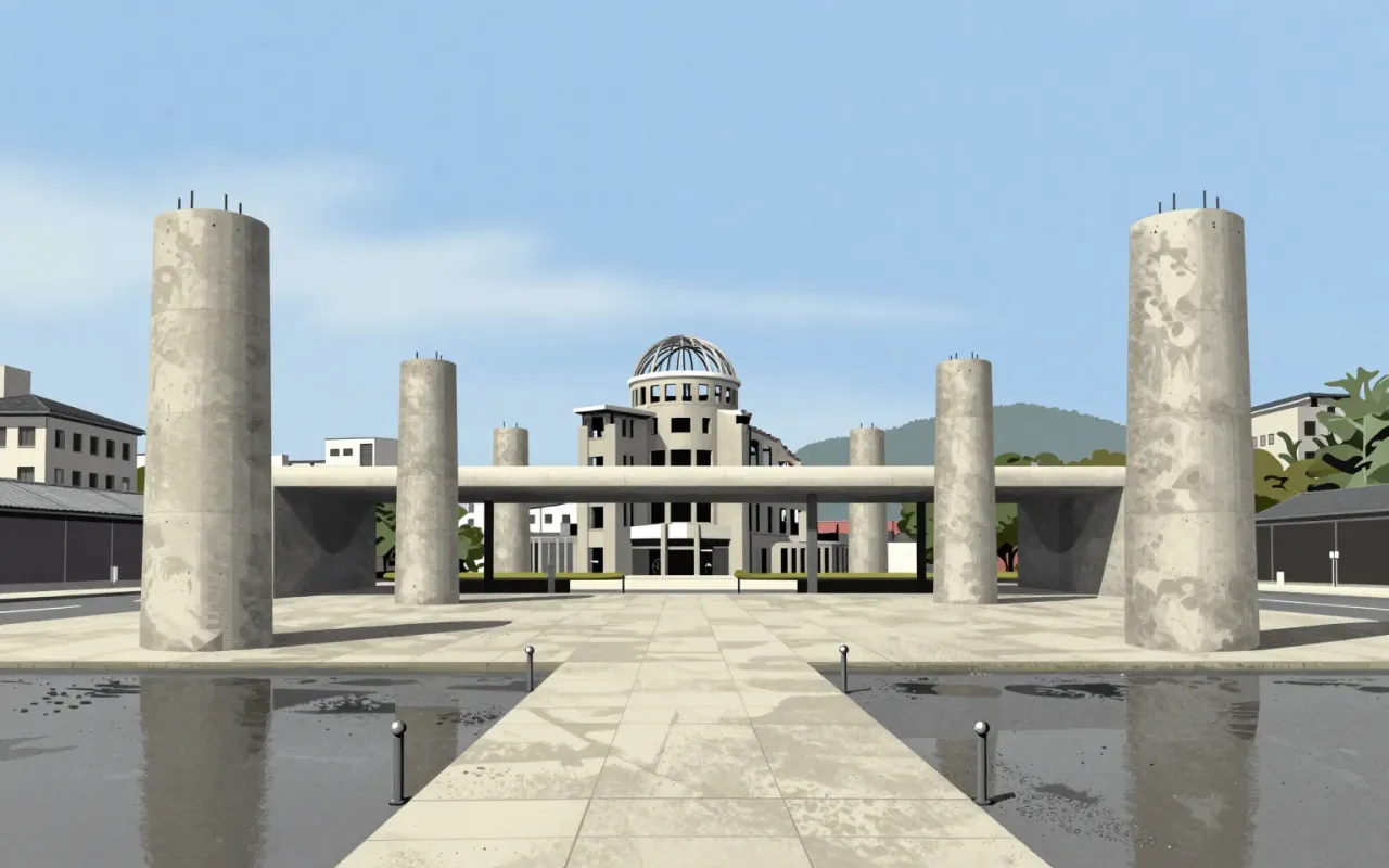
Tange didn’t rebuild Hiroshima—he reoriented it, using columns, concrete, and an axis as instruments of moral geometry.
9:14

Koloman Moser

Moser didn’t make style — he made syntax: a repeatable grammar for everyday things.
9:25

Konstantin Melnikov

Melnikov didn’t follow Constructivism—he outmanoeuvred its dogma with sawtooths, slopes, and glass.
10:13

Lever House

Skidmore, Owings & Merrill

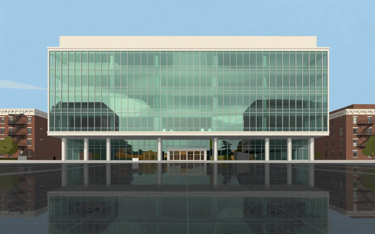
Lever House is a 21-storey New York City office building completed in 1952. It is a glass-clad slab, built for Unilever, that uses fixed glazing, concealed HVAC, and a custom window-cleaning system.

8:54

Lina Bo Bardi

She made museums uncomfortable on purpose—and proved modernism could be both raw and socially urgent.
8:55

Lúcio Costa

A jury chose Costa’s sketch over detailed rivals — not for precision, but for scalability.
10:32

Ludwig Mies van der Rohe

Mies didn’t invent minimalism—he weaponised the grid, the bolt, and the beam to make architecture a declaration of industrial certainty.
9:59

Macintosh 128K

Steve Jobs & Apple · 1984

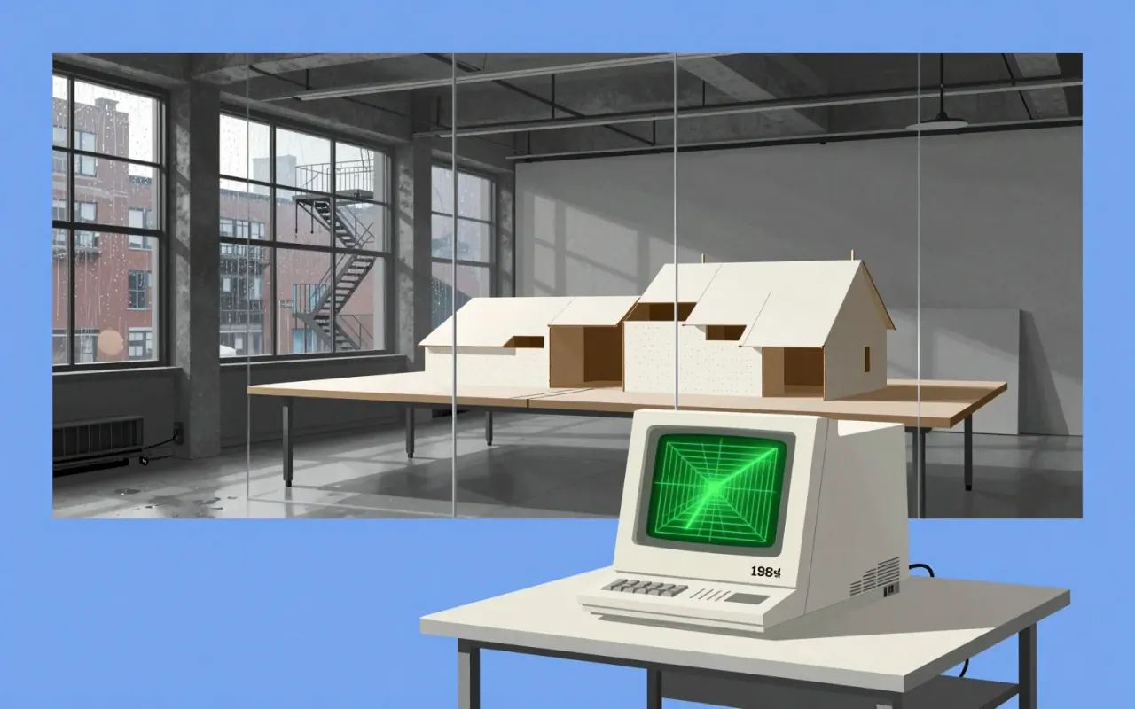
The Macintosh 128K is the original Macintosh personal computer from Apple. It is the first successful mass-market all-in-one desktop personal computer with a graphical user interface, built-in screen and mouse. It was pivotal in establishing desktop publishing as a general office function. Its hardware includes a 9-inch, 512×342 pixel monochrome CRT display, a Motorola 68000 microprocessor running at 7.8336 MHz, 128 KB RAM shared by the processor and display controller, and 64 KB ROM containing the boot procedure, OS routines, and the complete QuickDraw picture language and interpreter. The RAM consists of sixteen 64-kilobit modules soldered to the logic board. It ships with MacPaint and MacWrite to showcase its GUI and mouse-driven workflow.
11:24

Massimo Vignelli

Vignelli’s design is not about truthfulness — it’s about control over how information is seen, read, and believed.
10:44

Matthew Carter

Carter didn’t preserve tradition — he weaponised its precision against new constraints.
10:45

Max Bill

Max Bill didn’t make Swiss design rational — he made it bodily.
9:00

Michael Graves

Postmodernism wasn’t theory — it was a red bird whistling on your stove.
10:59

Milton Glaser

Glaser didn’t invent graphic design — he weaponised historical style against modern banality.
7:56

Modernism

Modernism isn’t a look—it’s a refusal to accept that art, design, or society must work the way they always have.
11:12

Muriel Cooper

She didn’t predict the digital future — she built its first grammar in Helvetica and code.
9:36

Neville Brody

Typography was never just letters for Brody—it was a weapon, a system, and a subscription service.
9:48

Norman Foster

Foster didn’t invent transparency — he engineered it into structure, climate response, and daily life.
9:44

Olivetti

Adriano Olivetti · 1908

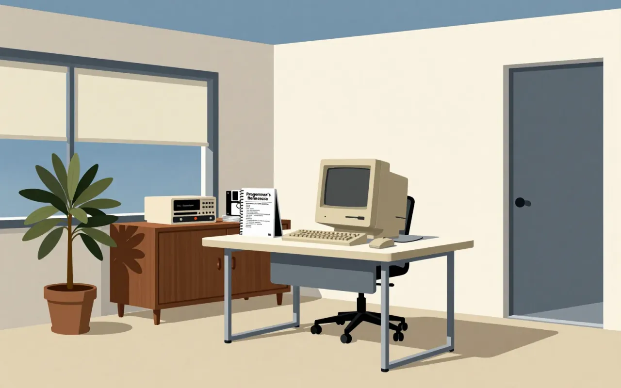
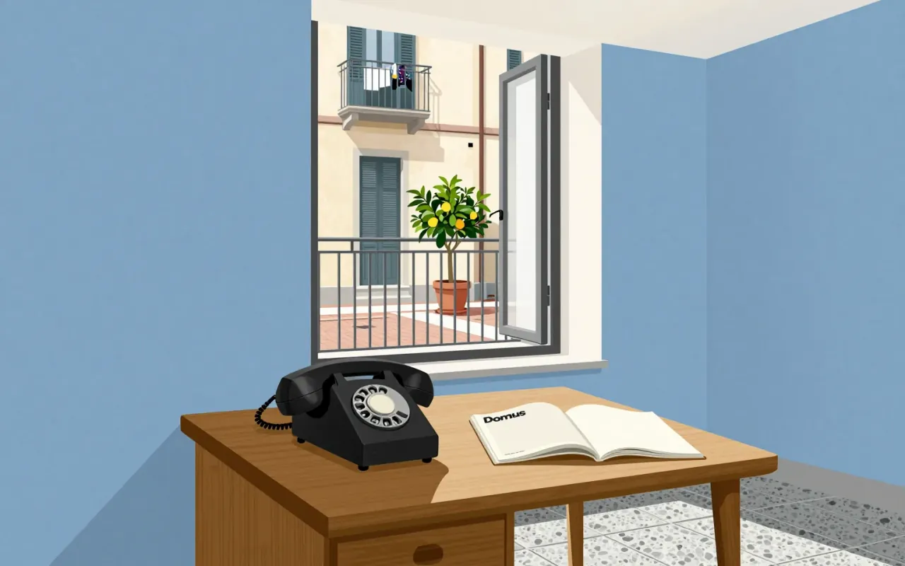
Adriano Olivetti’s work is a coherent, documented system of industrial organisation, spatial planning, and political theory — not a collection of iconic objects. Its strength lies in the linkage between departmental structure, worker housing, advertising partnerships, and published doctrine. Its limitation is that none of the celebrated products (Lettera 22, Programma 101, Valentine, Elea 9003) are attributed to him directly in the source material. The influence is structural, not stylistic.

10:06

Optima

Hermann Zapf · 1958

Optima is a deliberate hybrid: a sans-serif built from serif sources, calibrated by mathematical proportion, and tested in real textual labour. It does not invent new categories — it occupies the gap between them with precision.

9:24

Otl Aicher

Aicher’s Olympic system proved pictograms could be both precise tools and shared language — not art, not decoration, but operational infrastructure.
10:22

Panton Chair

Verner Panton · 1963

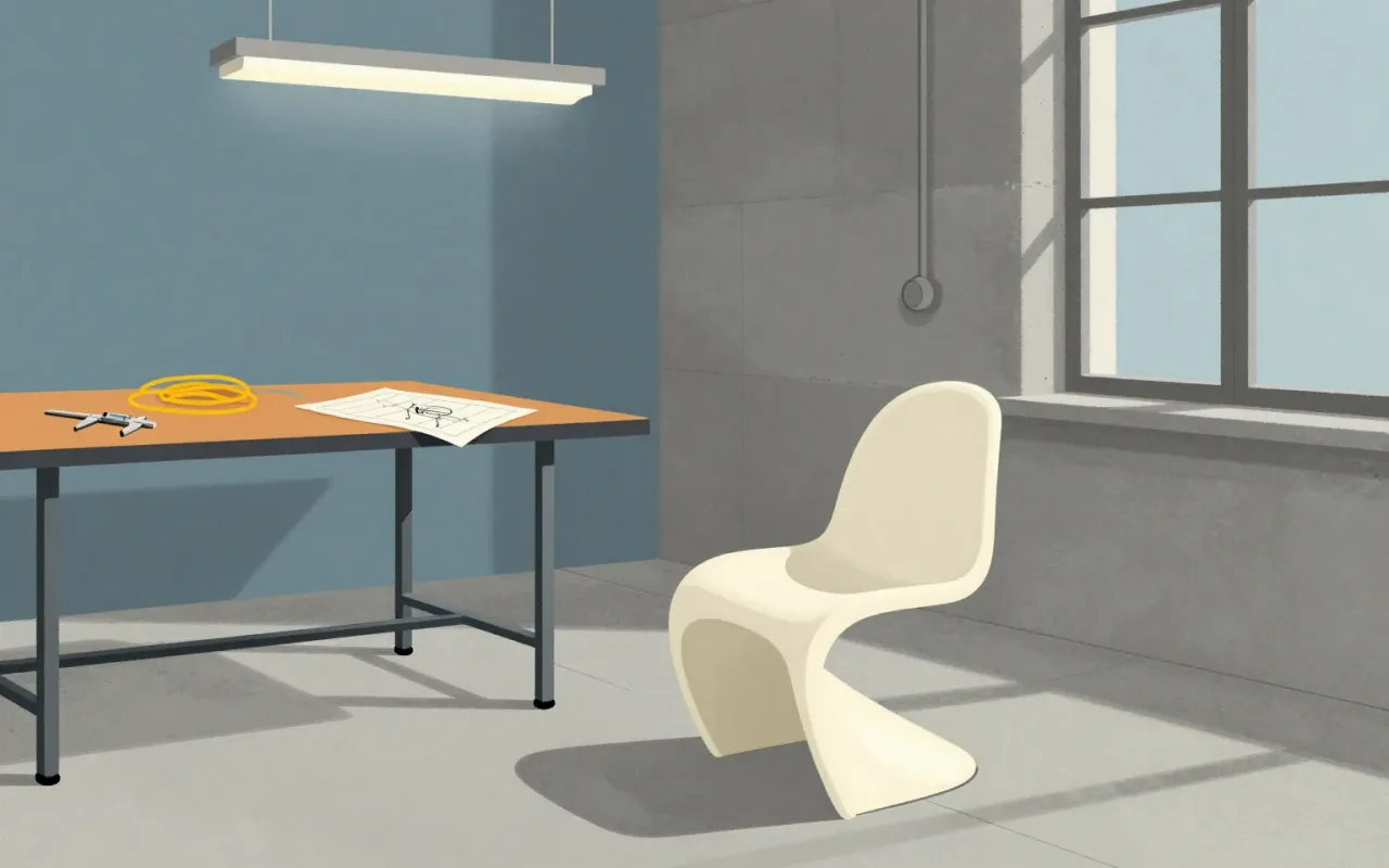
The Panton Chair is the world’s first single-piece moulded plastic chair — a continuous S-shaped shell with no legs, no joints, no assembly. Designed by Verner Panton in the 1960s, it emerged from iterative prototyping in plaster and fibreglass-reinforced polyester, then scaled via thermoplastic polystyrene injection moulding. Its success lies in resolving stackability, cantilever, and monolithic form — but its fixed geometry sacrifices adaptability and long-term durability. It proved plastic could carry structure and identity at scale, influencing decades of industrial seating. It is worth your time: not as a relic, but as a decisive answer to a tight set of material and manufacturing constraints.

10:55

Paola Antonelli

Design isn’t decoration—it’s the filter between tech and life. Antonelli proved it by putting Pac-Man and the 747 in the same museum.
9:45

Paul Rand

Rand didn’t sell logos — he sold the idea that design could change business thinking.
11:34

Paula Scher

Typography as civic infrastructure: Scher didn’t make posters for plays — she made entry points for audiences who’d never set foot in a theater.
9:56

Peter Behrens

Peter Behrens didn’t invent modernism — he built its first operating system.
8:54

Peter Eisenman

Eisenman didn’t break architecture—he broke its assumptions about coherence.
9:18

Post-it note

Spencer Silver & Art Fry / 3M

The Post-it note is a small sheet of paper with a low-tack, reusable, pressure-sensitive adhesive. It emerged from a failed adhesive experiment (1968), five years of internal neglect, a hymn-book insight (1974), bootleg development, and opportunistic colour selection. Its communicative function was proven through employee message exchange—not market testing. The 1977 'Press 'n Peel' test failed; the 1978 Boise Blitz succeeded only after renaming and free-sample distribution. It is worth attention because it reveals how industrial innovation depends less on intention than on permission, accident, and low-fidelity validation.

10:08

Postmodernism

Robert Venturi

Robert Venturi’s ‘Postmodernism’ is two books — not a style, not a movement, not a building. It is a method for reading complexity into architecture where modernism saw only noise. It trades certainty for interpretation. It trades universality for local meaning. It trades elegance for richness. Its power lies in what it permits, not what it prescribes.

10:19

Poul Henningsen

He didn’t make beautiful lamps. He engineered light to stop hurting people’s eyes.
8:53

Rei Kawakubo

Kawakubo’s work is not feminist expression — it is a deliberate refusal to let femininity define design.
9:18

Reichstag dome

Norman Foster · 1999

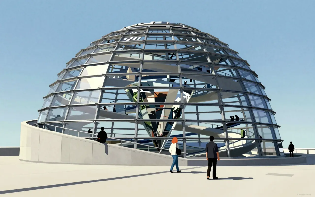
The Reichstag dome is a reconstructed glass structure on the Reichstag building in Berlin. Norman Foster designed it from Gottfried Böhm’s idea. Waagner-Biro built it. It features a mirrored cone, two steel spiral ramps, an electronically tracked sun shield, and daylight-driven energy efficiency. It provides a 360° view of Berlin. It makes the Bundestag chamber visible from above. It symbolises German reunification and democratic transparency.

9:58

Renzo Piano

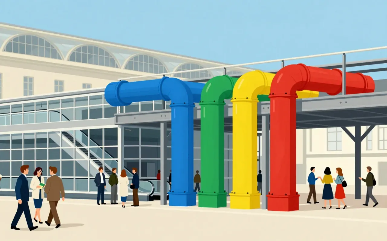
Renzo Piano’s architecture is not about style — it’s about where you put the ducts.
9:54

Robert Venturi

Venturi didn’t build buildings—he built arguments, and they dismantled modernism from the inside.
11:22

Roboto

Christian Robertson · 2011

Roboto is a functional, open, and pervasive sans-serif typeface family designed by Christian Robertson for Google in 2011. It succeeded by solving a narrow problem well — legibility on early Android screens — then scaled through permissive licensing and platform integration.

9:17

Rosa Barba

Cinema is not a window—it’s scaffolding, and Rosa Barba builds with it.
9:49

Rubik's Cube

Ernő Rubik · 1974

The Rubik's Cube is an industrial design solution to a structural problem — not a toy conceived for entertainment. Its puzzle nature was discovered retroactively. Its success rests on a durable, self-contained mechanical system made possible by interlocking plastic — a deliberate departure from earlier magnetic designs. It entered culture via student and enthusiast adoption in Budapest, not marketing or pedagogy. Its influence lies in proving that constraint-driven engineering can generate enduring cultural objects.

8:35

Ryoji Ikeda

Ikeda doesn’t make music you feel in your chest—he makes music you measure in hertz.
10:44

Saul Bass

He didn’t make titles—he made first impressions that rewrote the grammar of film.
10:38

Seagram Building

Mies van der Rohe & Philip Johnson · 1958

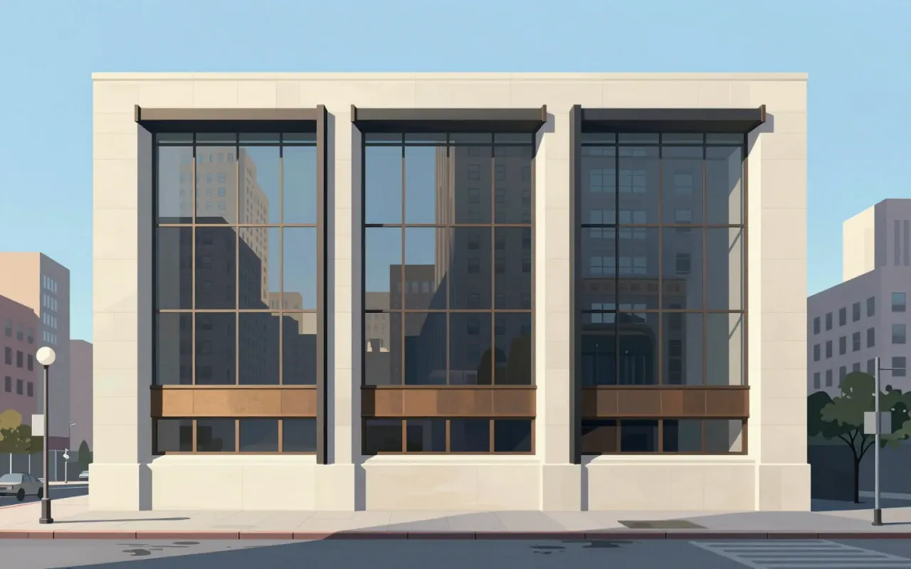
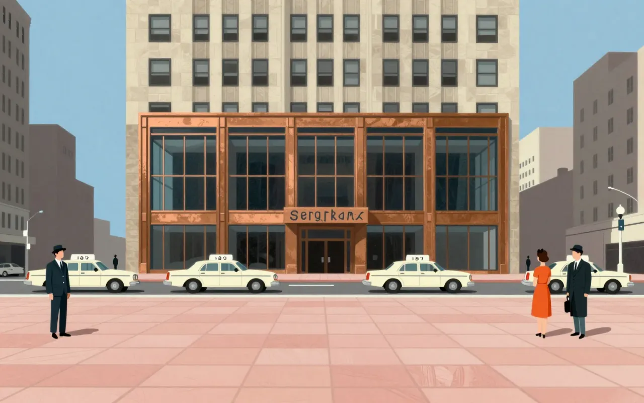
The Seagram Building is a methodologically rigorous application of International Style principles — sited, tested, and materialised with explicit constraints and innovations. Its influence is unverified. Its success lies in its documented departures: from structural facade integration, from NYC window conventions, and from untested corporate monumentality.

12:06

Sheila Hicks

Sheila Hicks didn’t make textiles. She made a grammar for occupying space with thread.
9:06

Shigeru Ban

Paper tubing isn’t poetic scaffolding — it’s a calibrated response to scarcity, theft, deforestation, and bureaucracy.
7:47

Shōji Hamada

Hamada’s work is not about making pots — it’s about making a world where pots belong.
8:48

Sophie Taeuber-Arp

She didn’t just join Dada — she wove it from textile grids, turned wood, and polka dots.
10:32

Sori Yanagi

Beauty isn’t built — it’s coaxed from wood, time, and tradition.
9:20

Streamline Moderne

Streamline Moderne wasn’t about beauty—it was about selling motion during a depression.
9:48

Susan Kare

She didn’t invent the GUI — she gave it a face, a voice, and a sense of humour, all on graph paper.
9:11

Swiss Army knife

Karl Elsener

The Schweizer Offiziers- und Sportmesser is a pivotal industrial response: a compact, spring-driven, dual-sided tool system developed in Ibach, Switzerland in 1896. It solved production dependency on German suppliers, used cellulose fibre instead of imported materials, and achieved commercial viability without military adoption. Its influence lies not in novelty but in disciplined constraint — one spring, two sides, no commission, global reach.

9:21

Sydney Opera House

Jørn Utzon · 1973

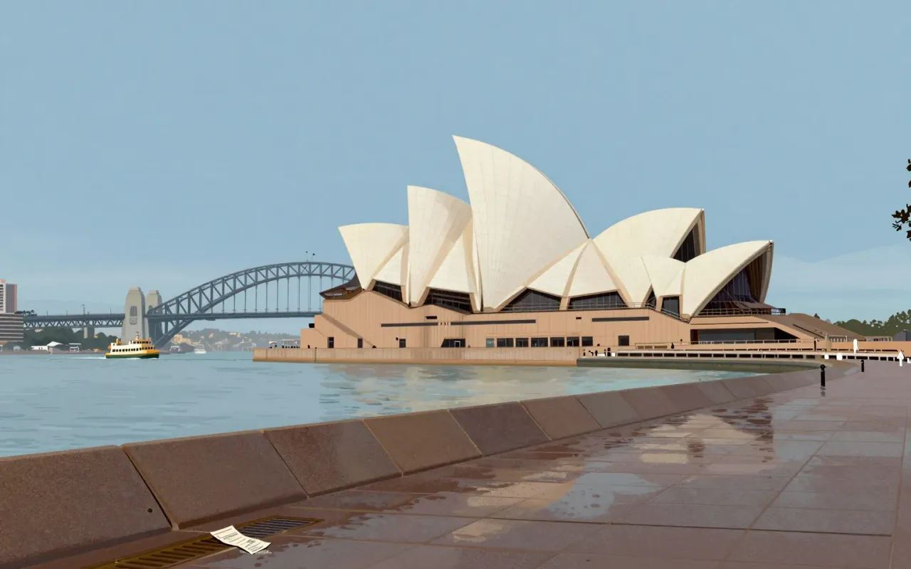
The Sydney Opera House is a landmark where aesthetic conviction collided with structural reality—and where resolution required iteration, computation, material innovation, and shared authorship.