designbriefs
Shortest first

All briefs

479 briefs · 3191 min · 97–192 on page 2 of 5
1:17

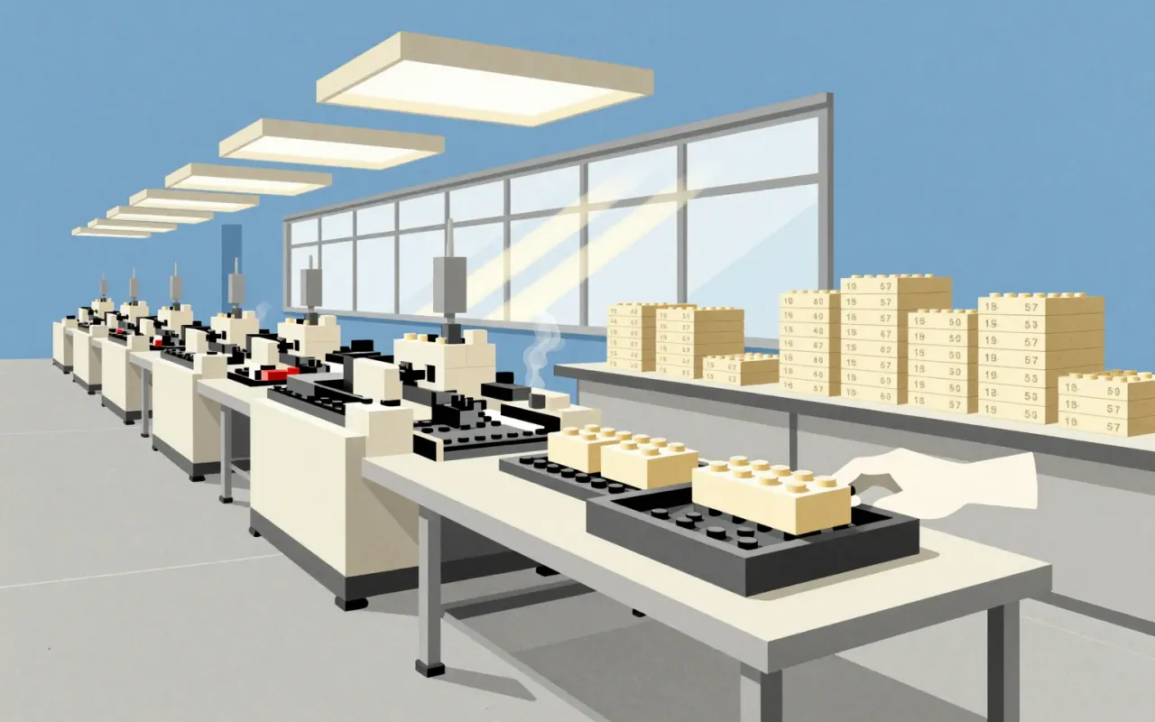
LEGO Brick

A repeatable connection turns individual plastic pieces into a reusable construction system.
1:17

Porsche Logo

A constructed coat of arms combines the company name with Stuttgart and regional heraldry.
1:17

Proxima Nova

Mark Simonson expanded a six-font design into a coordinated typographic family.
1:17

Steve Krug

Steve Krug connects practical web-usability advice with do-it-yourself testing.
1:18

Athos Bulcão

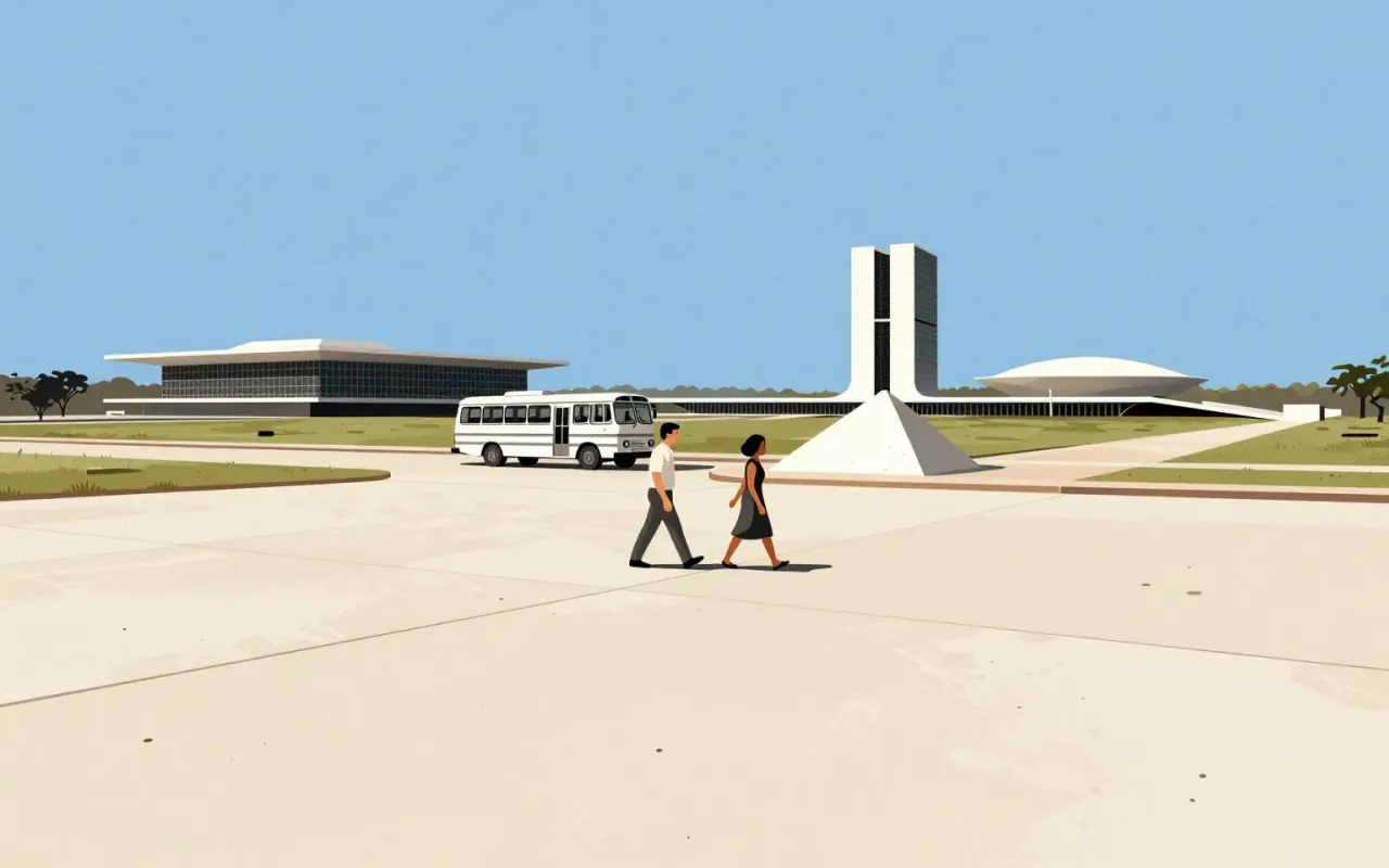
Athos Bulcão's career connects painting and sculpture with the construction of Brasília.
1:18

Frank Chimero

Chimero connects interfaces, illustration and writing within a broad design practice.
1:18

LC4 Chaise Longue

An adjustable reclining chair whose authorship deserves as much attention as its silhouette.
1:18

Luke Wroblewski

Wroblewski connects interface design, product leadership and practical writing about the web.
1:18

Tetra Pak Carton

The original tetrahedral carton was inseparable from the machine that formed and filled it.
1:19

Mercedes-Benz Logo

A three-pointed star carries an engineering ambition through badges and a corporate merger.
1:21

Neri & Hu

A Shanghai practice connects architecture with interiors, objects and graphic design.
1:22

Vespa Scooter

An enclosed drivetrain and a step-through body reorganised the relationship between rider and machine.
1:35

Swan (chair)

Arne Jacobsen

Arne Jacobsen designed the Swan lounge chair and sofa for Copenhagen's SAS Royal Hotel in 1958. The chair combines an upholstered body with a star-shaped satin-polished aluminium base.

1:44

Arco (lamp)

Achille & Pier Giacomo Castiglioni · 1962

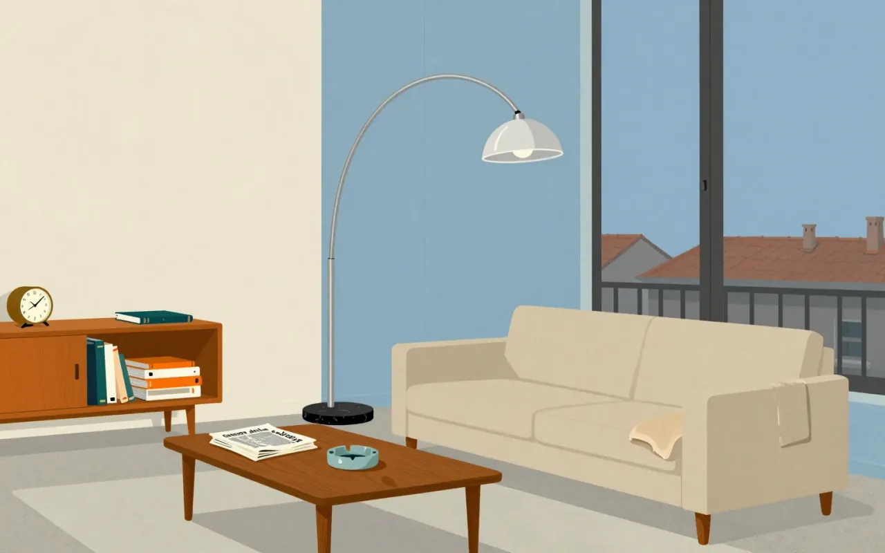
Achille and Pier Giacomo Castiglioni designed the Arco floor lamp for Flos in 1962. It connects a suspended spun-aluminium pendant to a Carrara marble base through an arching stainless-steel arm.

1:44

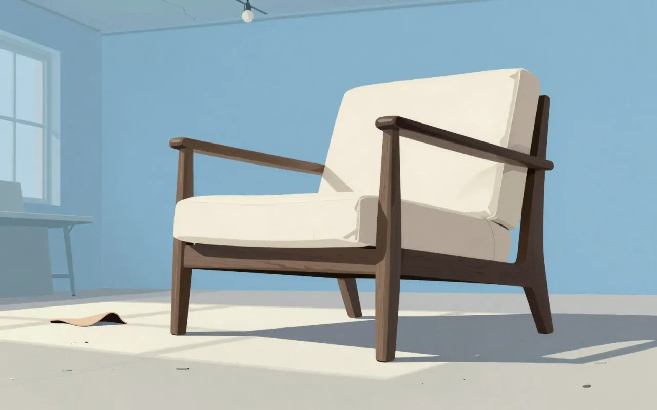
Wishbone chair

The Wishbone chair brings a shaped wooden back and a woven seat into one recognizable arrangement.
1:46

Tolomeo desk lamp

Michele De Lucchi & Giancarlo Fassina · 1986

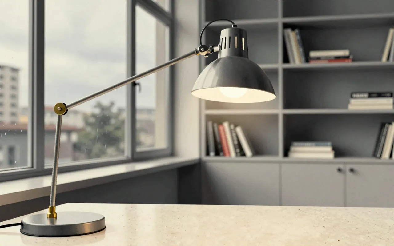
Michele De Lucchi and Giancarlo Fassina designed the Tolomeo desk lamp for Artemide in 1986. Its articulated aluminium arms, tension cables and swivelling reflector make it a useful study in adjustable task lighting.

1:49

Barcelona chair

Ludwig Mies van der Rohe · 1929

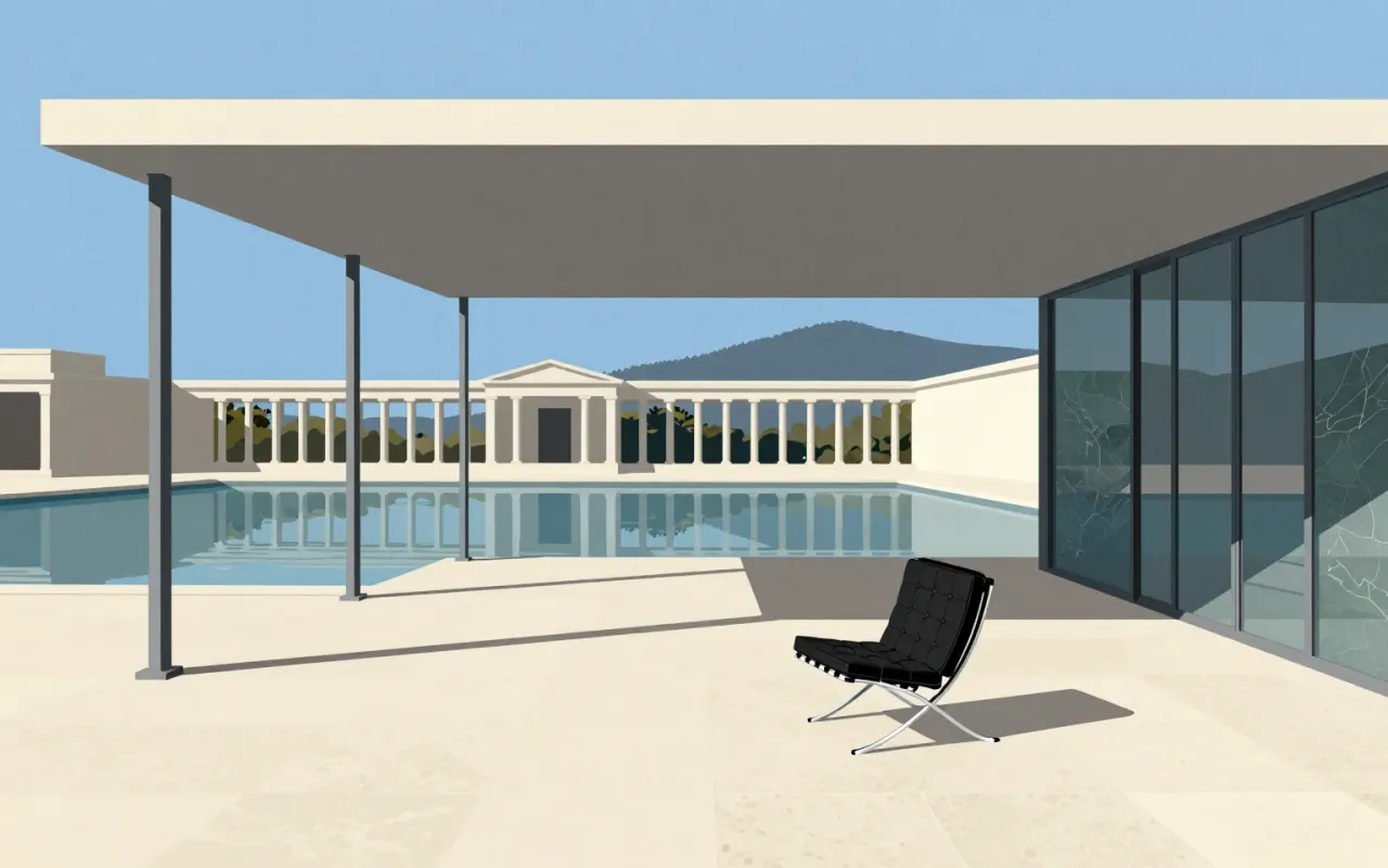
Associated with Ludwig Mies van der Rohe and Lilly Reich's work for the German Pavilion in Barcelona in 1929, the Barcelona chair combines a metal frame with leather upholstery. Its construction changed after the original design.

4:11

Kasper Salto

Salto’s career is a case study in how Danish furniture design professionalised — not through rupture, but through steady studio expansion.
4:16

Lato (typeface)

Łukasz Dziedzic

Lato is a humanist sans-serif typeface designed by Łukasz Dziedzic and released in 2010. It was commissioned by a Polish bank, then cancelled and published under the Open Font License. As of August 2018, it appeared on over 9.6 million websites and ranked third on Google Fonts by usage. It has been applied in physical media including election billboards and information signs, and adopted by Save the Children for its logotype since 2022.

4:18

Ross Lovegrove

Lovegrove’s career is a sequence of verified commissions—not a manifesto.
4:18

Vittorio Gregotti

Gregotti didn’t design buildings—he designed the conditions under which architecture could be both ideological and buildable.
4:24

Bret Victor

Bret Victor didn’t build the iPad—he built the argument against it.
4:28

Kartell

Kartell is an Italian company, headquartered in the Metropolitan City of Milan, that makes and sells contemporary plastic furniture.
4:29

Tord Boontje

Boontje proved ornament could scale — not as decoration, but as a design strategy for retail and research.
4:31

Jen Simmons

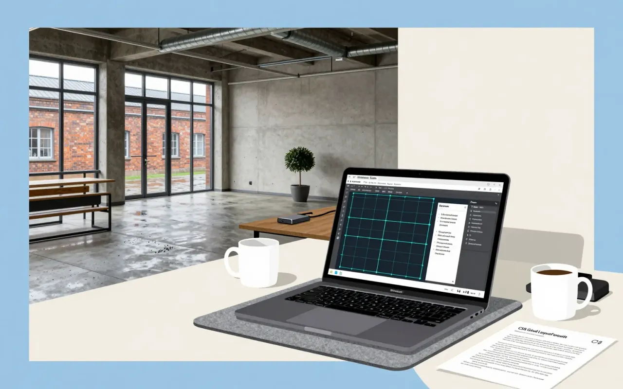
She didn’t just build CSS Grid — she named it, shipped its debugger, and taught the web how to think in two dimensions.
4:32

James Victore

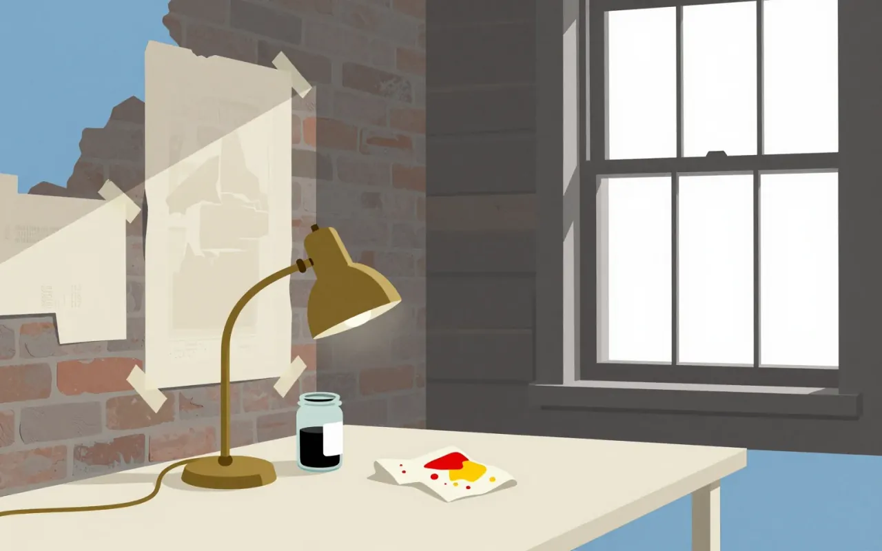
Hand-lettered posters are not nostalgic — they are a refusal of mediation.
4:32

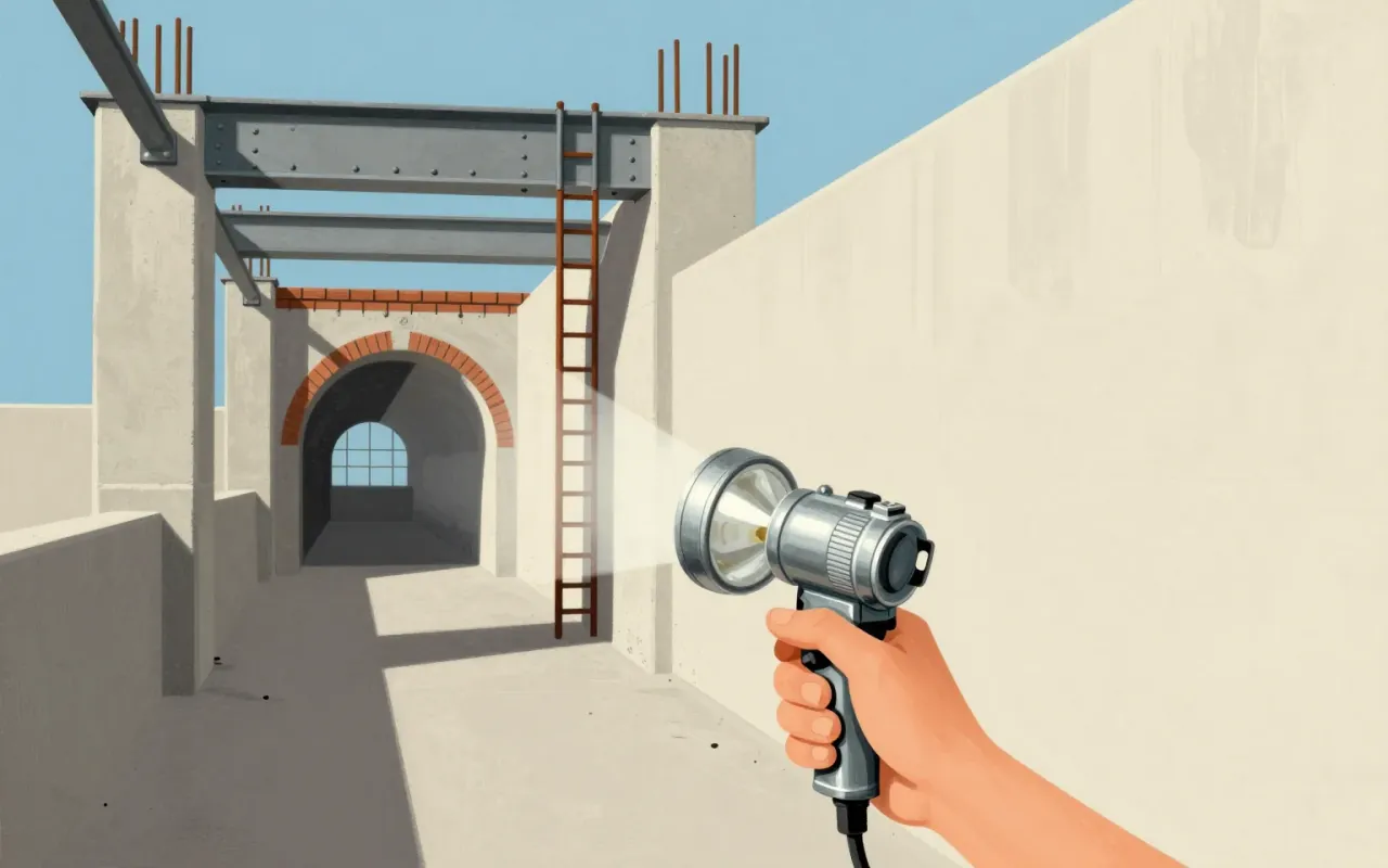
Maglite

A flashlight that became a weapon because its materials refused to compromise.
4:33

Kenji Ekuan

One designer, eight verified works, zero commentary: Ekuan’s legacy is a list of dates and clients—not a theory of form.
5:06

Paola Navone

Navone’s real work is not what she made — it’s how she refused to choose, and later refused to keep.
5:16

DIN 1451

German Institute for Standardization · 1931

DIN 1451 is a foundational typographic standard—not a font family, but a reproducible system. Its value lies in its constraint-driven clarity, not its aesthetic novelty.
5:27

Egg (chair)

Arne Jacobsen · 1958

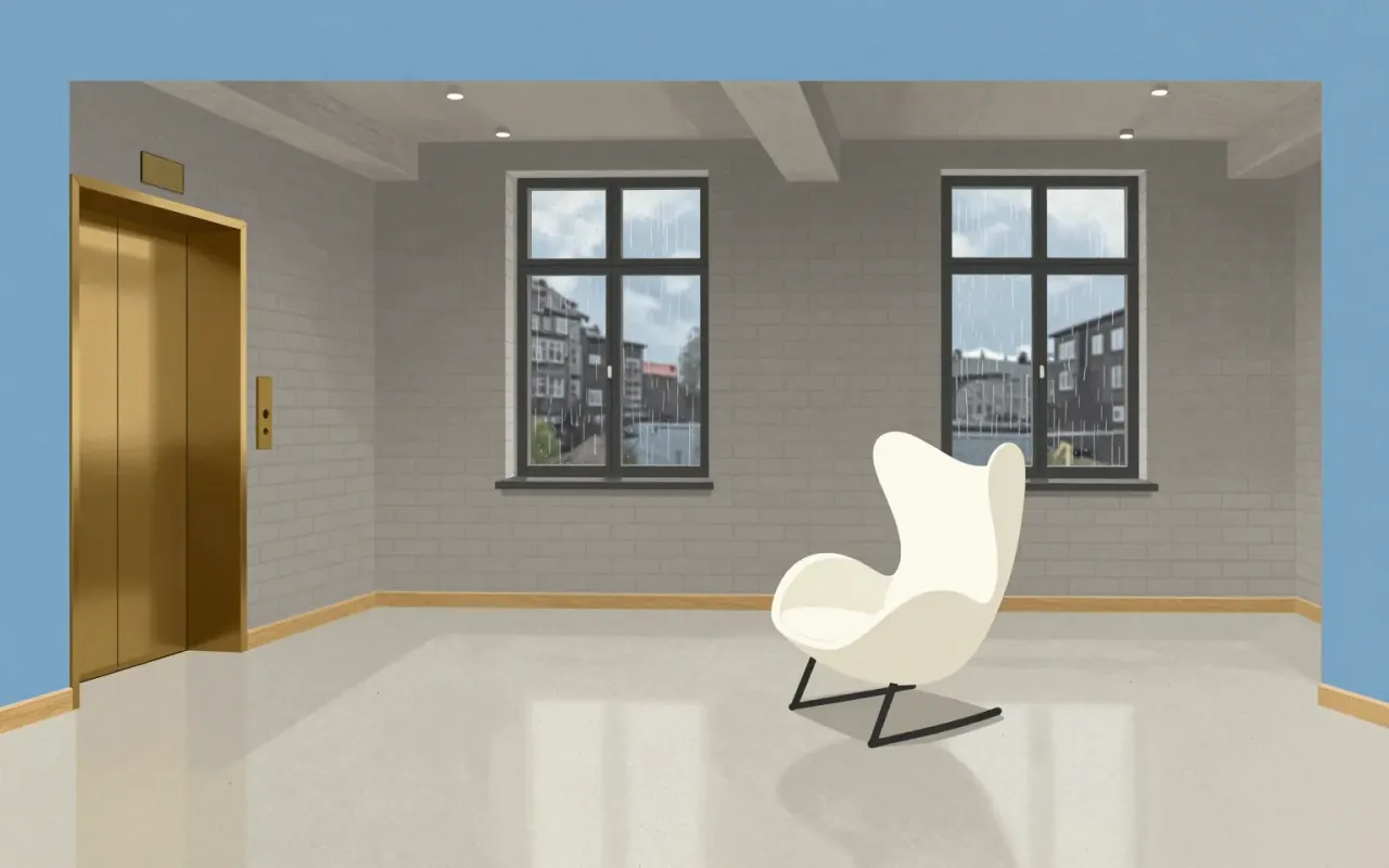
The Egg chair is a tightly constrained response to the SAS Royal Hotel commission: a sculptural, isolating seat made possible by new materials. Its couch variant reveals the cost of scaling that logic — a visible seam, limited production, and unresolved tension between form and upholstery. It belongs to design/furniture and design/interiors. Topics include furniture, industrial-design, and interiors.

5:38

King Power Mahanakhon

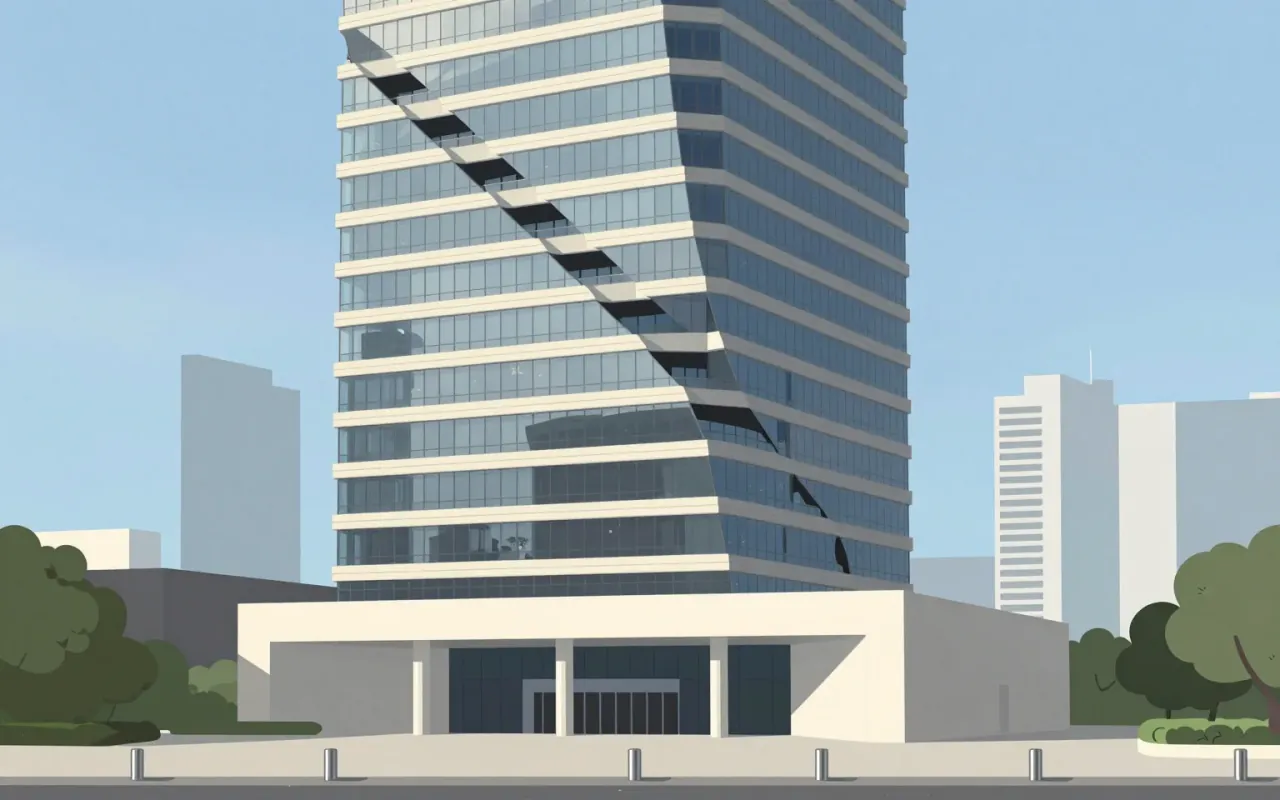
A helix-shaped void that made a building famous—not for what it housed, but for how tall it stood, and how briefly.
5:45

Arne Norell

Norell’s furniture isn’t Swedish modernism — it’s Danish influence made local, then licensed for longevity.
5:50

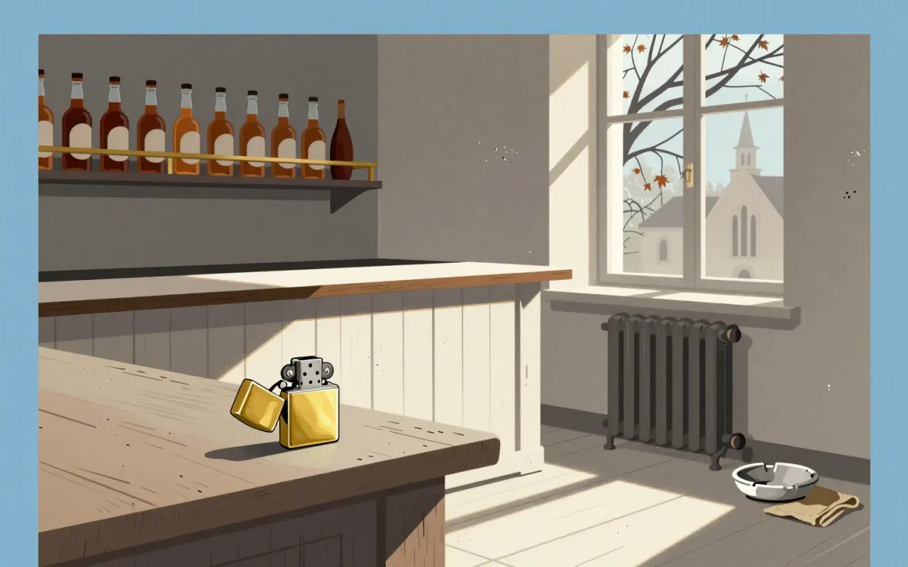
Zippo

George G. Blaisdell · 1932

The Zippo lighter is a tightly constrained industrial object defined by wind resistance, guaranteed longevity, and procedural repeatability — not novelty, aesthetics, or scale.

5:55

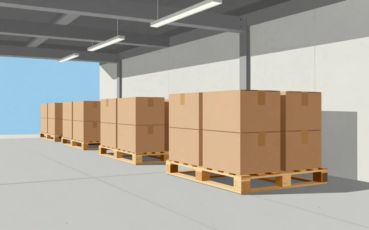
Pallet

The pallet isn’t a design — it’s the silent contract between forklifts, containers, and capitalism.
6:14

Gotham (typeface)

Tobias Frere-Jones · 2000

Gotham is a geometric sans-serif typeface family designed in 2000 by Tobias Frere-Jones with Jesse Ragan and released in 2002. It was commissioned by GQ magazine to display a sans-serif with a 'geometric structure' that would look 'masculine, new, and fresh'. Its letterforms were inspired by examples of architectural signs of the mid-twentieth century, especially the sign on the Eighth Avenue façade of the Port Authority Bus Terminal. Frere-Jones based the font on lettering seen in older Manhattan buildings, and characterised the simplification as 'not the kind of letter a type designer would make. It's the kind of letter an engineer would make.' The letterforms Gotham was based on were geometric yet did not look like Futura; their widths were more uniform and less classical, bowls were larger. Reviews of Gotham focus on its identity as something both American and specific to New York City.
6:38

Inter (typeface)

Inter isn’t prettier than Roboto—it’s legible where Roboto fails, and that’s why it replaced it.
6:40

Source Sans

A pragmatic open-source sans-serif built to fix News Gothic’s uneven colour — not to reinvent typography.