Frutiger (typeface)
Frutiger is not a universal font — it is a precise answer to one problem: reading signs in motion.
Futura is a geometric sans-serif typeface designed by Paul Renner and released in 1927.
Georgia is a 1993 serif typeface designed by Matthew Carter for Microsoft, manually hinted by Thomas Rickner, specifically optimised for legibility on low-resolution screens through features including a large x-height, thicker thin strokes, reduced contrast, thickened serifs, and an unusually bold weight — all shaped by the binary bitmap constraints of mid-1990s screen rendering. Its design draws on 19th-century Scotch Roman models and shares lineage with Carter’s concurrent print typeface Miller.
Gotham is a geometric sans-serif typeface family designed in 2000 by Tobias Frere-Jones with Jesse Ragan and released in 2002. It was commissioned by GQ magazine to display a sans-serif with a 'geometric structure' that would look 'masculine, new, and fresh'. Its letterforms were inspired by examples of architectural signs of the mid-twentieth century, especially the sign on the Eighth Avenue façade of the Port Authority Bus Terminal. Frere-Jones based the font on lettering seen in older Manhattan buildings, and characterised the simplification as 'not the kind of letter a type designer would make. It's the kind of letter an engineer would make.' The letterforms Gotham was based on were geometric yet did not look like Futura; their widths were more uniform and less classical, bowls were larger. Reviews of Gotham focus on its identity as something both American and specific to New York City.
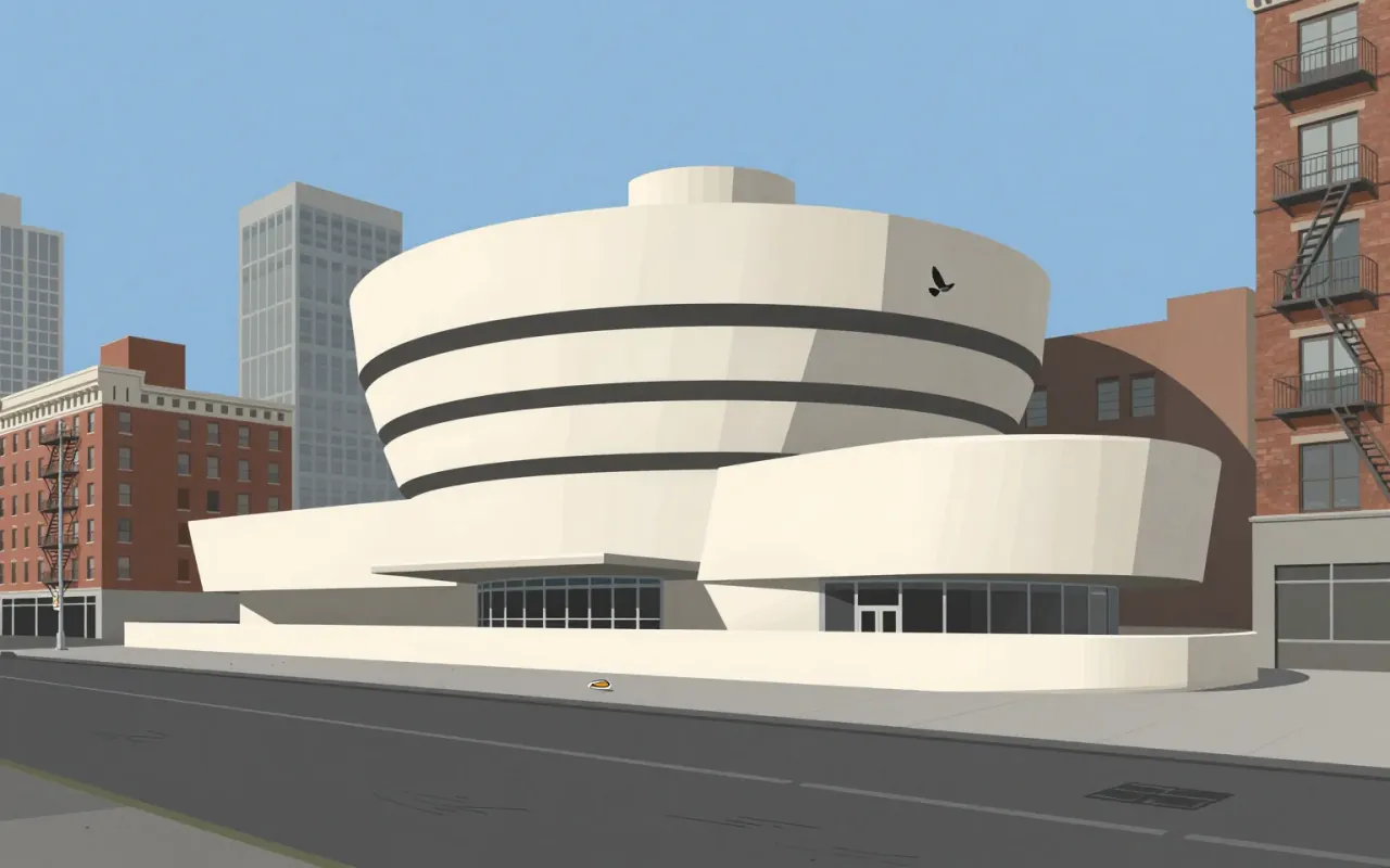
The Solomon R. Guggenheim Museum is Frank Lloyd Wright’s most recognized masterpiece. Built in New York City and completed in 1959, it features a helical ramp surrounding an open-air atrium. Wright designed it over 15 years, using more than 700 sketches and six sets of working drawings. The commission came from Hilla von Rebay, who envisioned a 'temple of spirit' enabling a new way of seeing modern art. Wright incorporated geometric motifs — squares, circles, rectangles, triangles, lozenges — each assigned symbolic meaning. Visitors ride an elevator to the top and descend the ramp, experiencing the gallery itself as a work of art. The building drew controversy for its unusual display spaces and remains a landmark of 20th-century architecture.
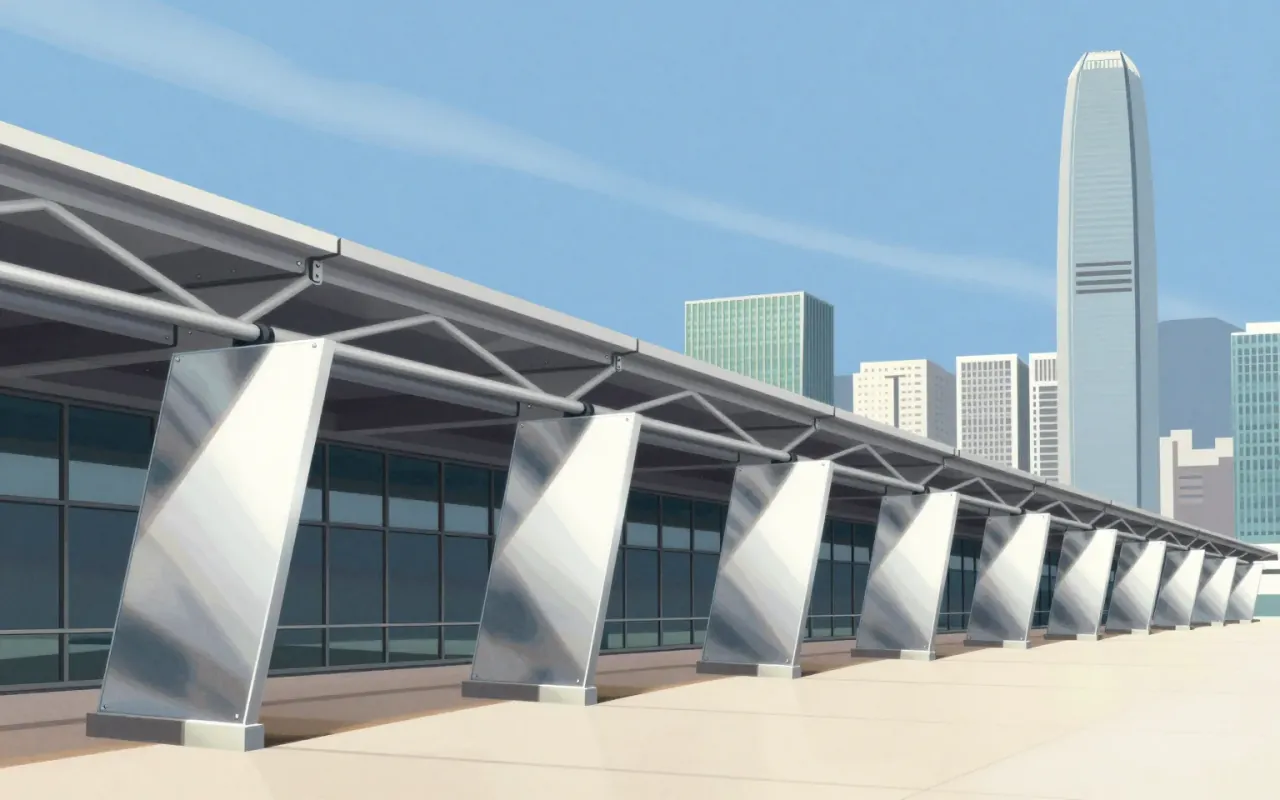
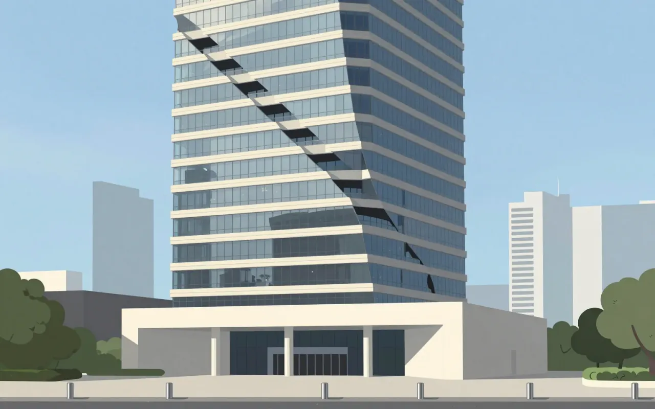
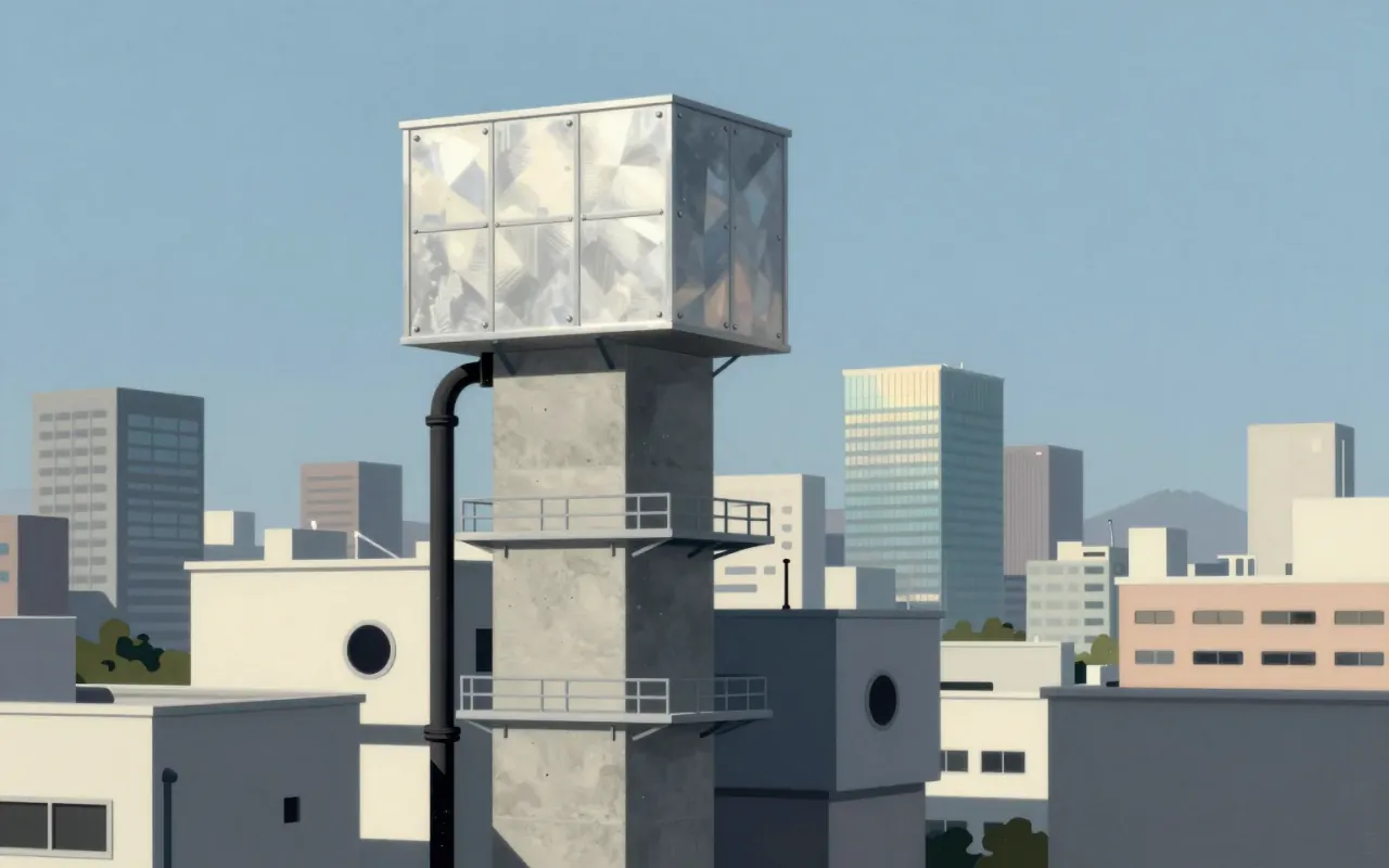
A suspended steel tower that replaced internal columns with external masts, prefabricated modules, and escalators—built at record cost to save a firm.
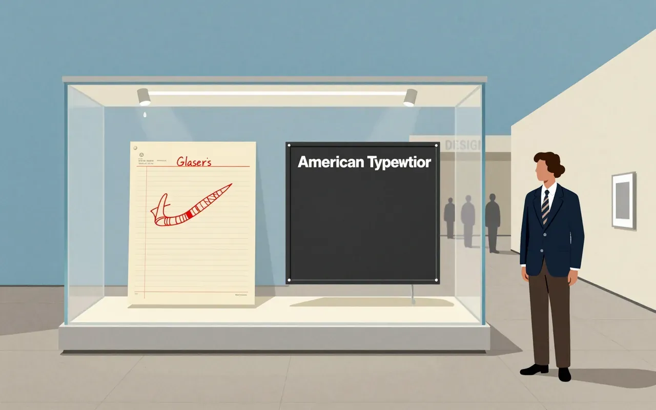
A graphic design brief must account for what is materially present—not reputation, not legacy, not what it ‘feels like’. This logo is three glyphs, one typeface, one colour, made in a taxi, given away, preserved in a museum, and later reactivated by trauma. Its power lies in what it omits: no skyline, no people, no narrative, no explanation.

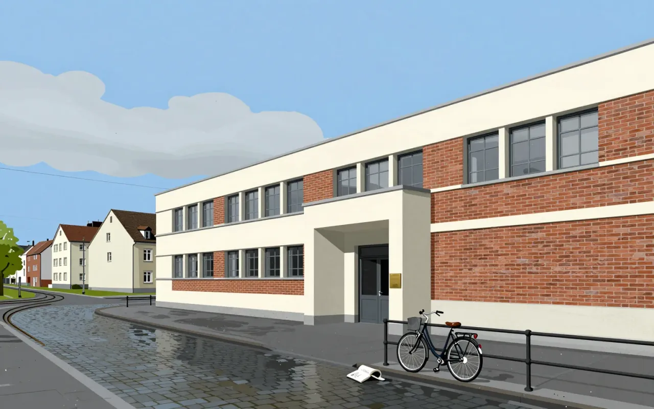
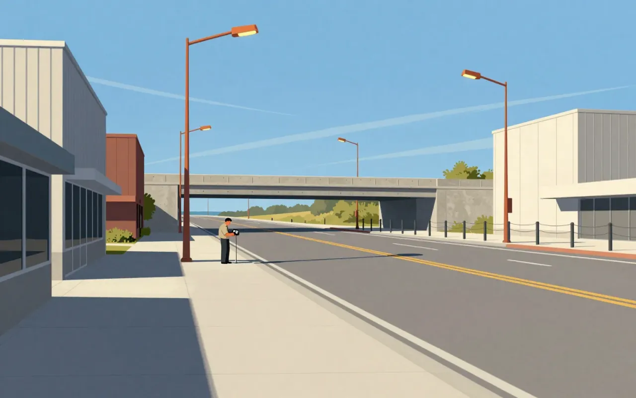
Interstate is a functional, legibility-first typeface built for versatility — not nostalgia. Its strength lies in disciplined departure from its source: the 1949 FHWA alphabets. It trades strict fidelity for readability in new contexts — but pays for that with constraints in text density. It is a defining typeface of its era not because it is novel, but because it answers a clear constraint: how to make road signage work on a magazine cover, a website headline, and a network logo — all without breaking.

Lato is a humanist sans-serif typeface designed by Łukasz Dziedzic and released in 2010. It was commissioned by a Polish bank, then cancelled and published under the Open Font License. As of August 2018, it appeared on over 9.6 million websites and ranked third on Google Fonts by usage. It has been applied in physical media including election billboards and information signs, and adopted by Save the Children for its logotype since 2022.
A diagrammatic map of London's rapid transit network, designed in 1931 by Harry Beck. It is not a geographic map. It is a navigational tool that reduces the network to connections, sequence, and interchange points.
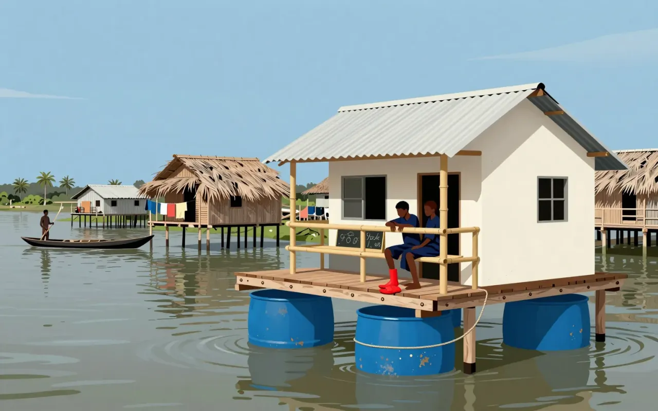
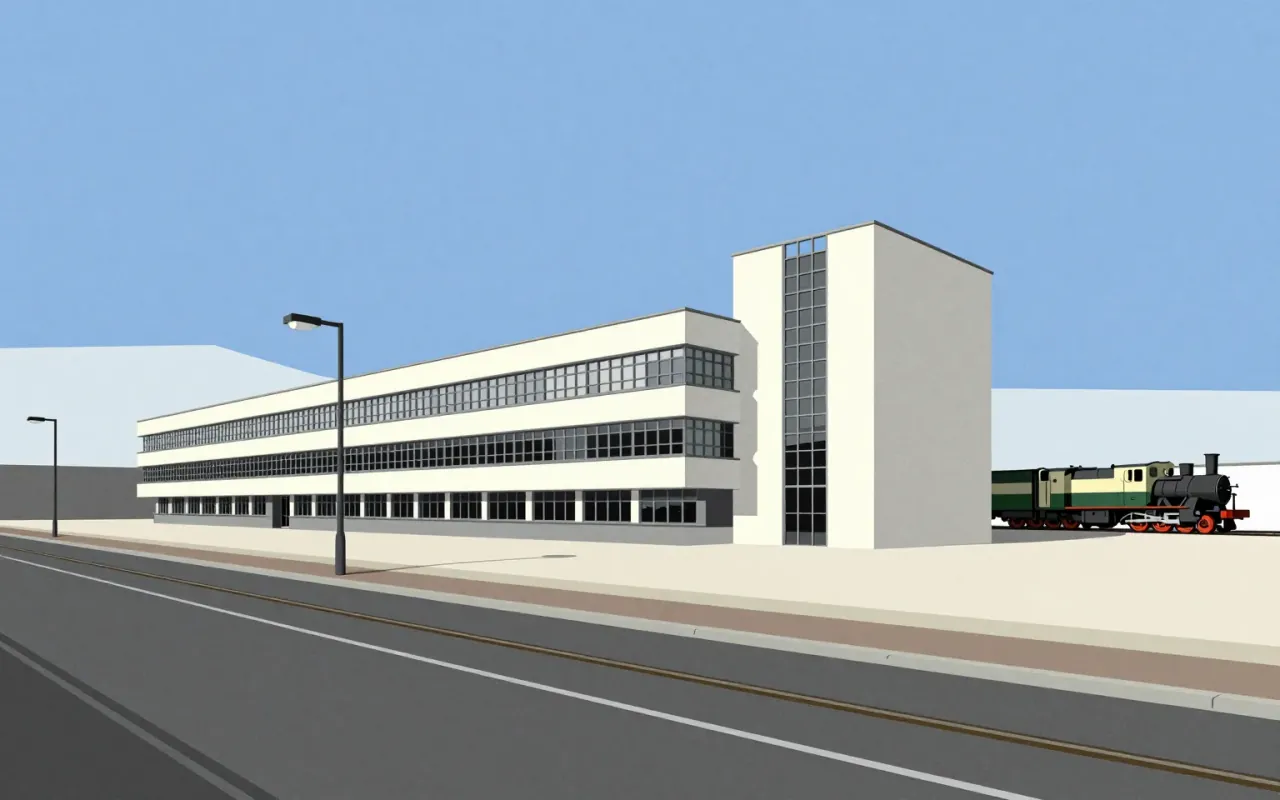
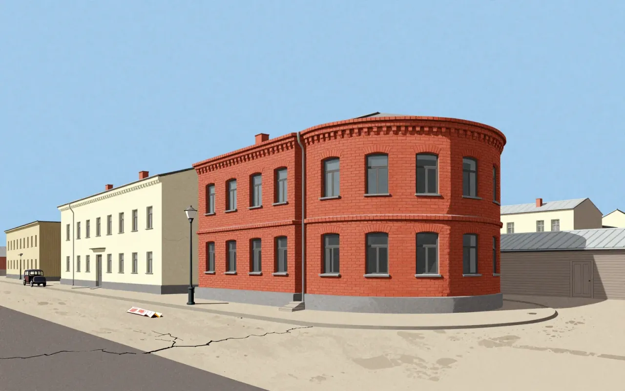
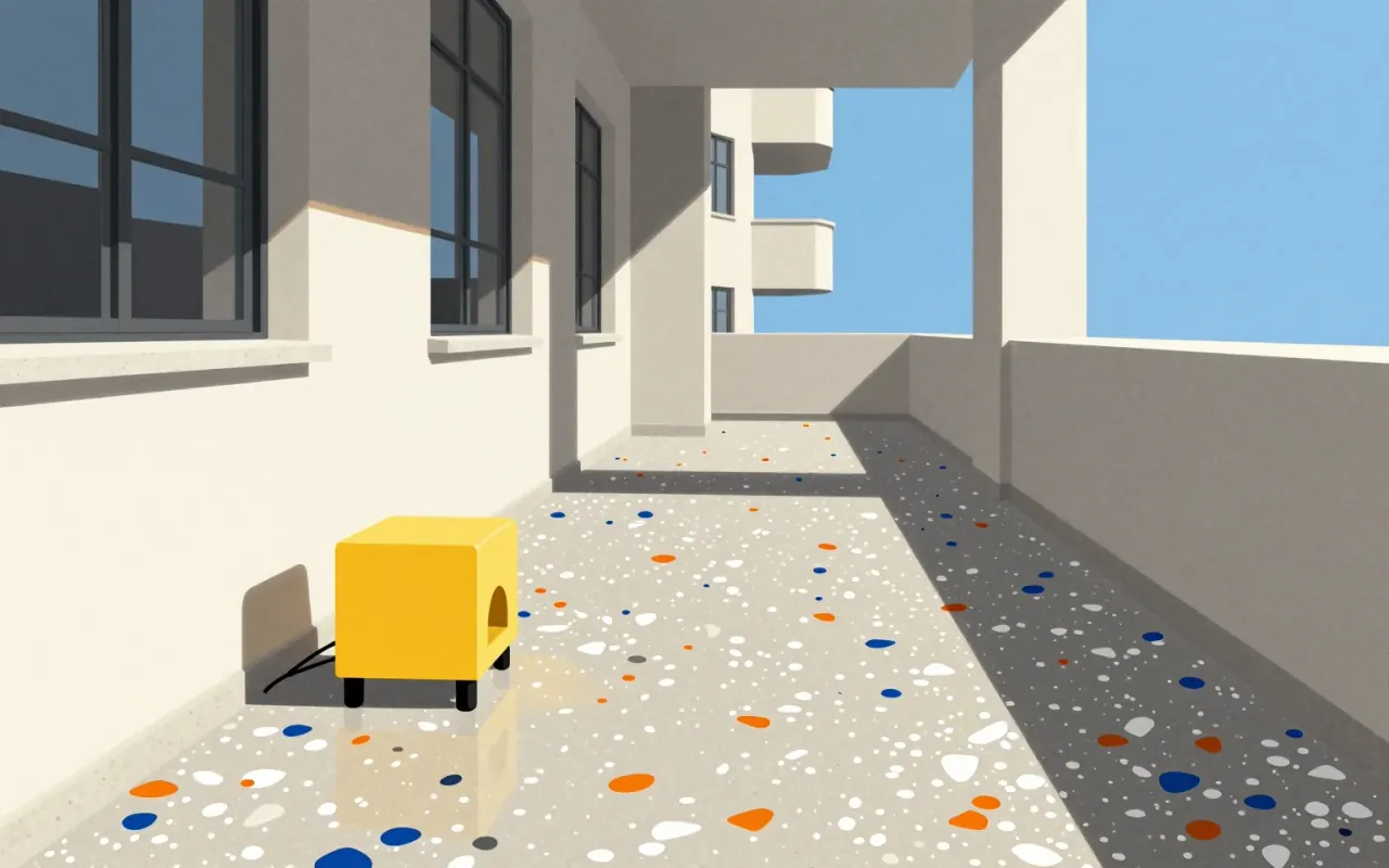
The Memphis Group was a short-lived but decisive intervention: a collective rejection of Modernist austerity, built on accessible materials, shared drawing, and irreverent references. Its durability lies not in longevity but in how precisely it named the limits of ‘good taste’ — then stepped past them.
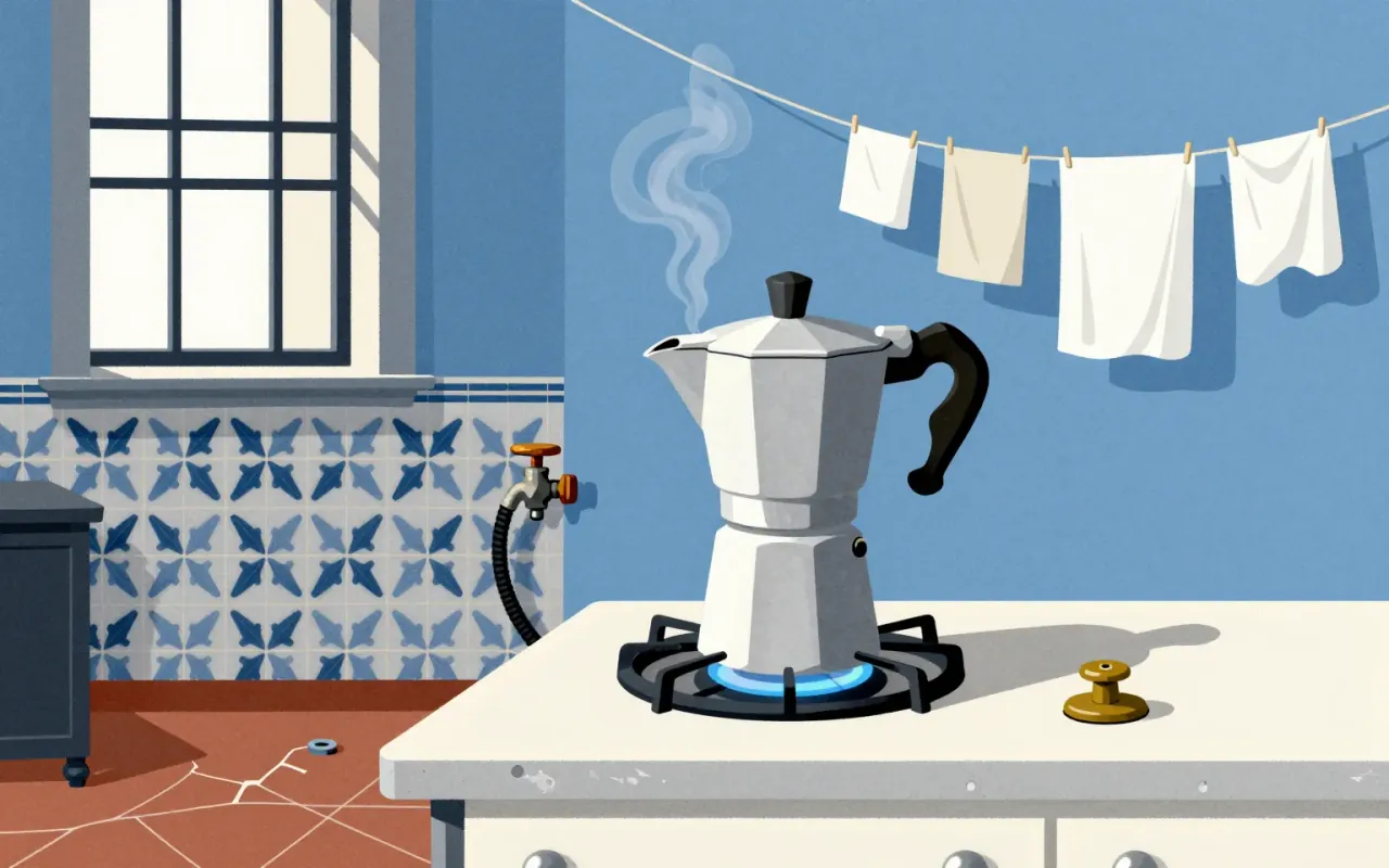
The Moka Express is a functional industrial object defined by constraint: it delivers espresso-style coffee without electricity, pumps, or bar pressure. Its success lies in aluminium’s lightness and manufacturability, its vertical stack’s thermodynamic inevitability, and its tolerance for user inconsistency. Its flaw — the strombolian phase — is inseparable from its mechanism. It is influential not because it is perfect, but because it is sufficient.
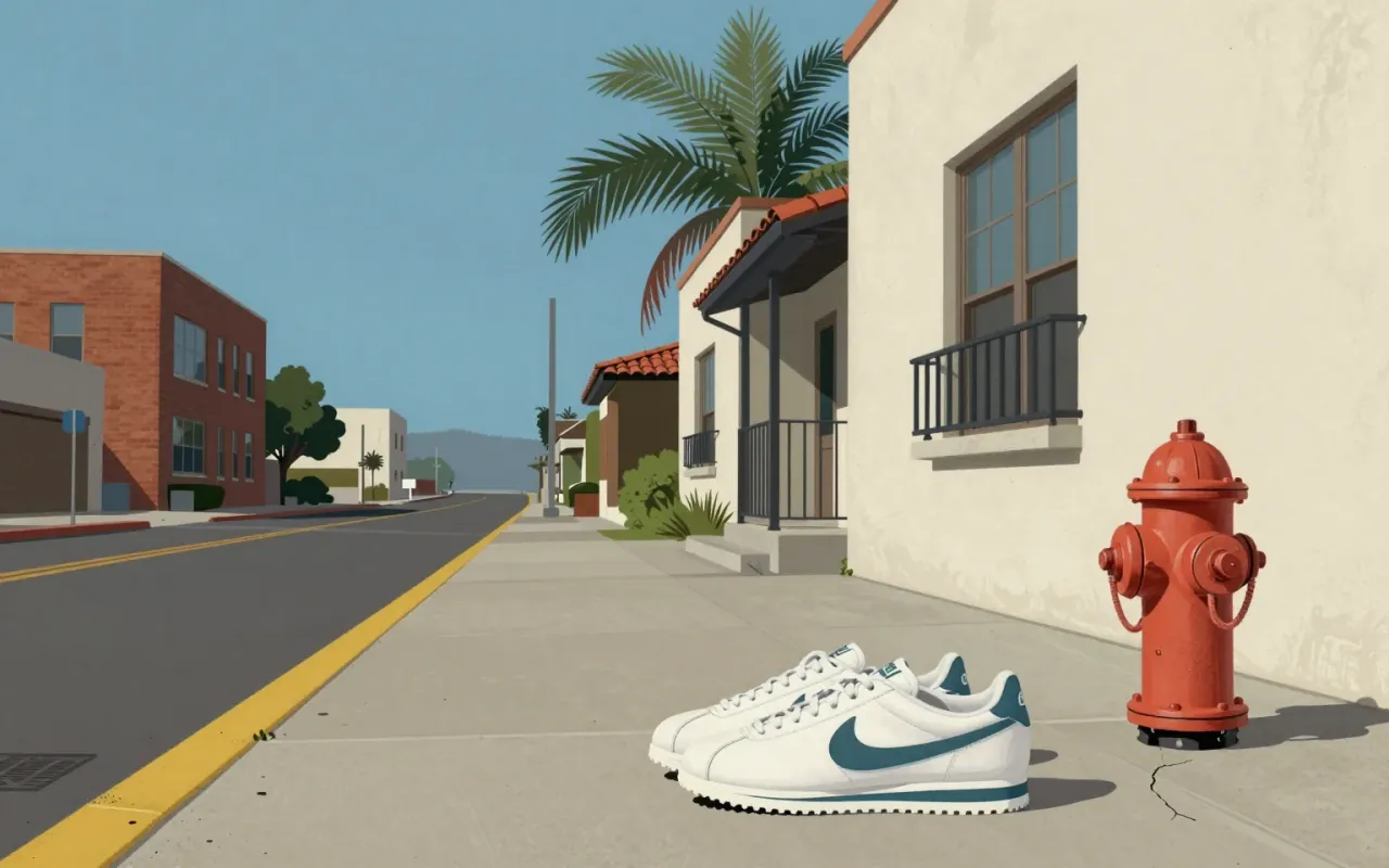
The Swoosh is a 1971 graphic design solution to a specific client request: motion, differentiation from Adidas, speed of execution. It succeeded not as an expression of personality or craft, but as a functional answer to a narrow constraint — and its longevity reveals more about brand consolidation than design innovation.
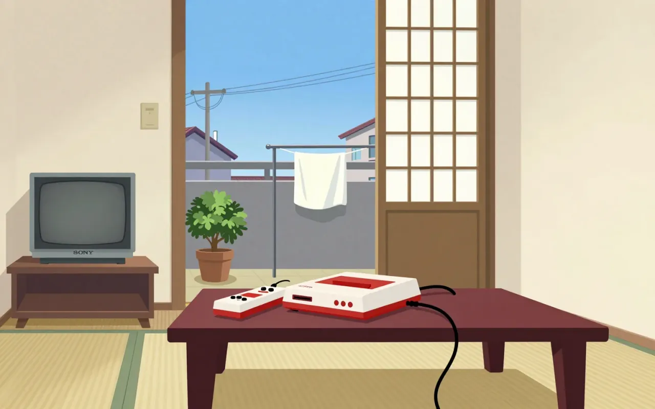
The Nintendo Entertainment System is an 8-bit home video game console. It began as the Family Computer (Famicom), released in Japan in July 1983. It was later redesigned and rebranded for Western markets as the NES.

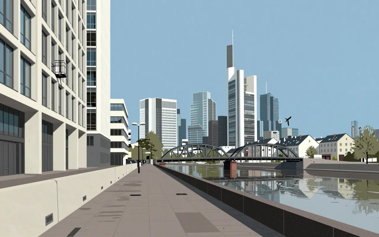
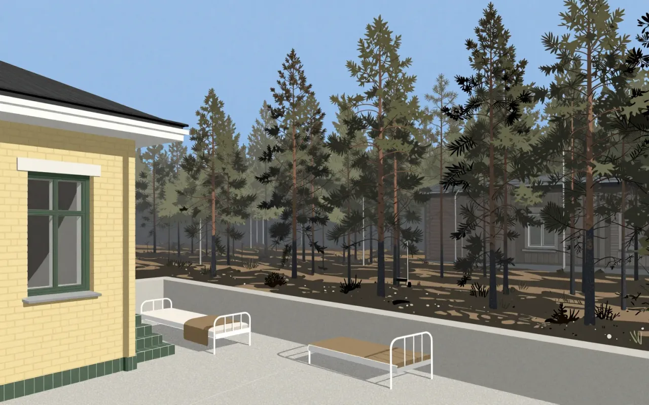
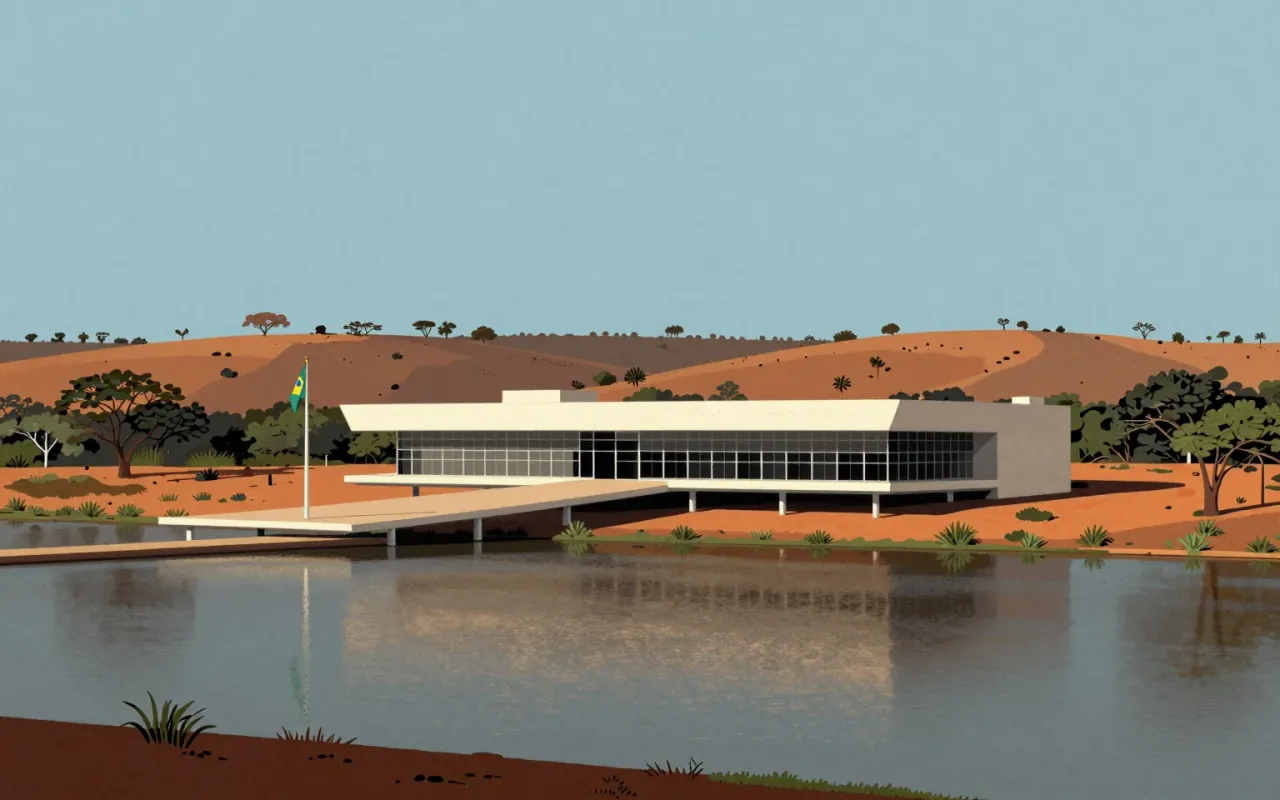
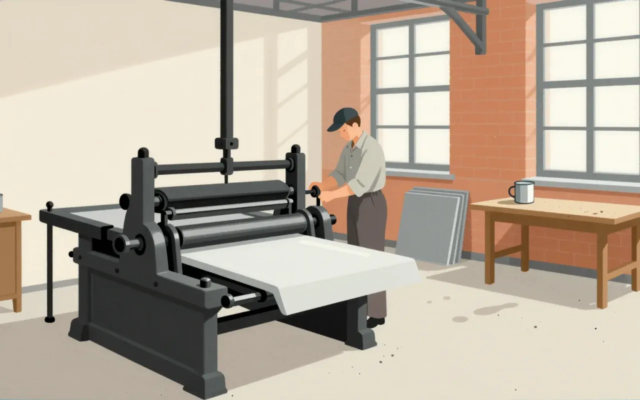
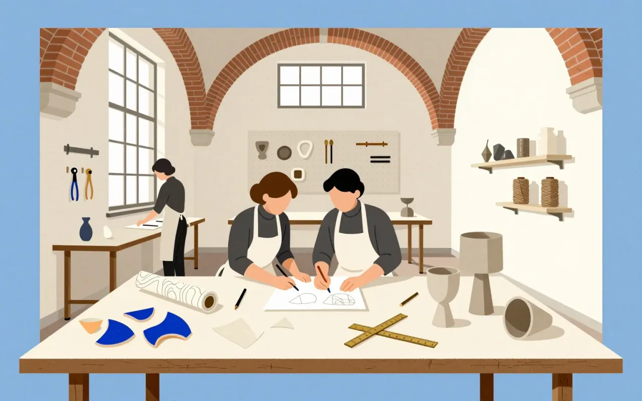
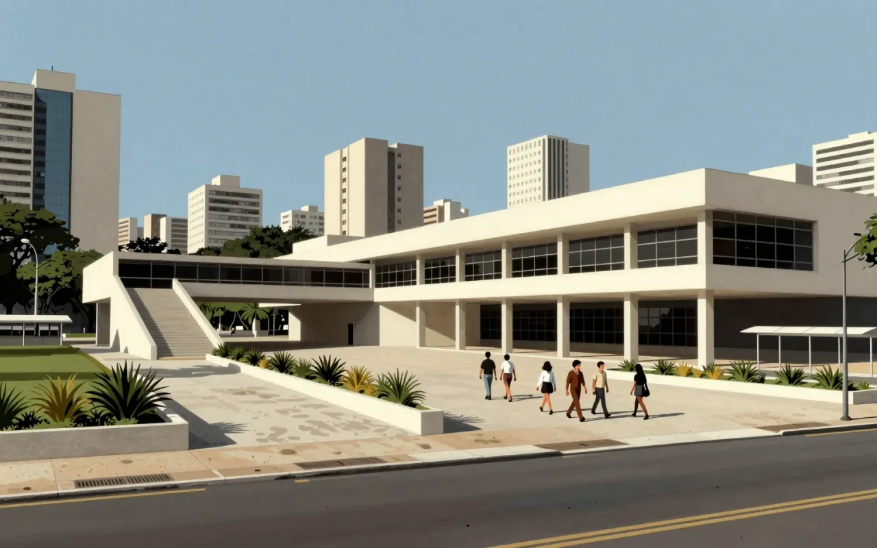
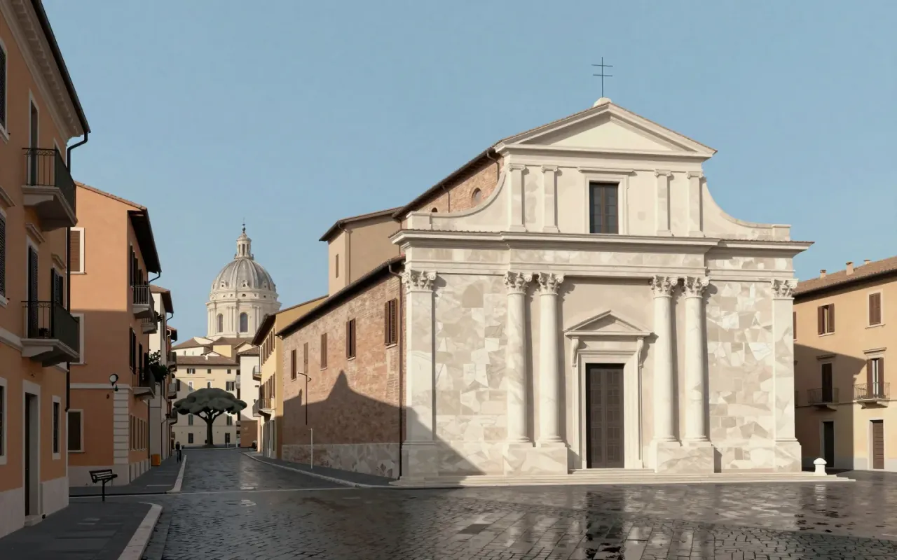
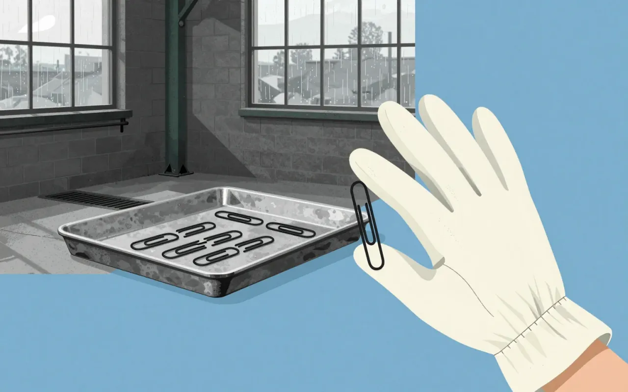
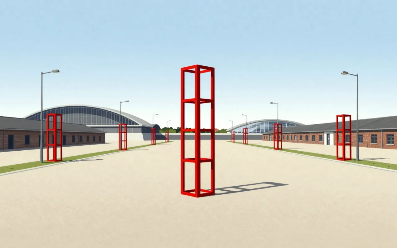
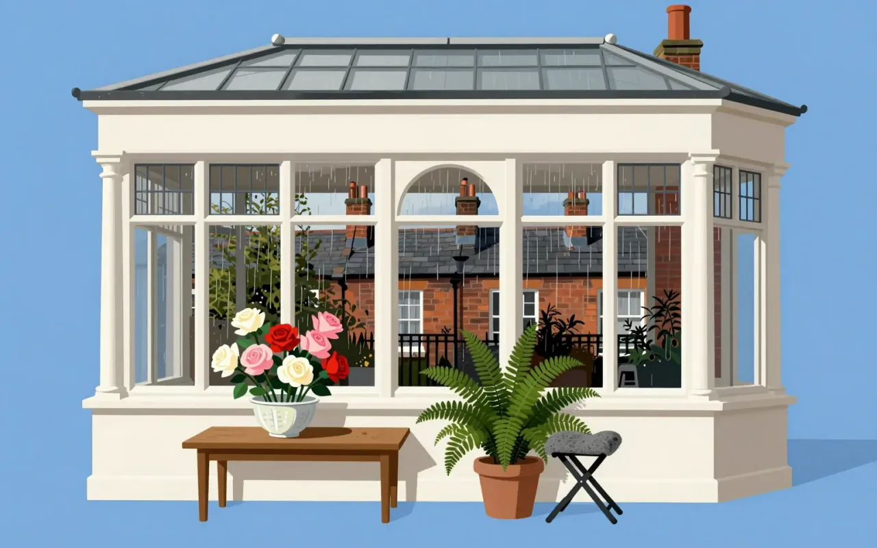
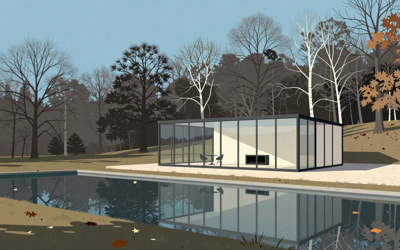
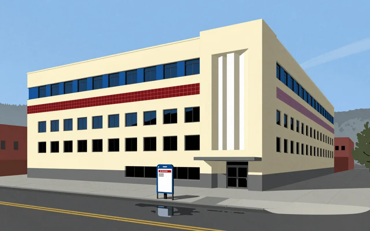

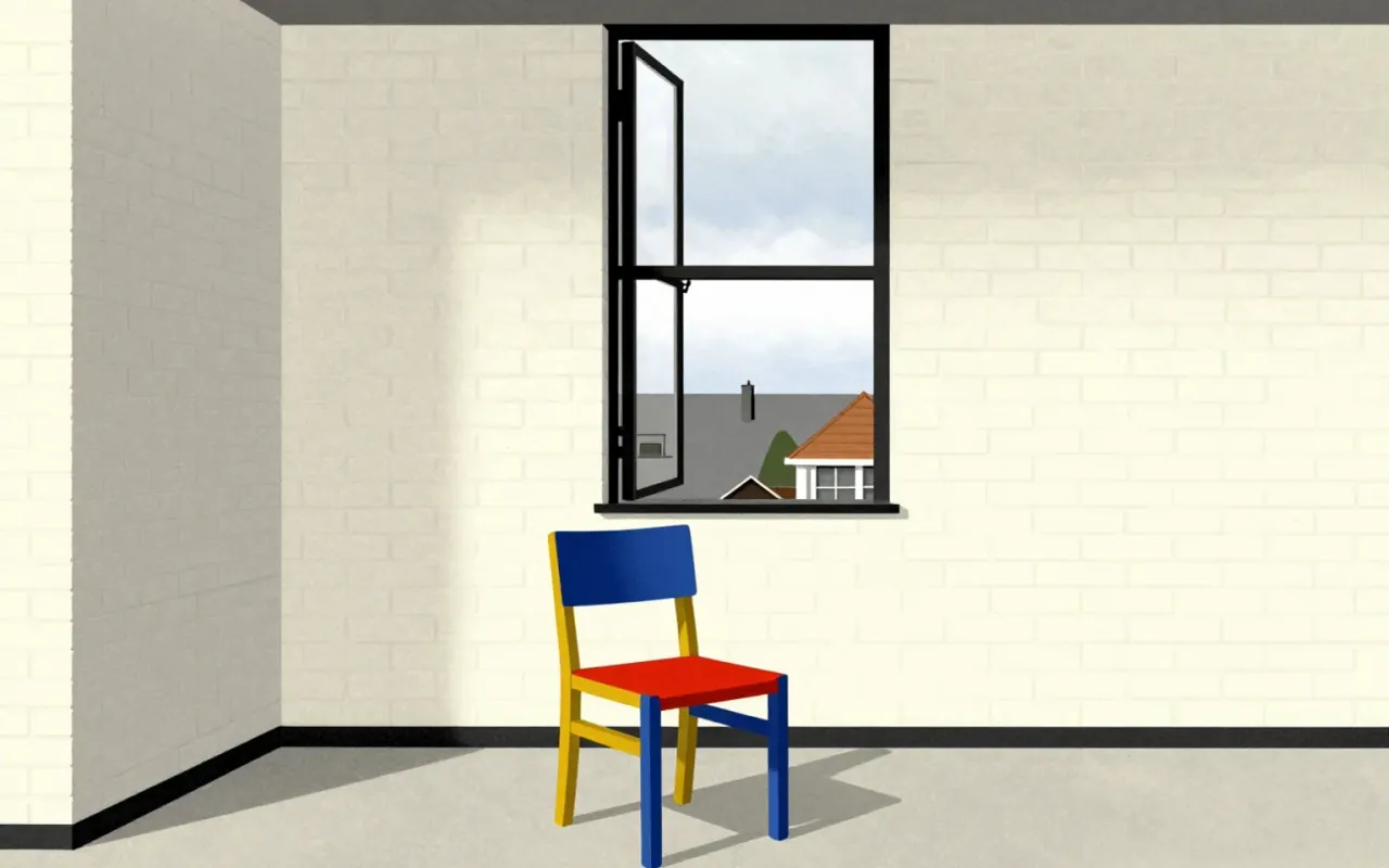
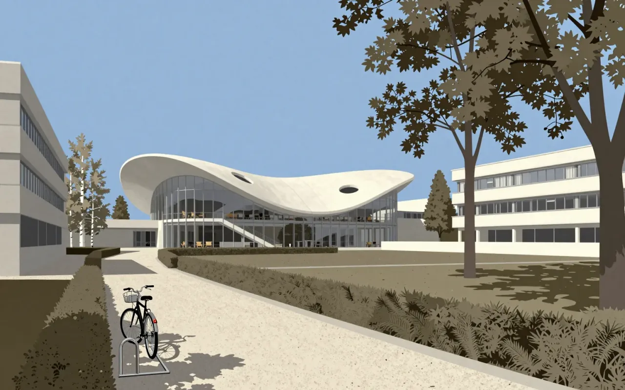
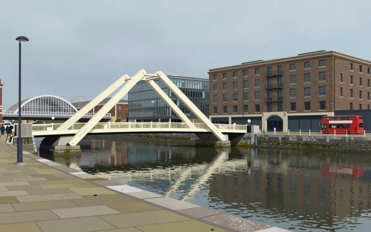
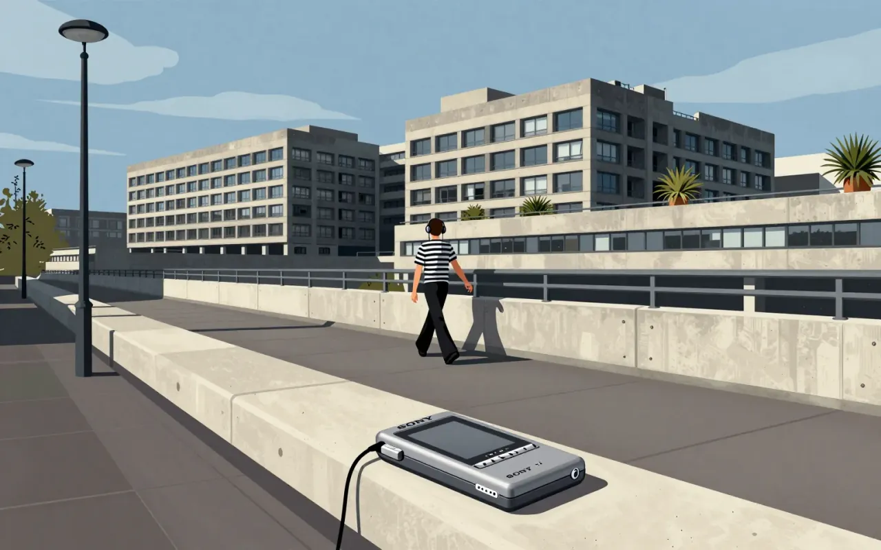
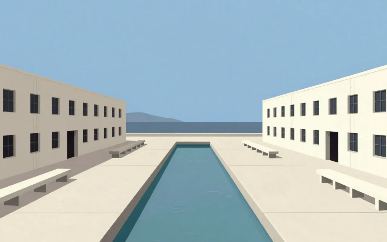
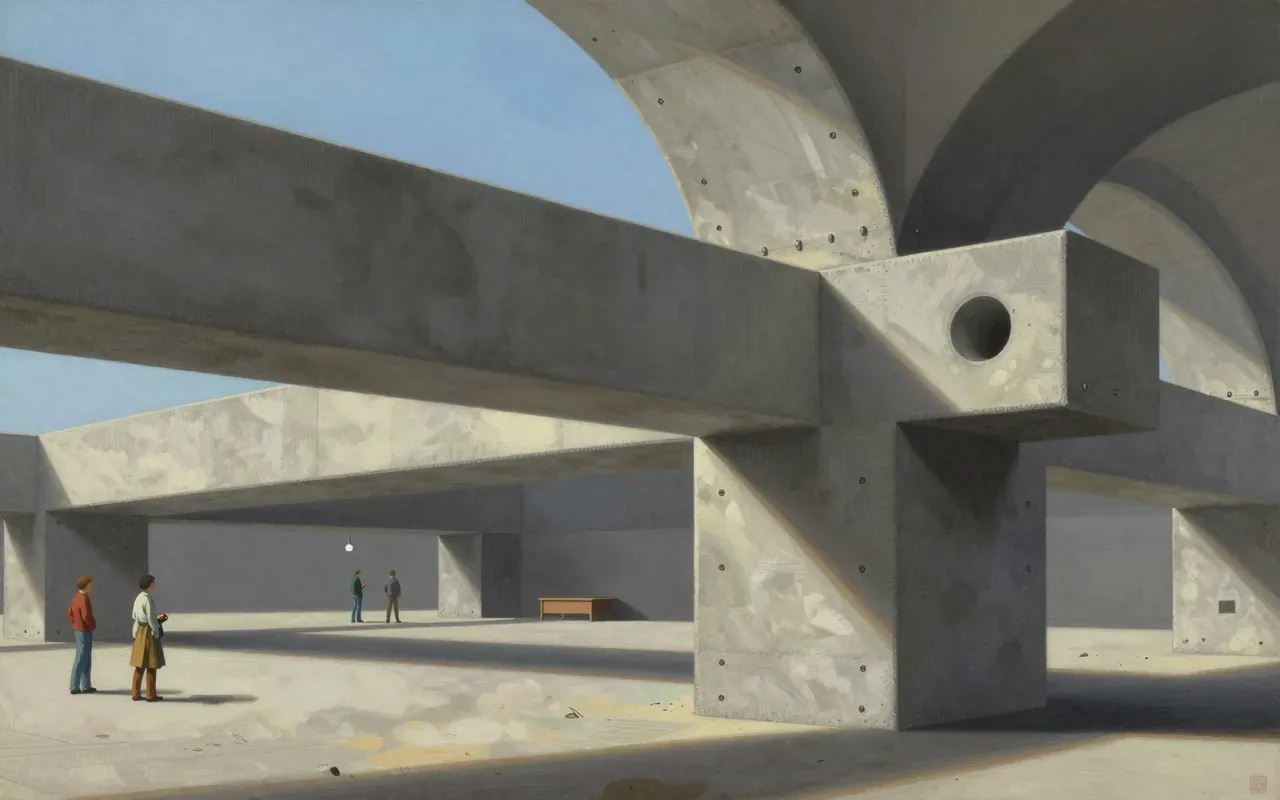
The Salk Institute is the laboratory cluster of Louis Kahn’s unrealised three-part campus. Built 1959–1965 in La Jolla, California, it uses column-free floors, integrated service floors supported by Komendant’s pre-stressed concrete Vierendeel trusses, and a Barragan-advised water court to focus attention on the Pacific Ocean. Only the lab cluster was realised. No source states what it influenced.

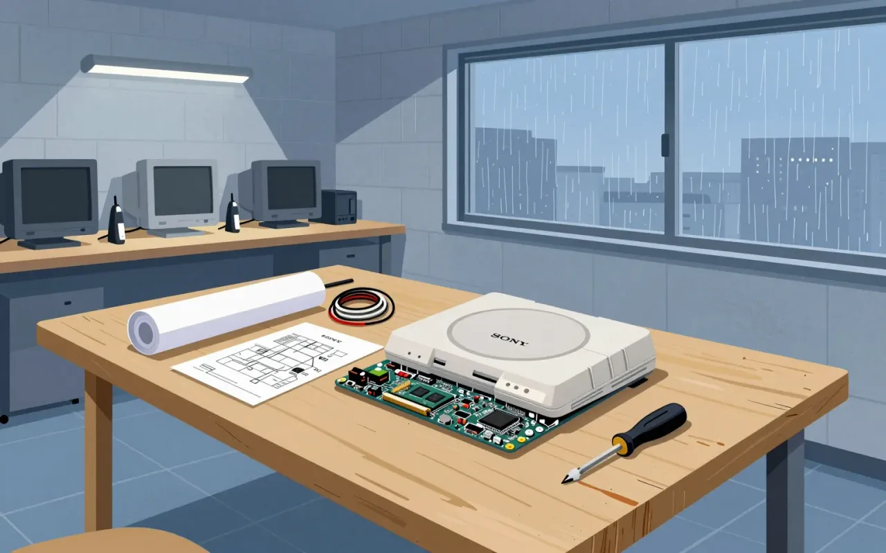
The PlayStation’s significance lies in its developer-centric architecture—not its industrial design. Teiyu Goto is not referenced in any verified source. The brief treats the console as a software platform first, a physical object second—and only what is documented is stated.
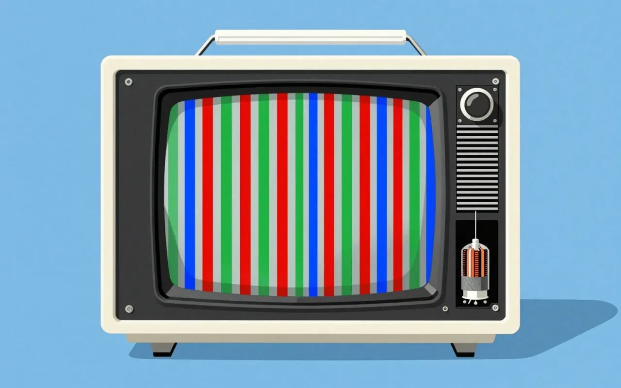
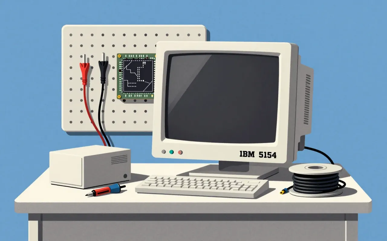
Trinitron is a CRT display technology defined by its single-gun three-cathode electron gun and vertically aligned steel aperture grille. It improved image sharpness by reducing beam obstruction and simplifying focus. Its patent ran until 1996. It launched as a branded line in 1968, powered televisions and monitors until 2005–2007, and marked the end of Sony’s analog display era.
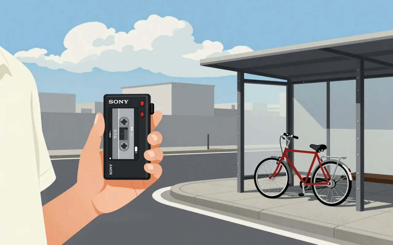
The Walkman is industrial design as behavioural intervention — minimal, specific, and consequential.
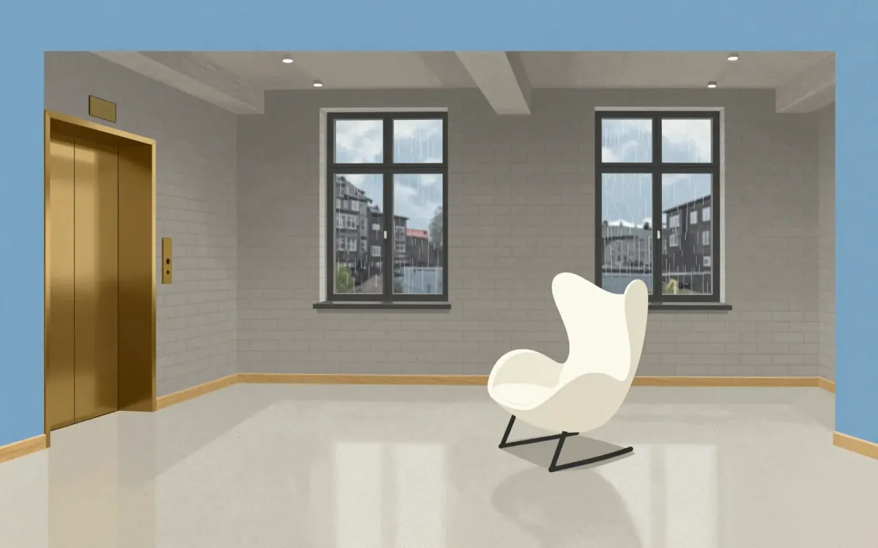
Arne Jacobsen designed the Swan lounge chair and sofa for Copenhagen's SAS Royal Hotel in 1958. The chair combines an upholstered body with a star-shaped satin-polished aluminium base.
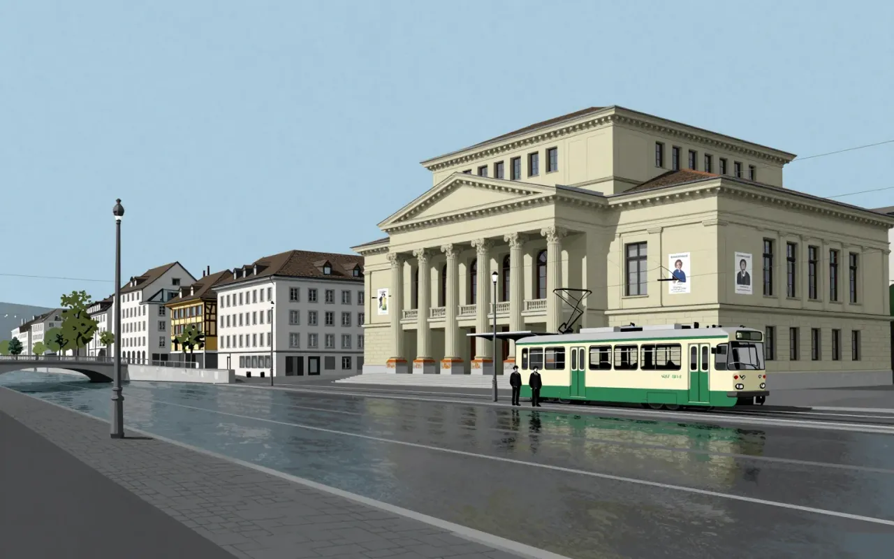
The International Typographic Style is a systemic, modernist graphic design approach that emerged during the 1930s–1950s. It prioritises objectivity, clarity, and universality through asymmetry, grid, sans-serif type, flush-left text, and photography. Josef Müller-Brockmann pioneered its application in works including the Tonhalle Series (1950) and the Accident Barometer (1952). His method relied on nonrepresentational abstraction, geometric elements, and musical structure—scale, rhythm, repetition—without illustration or embellishment.
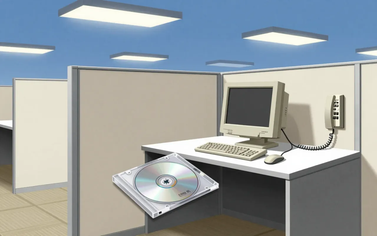
Tahoma is a humanist sans-serif typeface designed by Matthew Carter for Microsoft as the Windows interface typeface. It shipped with Office 97 and served as the default screen font in multiple Windows versions. Carter first designed it as a bitmap font, then wrapped TrueType outlines around those bitmaps. Its bold weight is based on double-pixel width. Ascender Corporation added italic and small caps versions in 2010. Tahoma has a narrower body, smaller counters, tighter letter spacing, and a more complete Unicode set than Verdana. The uppercase I is distinguishable from lowercase l — critical for technical clarity. Carter acknowledged similarities between Tahoma and his earlier Bell Centennial typeface. It was created to address specific technical challenges posed by early computers.
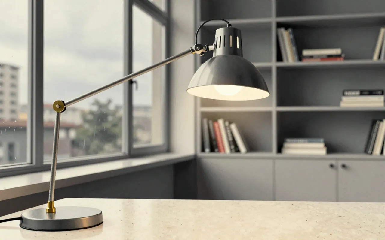
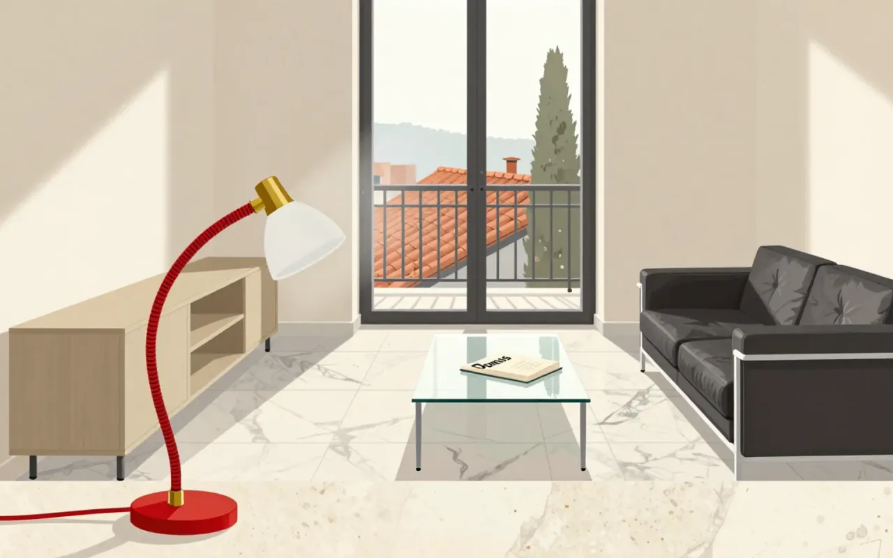
Michele De Lucchi and Giancarlo Fassina designed the Tolomeo desk lamp for Artemide in 1986. Its articulated aluminium arms, tension cables and swivelling reflector make it a useful study in adjustable task lighting.
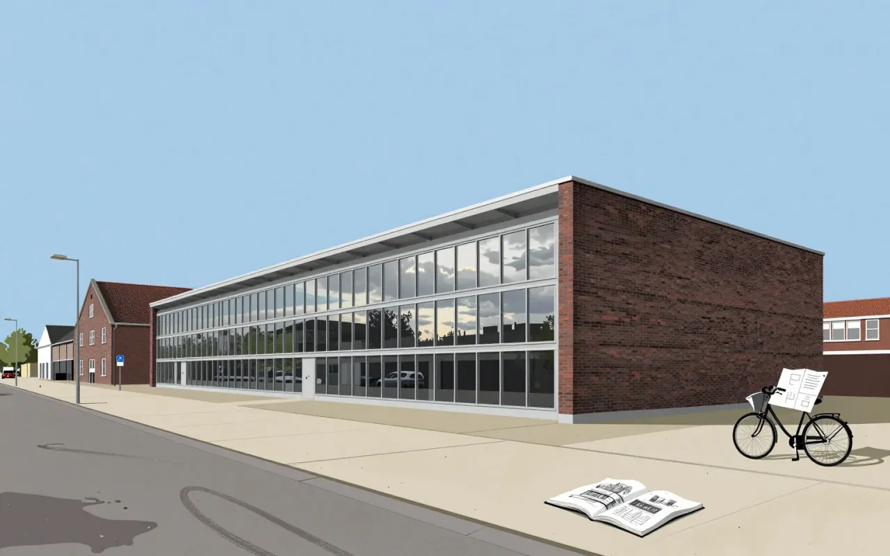
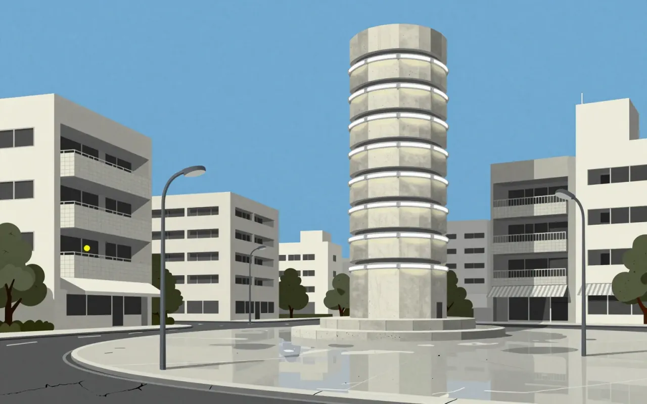
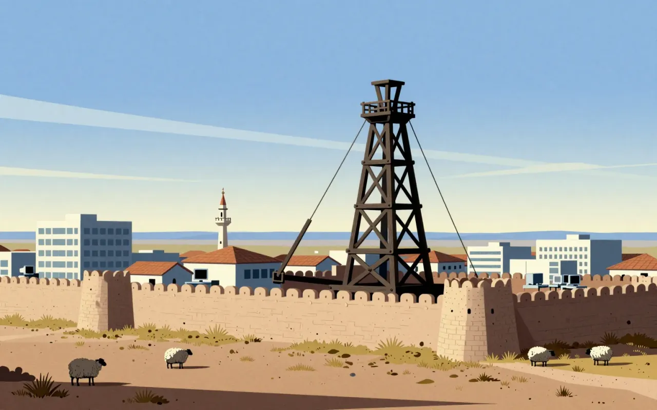
Trebuchet MS is a functional, context-bound typeface — defined by its distribution, its contrast with Verdana, and its role in Windows XP. Its influence lies in reach, not revision.

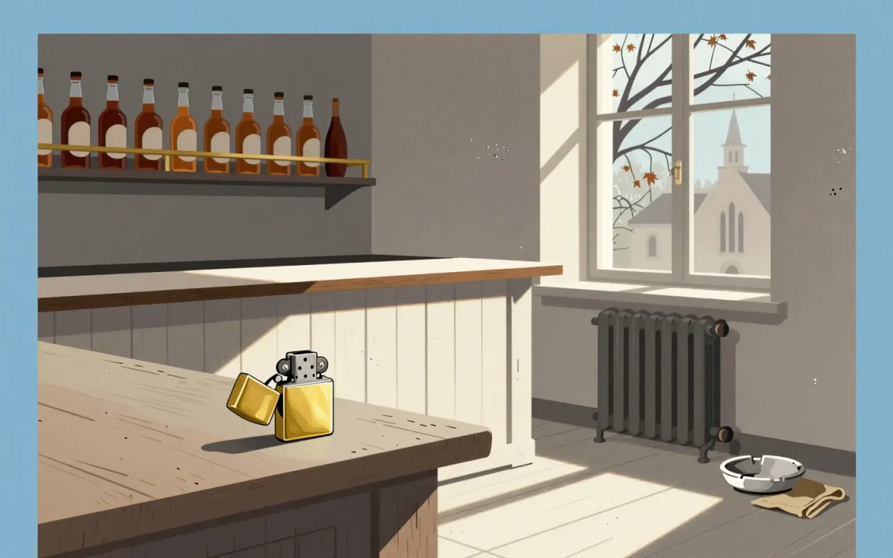
The Zippo lighter is a tightly constrained industrial object defined by wind resistance, guaranteed longevity, and procedural repeatability — not novelty, aesthetics, or scale.